

11 Tell Your Story with Data
NoteIn this chapter, you’ll learn how to:
- Apply the full data-science pipeline (import → wrangle → visualize → model) to a multi-step case study
- Diagnose and address common data quality issues (skewness, missing values, outliers)
- Build a regression model that captures interaction between variables
- Communicate statistical findings clearly to a non-technical audience
Recall in the Preface and at the end of chapters throughout this book, we displayed the “ModernDive flowchart” mapping your journey through this book.
11.1 Review
Let’s go over a refresher of what you’ve covered so far. You first got started with data in Chapter 1 (Getting Started with Data in R) where you learned about the difference between R and RStudio, started coding in R, installed and loaded your first R packages, and explored your first dataset: all domestic departure flights from a major New York City airport in 2023. Then you covered the following three parts of this book (Parts 2 and 4 are combined into a single portion):
- Data science with
tidyverse. You assembled your data science toolbox usingtidyversepackages. In particular, you
-
Chapter 2 (Data Visualization): Visualized data using the
ggplot2package. -
Chapter 3 (Data Wrangling): Wrangled data using the
dplyrpackage. -
Chapter 4 (Data Importing and Tidy Data): Learned about the concept of “tidy” data as a standardized data frame input and output format for all packages in the
tidyverse. Furthermore, you learned how to import spreadsheet files into R using thereadrpackage.
- Statistical/Data modeling with
moderndive. Using these data science tools and helper functions from themoderndivepackage, you fit your first data models. In particular, you
- Chapter 5 (Simple Linear Regression): Discovered basic regression models with only one explanatory variable.
- Chapter 6 (Multiple Regression): Examined multiple regression models with more than one explanatory variable.
- Statistical inference with
infer. Once again using your newly acquired data science tools, you unpacked statistical inference using theinferpackage. In particular, you
- Chapter 7 (Sampling): Learned about the role that sampling variability plays in statistical inference and the role that sample size plays in this sampling variability.
- Chapter 8 (Estimation, Confidence Intervals, and Bootstrapping): Constructed confidence intervals using bootstrapping and learned some about a theory-based approach to confidence intervals.
- Chapter 9 (Hypothesis Testing): Conducted hypothesis tests using permutation.
- Statistical/Data modeling with
moderndive(revisited): Armed with your understanding of statistical inference, you revisited and reviewed the models you constructed in Chapter 5 (Simple Linear Regression) and Chapter 6 (Multiple Regression). In particular, you
- Chapter 10 (Inference for Regression): Interpreted confidence intervals and hypothesis tests in a regression setting using both theory-based and simulation-based approaches.
We’ve guided you through your first experiences of “thinking with data,” an expression originally coined by Dr. Diane Lambert. The philosophy underlying this expression guided your path in the flowchart in Figure 11.1.
This philosophy is also well-summarized in “Practical Data Science for Stats”: a collection of pre-prints focusing on the practical side of data science workflows and statistical analysis curated by Dr. Jennifer Bryan and Dr. Hadley Wickham. They quote:
There are many aspects of day-to-day analytical work that are almost absent from the conventional statistics literature and curriculum. And yet these activities account for a considerable share of the time and effort of data analysts and applied statisticians. The goal of this collection is to increase the visibility and adoption of modern data analytical workflows. We aim to facilitate the transfer of tools and frameworks between industry and academia, between software engineering and statistics and computer science, and across different domains.
In other words, to be equipped to “think with data” in the 21st century and beyond, analysts need practice going through the “data/science pipeline” we saw in the Preface (re-displayed in Figure 11.2). It is our opinion that, for too long, statistics education has only focused on parts of this pipeline, instead of going through it in its entirety.

To conclude this book, we’ll present you with some additional case studies of working with data. In Section 11.2 we’ll take you through a full-pass of the “Data/Science Pipeline” in order to analyze the sale price of houses in Seattle, Washington, USA. In Section 11.3, we’ll present you with some examples of effective data storytelling drawn from the data journalism website, FiveThirtyEight.com. We present these case studies to you because we believe that you should not only be able to “think with data,” but also be able to “tell your story with data.” Let’s explore how to do this!
Needed packages
Let’s load all the packages needed for this chapter (this assumes you’ve already installed them). Read Section 1.3 for information on how to install and load R packages.
11.2 Case study: Seattle house prices
Kaggle.com is a machine learning and predictive modeling competition website that hosts datasets uploaded by companies, governmental organizations, and other individuals. One of their datasets is the “House Sales in King County, USA”. It consists of sale prices of homes sold between May 2014 and May 2015 in King County, Washington, USA, which includes the greater Seattle metropolitan area. This dataset is in the house_prices data frame included in the moderndive package.
The dataset consists of 21,613 houses and 23 variables describing these houses (for a full list and description of these variables, see the help file by running ?house_prices in the console). In this case study, we’ll create a multiple regression model where:
- The outcome variable \(y\) is the sale
priceof houses. - Two explanatory variables:
- A numerical explanatory variable \(x_1\): house size
sqft_livingas measured in square feet of living space. Note that 1 square foot is about 0.09 square meters. - A categorical explanatory variable \(x_2\): house
condition, a categorical variable with five levels where1indicates “poor” and5indicates “excellent.”
11.2.1 Exploratory data analysis: part I
As we’ve said numerous times throughout this book, a crucial first step when presented with data is to perform an exploratory data analysis (EDA). Exploratory data analysis can give you a sense of your data, help identify issues with your data, bring to light any outliers, and help inform model construction. Recall the three common steps in an exploratory data analysis we introduced in Section 5.1.1:
- Looking at the raw data values.
- Computing summary statistics.
- Creating data visualizations.
First, let’s look at the raw data using View() to bring up RStudio’s spreadsheet viewer and the glimpse() function from the dplyr package:
Rows: 21,613
Columns: 23
$ id            <chr> "7129300520", "6414100192", "5631500400", "2487200875", …
$ date          <date> 2014-10-13, 2014-12-09, 2015-02-25, 2014-12-09, 2015-02…
$ price         <dbl> 221900, 538000, 180000, 604000, 510000, 1225000, 257500,…
$ bedrooms      <int> 3, 3, 2, 4, 3, 4, 3, 3, 3, 3, 3, 2, 3, 3, 5, 4, 3, 4, 2,…
$ bathrooms     <dbl> 1.00, 2.25, 1.00, 3.00, 2.00, 4.50, 2.25, 1.50, 1.00, 2.…
$ sqft_living   <int> 1180, 2570, 770, 1960, 1680, 5420, 1715, 1060, 1780, 189…
$ sqft_lot      <int> 5650, 7242, 10000, 5000, 8080, 101930, 6819, 9711, 7470,…
$ floors        <dbl> 1.0, 2.0, 1.0, 1.0, 1.0, 1.0, 2.0, 1.0, 1.0, 2.0, 1.0, 1…
$ waterfront    <lgl> FALSE, FALSE, FALSE, FALSE, FALSE, FALSE, FALSE, FALSE, …
$ view          <int> 0, 0, 0, 0, 0, 0, 0, 0, 0, 0, 0, 0, 0, 0, 0, 3, 0, 0, 0,…
$ condition     <fct> 3, 3, 3, 5, 3, 3, 3, 3, 3, 3, 3, 4, 4, 4, 3, 3, 3, 4, 4,…
$ grade         <fct> 7, 7, 6, 7, 8, 11, 7, 7, 7, 7, 8, 7, 7, 7, 7, 9, 7, 7, 7…
$ sqft_above    <int> 1180, 2170, 770, 1050, 1680, 3890, 1715, 1060, 1050, 189…
$ sqft_basement <int> 0, 400, 0, 910, 0, 1530, 0, 0, 730, 0, 1700, 300, 0, 0, …
$ yr_built      <int> 1955, 1951, 1933, 1965, 1987, 2001, 1995, 1963, 1960, 20…
$ yr_renovated  <int> 0, 1991, 0, 0, 0, 0, 0, 0, 0, 0, 0, 0, 0, 0, 0, 0, 0, 0,…
$ zipcode       <fct> 98178, 98125, 98028, 98136, 98074, 98053, 98003, 98198, …
$ lat           <dbl> 47.5, 47.7, 47.7, 47.5, 47.6, 47.7, 47.3, 47.4, 47.5, 47…
$ long          <dbl> -122, -122, -122, -122, -122, -122, -122, -122, -122, -1…
$ sqft_living15 <int> 1340, 1690, 2720, 1360, 1800, 4760, 2238, 1650, 1780, 23…
$ sqft_lot15    <int> 5650, 7639, 8062, 5000, 7503, 101930, 6819, 9711, 8113, …
$ log10_price   <dbl> 5.35, 5.73, 5.26, 5.78, 5.71, 6.09, 5.41, 5.47, 5.36, 5.…
$ log10_size    <dbl> 3.07, 3.41, 2.89, 3.29, 3.23, 3.73, 3.23, 3.03, 3.25, 3.…
Here are some questions you can ask yourself at this stage of an EDA: Which variables are numerical? Which are categorical? For the categorical variables, what are their levels? Besides the variables we’ll be using in our regression model, what other variables do you think would be useful to use in a model for predicting house price?
Observe, for example, with the raw data that while the condition variable has values 1 through 5, these are saved in R as fct standing for “factors.” Recall this is one of R’s ways of saving categorical variables. So you should think of these as the “labels” 1 through 5 and not the numerical values 1 through 5.
Let’s now perform the second step in an EDA: computing summary statistics. Recall from Section 3.3 that summary statistics are single numerical values that summarize a large number of values. Examples of summary statistics include the mean, the median, the standard deviation, and various percentiles.
Let’s use the convenient tidy_summary() function from the moderndive package we first used in Section 6.1.1, being sure to only select() the variables of interest for our model:
house_prices |>
  select(price, sqft_living, condition) |>
tidy_summary()| column | n | group | type | min | Q1 | mean | median | Q3 | max | sd |
|---|---|---|---|---|---|---|---|---|---|---|
| price | 21613 | NA | numeric | 75000 | 321950 | 540088 | 450000 | 645000 | 7700000 | 367127 |
| sqft_living | 21613 | NA | numeric | 290 | 1427 | 2080 | 1910 | 2550 | 13540 | 918 |
| condition | 30 | 1 | factor | NA | NA | NA | NA | NA | NA | NA |
| condition | 172 | 2 | factor | NA | NA | NA | NA | NA | NA | NA |
| condition | 14031 | 3 | factor | NA | NA | NA | NA | NA | NA | NA |
| condition | 5679 | 4 | factor | NA | NA | NA | NA | NA | NA | NA |
| condition | 1701 | 5 | factor | NA | NA | NA | NA | NA | NA | NA |
Observe that the mean price of $540,088 is larger than the median of $450,000. This is because a small number of very expensive houses are inflating the average. In other words, there are “outlier” house prices in our dataset. (This fact will become even more apparent when we create our visualizations next.)
However, the median is not as sensitive to such outlier house prices. This is why news about the real estate market generally report median house prices and not mean/average house prices. We say here that the median is more robust to outliers than the mean. Similarly, while both the standard deviation and interquartile-range (IQR) are both measures of spread and variability, the IQR being based on quantiles as Q3 - Q1 is more robust to outliers.
Let’s now perform the last of the three common steps in an exploratory data analysis: creating data visualizations. Let’s first create univariate visualizations. These are plots focusing on a single variable at a time. Since price and sqft_living are numerical variables, we can visualize their distributions using a geom_histogram() as seen in Section 2.5 on histograms. On the other hand, since condition is categorical, we can visualize its distribution using a geom_bar(). Recall from Section 2.8 on barplots that since condition is not “pre-counted,” we use a geom_bar() and not a geom_col().
# Histogram of house price:
ggplot(house_prices, aes(x = price)) +
  geom_histogram(color = "white") +
  labs(x = "price (USD)", title = "House price")

# Histogram of sqft_living:
ggplot(house_prices, aes(x = sqft_living)) +
  geom_histogram(color = "white") +
  labs(x = "living space (square feet)", title = "House size")

# Barplot of condition:
ggplot(house_prices, aes(x = condition)) +
  geom_bar() +
  labs(x = "condition", title = "House condition")
In Figure 11.3, we display all three of these visualizations at once.
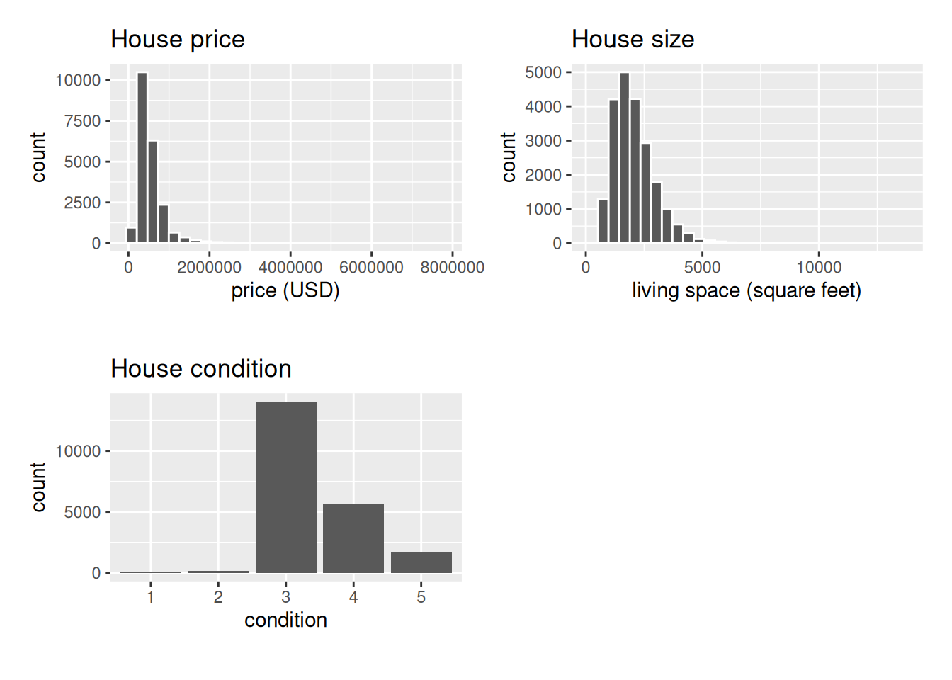
First, observe in the bottom plot that most houses are of condition 3, with a few more of conditions 4 and 5, and almost none that are 1 or 2.
Next, see in the histogram for price (the top-left plot) that a majority of houses are less than two million dollars. Observe also that the x-axis stretches out to 8 million dollars, even though there does not appear to be any houses close to that price. This is because there are a very small number of houses with prices closer to 8 million as noted in the tidy_summary(). These are the outlier house prices we mentioned earlier. We say that the variable price is right-skewed as exhibited by the long right tail.
Further, the histogram of sqft_living in the middle plot shows that most houses appear to have less than 5000 square feet of living space. For comparison, an American football field in the US is about 57,600 square feet, whereas a standard soccer/association football field is about 64,000 square feet. Observe also that this variable is also right-skewed, although not as drastically as the price variable.
For both the price and sqft_living variables, the right-skew makes distinguishing houses at the lower end of the x-axis hard. This is because the scale of the x-axis is compressed by the small number of quite expensive and immensely-sized houses.
So what can we do about this skew? Let’s apply a log10 transformation to these variables.
If you are unfamiliar with such transformations, we highly recommend you read Appendix A online on logarithmic (log) transformations.
In summary, log transformations allow us to alter the scale of a variable to focus on multiplicative changes instead of additive changes. In other words, they shift the view to be on relative changes instead of absolute changes. Such multiplicative/relative changes are also called changes in orders of magnitude.
Let’s create new log10 transformed versions of the right-skewed variable price and sqft_living using the mutate() function from Section 3.5, but we’ll give the latter the name log10_size, which is shorter and easier to understand than the name log10_sqft_living.
Let’s display the before and after effects of this transformation on these variables for only the first 10 rows of house_prices:
house_prices |>
select(price, log10_price, sqft_living, log10_size)# A tibble: 21,613 × 4
price log10_price sqft_living log10_size
<dbl> <dbl> <int> <dbl>
1 221900 5.35 1180 3.07
2 538000 5.73 2570 3.41
3 180000 5.26 770 2.89
4 604000 5.78 1960 3.29
5 510000 5.71 1680 3.23
6 1225000 6.09 5420 3.73
7 257500 5.41 1715 3.23
8 291850 5.47 1060 3.03
9 229500 5.36 1780 3.25
10 323000 5.51 1890 3.28
# ℹ 21,603 more rowsObserve in particular the houses in the sixth and third rows. The house in the sixth row has price $1,225,000, which is just above one million dollars. Since \(10^6\) is one million, its log10_price is around 6.09. Contrast this with all other houses with log10_price less than six, since they all have price less than $1,000,000. The house in the third row is the only house with sqft_living less than 1000. Since \(1000 = 10^3\), it’s the lone house with log10_size less than 3.
Let’s now visualize the before and after effects of this transformation for price in Figure 11.4.
# Before log10 transformation:
ggplot(house_prices, aes(x = price)) +
geom_histogram(color = "white") +
labs(x = "price (USD)", title = "House price: Before")
# After log10 transformation:
ggplot(house_prices, aes(x = log10_price)) +
geom_histogram(color = "white") +
labs(x = "log10 price (USD)", title = "House price: After")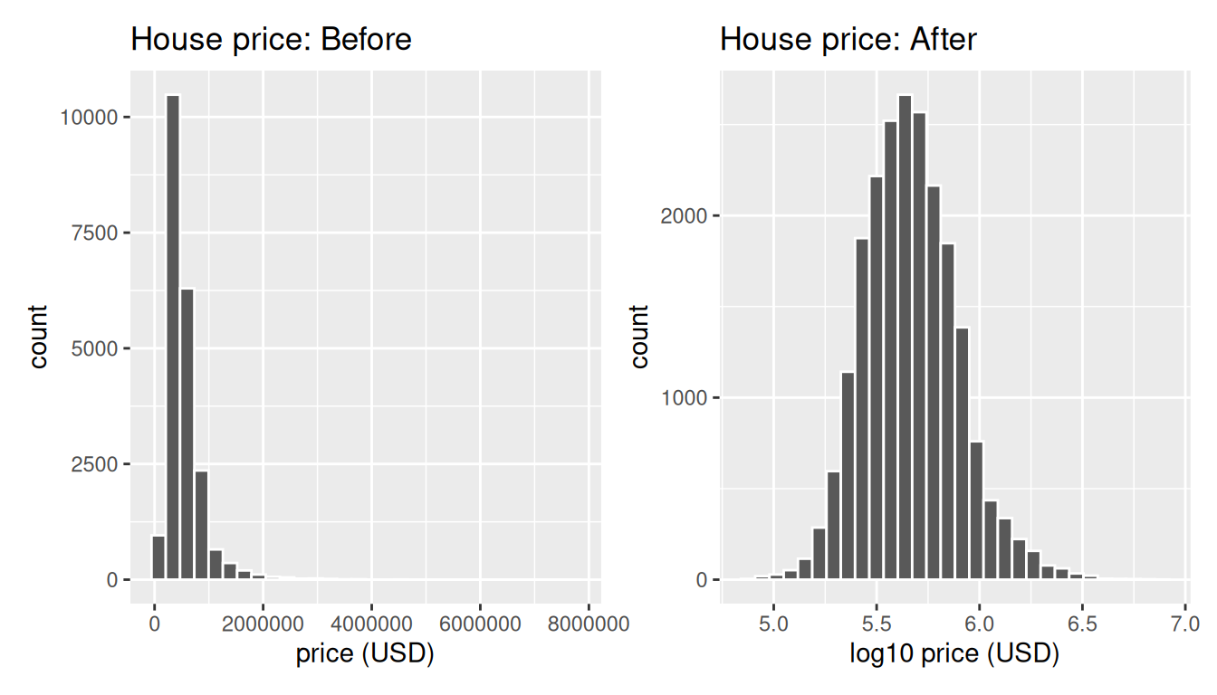
Observe that after the transformation, the distribution is much less skewed, and in this case, more symmetric and more bell-shaped. Now you can more easily distinguish the lower priced houses.
Let’s do the same for house size, where the variable sqft_living was log10 transformed to log10_size.
# Before log10 transformation:
ggplot(house_prices, aes(x = sqft_living)) +
geom_histogram(color = "white") +
labs(x = "living space (square feet)", title = "House size: Before")
# After log10 transformation:
ggplot(house_prices, aes(x = log10_size)) +
geom_histogram(color = "white") +
labs(x = "log10 living space (square feet)", title = "House size: After")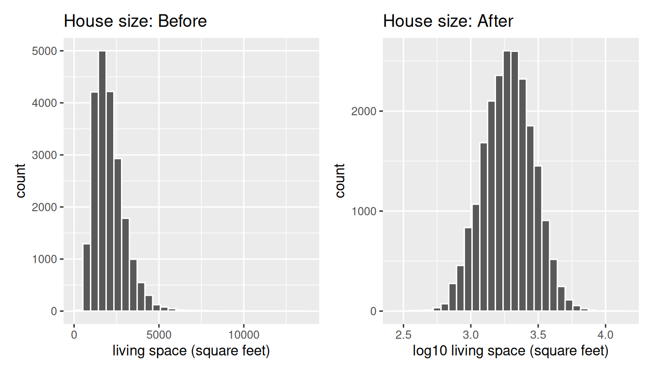
Observe in Figure 11.5 that the log10 transformation has a similar effect of un-skewing the variable. We emphasize that while in these two cases the resulting distributions are more symmetric and bell-shaped, this is not always necessarily the case.
Given the now symmetric nature of log10_price and log10_size, we are going to revise our multiple regression model to use our new variables:
- The outcome variable \(y\) is the sale
log10_priceof houses. - Two explanatory variables:
- A numerical explanatory variable \(x_1\): house size
log10_sizeas measured in log base 10 square feet of living space. - A categorical explanatory variable \(x_2\): house
condition, a categorical variable with five levels where1indicates “poor” and5indicates “excellent.”
11.2.2 Exploratory data analysis: part II
Let’s now continue our EDA by creating multivariate visualizations. Unlike the univariate histograms and barplot in the earlier Figure 11.3, Figure 11.4, and Figure 11.5, multivariate visualizations show relationships between more than one variable. This is an important step of an EDA to perform since the goal of modeling is to explore relationships between variables.
Since our model involves a numerical outcome variable, a numerical explanatory variable, and a categorical explanatory variable, we are in a similar regression modeling situation as in Section 6.1 where we studied the UN member states dataset. Recall in that case the numerical outcome variable was fertility rate, the numerical explanatory variable was life expectancy, and the categorical explanatory variable was income group.
We thus have two choices of models we can fit: either (1) an interaction model where the regression line for each condition level will have both a different slope and a different intercept or (2) a parallel slopes model where the regression line for each condition level will have the same slope but different intercepts.
Recall from Section 6.1.3 that the geom_parallel_slopes() function is a special purpose function that Evgeni Chasnovski created and included in the moderndive package, since the geom_smooth() method in the ggplot2 package does not have a convenient way to plot parallel slopes models. We plot both resulting models in Figure 11.6, with the interaction model on the left.
# Plot interaction model
ggplot(house_prices,
aes(x = log10_size, y = log10_price, col = condition)) +
geom_point(alpha = 0.05) +
geom_smooth(method = "lm", se = FALSE) +
labs(y = "log10 price",
x = "log10 size",
title = "House prices in Seattle")
# Plot parallel slopes model
ggplot(house_prices,
aes(x = log10_size, y = log10_price, col = condition)) +
geom_point(alpha = 0.05) +
geom_parallel_slopes(se = FALSE) +
labs(y = "log10 price",
x = "log10 size",
title = "House prices in Seattle")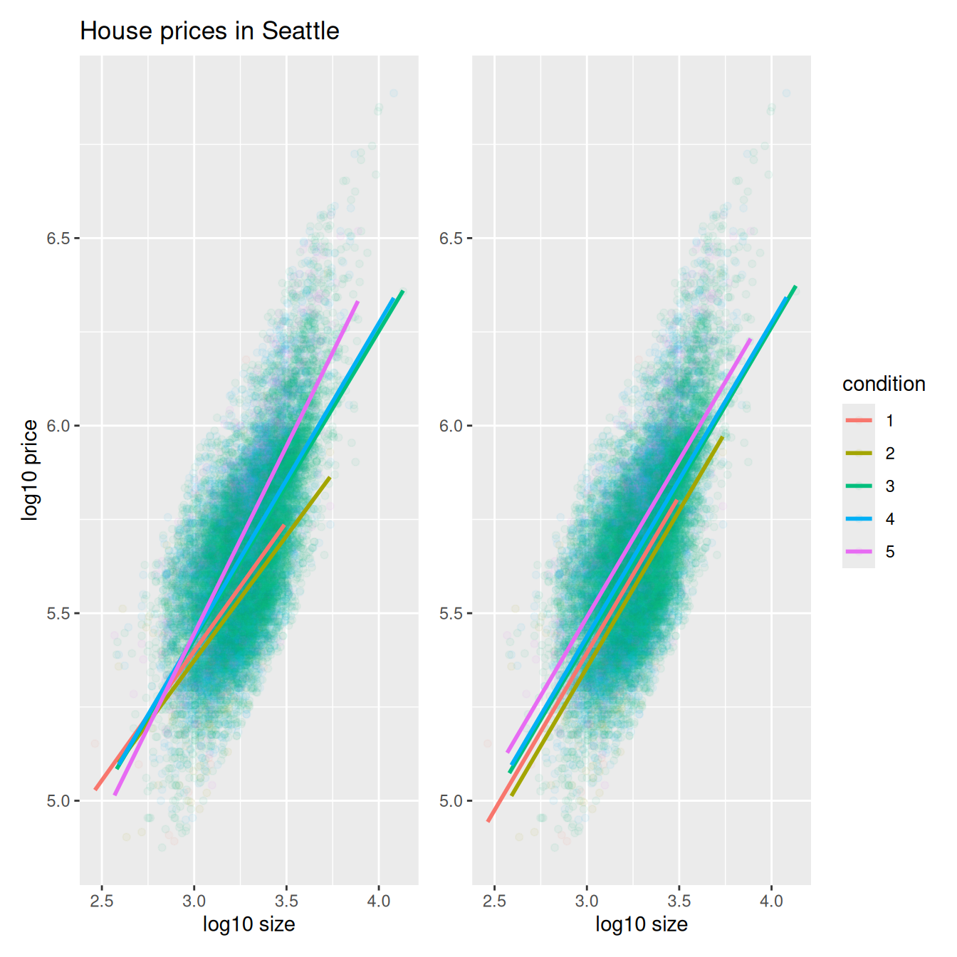
In both cases, we see there is a positive relationship between house price and size, meaning as houses are larger in size, they tend to be more expensive. Furthermore, in both plots it seems that houses of condition 5 tend to be the most expensive for most house sizes as evidenced by the fact that the line for condition 5 is highest, followed by conditions 4 and 3. As for conditions 1 and 2, this pattern isn’t as clear. Recall from the univariate barplot of condition in Figure 11.3, there are only a few houses of condition 1 or 2.
Let’s also show a faceted version of just the interaction model in Figure 11.7. It is now much more apparent just how few houses are of condition 1 or 2.
ggplot(house_prices,
aes(x = log10_size, y = log10_price, col = condition)) +
geom_point(alpha = 0.4) +
geom_smooth(method = "lm", se = FALSE) +
labs(y = "log10 price",
x = "log10 size",
title = "House prices in Seattle") +
facet_wrap(~ condition)This can be further checked using dplyr and its count() function:
house_prices |>
count(condition)# A tibble: 5 × 2
condition n
<fct> <int>
1 1 30
2 2 172
3 3 14031
4 4 5679
5 5 1701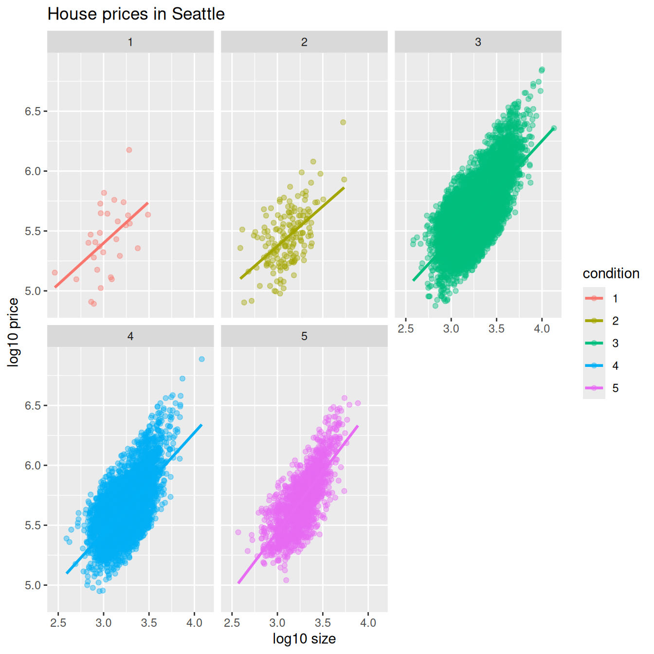
Which exploratory visualization of the interaction model is better, the one in the left-hand plot of Figure 11.6 or the faceted version in Figure 11.7? There is no universal right answer. You need to make a choice depending on what you want to convey, and own that choice, with including and discussing both also as an option as needed.
11.2.3 Regression modeling
Which of the two models in Figure 11.6 is “better”? The interaction model in the left-hand plot or the parallel slopes model in the right-hand plot?
With model selection, we should only favor more complex models if the additional complexity is warranted. In this case, the more complex model is the interaction model since it considers five intercepts and five slopes total. This is in contrast to the parallel slopes model which considers five intercepts but only one common slope.
Is the additional complexity of the interaction model warranted? Looking at the left-hand plot in Figure 11.6, we’re of the opinion that it is, as evidenced by the slight x-like (crossing) pattern to some of the lines. Therefore, we’ll focus the rest of this analysis only on the interaction model. (This visual approach is somewhat subjective, however, so feel free to disagree!) What are the five different slopes and five different intercepts for the interaction model? We can get these values from the regression table. Recall our two-step process for getting the regression table:
price_interaction <- lm(log10_price ~ log10_size * condition, data = house_prices)
get_regression_table(price_interaction)| term | estimate | std_error | statistic | p_value | lower_ci | upper_ci |
|---|---|---|---|---|---|---|
| intercept | 3.330 | 0.451 | 7.380 | 0.000 | 2.446 | 4.215 |
| log10_size | 0.690 | 0.148 | 4.652 | 0.000 | 0.399 | 0.980 |
| condition-2 | 0.047 | 0.498 | 0.094 | 0.925 | -0.930 | 1.024 |
| condition-3 | -0.367 | 0.452 | -0.812 | 0.417 | -1.253 | 0.519 |
| condition-4 | -0.398 | 0.453 | -0.879 | 0.380 | -1.286 | 0.490 |
| condition-5 | -0.883 | 0.457 | -1.931 | 0.053 | -1.779 | 0.013 |
| log10_size:condition-2 | -0.024 | 0.163 | -0.148 | 0.882 | -0.344 | 0.295 |
| log10_size:condition-3 | 0.133 | 0.148 | 0.893 | 0.372 | -0.158 | 0.424 |
| log10_size:condition-4 | 0.146 | 0.149 | 0.979 | 0.328 | -0.146 | 0.437 |
| log10_size:condition-5 | 0.310 | 0.150 | 2.067 | 0.039 | 0.016 | 0.604 |
Recall we saw in Section 6.1.2 how to interpret a regression table when there are both numerical and categorical explanatory variables. Let’s now do the same for all 10 values in the estimate column of Table 11.1.
In this case, the “baseline for comparison” group for the categorical variable condition are the condition 1 houses, since “1” comes first alphanumerically. Thus, the intercept and log10_size values are the intercept and slope for log10_size for this baseline group. Next, the condition-2 through condition-5 terms are the offsets in intercepts relative to the condition 1 intercept. Finally, the log10_size:condition-2 through log10_size:condition-5 are the offsets in slopes for log10_size relative to the condition 1 slope for log10_size.
Let’s simplify this by writing out the equation of each of the five regression lines using these 10 estimate values. We’ll write out each line in the following format:
\[ \widehat{\log10(\text{price})} = \hat{\beta}_0 + \hat{\beta}_{\text{size}} \cdot \log10(\text{size}) \]
- Condition 1:
\[\widehat{\log10(\text{price})} = 3.33 + 0.69 \cdot \log10(\text{size})\]
- Condition 2:
\[ \begin{aligned} \widehat{\log10(\text{price})} &= (3.33 + 0.047) + (0.69 - 0.024) \cdot \log10(\text{size}) \\ &= 3.377 + 0.666 \cdot \log10(\text{size}) \end{aligned} \]
- Condition 3:
\[ \begin{aligned} \widehat{\log10(\text{price})} &= (3.33 - 0.367) + (0.69 + 0.133) \cdot \log10(\text{size}) \\ &= 2.963 + 0.823 \cdot \log10(\text{size}) \end{aligned} \]
- Condition 4:
\[ \begin{aligned} \widehat{\log10(\text{price})} &= (3.33 - 0.398) + (0.69 + 0.146) \cdot \log10(\text{size}) \\ &= 2.932 + 0.836 \cdot \log10(\text{size}) \end{aligned} \]
- Condition 5:
\[ \begin{aligned} \widehat{\log10(\text{price})} &= (3.33 - 0.883) + (0.69 + 0.31) \cdot \log10(\text{size}) \\ &= 2.447 + 1 \cdot \log10(\text{size}) \end{aligned} \]
These correspond to the regression lines in the left-hand plot of Figure 11.6 and the faceted plot in Figure 11.7. For homes of all five condition types, as the size of the house increases, the price increases. This is what most would expect. However, the rate of increase of price with size is fastest for the homes with conditions 3, 4, and 5 of 0.823, 0.836, and 1, respectively. These are the three largest slopes out of the five.
11.2.4 Making predictions
Say you’re a realtor and someone calls you asking you how much their home will sell for. They tell you that it’s in condition = 5 and is sized 1900 square feet. What do you tell them? Let’s use the interaction model we fit to make predictions!
We first make this prediction visually in Figure 11.8. The predicted log10_price of this house is marked with a black dot. This is where the following two lines intersect:
- The regression line for the condition = 5 homes and
- The vertical dashed black line at
log10_sizeequals 3.28, since our predictor variable is the log10 transformed square feet of living space of \(\log10(1900) = 3.28\).
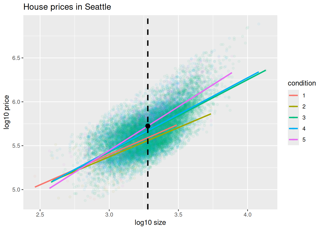
Eyeballing it, it seems the predicted log10_price seems to be around 5.75. Let’s now find the exact numerical value for the prediction using the equation of the regression line for the condition = 5 houses, being sure to log10() the square footage first.
2.45 + 1 * log10(1900)[1] 5.73This value is very close to our earlier visually made prediction of 5.75. But wait! Is our prediction for the price of this house $5.75? No, because we are using log10_price as our outcome variable! If we want a prediction in dollar units of price, we need to un-log this by taking a power of 10.
This described in Appendix A online.
10^(2.45 + 1 * log10(1900))[1] 535493Our predicted price for this home of condition 5 and of size 1900 square feet is $535,493.
11.2.5 Inference for multiple linear regression
Let’s next check the results of our multiple linear regression on house prices using both theory-based and simulation-based methods with hypothesis testing.
Theory-based hypothesis testing for partial slopes
Recall the results of our theory-based inference that were shown when we interpreted the estimate column of get_regression_table(price_interaction) in Table 11.1 and are shown again in Table 11.2. We can now use these values to perform hypothesis tests on the partial slopes.
price_interaction <- lm(log10_price ~ log10_size * condition, data = house_prices)
get_regression_table(price_interaction)| term | estimate | std_error | statistic | p_value | lower_ci | upper_ci |
|---|---|---|---|---|---|---|
| intercept | 3.330 | 0.451 | 7.380 | 0.000 | 2.446 | 4.215 |
| log10_size | 0.690 | 0.148 | 4.652 | 0.000 | 0.399 | 0.980 |
| condition-2 | 0.047 | 0.498 | 0.094 | 0.925 | -0.930 | 1.024 |
| condition-3 | -0.367 | 0.452 | -0.812 | 0.417 | -1.253 | 0.519 |
| condition-4 | -0.398 | 0.453 | -0.879 | 0.380 | -1.286 | 0.490 |
| condition-5 | -0.883 | 0.457 | -1.931 | 0.053 | -1.779 | 0.013 |
| log10_size:condition-2 | -0.024 | 0.163 | -0.148 | 0.882 | -0.344 | 0.295 |
| log10_size:condition-3 | 0.133 | 0.148 | 0.893 | 0.372 | -0.158 | 0.424 |
| log10_size:condition-4 | 0.146 | 0.149 | 0.979 | 0.328 | -0.146 | 0.437 |
| log10_size:condition-5 | 0.310 | 0.150 | 2.067 | 0.039 | 0.016 | 0.604 |
For this model, we can perform hypothesis tests on the partial slopes with an \(\alpha\) significance level set to 0.05. For example, we can test the null hypothesis that the partial slope for log10_size is zero. Looking at the \(p\)-value in the row corresponding to log10_size we see a value of 0 and a large statistic of 4.652. With \(\alpha = 0.05\), log10_size and the log10_size:condition-5 interaction (\(p\)-value = 0.039) are the only regressors with a statistically significant relationship with log10_price in this theory-based model.
Simulation-based hypothesis testing for partial slopes
We can also perform hypothesis tests on the partial slopes using simulation-based methods. We can use the fit() function and some of the other infer verbs to do so to check the results of our theory-based inference.
Let’s begin by retrieving the observed fit values from our price_interaction model:
# A tibble: 10 × 2
term estimate
<chr> <dbl>
1 intercept 3.33
2 log10_size 0.690
3 condition2 0.0470
4 condition3 -0.367
5 condition4 -0.398
6 condition5 -0.883
7 log10_size:condition2 -0.0242
8 log10_size:condition3 0.133
9 log10_size:condition4 0.146
10 log10_size:condition5 0.310 Next, we build a null distribution of the partial slopes using the generate() function and the fit() function, setting hypothesize() to null = "independence" which will shuffle the values of the response variable log10_price.
null_distribution_housing <- house_prices |>
specify(
log10_price ~ log10_size * condition
) |>
hypothesize(null = "independence") |>
generate(reps = 1000, type = "permute") |>
fit()We then visualize this null distribution and shade the observed fit values to see if they are statistically significant.
visualize(null_distribution_housing) +
shade_p_value(obs_stat = observed_fit_coefficients,
direction = "two-sided")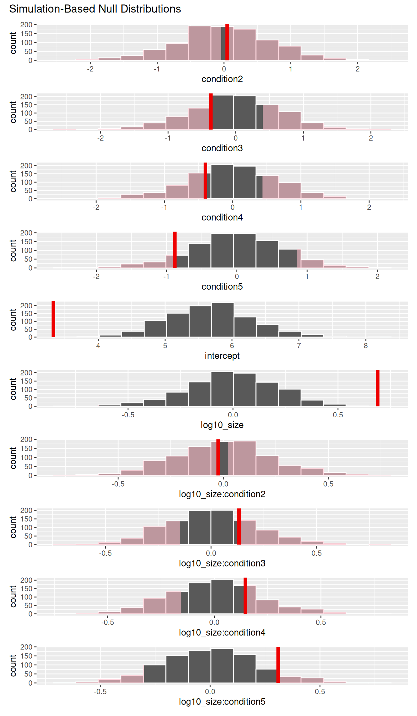
Of the regressors, it appears that only log10_size has a statistically significant relationship with log10_price. This is evidenced by the fact that the observed fit value for log10_size is far outside the range of the null distribution.
Lastly, we can calculate the \(p\)-value for the partial slopes using the get_p_value() function.
null_distribution_housing |>
get_p_value(obs_stat = observed_fit_coefficients, direction = "two-sided")# A tibble: 10 × 2
term p_value
<chr> <dbl>
1 condition2 0.948
2 condition3 0.538
3 condition4 0.508
4 condition5 0.178
5 intercept 0
6 log10_size 0.002
7 log10_size:condition2 0.916
8 log10_size:condition3 0.486
9 log10_size:condition4 0.454
10 log10_size:condition5 0.148The \(p\)-value matches up with this conclusion. Only log10_size appears to be a significant regressor for predicting log10_price in this model. This matches with the findings we had from our theory-based analysis for this same model. Remember that this won’t always be the case depending on the distributions of the variables and whether assumptions hold.
Learning Check
(LC11.1) Check that the LINE conditions are met for inference to be made in this Seattle house prices example with price_interaction <- lm(log10_price ~ log10_size * condition, data = house_prices).
TipSolution
price_interaction <- lm(
log10_price ~ log10_size * condition,
data = house_prices
)
regression_points <- get_regression_points(price_interaction, ID = "id")Plot log10 size and log10 price by condition:
ggplot(house_prices, aes(x = log10(sqft_living), y = log10(price), color = condition)) +
geom_point(alpha = 0.3) +
geom_smooth(method = "lm", se = FALSE) +
labs(x = "Log10 Size (sqft)", y = "Log10 Price ($)", color = "Condition")`geom_smooth()` using formula = 'y ~ x'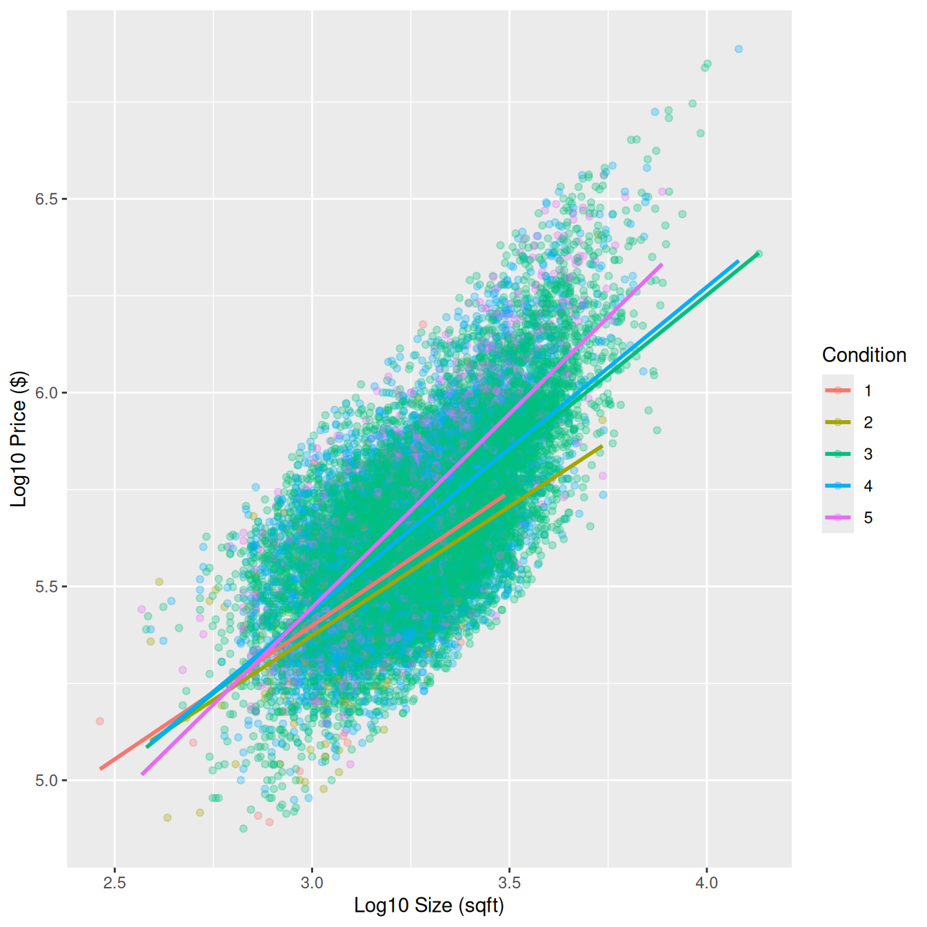
- Linearity: The relationship between log10 size and log10 price is approximately linear within each condition level. This is a little challenging to see due to overplotting.
- Independence: Each house sale is a separate observation, so independence is reasonable.
Plot Q-Q plot of residuals:
ggplot(regression_points, aes(sample = residual)) +
geom_qq(alpha = 0.3) +
geom_qq_line(color = "red") +
labs(title = "Q-Q Plot of Residuals")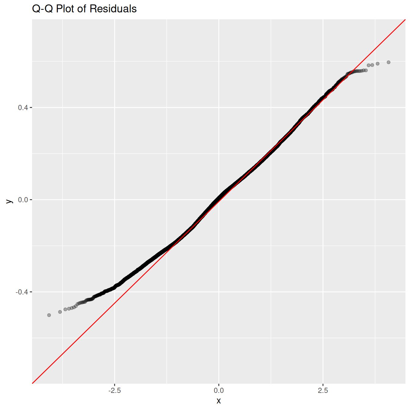
Histogram of residuals:
ggplot(regression_points, aes(x = residual)) +
geom_histogram(binwidth = 0.05, color = "white") +
labs(x = "Residual")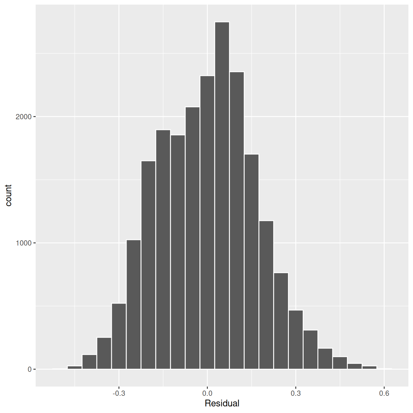
- Normality: Residuals appear roughly bell-shaped after the log10 transformation.
Plot residuals vs. fitted (log10_price_hat) values:
ggplot(regression_points, aes(x = log10_price_hat, y = residual)) +
geom_point(alpha = 0.3) +
geom_hline(yintercept = 0, color = "red") +
labs(x = "Fitted Values", y = "Residuals")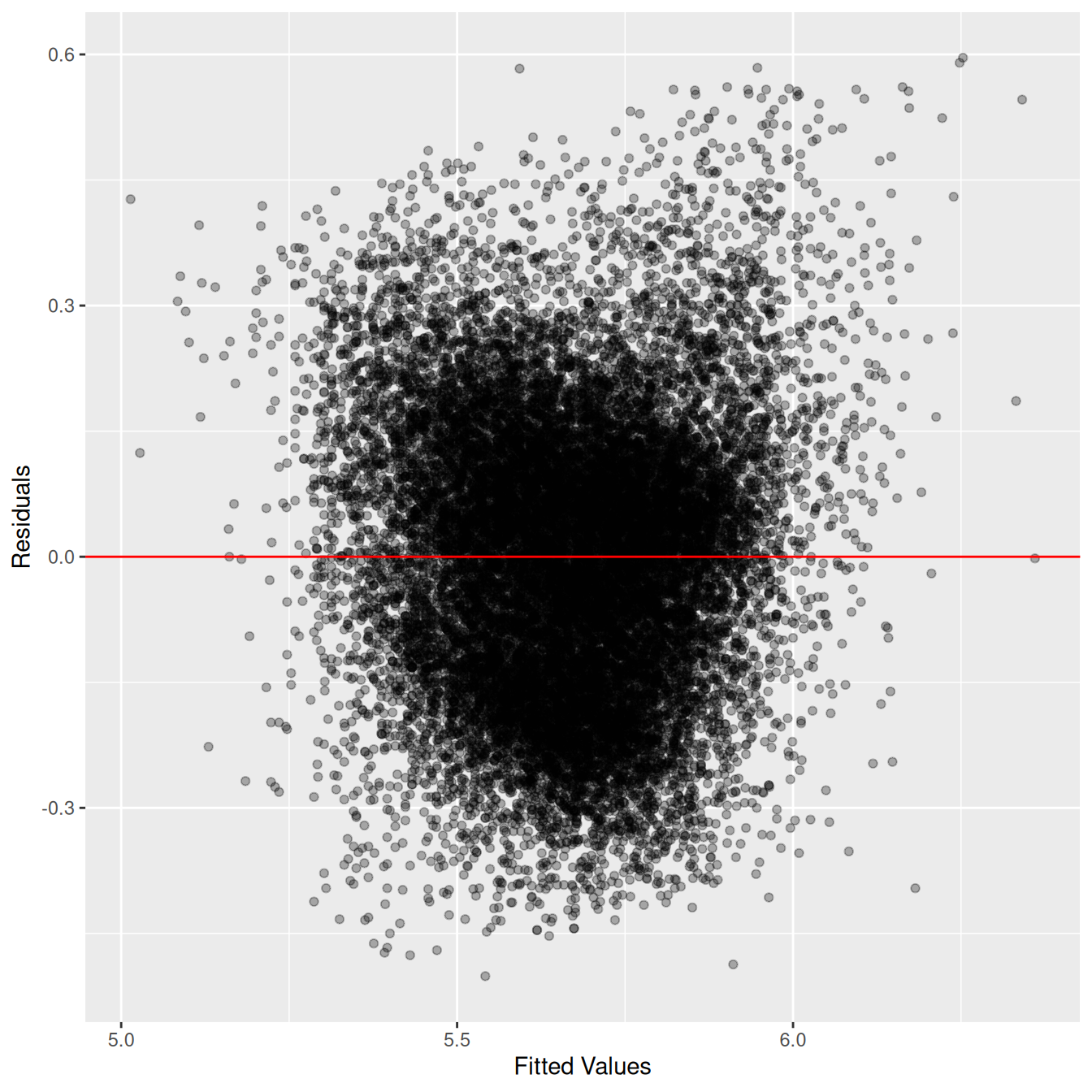
- Equal variance: The spread of residuals is fairly constant across fitted values. Overall, the LINE conditions are reasonably satisfied.
(LC11.2) Repeat the regression modeling in Section 11.2.3 and the prediction making you just did on the house of condition 5 and size 1900 square feet in Section 11.2.4, but using the parallel slopes model you visualized in Figure 11.6.
TipSolution
house_prices <- house_prices |>
  mutate(
    log10_price = log10(price),
    log10_size = log10(sqft_living)
  )
# Fit regression model:
price_interaction <- lm(log10_price ~ log10_size + condition,
data = house_prices
)
# Get regression table:
get_regression_table(price_interaction)# A tibble: 6 × 7
term estimate std_error statistic p_value lower_ci upper_ci
<chr> <dbl> <dbl> <dbl> <dbl> <dbl> <dbl>
1 intercept 2.88 0.036 80.0 0 2.81 2.95
2 log10_size 0.837 0.006 134. 0 0.825 0.85
3 condition-2 -0.039 0.033 -1.16 0.246 -0.104 0.027
4 condition-3 0.032 0.031 1.04 0.3 -0.028 0.092
5 condition-4 0.044 0.031 1.42 0.155 -0.017 0.104
6 condition-5 0.096 0.031 3.09 0.002 0.035 0.15610^(2.88 + 0.096 + 0.837 * log10(1900))[1] 525190(LC11.3) Interpret the results of the other rows in terms of inference in the get_regression_table(price_interaction) output in Table 11.1 that we did not interpret in Section 11.2.5.
TipSolution
-
condition2–condition5: These give the intercept differences relative to condition 1 houses. For example, a positive value forcondition5means condition 5 houses start with higher baseline log10 price at size = 1 square foot. -
log10_size:condition2–log10_size:condition5: These give slope differences relative to condition 1. A positive coefficient means price increases faster with size for that condition compared to condition 1.
(LC11.4) Create, visualize, and interpret confidence intervals using both theory-based and simulation-based approaches to mirror the hypothesis testing done in Section 11.2.5.
TipSolution
-
Theory-based: Use
get_regression_table(price_interaction)which reports CIs from the \(t\)-distribution. For example, the CI forlog10_sizeexcludes 0, so size is significant. -
Simulation-based: Bootstrap the regression with resampling (
inferpackage withfit()+get_confidence_interval()). Plot the bootstrap distribution of coefficients and shade the middle 95%. Both approaches agree: onlylog10_sizehas a confidence interval that does not include 0, confirming its significant relationship with log10 price.
11.3 Case study: effective data storytelling
As we’ve progressed throughout this book, you’ve seen how to work with data in a variety of ways. You’ve learned effective strategies for plotting data by understanding which types of plots work best for which combinations of variable types. You’ve summarized data in spreadsheet form and calculated summary statistics for a variety of different variables. Furthermore, you’ve seen the value of statistical inference as a process to come to conclusions about a population by using sampling. Lastly, you’ve explored how to fit linear regression models and the importance of checking the conditions required so that all confidence intervals and hypothesis tests have valid interpretation. All throughout, you’ve learned many computational techniques and focused on writing R code that’s reproducible.
We now present another set of case studies, but this time on the “effective data storytelling” done by data journalists around the world. Great data stories don’t mislead the reader, but rather engulf them in understanding the importance that data plays in our lives through storytelling.
11.3.1 Bechdel test for Hollywood gender representation
We recommend you read and analyze Walt Hickey’s FiveThirtyEight.com article, “The Dollar-And-Cents Case Against Hollywood’s Exclusion of Women.” In it, Walt completed a multi-decade study of how many movies pass the Bechdel test, an informal test of gender representation in a movie that was created by Alison Bechdel.
As you read over the article, think carefully about how Walt Hickey is using data, graphics, and analyses to tell the reader a story. In the spirit of reproducibility, FiveThirtyEight have also shared the data and R code that they used for this article. You can also find the data used in many more of their articles on their GitHub page.
ModernDive co-authors Chester Ismay and Albert Y. Kim along with Jennifer Chunn went one step further by creating the fivethirtyeight package which provides access to these datasets more easily in R. For a complete list of all 129 datasets included in the fivethirtyeight package, check out the package webpage at https://fivethirtyeight-r.netlify.app/articles/fivethirtyeight.html.
Furthermore, example “vignettes” of fully reproducible start-to-finish analyses of some of these data using dplyr, ggplot2, and other packages in the tidyverse are available here. For example, a vignette showing how to reproduce one of the plots at the end of the article on the Bechdel test is available here.
11.3.2 US Births in 1999
The US_births_1994_2003 data frame included in the fivethirtyeight package provides information about the number of daily births in the United States between 1994 and 2003. For more information on this data frame including a link to the original article on FiveThirtyEight.com, check out the help file by running ?US_births_1994_2003 in the console.
It’s always a good idea to preview your data, either by using RStudio’s spreadsheet View() function or using glimpse() from the dplyr package:
glimpse(US_births_1994_2003)Rows: 3,652
Columns: 6
$ year <int> 1994, 1994, 1994, 1994, 1994, 1994, 1994, 1994, 1994, 19…
$ month <int> 1, 1, 1, 1, 1, 1, 1, 1, 1, 1, 1, 1, 1, 1, 1, 1, 1, 1, 1,…
$ date_of_month <int> 1, 2, 3, 4, 5, 6, 7, 8, 9, 10, 11, 12, 13, 14, 15, 16, 1…
$ date <date> 1994-01-01, 1994-01-02, 1994-01-03, 1994-01-04, 1994-01…
$ day_of_week <ord> Sat, Sun, Mon, Tues, Wed, Thurs, Fri, Sat, Sun, Mon, Tue…
$ births <int> 8096, 7772, 10142, 11248, 11053, 11406, 11251, 8653, 791…We’ll focus on the number of births for each date, but only for births that occurred in 1999. Recall from Section 3.2 we can do this using the filter() function from the dplyr package:
US_births_1999 <- US_births_1994_2003 |>
  filter(year == 1999)
As discussed in Section 2.4, since date is a notion of time and thus has sequential ordering to it, a linegraph would be a more appropriate visualization to use than a scatterplot. In other words, we should use a geom_line() instead of geom_point(). Recall that such plots are called time series plots.
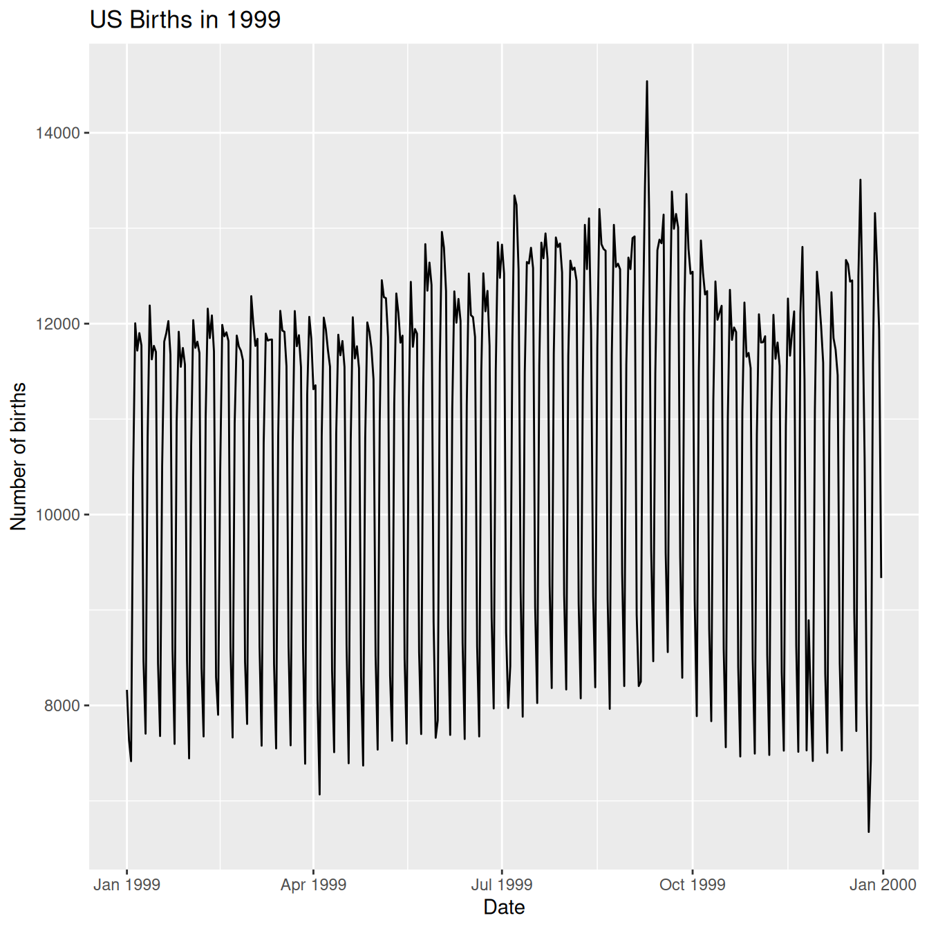
In Figure 11.9, we see a big dip occurring just before January 1st, 2000, most likely due to the holiday season. However, what about the large spike of over 14,000 births occurring just before October 1st, 1999? What could be the reason for this anomalously high spike?
Let’s sort the rows of US_births_1999 in descending order of the number of births. Recall from Section 3.6 that we can use the arrange() function from the dplyr function to do this, making sure to sort births in descending order:
# A tibble: 365 × 6
    year month date_of_month date       day_of_week births
   <int> <int>         <int> <date>     <ord>        <int>
 1  1999     9             9 1999-09-09 Thurs        14540
 2  1999    12            21 1999-12-21 Tues         13508
 3  1999     9             8 1999-09-08 Wed          13437
 4  1999     9            21 1999-09-21 Tues         13384
 5  1999     9            28 1999-09-28 Tues         13358
 6  1999     7             7 1999-07-07 Wed          13343
 7  1999     7             8 1999-07-08 Thurs        13245
 8  1999     8            17 1999-08-17 Tues         13201
 9  1999     9            10 1999-09-10 Fri          13181
10  1999    12            28 1999-12-28 Tues         13158
# ℹ 355 more rows
The date with the highest number of births (14,540) is in fact 1999-09-09. If we write down this date in month/day/year format (a standard format in the US), the date with the highest number of births is 9/9/99! All nines! Could it be that parents deliberately induced labor at a higher rate on this date? Maybe? Whatever the cause may be, this fact makes a fun story!
Learning Check
(LC11.5) What date between 1994 and 2003 has the fewest number of births in the US? What story could you tell about why this is the case?
TipSolution
US_births_1994_2003 |>
  arrange(births)
# A tibble: 3,652 × 6
year month date_of_month date day_of_week births
<int> <int> <int> <date> <ord> <int>
1 2001 12 25 2001-12-25 Tues 6443
2 2000 12 25 2000-12-25 Mon 6566
3 2003 12 25 2003-12-25 Thurs 6628
4 2002 12 25 2002-12-25 Wed 6629
5 1999 12 25 1999-12-25 Sat 6674
6 2000 12 24 2000-12-24 Sun 6801
7 1995 12 24 1995-12-24 Sun 6999
8 2002 4 7 2002-04-07 Sun 7008
9 2002 3 31 2002-03-31 Sun 7019
10 1998 12 25 1998-12-25 Fri 7020
# ℹ 3,642 more rowsThe dates with the fewest number of births in the US were 12/25 of the years of 2001, 2000, 2003, 2002, and 1999. Because it is Christmas Day and hospitals don’t generally induce labor on that day.
Time to think with data and further tell your story with data! How could statistical modeling help you here? What types of statistical inference would be helpful? What else can you find and where can you take this analysis? What assumptions did you make in this analysis? We leave these questions to you as the reader to explore and examine. Remember to get in touch with us via our contact info in the Preface. We’d love to see what you come up with!
Please check out additional problem sets and labs at https://moderndive.com/labs.
11.3.3 Scripts of R code
An R script file of all R code used in this chapter is available here.
R code files saved as *.R files for all relevant chapters throughout the entire book are given:
| chapter | link |
|---|---|
| 1 | https://moderndive.com/v2/scripts/01-getting-started.R |
| 2 | https://moderndive.com/v2/scripts/02-visualization.R |
| 3 | https://moderndive.com/v2/scripts/03-wrangling.R |
| 4 | https://moderndive.com/v2/scripts/04-tidy.R |
| 5 | https://moderndive.com/v2/scripts/05-regression.R |
| 6 | https://moderndive.com/v2/scripts/06-multiple-regression.R |
| 7 | https://moderndive.com/v2/scripts/07-sampling.R |
| 8 | https://moderndive.com/v2/scripts/08-confidence-intervals.R |
| 9 | https://moderndive.com/v2/scripts/09-hypothesis-testing.R |
| 10 | https://moderndive.com/v2/scripts/10-inference-for-regression.R |
| 11 | https://moderndive.com/v2/scripts/11-tell-your-story-with-data.R |
Quick checks
Ten questions to assess your understanding. Several are designed around common misconceptions — read each option carefully before peeking at the answer.
Q11-1. When a numerical variable is right-skewed (a long right tail), a useful transformation often is:
- Squaring the values
- Taking the log10 of the values
- Subtracting the mean from each value
- Multiplying every value by 10
TipShow answer
(b) The log10() transformation compresses large values relative to small ones, often producing a more symmetric distribution that’s easier to model.
Q11-2. What’s the most important reason to communicate uncertainty (e.g., confidence intervals) along with point estimates in a data story?
- To impress the reader with statistical jargon
- To satisfy a journal or regulatory reporting requirement
- To make the report look longer and more thorough
- To show how much the estimate could vary across samples
TipShow answer
(d) Reporting only point estimates implies more precision than the data supports. CIs (or other uncertainty measures) honestly communicate sampling variability.
Q11-3. Before fitting a regression model on real data, it’s good practice to:
- Take the log of every numerical variable
- Read the data dictionary and explore the variables
- Skip exploratory analysis to save time
- Always remove every row that has a missing value in any column
TipShow answer
(b) EDA reveals data quality issues, distributions, outliers, and relationships that inform modeling decisions. The other answers are too aggressive defaults that often discard signal.
Q11-4. A right-skewed variable like house prices is log10-transformed. After fitting lm(log10_price ~ log10_size), the slope is 0.5. The interpretation:
- The relationship cannot be interpreted on the original scale
- Price increases by 50% for each extra square foot
- For every 1-square-foot increase in size, log10(price) increases by 0.5
- For every 10× increase in size, price multiplies by about 3.16
TipShow answer
(d) A 10× increase in size raises log10_price by 0.5, so price is multiplied by \(10^{0.5} \approx 3.16\). With both variables on a log scale, slopes describe multiplicative changes: a 10× increase in \(x\) predicts a \(10^{\beta}\)× change in \(y\). This is the elasticity interpretation common in economics.
Q11-5. Suppose that instead of the Seattle case-study model, you had fit lm(price ~ sqft_living * condition, data = house_prices), on raw dollars and square feet, with no log transformations. The residuals-vs-fitted plot for this model shows a clear funnel shape (residuals fan out as fitted values grow). What does that tell you?
- The Equal-variance condition is violated
- The model fits the data perfectly
- The response variable is bimodal
- The estimated slope is far too large to be trusted
TipShow answer
(a) A funnel-shaped residuals-vs-fitted plot violates Equal variance, the “E” in LINE from Chapter 10. When that happens, theory-based SEs/CIs from lm() are unreliable. This is precisely why the chapter log10-transforms both price and size before modeling: compressing the long right tails brings the residual spread back to roughly constant, so the funnel disappears in the chapter’s actual lm(log10_price ~ log10_size * condition) model.
Q11-6. When presenting a fitted regression line to stakeholders alongside the raw data, why is showing the data points (not just the line) the right call?
- To make the direction of the slope easier to see
- To show that the model was fit to a large dataset
- So the audience can see the spread of points around the line
- To make the plot look more polished and professional to stakeholders
TipShow answer
(c) A regression line is a summary, it replaces every individual observation with a single average relationship. Showing the original points alongside the line lets the audience judge for themselves whether the model captures the relationship tightly or loosely. A line with a wide cloud of points around it tells a very different story from a line with all the points snug against it, even when the slope is identical. For data storytelling, this honesty about scatter is what separates a useful chart from a misleading one.
Q11-7. In the Seattle interaction model lm(log10_price ~ log10_size * condition, data = house_prices), the chapter reports that condition = 5 houses have the fastest growth of price with size out of the five conditions. Given that condition = 1 is the baseline group, the sign of the log10_size:condition-5 coefficient should be:
- Zero
- Negative
- Positive
- Cannot tell
TipShow answer
(c) log10_size:condition-5 is the offset to the baseline (condition = 1) slope for condition = 5 houses. If price grows faster with size for condition = 5 houses than for the baseline, that offset must be positive, and the fitted value is about +0.31, making the condition = 5 slope roughly \(0.69 + 0.31 = 1.00\), the steepest of the five. Note this isn’t automatic for every interaction term: the fitted log10_size:condition-2 offset is slightly negative (\(-0.024\)).
Q11-8. Of the data-science pipeline phases (wrangling, visualization, modeling, communication), which is often the most time-consuming in practice?
- Modeling and fitting
- Communicating results
- Wrangling and cleaning
- Visualizing and plotting
TipShow answer
(c) Real data is messy. As the Practical Data Science for Stats collection quoted in this chapter puts it, these day-to-day activities (importing, cleaning, joining, and validating data) “account for a considerable share of the time and effort of data analysts and applied statisticians,” despite being almost absent from the conventional statistics curriculum.
Q11-9. A stakeholder asks: “If I list a 2,000-sqft house in ‘Good’ condition, what price should I expect?” After fitting the Seattle interaction model, the cleanest way to answer is:
- Plug the log10 of 2,000 into that condition’s fitted equation and un-log the result
- Look up the average price of all houses in the dataset and quote that
- Take the maximum predicted price across all the listings in the dataset
- Read the slope from the regression table and multiply it by 2,000 square feet
TipShow answer
(a) This is the chapter’s prediction workflow: use the regression table to write out the fitted equation for the relevant condition group (its intercept and slope offsets added to the baseline), evaluate it at log10(2000), and (because the model’s outcome is log10_price, not price) un-log the result by taking 10^ of the prediction to report dollars. (d) forgets both the intercept and the log transformation: the slope multiplies log10(size), not raw square footage.
Q11-10. A reader of your case study asks: “could there be a confounding variable affecting the relationship you found?” The honest answer is:
- Run more bootstrap replicates to settle it
- Yes; observational data is always vulnerable to confounding
- Explain that the fitted regression model establishes causation
- Point them to the small p-value as proof
TipShow answer
(b) Observational regressions describe associations, not causation. Adjusting for the confounders we know about helps, but only a randomized experiment rules out the ones we haven’t measured. Honest communication acknowledges the limits of what your data can tell you and the role of unmeasured variables.
TipChapter cheatsheet
| Pattern | What it does | Quick example |
|---|---|---|
mutate(log10_var = log10(var)) |
Log-transform a right-skewed numerical variable | house_prices |> mutate(log10_price = log10(price)) |
lm(y ~ x1 * x2, data) |
Interaction model — slopes vary by group | lm(log10_price ~ log10_size * condition, data = house_prices) |
glimpse(df) / summary(df)
|
Quick look at structure / range of every column | glimpse(house_prices) |
ggplot(df, aes(x, y, color = group)) + geom_point() + geom_smooth(method = "lm", se = FALSE) + facet_wrap(~group) |
Faceted, colored scatterplot with per-group regression lines | ggplot(house_prices, aes(x = log10_size, y = log10_price, col = condition)) + geom_point(alpha = 0.4) + geom_smooth(method = "lm", se = FALSE) + facet_wrap(~ condition) |
Exercises
The chapter caps off the book with a Seattle house-price case study and a discussion of effective data storytelling. The end-of-chapter exercises are intentionally smaller and more open-ended than earlier chapters — each asks you to put the full data-science toolkit (visualize → wrangle → tidy → model → infer) to work on one of the five datasets used throughout the exercise sets. Solutions are available to instructors separately.
Difficulty stars: ★ warm-up, ★★ standard application, ★★★ critical thinking. Solutions are available to instructors separately.
Data source (episodes, from the steves package). Source: Rick Steves’ Europe (compiled dataset). Note: This dataset was created from public sources for teaching purposes and is not an official or verified Rick Steves’ Europe dataset.
Case study: Seattle house prices (modeling + inference)
EX11.1 (★★★) Connect modeling to inference: pick two numerical variables from any of the five exercise datasets (olympic_athletes, episodes, bob_ross, planets, volcanoes), fit a regression, build a CI for the slope, and write a one-paragraph synthesis: what’s the slope, is it significantly different from zero, and what’s the practical interpretation?
One wrinkle before you infer: each of these datasets is a complete catalog of what it covers (every episode, every catalogued volcano), so a CI computed from the full data has nothing left to estimate. Use the device EX 10.1 and EX 10.2 introduced for the volleyball catalog: treat the full data as the population, set a seed and draw a random sample of about a quarter of the rows with slice_sample() (small enough that the sample is clearly not the catalog itself), fit the model and build the slope CI on the sample, then compute the full-data slope directly and check whether your interval captured it.
Reasonable pairs: imdb_rating ~ season in episodes (a pair this book hasn’t modeled yet; 8 of the 159 episodes lack a rating, so filter with !is.na(imdb_rating) first); mass_earth ~ radius_earth in planets (Chapter 5’s pair); or eq_temp_k ~ insolation_earth in planets (each is missing for about 26-30% of planets, filter first). Chapter 10 already worked weight ~ height hard for volleyball athletes, so give that pair a rest here.
Steer clear of: identifier columns (volcanoes$volcano_number runs from about 210,010 to 390,847, it’s a catalog label, so a “slope per unit of volcano number” means nothing; likewise episodes$tvmaze_id), and treating a year column as the outcome, a regression “predicting the year” from a physical measurement answers no real question.
EX11.2 (★★★) Replicate the Seattle case-study arc. Section 11.2 works end-to-end through EDA → modeling → prediction → inference for Seattle house prices. Pick one of the five exercise datasets (olympic_athletes, episodes, bob_ross, planets, volcanoes), choose a numerical target variable (the variable menu in EX 11.1 applies here too), and reproduce the same four-step arc:
- one EDA chart,
- one fitted regression,
- predictions for at least three plausible inputs (plug values into the fitted equation by hand, using the coefficients from
get_regression_table()),
- predictions for at least three plausible inputs (plug values into the fitted equation by hand, using the coefficients from
- a 95% CI for at least one slope, pulled from the
lower_ci/upper_cicolumns of the same table, together with the decision it supports (does the CI rule out zero?) and a plain-English conclusion in context.
- a 95% CI for at least one slope, pulled from the
Run the arc the way EX 11.1 did: all five datasets are complete catalogs, so draw your seeded slice_sample() sample first, run steps (i) through (iv) on the sample, and close by revealing the full-data slope and checking it against your step-(iv) CI.
Tie the four steps together in a single “case-study summary” paragraph.
Effective data storytelling
EX11.3 (★★★) A headline finding. Exercises 11.3 through 11.9 build one data-storytelling project, step by step, on a single dataset: the dataset and finding you choose here carry through the whole sequence. Pick one dataset from the five (olympic_athletes, episodes, bob_ross, planets, volcanoes) and explore it until you land on a finding you would stand behind. Then write a 3-sentence “headline finding” you could pitch to a journalist, what’s the data story?
EX11.4 (★★★) Continuing the storytelling project, build the single best chart that supports the headline finding you wrote in EX 11.3. Apply everything you know about labels, color, and layout. The chart should stand alone (a casual reader doesn’t need to see the rest of your analysis to understand it). If a variable is heavily right-skewed, use scale_x_log10() (first met in Chapter 6’s Extension EX 6.36, it log-scales the x-axis while keeping the original units in the labels), and add a text label or mark calling out the key point.
EX11.5 (★★★) Add a one-paragraph caption below the chart you built in EX 11.4. The caption should:
- state the finding in plain language,
- name the data source,
- note one important caveat about the data.
EX11.6 (★★★) Now construct the opposite story, a chart of the same data as your EX 11.4 chart that misleads the reader. Two ggplot2 functions we’ve met only in Extension exercises help here, ylim() truncates the y-axis (Chapter 2’s Extension EX 2.47 showed it doesn’t just zoom, it silently removes points outside the range), and scale_x_log10() (Chapter 6’s Extension EX 6.36) gives a log-scaled x-axis, use either if it helps distort (or un-distort) the visual impression. Save both versions and discuss the difference in 2 sentences.
EX11.7 (★★★) Audience adaptation: take the chart you built in EX 11.4 (or any other chart you’ve built in this chapter, such as EX 11.2’s EDA chart) and produce two versions, one for a 7-year-old (no jargon, big text, simple title) and one for a peer statistician (precision-oriented annotations, error bars via geom_errorbar(), the ggplot2 layer met once before in EX 8.24’s CI-coverage plot, it draws error bars from ymin/ymax aesthetics, and full statistical notation). Add the text/marks each audience needs.
EX11.8 (★★★) Write a 200–300 word mini-essay (“research note”) about the dataset you chose in EX 11.3. Use the structure:
- what’s the question?
- what’s the data?
- what’s the finding?
- what’s the limitation?
EX11.9 (★★★) The takeaway: to close out the storytelling project, ask yourself, “If a reader took one idea away from your work, what should it be?” Write that idea in a single sentence. Then check it against the chart you built in EX 11.4 and the research note you wrote in EX 11.8: do they support exactly that idea, or are they hedging?
Synthesis and concluding remarks
EX11.10 (★★★) Multi-step pipeline: pick one of the five exercise datasets (the same menu as EX 11.3), then chain at least four dplyr verbs and one visualization into a single piped pipeline that ends in a chart. Apply names that make the intent clear without comments. Finish with one sentence reading your own chart: what is the most striking pattern it shows?
EX11.11 (★★★) Reproducibility check: re-render your .Rmd/.qmd from scratch. Did everything run? If not, identify what depended on global state (an installed package, a random seed, a saved object) and refactor.
EX11.12 (★★★) One question that the data CAN’T answer: staying with one of the five exercise datasets (your EX 11.3 choice or any other), identify a question you’d like to ask of it that the data cannot resolve. Specify what additional data you would need, and where you’d plausibly find it.
EX11.13 (★★★) Cross-dataset comparison: pick a single statistical concept from the earlier chapters and demonstrate it with three of the five exercise datasets. Build a 2×2 or 1×3 paneled figure, stacking the datasets into one data frame with bind_rows() (the dplyr row-stacker introduced in Chapter 3’s Extension EX 3.61) and paneling with facet_wrap(), showing the same concept three ways. For skewed variables, transform first with mutate() and log10(), as in Section 11.2, before plotting.
Case-study mechanics: the interaction model
EX11.14 (★★★) Scaffolded case-study mechanics: reading the interaction model’s lines. Section 11.2.3 settles on the chapter’s centerpiece: an interaction model in log-log space. Rebuild it exactly as the chapter does, first mutate() the two transformed variables log10_price = log10(price) and log10_size = log10(sqft_living), then fit price_interaction <- lm(log10_price ~ log10_size * condition, data = house_prices) and pull get_regression_table(price_interaction). (A scope note that carries through this chapter’s house_prices exercises: the dataset is every recorded Seattle-area sale in its 2014-2015 window rather than a sample from a longer list of sales, so per EX 10.27 read the table’s standard errors, CIs, and p-values in Section 10.1’s data-generating-process sense, the sales are realizations of the Seattle market’s price-setting process, and the inference is about that process.)
- Write out the fitted equation \(\widehat{\log_{10}(\text{price})} = b_0 + b_1 \cdot \log_{10}(\text{size})\) for two groups: the baseline condition-1 houses, and the condition-5 houses (combine the baseline intercept and slope with the
condition-5andlog10_size:condition-5offsets).
- Write out the fitted equation \(\widehat{\log_{10}(\text{price})} = b_0 + b_1 \cdot \log_{10}(\text{size})\) for two groups: the baseline condition-1 houses, and the condition-5 houses (combine the baseline intercept and slope with the
- Both axes are log10-scaled, so the slope acts on multiplicative changes: what does the positive
log10_size:condition-5slope offset tell you about how the size-price relationship differs for condition-5 houses compared to condition-1 houses?
- Both axes are log10-scaled, so the slope acts on multiplicative changes: what does the positive
- Using the full-precision coefficients from
coef(price_interaction)rather than the rounded printed table (the table rounds to 3 decimals, and any rounding in a coefficient gets amplified once that coefficient sits in an exponent), compute for each of the two groups the factor by which the model predictspriceis multiplied when a house’s size doubles: \(10^{b_1 \cdot \log_{10}(2)} = 2^{b_1}\). Which group’s predicted price is more sensitive to size, and by how much for a doubling?
- Using the full-precision coefficients from
EX11.15 (★★★) Scaffolded case-study mechanics: simulation-based inference with fit(). Section 11.2.5 double-checks the interaction model’s theory-based inference with a simulation-based permutation test built from infer’s fit() verb, replicate that pipeline. (Unlike EX 11.1’s estimation device, a permutation test needs no seeded sample of the catalog: its randomness comes from the shuffles you generate, not from sampling houses, so the complete house_prices data is exactly the right input here.)
- Rebuild
log10_priceandlog10_sizeas in the chapter, then get the observed coefficients withhouse_prices |> specify(log10_price ~ log10_size * condition) |> fit().
- Rebuild
- Run
set.seed(76), then build the null distribution by insertinghypothesize(null = "independence")andgenerate(reps = 1000, type = "permute")beforefit(). What, concretely, does this permutation shuffle, and why does that encode “no relationship”?
- Run
-
visualize()the null distributions withshade_p_value(obs_stat = ..., direction = "two-sided"), then compute \(p\)-values withget_p_value(). Focusing on thelog10_sizecoefficient: state \(H_0\) and \(H_A\), and interpret your \(p\)-value at \(\alpha = 0.05\) using the book’s careful language (“assuming \(H_0\) is true…”). Does your simulation-based conclusion forlog10_sizematch the theory-based regression table? What about forlog10_size:condition-5?
-
Extensions
NoteAbout these Extensions
The exercises below deliberately introduce functions and concepts beyond what this chapter teaches — log transformations, predict(), new packages, foreshadowing later chapters. They are optional, aimed at readers who want to push further. The main Exercises and Quick checks above stick strictly to what this chapter covers.
EX11.16 (◆◆◆) k-fold cross-validation. Extension EX 5.47 introduced \(R^2\) as a summary of how well a model fits the data it was fit to, and Chapter 11’s case study likewise evaluated its model only on the data it was fit to. But a model that fits its training data well can still predict new data poorly (the model has “memorized” the training set). Cross-validation evaluates how a model generalizes, randomly split the data into \(k\) folds, train on \(k-1\) of them, test on the held-out fold, repeat for all \(k\) folds, and report the average out-of-sample error. Run the 5-fold CV snippet on the Seattle house_prices data from Section 11.2’s case study. Two of its tools have appeared before: predict(m, newdata = ...) (Chapter 5’s Extension EX 5.38) gets a fitted model’s predictions on new rows, and purrr::map_dbl(1:k, cv_rmse) (the mapper met in Chapter 8’s Extension EX 8.45) applies cv_rmse() to each fold number and returns one RMSE per fold. Why is the mean fold RMSE a more honest estimate of how the model will perform on truly new houses than the in-sample \(R^2\)?
EX11.17 (◆◆◆) Train/test split. A simpler alternative to full \(k\)-fold CV, hold out a single chunk (typically 20–30 %) as the test set, train on the rest, evaluate on the held-out. One fit, one number out. Cheaper than \(k\)-fold but noisier (you get one estimate, not \(k\)). Run the 80/20 split on the same Seattle house_prices data as EX 11.16 (the snippet reads the training \(R^2\) from broom::glance(m), the one-row whole-model summary tibble met in Chapter 5’s Extension EX 5.45, piped into pull(r.squared)). Compare the training \(R^2\) to the test RMSE. When would a single split be sufficient vs. when would you want full \(k\)-fold?
EX11.18 (◆◆◆) Overfitting demonstration. Add too many predictors (or too high a polynomial degree) and your model will memorize the training data, driving the training RMSE down, while predicting badly on new data. Run the snippet: on a seeded 2,000-house subsample of the same Seattle house_prices data as EX 11.16 and EX 11.17, it fits polynomials of degree 1 through 12 of sqft_living on a training set and tracks training vs test RMSE at each degree, collecting one row per degree with purrr::map_dfr() (the purrr row-binder first explained in EX 9.19). It then plots both RMSE curves against degree; scale_y_log10(), the y-axis sibling of EX 6.36’s scale_x_log10(), keeps the exploding test RMSEs on screen. At what degree does the test RMSE bottom out? At what degree does training RMSE keep falling while test RMSE rises? That’s overfitting in action. Close with a decision and a plain-English conclusion: which degree would you ship, and why?
EX11.19 (◆◆◆) In-sample \(R^2\) vs out-of-sample RMSE. Training \(R^2\) rewards “how much variance does the model explain in the training data.” Test RMSE rewards “how accurately can the model predict new observations.” For a published model, both are worth reporting, the \(R^2\) describes the explanatory fit, the test RMSE describes the predictive accuracy. The snippet fits the two-predictor model lm(log10(price) ~ sqft_living + bedrooms) on a seeded 80/20 train/test split of the Seattle house_prices data and reports both numbers, reading the training \(R^2\) from broom::glance() as in EX 11.17. Why is the test RMSE (not training RMSE) the right number to use when comparing predictive models?
EX11.20 (◆◆◆) Communicating uncertainty visually. A regression line alone tells the story of the point prediction, but readers also need to see the range of plausible outcomes. Using the simple Seattle model lm(log10(price) ~ sqft_living, data = house_prices) (the model EX 11.16 and EX 11.17 evaluated), build a plot with two layered bands, a narrow confidence band for the mean (Chapter 10’s extension EX 10.49) and a wider prediction band for individual houses (Chapter 10’s extension EX 10.47); geom_ribbon(aes(ymin = ..., ymax = ...)), a new-to-us ggplot2 layer that shades the region between two curves, draws each band. (Read both bands per EX 11.14’s scope note: statements about the Seattle market process, not about resampling the catalog.) When publishing the Seattle case study results, why is the prediction band often the more honest visualization for a stakeholder asking “how much should I expect to pay?”
EX11.21 (◆◆) Reproducibility: sessionInfo(), renv, version control. A published statistical analysis should be reproducible, anyone with the data should be able to re-run the code and get the same numbers. Three pillars:
-
sessionInfo()prints your R version, OS, and every loaded package’s version at the end of your script, so reviewers know your exact environment.
-
- The
renvpackage snapshots package versions into a project-local lockfile, so collaborators can install the same package versions you used.
- The
- Version control (git) tracks every change to the code itself.
Run sessionInfo() now. In 2-3 sentences, why is reproducibility especially important in the context of the case-study workflow you walked through in Chapter 11?
EX11.22 (◆◆) Scaffolded warm-up to the Seattle case study: log-transform on price. Section 11.2’s EDA flagged that raw price is strongly right-skewed, a long tail of expensive homes pulls the mean above the median and makes the histogram hard to read. The chapter’s fix was a log10() transform. Build both plots, raw price and log10(price), side by side.
- Describe what changes about the histogram’s shape under the transform.
- Why is a symmetric (less skewed) outcome variable a better starting point for linear regression than a heavily right-skewed one?
EX11.23 (◆◆) Scaffolded warm-up: predict a single Seattle house price by hand, then reconcile two models. Section 11.2.4 walks through making predictions from the fitted interaction model, and the chapter’s Learning check LC11.2 has you predict from the parallel-slopes model on log10_size; this exercise pushes past both.
- Fit a parallel-slopes model on raw square footage,
lm(log10(price) ~ sqft_living + condition, data = house_prices), and pull the table withget_regression_table(). Using only the intercept, thesqft_livingslope, and thecondition3offset, compute (by hand from the coefficient table) the predicted \(\log_{10}(\text{price})\) for a 2,000 sqft, condition-3 house, then take \(10^{\widehat{\log_{10}(\text{price})}}\) to back-transform to dollars. Why must you exponentiate at the end rather than read the dollar prediction directly off the table?
- Fit a parallel-slopes model on raw square footage,
- Now predict the same house from the chapter’s interaction model (
log10_price ~ log10_size * condition, remember to feed itlog10(2000)). The two dollar figures disagree. By how much, and which prediction do you trust more for this house? Justify using what the chapter showed about the two models.
- Now predict the same house from the chapter’s interaction model (
EX11.24 (◆◆◆) Train-test split: honest prediction error. EX 11.17 ran a ready-made 80/20 split on the simple model and read off its log-scale numbers; now build the split yourself with dplyr tools and put it to work on the chapter’s interaction model, scored in dollars, the units a homebuyer cares about. (The motivation is the same: evaluating a model on the data it was fit to is like grading students on the exact questions they studied from.) With set.seed(76), tag each row of house_prices with an id using row_number() (which numbers the rows 1, 2, 3, …), draw a random 80% training set with slice_sample(prop = 0.8) (a dplyr verb that keeps a random sample of rows, here 80% of them), and form the 20% test set with anti_join(hp, train, by = "id") (a dplyr join that keeps only the rows whose id does not appear in the training set). Refit the chapter’s interaction model log10_price ~ log10_size * condition on the training set only, predict \(\log_{10}(\text{price})\) for both sets, and compute each set’s RMSE in dollars: back-transform each prediction with 10^(), then apply sqrt(mean((price - predicted_price)^2)). Which of the two RMSEs is the honest estimate of how the model will perform on houses it has never seen, and why do we usually expect that one to be the larger of the two? (Run the code before answering: this dataset has a surprise in store.)
EX11.25 (◆◆◆) Out-of-sample model shoot-out. EX 11.23 showed that the parallel-slopes and interaction models can disagree by tens of thousands of dollars on a single house, but one house can’t settle which model predicts better. Settle it properly: rebuild EX 11.24’s train-test split (set.seed(76) with the same calls gives you the identical split), fit both the interaction model log10_price ~ log10_size * condition and the parallel-slopes model log10_price ~ log10_size + condition on the training set, and compare their test-set RMSEs in dollars. Does the interaction model’s extra flexibility earn its keep on houses neither model has seen? Report the gap between the two RMSEs, and be honest about whether it is large or small relative to the RMSEs themselves.
EX11.26 (◆◆◆) 5-fold cross-validation, built by hand. EX 11.16 ran ready-made 5-fold CV machinery on the simple model; here you build that machinery yourself, for the interaction model and scored in dollars. Recall why CV exists. A single train-test split (EX 11.24) has two weaknesses: one fifth of your data never helps fit the model, and the RMSE you get depends on the luck of the draw (which mansions happened to land in the test set?). k-fold cross-validation fixes both. Split the houses into \(k = 5\) equal “folds” and give each fold one turn as the test set, training on the other four. With set.seed(76), assign each house a fold number by shuffling sample(rep(1:5, length.out = n())) (rep(..., length.out = n()) recycles 1 through 5 across all the rows; sample(...) then shuffles those labels randomly). For each fold, fit the chapter’s interaction model on the other four folds and compute the test RMSE in dollars (EX 11.24’s formula) on the held-out fold. A base for() loop is the clearest tool for “repeat this once per fold”. Report the five fold RMSEs and their mean, then make the spread visible: plot the five fold RMSEs as points with geom_point(), add a solid horizontal line at their mean with geom_hline(), and a dashed one at EX 11.24’s single-split test RMSE. Then answer:
- how much do the five RMSEs vary, and what does that spread tell you that a single train-test split can’t?
- why does giving every house exactly one turn in the test set make cross-validation a better use of the data than a single split?
Concluding remarks
Now that you’ve made it to this point in the book, we suspect that you know a thing or two about how to work with data in R! You’ve also gained a lot of knowledge about how to use simulation-based techniques for statistical inference and how these techniques help build intuition about traditional theory-based inferential methods.
The hope is that you’ve come to appreciate the power of data in all respects, such as data wrangling, tidying datasets, data visualization, statistical/data modeling, and statistical inference. In our opinion, while each of these is important, data visualization may be the most important tool for a citizen or professional data scientist to have in their toolbox. If you can create truly beautiful graphics that display information in ways that the reader can clearly understand, you have great power to tell your tale with data. Let’s hope that these skills help you tell great stories with data into the future. Thanks for coming along this journey as we dove into modern data analysis using R and the tidyverse!