6 Multiple Regression
- Fit a multiple regression model with one numerical and one categorical predictor
- Distinguish between parallel-slopes and interaction models
- Interpret regression coefficients when more than one predictor is present
- Recognize when interaction effects matter for the story your data tells
In Chapter 5, we studied simple linear regression as a model that represents the relationship between two variables: an outcome variable or response \(y\) and an explanatory variable or regressor \(x\). Furthermore, to keep things simple, we only considered models with one explanatory \(x\) variable that was either numerical in Section 5.1 or categorical in Section 5.2.
In this chapter, we introduce multiple linear regression, the direct extension to simple linear regression when more than one explanatory variable is taken into account to explain changes in the outcome variable. As we show in the next few sections, much of the material developed for simple linear regression translates directly into multiple linear regression, but the interpretation of the associated effect of any one explanatory variable must be made taking into account the other explanatory variables included in the model.
Needed packages
If needed, read Section 1.3 for information on how to install and load R packages.
6.1 One numerical and one categorical explanatory variable
We continue using the UN member states dataset introduced in Section 5.1. Recall that we studied the relationship between the outcome variable fertility rate, \(y\), and the regressor life expectancy, \(x\).
In this section, we introduce one additional regressor to this model: the categorical variable income group with four categories: Low income, Lower middle income, Upper middle income, and High income. We now want to study how fertility rate changes due to changes in life expectancy and different income levels. To do this, we use multiple regression. Observe that we now have:
- A numerical outcome variable \(y\), the fertility rate in a given country or state, and
- Two explanatory variables:
- A numerical explanatory variable \(x_1\), the life expectancy.
- A categorical explanatory variable \(x_2\), the income group.
6.1.1 Exploratory data analysis
The UN member states data frame is included in the moderndive package. To keep things simple, we select() only the subset of the variables needed here, and save this data in a new data frame called UN_data_ch6. Note that the variables used are different than the ones chosen in Chapter 5. We also set the income variable to be a factor so that its levels show up in the expected order.
UN_data_ch6 <- un_member_states_2024 |>
  select(country,
         life_expectancy_2022,
         fertility_rate_2022,
         income_group_2024)|>
  na.omit()|>
  rename(life_exp = life_expectancy_2022,
         fert_rate = fertility_rate_2022,
         income = income_group_2024)|>
  mutate(income = factor(income,
                         levels = c("Low income", "Lower middle income",
                                    "Upper middle income", "High income")))
Recall the three common steps in an exploratory data analysis we saw in Section 5.1.1:
- Inspecting a sample of raw values.
- Computing summary statistics.
- Creating data visualizations.
We first look at the raw data values by either looking at UN_data_ch6 using RStudio’s spreadsheet viewer or by using the glimpse() function from the dplyr package:
glimpse(UN_data_ch6)Rows: 182
Columns: 4
$ country <chr> "Afghanistan", "Albania", "Algeria", "Angola", "Antigua and …
$ life_exp <dbl> 53.6, 79.5, 78.0, 62.1, 77.8, 78.3, 76.1, 83.1, 82.3, 74.2, …
$ fert_rate <dbl> 4.3, 1.4, 2.7, 5.0, 1.6, 1.9, 1.6, 1.6, 1.5, 1.6, 1.4, 1.8, …
$ income <fct> Low income, Upper middle income, Lower middle income, Lower …The variable country contains all the UN member states. R reads this variable as character, <chr>, and beyond the country identification it will not be needed for the analysis. The variables life expectancy, life_exp, and fertility rate, fert_rate, are numerical, and the variable income, income, is categorical. In R, categorical variables are called factors and the categories are factor levels.
We also display a random sample of 10 rows of the 182 rows corresponding to different countries in Table 6.1. Remember due to the random nature of the sampling, you will likely end up with a different subset of 10 rows.
UN_data_ch6 |> sample_n(size = 10)| country | life_exp | fert_rate | income |
|---|---|---|---|
| Trinidad and Tobago | 75.9 | 1.6 | High income |
| Micronesia, Federated States of | 74.4 | 2.6 | Lower middle income |
| North Macedonia | 76.8 | 1.4 | Upper middle income |
| Portugal | 81.5 | 1.4 | High income |
| Madagascar | 68.2 | 3.7 | Low income |
| Cambodia | 70.7 | 2.3 | Lower middle income |
| Dominica | 78.2 | 1.6 | Upper middle income |
| Peru | 68.9 | 2.1 | Upper middle income |
| Cyprus | 79.7 | 1.3 | High income |
| Guinea-Bissau | 63.7 | 3.8 | Low income |
Life expectancy, life_exp, is an estimate of how many years, on average, a person in a given country is expected to live. Fertility rate, fert_rate, is the average number of live births per woman of childbearing age in a country. As we did in our exploratory data analyses in Section 5.1.1 and Section 5.2.1 from Chapter 5, we find summary statistics:
UN_data_ch6 |>
  select(life_exp, fert_rate, income) |>
tidy_summary()| column | n | group | type | min | Q1 | mean | median | Q3 | max | sd |
|---|---|---|---|---|---|---|---|---|---|---|
| life_exp | 182 | numeric | 53.6 | 69.4 | 73.67 | 75.2 | 78.4 | 86.4 | 6.86 | |
| fert_rate | 182 | numeric | 0.9 | 1.6 | 2.49 | 2.0 | 3.2 | 6.6 | 1.16 | |
| income | 25 | Low income | factor | |||||||
| income | 52 | Lower middle income | factor | |||||||
| income | 49 | Upper middle income | factor | |||||||
| income | 56 | High income | factor |
Recall that each row in UN_data_ch6 represents a particular country or UN member state. The tidy_summary() function shows a summary for the numerical variables life expectancy (life_exp), fertility rate (fert_rate), and the categorical variable income group (income). When the variable is numerical, the tidy_summary() function provides the total number of observations in the data frame, the five-number summary, the mean, and the standard deviation.
For example, the first row of our summary refers to life expectancy as life_exp. There are 182 observations for this variable, it is a numerical variable, and the first quartile, Q1, is 69.4; this means that the life expectancy of 25% of the UN member states is less than 69.4 years. When a variable in the dataset is categorical, also called a factor, the summary shows all the categories or factor levels and the number of observations for each level. For example, income group (income) is a factor with four levels: Low income, Lower middle income, Upper middle income, and High income. The summary also provides the number of states for each factor level; observe, for example, that the dataset has 56 UN member states that are considered High income states.
Furthermore, we can compute the correlation coefficient between our two numerical variables: life_exp and fert_rate. Recall from Section 5.1.1 that correlation coefficients only exist between numerical variables. We observe that they are “strongly negatively” correlated.
UN_data_ch6 |>
  get_correlation(formula = fert_rate ~ life_exp)
# A tibble: 1 × 1
cor
<dbl>
1 -0.815We are ready to create data visualizations, the last of our exploratory data analysis. Given that the outcome variable fert_rate and explanatory variable life_exp are both numerical, we can create a scatterplot to display their relationship, as we did in Figure 5.2. But this time, we incorporate the categorical variable income by mapping this variable to the color aesthetic, thereby creating a colored scatterplot.
ggplot(UN_data_ch6, aes(x = life_exp, y = fert_rate, color = income)) +
  geom_point() +
  labs(x = "Life Expectancy", y = "Fertility Rate", color = "Income group") +
  geom_smooth(method = "lm", se = FALSE)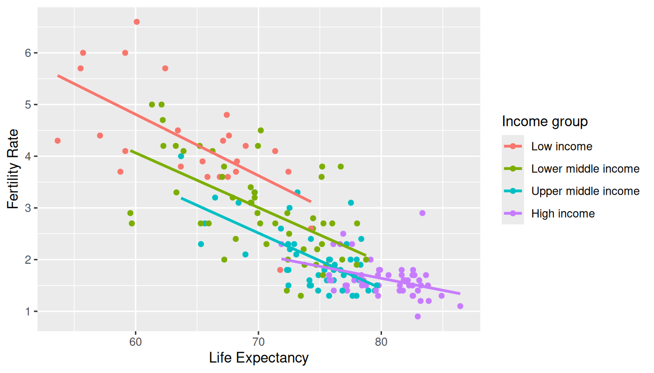
In the resulting Figure 6.1, observe that ggplot() assigns a default color scheme to the points and to the lines associated with the four levels of income: Low income, Lower middle income, Upper middle income, and High income. Furthermore, the geom_smooth(method = "lm", se = FALSE) layer automatically fits a different regression line for each group.
We can see some interesting trends. First, observe that we get a different line for each income group. Second, the slopes for all the income groups are negative. Third, the slope for the High income group is clearly less steep than the slopes for all other three groups. So, the changes in fertility rate due to changes in life expectancy are dependent on the level of income of a given country. Fourth, observe that high-income countries have, in general, high life expectancy and low fertility rates.
6.1.2 Model with interactions
We can represent the four regression lines in Figure 6.1 as a multiple regression model with interactions.
Before we do this, however, we review a linear regression with only one categorical explanatory variable. Recall in Section 5.2.2 we fit a regression model for each country life expectancy as a function of the corresponding continent. We produce the corresponding analysis here, now using the fertility rate as the response variable and the income group as the categorical explanatory variable. We’ll use slightly different notation to what was done previously to make the model more general.
A linear model with a categorical explanatory variable is called a one-factor model where factor refers to the categorical explanatory variable and the categories are also called factor levels. We represent the categories using indicator functions or dummy variables. In our UN data example, the variable income has four categories or levels: Low income, Lower middle income, Upper middle income, and High income. The corresponding dummy variables needed are:
\[ D_1 = \left\{ \begin{array}{ll} 1 & \text{if the UN member state has low income} \phantom{asfdasfd} \\ 0 & \text{otherwise}\end{array} \right. \] \[ D_2 = \left\{ \begin{array}{ll} 1 & \text{if the UN member state has lower middle income} \\ 0 & \text{otherwise}\end{array} \right. \] \[ D_3 = \left\{ \begin{array}{ll} 1 & \text{if the UN member state has upper middle income}\phantom{a} \\ 0 & \text{otherwise}\end{array} \right. \] \[ D_4 = \left\{ \begin{array}{ll} 1 & \text{if the UN member state has high income} \phantom{asfdafd}\\ 0 & \text{otherwise}\end{array} \right.\\ \]
So, for example, if a given UN member state has Low income, its dummy variables are \(D_1 = 1\) and \(D_2 = D_3 = D_4 = 0\). Similarly, if another UN member state has Upper middle income, then its dummy variables would be \(D_1 = D_2 = D_4 = 0\) and \(D_3 = 1\). Using dummy variables, the mathematical formulation of the linear regression for our example is:
\[\hat y = \widehat{\text{fert rate}} = b_0 + b_2 D_2 + b_3 D_3 + b_4 D_4\]
or if we want to express it in terms of the \(i\)th observation in our dataset, we can include the \(i\)th subscript:
\[\hat y_i = \widehat{\text{fert rate}}_i = b_0 + b_2 D_{2i} + b_3 D_{3i} + b_4 D_{4i}\]
Recall that the coefficient \(b_0\) represents the intercept and the coefficients \(b_2\), \(b_3\), and \(b_4\) are the offsets based on the appropriate category. The dummy variables, \(D_2\), \(D_3\), and \(D_4\), take the values of zero or one depending on the corresponding category of any given country. Observe also that \(D_1\) does not appear in the model. The reason for this is entirely mathematical: if the model would contain an intercept and all the dummy variables, the model would be over-specified, that is, it would contain one redundant explanatory variable. The solution is to drop one of the variables. We keep the intercept because it provides flexibility when interpreting more complicated models, and we drop one of the dummy variables which, by default in R, is the first dummy variable, \(D_1\). This does not mean that we are losing information of the first level \(D_1\). If a country is part of the Low income level, \(D_1 = 1\), \(D_2 = D_3 = D_4 = 0\), so most of the terms in the regression are zero and the linear regression becomes:
\[\hat y = \widehat{\text{fert rate}} = b_0\] So the intercept represents the average fertility rate when the country is a Low income country. Similarly, if another country is part of the Upper middle income level, then \(D_1 = D_2 = D_4 = 0\) and \(D_3 = 1\) so the linear regression becomes:
\[\hat y = \widehat{\text{fert rate}} = b_0 + b_3\] The average fertility rate for an Upper middle income country is \(b_0 + b_3\). Observe that \(b_3\) is an offset for fertility rate between the baseline level and the Upper middle income level. The same logic applies to the model for each possible income category.
We calculate the regression coefficients using the lm() function and the command coef() to retrieve the coefficients of the linear regression:
We present these results on a table with the mathematical notation used above:
| Coefficients | Values | |
|---|---|---|
| (Intercept) | b0 | 4.28 |
| incomeLower middle income | b2 | -1.30 |
| incomeUpper middle income | b3 | -2.25 |
| incomeHigh income | b4 | -2.65 |
The first level, Low income, is the “baseline” group. The average fertility rate for Low income UN member states is 4.28. Similarly, the average fertility rate for Upper middle income member states is 4.28 + -2.25 = 2.03.
We are now ready to study the multiple linear regression model with interactions shown in Figure 6.1. In this figure we can identify three different effects. First, for any fixed level of life expectancy, observe that there are four different fertility rates. They represent the effect of the categorical explanatory variable, income. Second, for any given regression line, the slope represents the change in average fertility rate due to changes in life expectancy. This is the effect of the numerical explanatory variable life_exp. Third, observe that the slope of the line depends on the income level; as an illustration, observe that for High income member states the slope is less steep than for Low income member states. When the slope changes due to changes in the explanatory variable, we call this an interaction effect.
The mathematical formulation of the linear regression model with two explanatory variables, one numerical and one categorical, and interactions is:
\[\begin{aligned}\widehat{y} = \widehat{\text{fert rate}} = b_0 &+ b_{02}D_2 + b_{03}D_3 + b_{04}D_4 \\ &+ b_1x \\ &+ b_{12}xD_2 + b_{13}xD_3 + b_{14}xD_4\end{aligned}\]
The linear regression shows how the average fertility rate is affected by the categorical variable, the numerical variable, and the interaction effects. There are eight coefficients in our model and we have separated their coefficients into three lines to highlight their different roles. The first line shows the intercept and the effects of the categorical explanatory variables. Recall that \(D_2\), \(D_3\), and \(D_4\) are the dummy variables in the model and each is equal to one or zero depending on the category of the country at hand; correspondingly, the coefficients \(b_{02}\), \(b_{03}\), and \(b_{04}\) are the offsets with respect to the baseline level of the intercept, \(b_0\). Recall that the first dummy variable has been dropped and the intercept captures this effect. The second line in the equation represents the effect of the numerical variable, \(x\). In our example \(x\) is the value of life expectancy. The coefficient \(b_1\) is the slope of the line and represents the change in fertility rate due to one unit change in life expectancy. The third line in the equation represents the interaction effects on the slopes. Observe that they are a combination of life expectancy, \(x\), and income level, \(D_2\), \(D_3\), and \(D_4\). What these interaction effects do is to modify the slope for different levels of income. For a Low income member state, the dummy variables are \(D_1 = 1\), \(D_2 = D_3 = D_4 = 0\) and our linear regression is:
\[\begin{aligned}\widehat{y} = \widehat{\text{fert rate}} &= b_0 + b_{02}\cdot 0 + b_{03}\cdot 0 + b_{04}\cdot 0 + b_1x + b_{12}x\cdot 0 + b_{13}x\cdot 0 + b_{14}x\cdot 0\\ & = b_0 + b_1x \end{aligned}\]
Similarly, for a High income member state, the dummy variables are \(D_1 = D_2 =D_3 = 0\), and \(D_4 = 1\). We take into account the offsets for the intercept, \(b_{04}\), and the slope, \(b_{14}\), and the linear regression becomes:
\[\begin{aligned}\widehat{y} = \widehat{\text{fert rate}} &= b_0 + b_{02}\cdot 0 + b_{03}\cdot 0 + b_{04}\cdot 1 + b_1 x + b_{12}x\cdot 0 + b_{13}x\cdot 0 + b_{14}x\cdot 1\\ & = b_0 + b_{04} + b_1x + b_{14}x\\ & = (b_0 + b_{04}) + (b_1 + b_{14})\cdot x\end{aligned}\]
Observe how the intercept and the slope are different for a High income member state when compared to the baseline Low income member state. As an illustration, we construct this multiple linear regression for the UN member state dataset in R. We first “fit” the model using the lm() “linear model” function and then find the coefficients using the function coef(). In R, the formula used is y ~ x1 + x2 + x1:x2 where x1 and x2 are the variable names in the dataset and represent the main effects while x1:x2 is the interaction term. For simplicity, we can also write y ~ x1 * x2 as the * sign accounts for both, main effects and interaction effects. R would let both x1 and x2 be either categorical or numerical, and we need to make sure the dataset format is appropriate for the regression we want to run. Here is the code for our example:
| Coefficients | Values | |
|---|---|---|
| (Intercept) | b0 | 11.918 |
| incomeLower middle income | b02 | -1.504 |
| incomeUpper middle income | b03 | -1.893 |
| incomeHigh income | b04 | -6.580 |
| life_exp | b1 | -0.118 |
| incomeLower middle income:life_exp | b12 | 0.013 |
| incomeUpper middle income:life_exp | b13 | 0.011 |
| incomeHigh income:life_exp | b14 | 0.072 |
We can match the coefficients with the values computed in Table 6.2: the fitted fertility rate \(\widehat{y} = \widehat{\text{fert rate}}\) for Low income countries is
\[\widehat{\text{fert rate}} = b_0 + b_1\cdot x = 11.92 + (-0.12)\cdot x,\]
which is the equation of the regression line in Figure 6.1 for low income countries. The regression has an intercept of 11.92 and a slope of -0.12. Since life expectancy is greater than zero for all countries, the intercept has no practical interpretation and we only need it to produce the most appropriate line. The interpretation of the slope is: for Low income countries, every additional year of life expectancy reduces the average fertility rate by 0.12 units.
As discussed earlier, the intercept and slope for all the other income groups are determined by taking into account the appropriate offsets. For example, for High income countries \(D_4 = 1\) and all other dummy variables are equal to zero. The regression line becomes
\[\widehat{y} = \widehat{\text{fert rate}} = b_0 + b_1x + b_{04} + b_{14}x = (b_0 + b_{04} ) + (b_1+b_{14})x \]
where \(x\) is life expectancy, life_exp. The intercept is (Intercept) + incomeHigh income:
\[b_0 + b_{04} = 11.92 +(-6.58) = 5.34,\]
and the slope for these High income countries is life_exp + life_exp:incomeHigh income corresponding to
\[b_1 + b_{14}= -0.12 + 0.07 = -0.05.\]
For High income countries, every additional year of life expectancy reduces the average fertility rate by 0.05 units. The intercepts and slopes for other income levels are calculated similarly.
Since the life expectancy for Low income countries has a steeper slope than High income countries, one additional year of life expectancy will decrease fertility rates more for the low-income group than for the high-income group. This is consistent with our observation from Figure 6.1. When the associated effect of one variable depends on the value of another variable we say that there is an interaction effect. This is the reason why the regression slopes are different for different income groups.
Learning Check
(LC6.1) What is the goal of including an interaction term in a multiple regression model?
- A. To create more variables for analysis.
- B. To account for the effect of one explanatory variable on the response while considering the influence of another explanatory variable.
- C. To make the model more complex without any real benefit.
- D. To automatically improve the fit of the regression line.
B.
It lets the effect of one explanatory variable depend on the level of another.
(LC6.2) How does the inclusion of both main effects and interaction terms in a regression model affect the interpretation of individual coefficients?
- A. They represent simple marginal effects.
- B. They become meaningless.
- C. They are conditional effects, depending on the level of the interacting variables.
- D. They are interpreted in the same way as in models without interactions.
C.
Coefficients become conditional effects that depend on the interacting variable(s).
(LC6.3) Which statement about the use of dummy variables in regression models is correct?
- A. Dummy variables are used to represent numerical variables.
- B. Dummy variables are used to represent categorical variables with at least two levels.
- C. Dummy variables always decrease the R-squared value.
- D. Dummy variables are unnecessary in regression models.
B.
They encode categorical variables with at least two levels.
6.1.3 Model without interactions
We can simplify the previous model by removing the interaction effects. The model still represents different income groups with different regression lines by allowing different intercepts but all the lines have the same slope: they are parallel as shown in Figure 6.2.
To plot parallel slopes we use the function geom_parallel_slopes() that is included in the moderndive package. To use this function you need to load both the ggplot2 and moderndive packages. Observe how the code is identical to the one used for the model with interactions in Figure 6.1, but now the geom_smooth(method = "lm", se = FALSE) layer is replaced with geom_parallel_slopes(se = FALSE).
ggplot(UN_data_ch6, aes(x = life_exp, y = fert_rate, color = income)) +
  geom_point() +
  labs(x = "Life expectancy", y = "Fertility rate", color = "Income group") +
  geom_parallel_slopes(se = FALSE)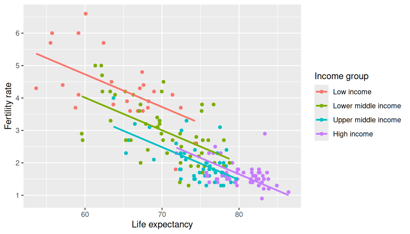
The regression lines for each income group are shown in Figure 6.2. Observe that the lines are now parallel: they all have the same negative slope. The interpretation of this result is that the change in fertility rate due to changes in life expectancy in a given country are the same regardless of the income group of this country.
On the other hand, any two regression lines in Figure 6.2 have different intercepts representing the income group; in particular, observe that for any fixed level of life expectancy the fertility rate is greater for Low income and Lower middle income countries than for Upper middle income and High income countries.
The mathematical formulation of the linear regression model with two explanatory variables, one numerical and one categorical, and without interactions is:
\[\widehat{y} = b_0 + b_{02}D_2 + b_{03}D_3 + b_{04}D_4+ b_1x.\] Observe that the dummy variables only affect the intercept now, and the slope is fully described by \(b_1\) for any income group. In the UN data example, a High income country, with \(D_4 = 1\) and the other dummy variables equal to zero, will be represented by
\[\widehat{y} = (b_0 + b_{04})+ b_1x.\]
To find the coefficients for this regression in R, the formula used is y ~ x1 + x2 where x1 and x2 are the variable names in the dataset and represent the main effects. Observe that the term x1:x2 representing the interaction is no longer included. R would let both x1 and x2 be either categorical or numerical; therefore, we should always check that the variable format is appropriate for the regression we want to run. Here is the code for the UN data example:
| Coefficients | Values | |
|---|---|---|
| (Intercept) | b0 | 10.768 |
| incomeLower middle income | b02 | -0.719 |
| incomeUpper middle income | b03 | -1.239 |
| incomeHigh income | b04 | -1.067 |
| life_exp | b1 | -0.101 |
In this model without interactions presented in Table 6.3, the slope is the same for all the regression lines, \(b_1 = -0.101\). Assuming that this model is correct, for any UN member state, every additional year of life expectancy reduces the average fertility rate by 0.101 units, regardless of the income level of the member state. The intercept of the regression line for Low income member states is 10.768 while for High income member states is \(10.768 + (-1.067) = 9.701\). The intercepts for other income levels can be determined similarly. We compare the visualizations for both models side-by-side in Figure 6.3.
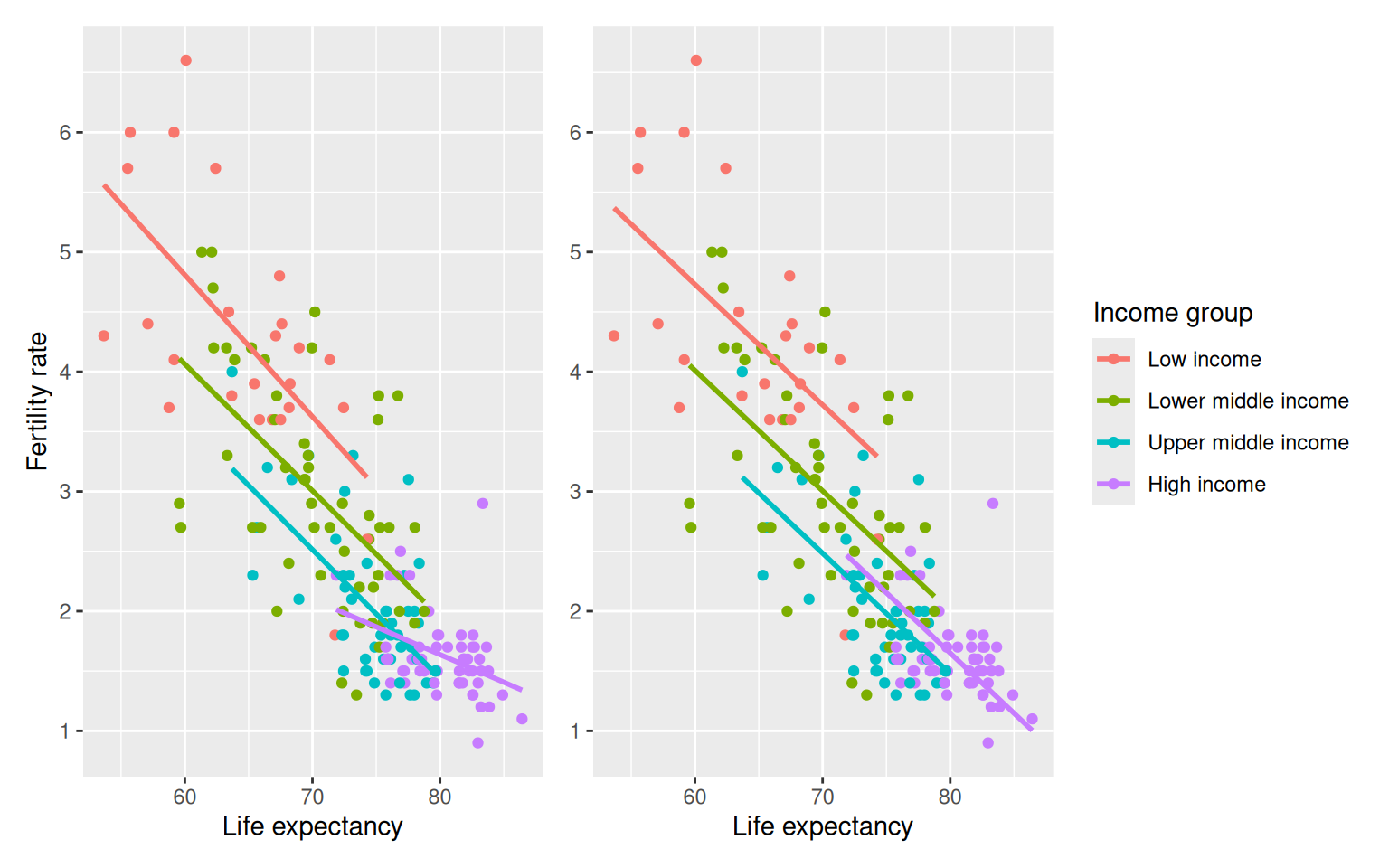
Which one is the preferred model? Looking at the scatterplot and the clusters of points in Figure 6.3, it does appear that lines with different slopes capture better the behavior of different groups of points. The lines do not appear to be parallel and the interaction model seems more appropriate.
Learning Check
(LC6.4) How should a model with one categorical regressor and one numerical regressor, but no interactions, be interpreted?
- A. The slope of the model for each category is different.
- B. The slope of the model for each category is the same.
- C. There is no relationship between the categorical regressor and the response.
- D. There is no relationship between the numerical regressor and the response.
B.
All categories share the same slope; only intercepts differ.
6.1.4 Observed responses, fitted values, and residuals
In this subsection, we work with the regression model with interactions. The coefficients for this model were found earlier, saved in model_int, and are displayed in Table 6.4:
| Coefficients | Values | |
|---|---|---|
| (Intercept) | b0 | 11.918 |
| incomeLower middle income | b02 | -1.504 |
| incomeUpper middle income | b03 | -1.893 |
| incomeHigh income | b04 | -6.580 |
| life_exp | b1 | -0.118 |
| incomeLower middle income:life_exp | b12 | 0.013 |
| incomeUpper middle income:life_exp | b13 | 0.011 |
| incomeHigh income:life_exp | b14 | 0.072 |
We can use these coefficients to find the fitted values and residuals for any given observation. As an illustration, we chose two observations from the UN member states dataset, provided the values for the explanatory variables and response, as well as the fitted values and residuals:
| ID | fert_rate | income | life_exp | fert_rate_hat | residual |
|---|---|---|---|---|---|
| 1 | 1.3 | High income | 79.7 | 1.65 | -0.35 |
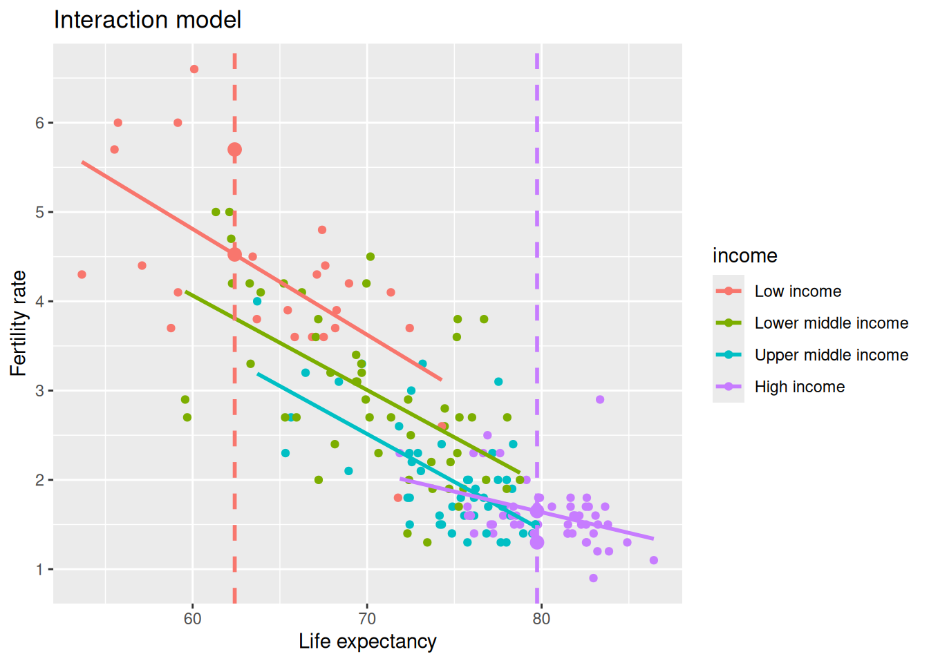
| 2 | 5.7 | Low income | 62.4 | 4.52 | 1.18 |
The first observation is a High income country with a life expectancy of 79.74 years and an observed fertility rate equal to 1.3. The second observation is a Low income country with a life expectancy of 62.41 years and an observed fertility rate equal to 5.7. The fitted value, \(\hat y\), called fert_rate_hat in the table, is the estimated value of the response determined by the regression line. This value is computed by using the values of the explanatory variables and the coefficients of the linear regression. In addition, recall the difference between the observed response value and the fitted value, \(y - \hat y\), is called the residual.
We illustrate this in Figure 6.4. The vertical line on the left represents the life expectancy value for the Low income country. The y-value for the large dot on the regression line that intersects the vertical line is the fitted value for fertility rate, \(\widehat y\), and the y-value for the large dot above the line is the observed fertility rate, \(y\). The difference between these values, \(y - \widehat y\), is called the residual and in this case is positive. Similarly, the vertical line on the right represents the life expectancy value for the High income country, the y-value for the large dot on the regression line is the fitted fertility rate. The observed y-value for fertility rate is below the regression line making the residual negative.
We can generalize the study of fitted values and residuals for all the countries in the UN_data_ch6 dataset, as shown in Table 6.5.
regression_points <- get_regression_points(model_int)
regression_points| ID | fert_rate | income | life_exp | fert_rate_hat | residual |
|---|---|---|---|---|---|
| 1 | 4.3 | Low income | 53.6 | 5.56 | -1.262 |
| 2 | 1.4 | Upper middle income | 79.5 | 1.50 | -0.098 |
| 3 | 2.7 | Lower middle income | 78.0 | 2.16 | 0.544 |
| 4 | 5.0 | Lower middle income | 62.1 | 3.84 | 1.159 |
| 5 | 1.6 | High income | 77.8 | 1.74 | -0.139 |
| 6 | 1.9 | Upper middle income | 78.3 | 1.62 | 0.278 |
| 7 | 1.6 | Upper middle income | 76.1 | 1.86 | -0.256 |
| 8 | 1.6 | High income | 83.1 | 1.50 | 0.105 |
| 9 | 1.5 | High income | 82.3 | 1.53 | -0.033 |
| 10 | 1.6 | Upper middle income | 74.2 | 2.07 | -0.469 |
Learning Check
(LC6.5) Compute the observed response values, fitted values, and residuals for the model without interactions.
Use the fitted no interaction model and generate regression points:
model_no_int <- lm(fert_rate ~ life_exp + income, data = UN_data_ch6)
pts_no_int <- get_regression_points(model_no_int)
# Columns include fert_rate (observed y), fert_rate_hat (fitted ŷ), and residual = y - ŷ
head(pts_no_int)
# A tibble: 6 × 6
ID fert_rate life_exp income fert_rate_hat residual
<int> <dbl> <dbl> <fct> <dbl> <dbl>
1 1 4.3 53.6 Low income 5.37 -1.07
2 2 1.4 79.5 Upper middle income 1.53 -0.131
3 3 2.7 78.0 Lower middle income 2.20 0.503
4 4 5 62.1 Lower middle income 3.80 1.20
5 5 1.6 77.8 High income 1.87 -0.272
6 6 1.9 78.3 Upper middle income 1.65 0.252Interpretation: for each row, compare fert_rate to fert_rate_hat; the residual is their difference.
(LC6.6) What is the main benefit of visualizing the fitted values and residuals of a multiple regression model?
- A. To find errors in the dataset.
- B. To check the assumptions of the regression model, such as linearity and homoscedasticity.
- C. To always improve the model’s accuracy.
- D. To increase the complexity of the model.
B.
To assess model assumptions like linearity and constant variance.
6.2 Two numerical explanatory variables
We now consider regression models with two numerical explanatory variables. To illustrate this situation we explore the ISLR2 R package for the first time in this book using its Credit dataset. This dataset contains simulated information for 400 customers. For the regression model we use the credit card balance (Balance) as the response variable; and the credit limit (Limit), and the income (Income) as the numerical explanatory variables.
6.2.1 Exploratory data analysis
We load the Credit data frame and to ensure the type of behavior we have become accustomed to in using the tidyverse, we also convert this data frame to be a tibble using as_tibble(). We construct a new data frame credit_ch6 with only the variables needed. We do this by using the select() verb as we did in Section 3.8.1 and, in addition, we save the selecting variables with different names: Balance becomes debt, Limit becomes credit_limit, and Income becomes income:
You can observe the effect of our use of select() by looking at the raw values either in RStudio’s spreadsheet viewer or by using glimpse().
glimpse(credit_ch6)Rows: 400
Columns: 5
$ debt <dbl> 333, 903, 580, 964, 331, 1151, 203, 872, 279, 1350, 1407…
$ credit_limit <dbl> 3606, 6645, 7075, 9504, 4897, 8047, 3388, 7114, 3300, 68…
$ income <dbl> 14.9, 106.0, 104.6, 148.9, 55.9, 80.2, 21.0, 71.4, 15.1,…
$ credit_rating <dbl> 283, 483, 514, 681, 357, 569, 259, 512, 266, 491, 589, 1…
$ age <dbl> 34, 82, 71, 36, 68, 77, 37, 87, 66, 41, 30, 64, 57, 49, …Furthermore, we present a random sample of five out of the 400 credit card holders in Table 6.6. As observed before, each time you run this code, a different subset of five rows is given.
credit_ch6 |> sample_n(size = 5)| debt | credit_limit | income | credit_rating | age |
|---|---|---|---|---|
| 0 | 1402 | 27.2 | 128 | 67 |
| 1081 | 6922 | 43.7 | 511 | 49 |
| 1237 | 7499 | 58.0 | 560 | 67 |
| 379 | 4742 | 57.1 | 372 | 79 |
| 1151 | 8047 | 80.2 | 569 | 77 |
Note that income is in thousands of dollars while debt and credit limit are in dollars. We can also compute summary statistics using the tidy_summary() function. We only select() the columns of interest for our model as shown in Table 6.7:
credit_ch6 |> select(debt, credit_limit, income) |> tidy_summary()| column | n | group | type | min | Q1 | mean | median | Q3 | max | sd |
|---|---|---|---|---|---|---|---|---|---|---|
| debt | 400 | numeric | 0.0 | 68.8 | 520.0 | 459.5 | 863.0 | 1999 | 459.8 | |
| credit_limit | 400 | numeric | 855.0 | 3088.0 | 4735.6 | 4622.5 | 5872.8 | 13913 | 2308.2 | |
| income | 400 | numeric | 10.4 | 21.0 | 45.2 | 33.1 | 57.5 | 187 | 35.2 |
The mean and median credit card debt are $520.0 and $459.5, respectively. The first quartile for debt is 68.8; this means that 25% of card holders had debts of $68.80 or less. Correspondingly, the mean and median credit card limit, credit_limit, are around $4,736 and $4,622, respectively. Note also that the third quartile of income is 57.5; so 75% of card holders had incomes below $57,500.
We visualize the relationship of the response variable with each of the two explanatory variables using this R code. These plots are shown in Figure 6.5.
ggplot(credit_ch6, aes(x = credit_limit, y = debt)) +
  geom_point() +
  labs(x = "Credit limit (in $)", y = "Credit card debt (in $)",
       title = "Debt and credit limit") +
  geom_smooth(method = "lm", se = FALSE)

ggplot(credit_ch6, aes(x = income, y = debt)) +
  geom_point() +
  labs(x = "Income (in $1000)", y = "Credit card debt (in $)",
       title = "Debt and income") +
  geom_smooth(method = "lm", se = FALSE)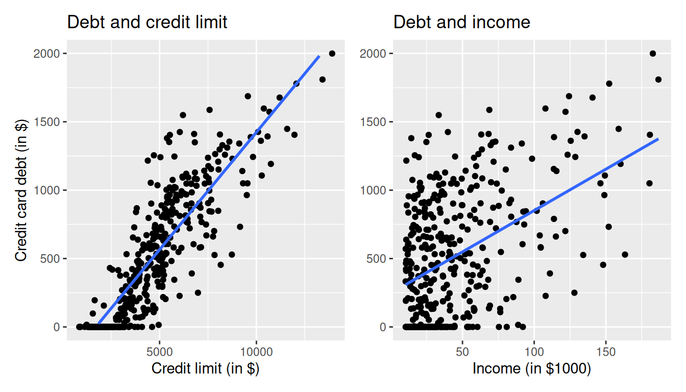
The left plot in Figure 6.5 shows a positive and linear association between credit limit and credit card debt: as credit limit increases so does credit card debt. Observe also that many customers have no credit card debt and there is a cluster of points at the credit card debt value of zero. The right plot in Figure 6.5 shows also positive and somewhat linear association between income and credit card debt, but this association seems weaker and actually appears positive only for incomes larger than $50,000. For lower income values it is not clear there is any association at all.
Since variables debt, credit_limit, and income are numerical, and more importantly, the associations between the response and explanatory variables appear to be linear or close to linear, we can also calculate the correlation coefficient between any two of these variables. Recall that the correlation coefficient is appropriate if the association between the variables is linear. One way to do this is using the get_correlation() command as seen in Section 5.1.1, once for each explanatory variable with the response debt:
credit_ch6 |> get_correlation(debt ~ credit_limit)
credit_ch6 |> get_correlation(debt ~ income)
Alternatively, using the select() verb and command cor() we can find all correlations simultaneously by returning a correlation matrix as shown in Table 6.8. This matrix shows the correlation coefficient for any pair of variables in the appropriate row/column combination.
| debt | credit_limit | income | |
|---|---|---|---|
| debt | 1.000 | 0.862 | 0.464 |
| credit_limit | 0.862 | 1.000 | 0.792 |
| income | 0.464 | 0.792 | 1.000 |
Let’s look at some findings presented in the correlation matrix:
- The diagonal values are all 1 because, based on the definition of the correlation coefficient, the correlation of a variable with itself is always 1.
- The correlation between
debtandcredit_limitis 0.862. This indicates a strong and positive linear relationship: the greater the credit limit is, the larger is the credit card debt, on average. - The correlation between
debtandincomeis 0.464. The linear relationship is positive albeit somewhat weak. In other words, higher income is only weakly associated with higher debt. - Observe also that the correlation coefficient between the two explanatory variables,
credit_limitandincome, is 0.792.
A useful property of the correlation coefficient is that it is invariant to linear transformations; this means that the correlation between two variables, \(x\) and \(y\), will be the same as the correlation between \((a\cdot x + b)\) and \(y\) for any constants \(a\) and \(b\). To illustrate this, observe that the correlation coefficient between income in thousands of dollars and credit card debt was 0.464. If we now find the correlation income in dollars, by multiplying income by 1000, and credit card debt we get:
credit_ch6 |> get_correlation(debt ~ 1000 * income)# A tibble: 1 × 1
cor
<dbl>
1 0.464The correlation is exactly the same.
We return to our exploratory data analysis of the multiple regression. The plots in Figure 6.5 correspond to the response and each of the explanatory variables separately. In Figure 6.6 we show a 3-dimensional (3D) scatterplot representing the joint relationship of all three variables simultaneously. Each of the 400 observations in the credit_ch6 data frame are marked with a blue point where
- The response variable \(y\),
debt, is on the vertical axis. - The regressors \(x_1\),
income, and \(x_2\),credit_limit, are on the two axes that form the bottom plane.
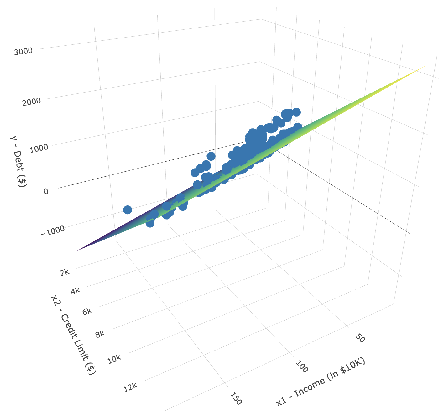
In addition, Figure 6.6 includes a regression plane. Recall from Section 5.3.2 that the linear regression with one numerical explanatory variable selects the “best-fitting” line: the line that minimizes the sum of squared residuals. When linear regression is performed with two numerical explanatory variables, the solution is a “best-fitting” plane: the plane that minimizes the sum of squared residuals. Visit this website to open an interactive version of this plot in your browser.
Learning Check
(LC6.7) Conduct a new exploratory data analysis with the same outcome variable \(y\) debt but with credit_rating and age as the new explanatory variables \(x_1\) and \(x_2\). What can you say about the relationship between a credit card holder’s debt and their credit rating and age?
Make scatterplots and summaries; compute correlations:
credit_ch6 |>
  select(debt, credit_rating, age) |>
  tidy_summary()
# A tibble: 3 × 11
column n group type min Q1 mean median Q3 max sd
<chr> <int> <chr> <chr> <dbl> <dbl> <dbl> <dbl> <dbl> <dbl> <dbl>
1 debt 400 <NA> numeric 0 68.8 520. 460. 863 1999 460.
2 credit_rating 400 <NA> numeric 93 247. 355. 344 437. 982 155.
3 age 400 <NA> numeric 23 41.8 55.7 56 70 98 17.2ggplot(credit_ch6, aes(credit_rating, debt)) +
geom_point() +
geom_smooth(method = "lm", se = FALSE) +
labs(x = "Credit rating", y = "Debt ($)")`geom_smooth()` using formula = 'y ~ x'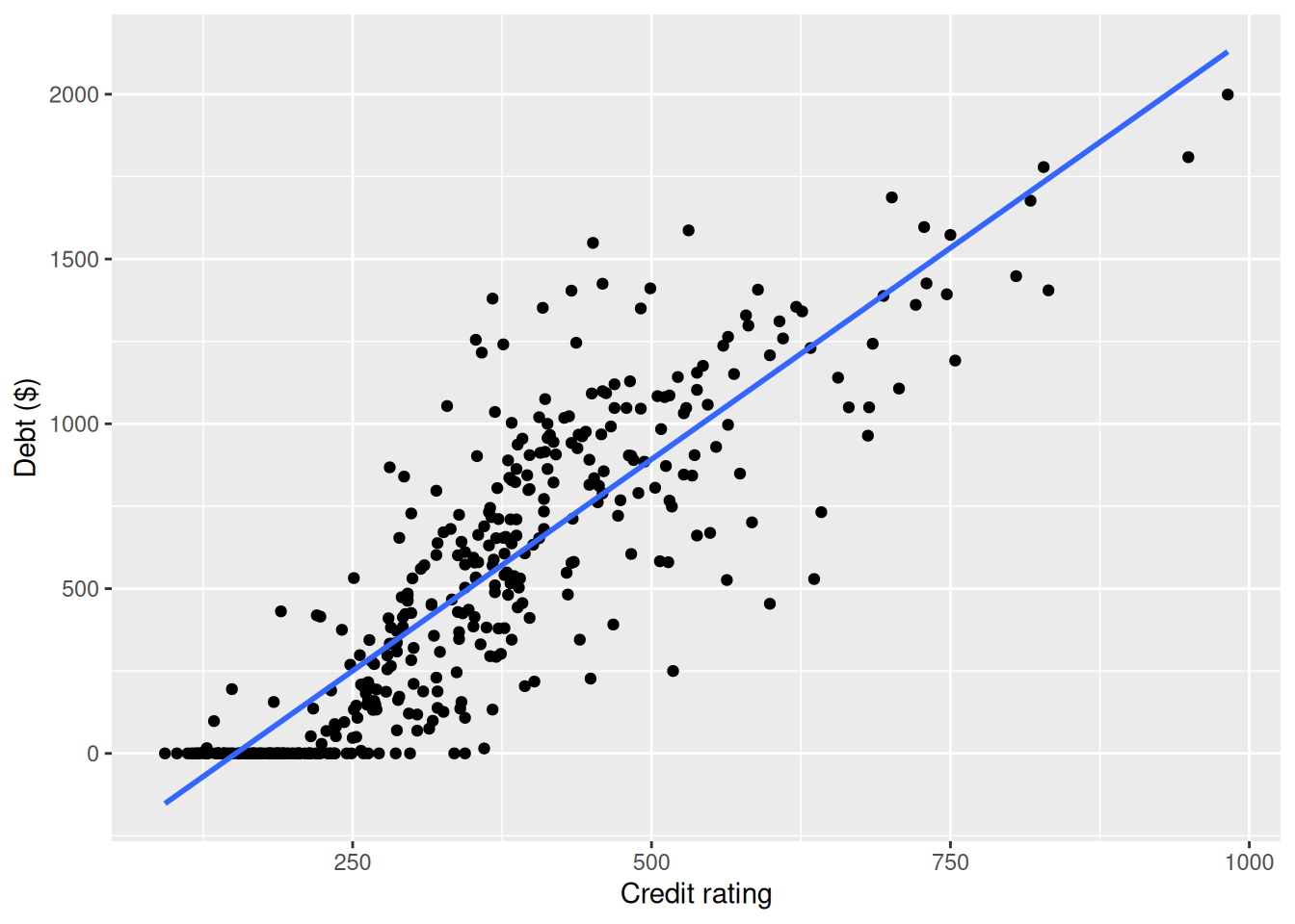
ggplot(credit_ch6, aes(age, debt)) +
  geom_point() +
  geom_smooth(method = "lm", se = FALSE) +
  labs(x = "Age", y = "Debt ($)")
`geom_smooth()` using formula = 'y ~ x'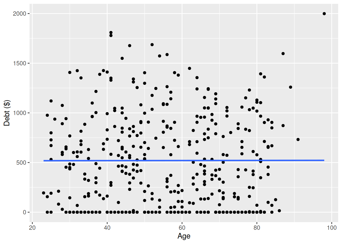
                 debt credit_rating     age
debt          1.00000         0.864 0.00184
credit_rating 0.86363         1.000 0.10316
age           0.00184         0.103 1.00000
Patterns to look for: higher credit ratings often associate with lower debt; age can show weak or nonlinear association. Your plots and correlations should guide the final statement.
6.2.2 Multiple regression with two numerical regressors
As shown in Figure 6.6, the linear regression with two numerical regressors produces the “best-fitting” plane. We start with a model with no interactions for the two numerical explanatory variables income and credit_limit. In R we consider a model fit with a formula of the form y ~ x1 + x2. We retrieve the regression coefficients using the lm() function and the command coef() to get the coefficients of the linear regression. The regression coefficients are shown in what follows.
We present these results in a table with the mathematical notation used above:
| Coefficients | Values | |
|---|---|---|
| (Intercept) | b0 | -385.179 |
| credit_limit | b1 | 0.264 |
| income | b2 | -7.663 |
- We determine the linear regression coefficients using
lm(y ~ x1 + x2, data)wherex1andx2are the two numerical explanatory variables used. - We extract the coefficients from the output using the
coef()command.
Let’s interpret the coefficients. The intercept value is -$385.179. If the range of values that the regressors could take include a credit_limit of $0 and an income of $0, the intercept would represent the average credit card debt for an individual with those levels of credit_limit and income. This is not the case in our data and the intercept has no practical interpretation; it is mainly used to determine where the plane should cut the \(y\)-intercept to produce the smallest sum of squared residuals.
Each slope in a multiple linear regression is considered a partial slope and represents the marginal or additional contribution of a regressor when it is added to a model that already contains other regressors. This partial slope is typically different than the slope we may find in a simple linear regression for the same regressor. The reason is that, typically, regressors are correlated, so when one regressor is part of a model, indirectly it’s also explaining part of the other regressor. When the second regressor is added to the model, it helps explain only changes in the response that were not already accounted for by the first regressor. For example, the slope for credit_limit is $0.264. Keeping income fixed to some value, for an additional increase of credit limit by one dollar the credit debt increases, on average, by $0.264. Similarly, the slope of income is -$7.663. Keeping credit_limit fixed to some level, for a one unit increase of income ($1000 in actual income), there is an associated decrease of $7.66 in credit card debt, on average.
Putting these results together, the equation of the regression plane that gives us fitted values \(\widehat{y}\) = \(\widehat{\text{debt}}\) is:
\[ \begin{aligned} \widehat{y} = \widehat{\text{debt}} &= b_0 + b_1 \cdot x_1 + b_2 \cdot x_2\\ &= -385.179 + 0.264 \cdot x_1 - 7.663 \cdot x_2 \end{aligned} \] where \(x_1\) represents credit limit and \(x_2\) income.
To illustrate the role of partial slopes further, observe that the right plot in Figure 6.5 shows the relationship between debt and income in isolation, a positive relationship, so the slope of income is positive. We can determine the value of this slope by constructing a simple linear regression using income as the only regressor:
| Coefficients | Values | |
|---|---|---|
| (Intercept) | b0' | 246.51 |
| income | b2' | 6.05 |
The regression line is given by the following with the coefficients denoted using the prime (\('\)) designation since they are different values than what we saw previously
\[
\begin{aligned}
\widehat{y} = \widehat{\text{debt}} &= b_0' + b_2' \cdot x_2 = 246.515 + 6.048 \cdot x_2
\end{aligned}
\] where \(x_2\) is income. By contrast, when credit_limit and income are considered jointly to explain changes in debt, the equation for the multiple linear regression was:
\[ \begin{aligned} \widehat{y} = \widehat{\text{debt}} &= b_0 + b_1 \cdot x_1 + b_2 \cdot x_2\\ &= -385.179 + 0.264 \cdot x_1 - 7.663 \cdot x_2 \end{aligned} \]
So the slope for income in a simple linear regression is 6.048, and the slope for income in a multiple linear regression is \(-7.663\). As surprising as these results may appear at first, they are perfectly valid and consistent as the slope of a simple linear regression has a different role than the partial slope of a multiple linear regression. The latter is the additional effect of income on debt when credit_limit has already been taken into account.
Learning Check
(LC6.8) Fit a new simple linear regression using lm(debt ~ credit_rating + age, data = credit_ch6) where credit_rating and age are the new numerical explanatory variables \(x_1\) and \(x_2\). Get information about the “best-fitting” regression plane from the regression table by finding the coefficient of the model. How do the regression results match up with the results from your previous exploratory data analysis?
Fit and read coefficients, then check signs and magnitudes against your plots.
m_ca <- lm(debt ~ credit_rating + age, data = credit_ch6)
get_regression_table(m_ca)
# A tibble: 3 × 7
term estimate std_error statistic p_value lower_ci upper_ci
<chr> <dbl> <dbl> <dbl> <dbl> <dbl> <dbl>
1 intercept -270. 44.8 -6.02 0 -358. -181.
2 credit_rating 2.59 0.074 34.8 0 2.45 2.74
3 age -2.35 0.668 -3.52 0 -3.66 -1.04Interpretation: the coefficient on credit_rating is the partial effect holding age fixed; same for age. If EDA showed debt decreasing as rating increases, expect a negative coefficient on credit_rating. If age showed a weak relationship, expect a small coefficient or consider adding nonlinear terms if residual plots suggest curvature.
(LC6.9) Which of the following statements best describes the interpretation of a regression coefficient in a multiple regression model?
- A. It is the additional effect of a regressor on the response when other regressors have already been taken into account.
- B. It is the average response variable value when all explanatory variables are zero.
- C. It is always positive if the correlation is strong.
- D. It cannot be interpreted if there are more than two explanatory variables.
A.
It is the additional effect of a regressor/predictor variable on the response after accounting for other regressors.
(LC6.10) What is a characteristic of the “best-fitting” plane in a multiple regression model with two numerical explanatory variables?
- A. It represents the line of best fit for each explanatory variable separately.
- B. It minimizes the product of residuals.
- C. It minimizes the sum of squared residuals for all combinations of regressors.
- D. It shows the exact predictions for every data point.
C.
It minimizes the sum of squared residuals over all observations.
(LC6.11) What does the intercept represent in a multiple regression model with two explanatory variables?
- A. The effect of one explanatory variable, keeping the other constant.
- B. The change in the response variable per unit change in the explanatory variable.
- C. The correlation between the two explanatory variables.
- D. The expected value of the response variable when all regressors are zero.
D.
The expected response when all regressors are zero.
(LC6.12) What does the term “partial slope” refer to in a multiple regression model?
- A. The additional effect of a regressor on the response variable, when all the other regressors have been taken into account.
- B. The total slope of all variables combined.
- C. The slope when all variables are zero.
- D. The average of all slopes in the model.
A.
The additional effect of a regressor on the response after the others are taken into account.
6.2.3 Observed/fitted values and residuals
As shown in Section 6.1.4 for the UN member states example, we find the fitted values and residuals for our credit card debt regression model. The fitted values for the credit card debt (\(\widehat{\text{debt}}\)) are computed using the equation for the regression plane:
\[
\begin{aligned}
\widehat{y} = \widehat{\text{debt}} &= -385.179 + 0.264 \cdot x_1 - 7.663 \cdot x_2
\end{aligned}
\] where \(x_1\) is credit_limit and \(x_2\) is income. The residuals are the difference between the observed credit card debt and the fitted credit card debt, \(y - \widehat y\), for each observation in the data set. In R, we find the fitted values, debt_hat, and residuals, residual, using the get_regression_points() function. In Table 6.9 we present the first 10 rows of output. Remember that the coordinates of each of the points in our 3D scatterplot in Figure 6.6 can be found in the income, credit_limit, and debt columns.
get_regression_points(debt_model)| ID | debt | credit_limit | income | debt_hat | residual |
|---|---|---|---|---|---|
| 1 | 333 | 3606 | 14.9 | 454 | -120.8 |
| 2 | 903 | 6645 | 106.0 | 559 | 344.3 |
| 3 | 580 | 7075 | 104.6 | 683 | -103.4 |
| 4 | 964 | 9504 | 148.9 | 986 | -21.7 |
| 5 | 331 | 4897 | 55.9 | 481 | -150.0 |
| 6 | 1151 | 8047 | 80.2 | 1127 | 23.6 |
| 7 | 203 | 3388 | 21.0 | 349 | -146.4 |
| 8 | 872 | 7114 | 71.4 | 948 | -76.0 |
| 9 | 279 | 3300 | 15.1 | 371 | -92.2 |
| 10 | 1350 | 6819 | 71.1 | 873 | 477.3 |
Quick checks
Ten questions to assess your understanding. Several are designed around common misconceptions — read each option carefully before peeking at the answer.
Q6-1. In a parallel slopes model with one numerical and one categorical predictor:
- Only one regression line is fit to all the data
- The numerical and categorical predictors are independent of each other
- Each category gets its own intercept with a common slope
- Each category gets its own slope and intercept
(c) Parallel slopes = same slope for all groups, different intercepts per category. Distinct from interaction models, where each group also gets its own slope.
Q6-2. In an interaction model lm(y ~ x * group), what does the interaction term capture?
- Whether the slope of
yonxdiffers bygroup - The intercept for the reference category of
group - The total variance of
yin the data - Whether
groupon its own predictsy
(a) Interaction terms allow the slope of x to vary across groups. If the interaction is large, the relationship between x and y depends on which group you’re in.
Q6-3. Why might a coefficient flip sign when you add a second predictor to a regression model?
- The model must be misspecified
- A coefficient can never flip sign when you add a predictor
- R has a bug in its
lm()implementation - The single-predictor model omitted a confounder
(d) The simple-regression slope captures the marginal relationship between \(x_1\) and \(y\), ignoring everything else. Adding a second predictor pulls out the partial effect: the slope of \(x_1\) holding \(x_2\) constant. When \(x_2\) is itself tied to both \(x_1\) and \(y\), the partial slope can land on a different side of zero from the marginal one. One caution worth carrying forward: a sign flip does not automatically mean the partial slope is the honest one. It is, when \(x_2\) is a genuine confounder — a common cause of \(x_1\) and \(y\). But the same flip appears when \(x_2\) sits on the causal path from \(x_1\) to \(y\) (a mediator, where controlling for it removes part of the very effect you wanted), or when \(x_2\) is a common consequence of \(x_1\) and \(y\) (a collider, where controlling for it manufactures an association that isn’t there). Which model to believe is a question about how the variables are related in the world, not one the data can settle on its own.
Q6-4. In the parallel-slopes model lm(fert_rate ~ life_exp + income, data = UN_data_ch6), the coefficient for life_exp represents the change in fert_rate per one-unit change in life_exp:
- Adding the
incomecoefficient - Holding
incomeconstant - Multiplied by the
incomecoefficient - Ignoring
incomeentirely
(b) This is the “taking into account” interpretation that makes multiple regression powerful. The life_exp slope here is the association between life expectancy and fertility rate among countries in the same income group. It typically differs from the simple-regression slope.
Q6-5. A categorical predictor income has three levels: low, medium, high. After fitting the model, the output shows TWO income coefficients (income_medium and income_high). Where’s low?
- The model is broken and silently dropped a level
- R silently errored when encoding the third level
-
lowis the reference level absorbed into the intercept - Drop the categorical predictor and refit the model without it
(c) Categorical predictors are encoded as a set of dummy variables, and the factor’s first level serves as the baseline: here the levels were set via factor(levels = c("low", "medium", "high")), so low comes first, just as the chapter’s income variable has its levels explicitly ordered. The reported coefficients are how much each level differs from the baseline, not absolute effects.
Q6-6. Adding a predictor to a regression model can never make the sum of squared residuals (the quantity least squares minimizes) increase on the same data. Why?
- R automatically applies built-in regularization to any new predictor
- Setting the new coefficient to zero reproduces the old fit
- R’s compiler optimizes the extra predictor away
- The residuals are computed from the same data
(b) Least squares finds the coefficients that minimize the sum of squared residuals. With a new predictor available, one valid option is to give it a coefficient near zero, basically ignoring it. So the new model can always match the old one’s fit, and in practice the new predictor’s coefficient gets nudged just enough to fit a sliver of noise too. Watch out: this means a model with more predictors automatically looks like a better fit on the same data, even when the extra predictors are noise.
Q6-7. In the chapter’s lm(debt ~ credit_limit + income, data = credit_ch6), the two explanatory variables are themselves strongly correlated. The slope for income is \(-7.663\) here, yet in the simple regression lm(debt ~ income, data = credit_ch6) it is \(+6.048\). What does that mean for interpreting the model?
- R returns an error for correlated predictors
- \(R^2\) automatically drops to 0 when predictors are correlated
- The two slopes should have come out equal once both variables are in the model
- One is the simple-regression slope and the other the partial slope
(d) When explanatory variables travel together in the data (here, higher-income cardholders also tend to have higher credit limits) the slope of a simple linear regression has a different role than the partial slope of a multiple regression. Ignoring credit_limit, income and debt are positively related (\(+6.048\)). But among cardholders with the same credit limit, higher income is associated with less debt (\(-7.663\)): the partial slope is the additional effect of income on debt once credit_limit has already been taken into account. Always be clear which of the two questions a slope is answering.
Q6-8. What’s the syntactic difference between lm(y ~ x1 + x2, data) and lm(y ~ x1 * x2, data)?
- The second syntax is deprecated
- The second multiplies the
x1andx2columns together - Only the second includes an interaction term
- The two formulas are identical
(c) * in a model formula is shorthand for “main effects + interaction”. To fit just the interaction term: x1:x2.
Q6-9. When SHOULD you prefer the parallel-slopes model over the interaction model?
- Never; the interaction model is always more accurate
- When the fitted lines look nearly identical
- Always; the simpler model is better
- Whenever you have a lot of data
(b) When two models visibly fit the data about equally well, prefer the simpler one; fewer moving parts means fewer chances to fit noise. If the interaction-term coefficients are small and overlaying the two models’ fitted lines on the scatterplot shows nearly identical curves, the interaction term is mostly fitting noise, and the parallel-slopes model captures the same relationship with less risk.
Q6-10. An interaction model lm(price ~ size * neighborhood) reports that NORTH-neighborhood houses have a slope 2× bigger than SOUTH. The correct interpretation:
- Price rises twice as fast with size in NORTH
- NORTH has twice as much data as SOUTH
- NORTH and SOUTH have equal size slopes
- NORTH houses are twice as large as SOUTH houses
(a) Interaction means the slope of size depends on the level of neighborhood. Same intuition: a one-square-foot increase predicts a larger price jump in NORTH than in SOUTH.
| Pattern | What it does | Quick example |
|---|---|---|
lm(y ~ x1 + x2, data = df) |
Multiple regression — parallel slopes when one predictor is categorical | lm(fert_rate ~ life_exp + income, data = UN_data_ch6) |
lm(y ~ x1 * x2, data = df) |
Multiple regression with interaction — slope of x1 differs by x2 group |
lm(fert_rate ~ life_exp * income, data = UN_data_ch6) |
coef(model) |
Regression coefficients (intercept + slopes) | coef(model) |
get_regression_points(model) |
Tidy table of fitted values + residuals | get_regression_points(model) |
geom_parallel_slopes() (moderndive) |
Overlay parallel-slopes lines on a scatterplot | ... + geom_parallel_slopes(se = FALSE) |
Exercises
The end-of-chapter exercises introduce a new dataset: planets from the exoplanetdata package — 6,278 confirmed exoplanets with merged host-star parameters. Key numerical variables: radius_earth, mass_earth, orbital_period_days, eq_temp_k, insolation_earth, star_mass_solar, star_temp_k, distance_pc. Categorical: discovery_method. Install with remotes::install_github("moderndive/exoplanetdata"). Solutions are available to instructors separately.
Difficulty stars: ★ warm-up, ★★ standard application, ★★★ critical thinking. Solutions are available to instructors separately.
Setup and EDA
EX6.1 (★) Run glimpse(planets), but this time scan the output with this chapter’s goal in mind: models with more than one explanatory variable. Locate star_temp_k, insolation_earth, and eq_temp_k in the listing: what does the type tag say each one is (numerical or categorical)? Name one categorical column that could serve as a second predictor alongside radius_earth.
EX6.2 (★) Compute the proportion of NA values for mass_earth, radius_earth, and eq_temp_k. Use summarize() with three explicit mean(is.na(...)) calculations, one per column. Why might mass be more often missing than radius?
EX6.3 (★★) You built planets_lite once already, in Ch 5’s exercises; so this time build it two different ways and confirm they agree: (i) the filter(!is.na(...)) route on the four columns radius_earth, mass_earth, discovery_method, eq_temp_k (as in EX 5.2), and (ii) a select()-the-columns-then-na.omit() route (the idiom §5.1.1 used for UN_data_ch5). Do both give the same number of rows? What differs between the two results, and when would that difference matter?
EX6.4 (★★) You read this scatter for its overall shape in Ch 5 (EX 5.4); this time read it for heterogeneity, the thing this chapter’s models exist to handle. Scatter mass_earth (y) vs radius_earth (x) on planets_lite. Where do most planets cluster, what do the extreme points along each axis tell you about the kinds of planets mixed together in the catalog, and why does that mixture motivate adding a second explanatory variable to the Ch 5 model rather than fitting one line to everything?
One numerical + one categorical: EDA
EX6.5 (★★) Rebuild pl2 (filter planets_lite to the two most common discovery_methods, as in Ch 5’s EX 5.14), then earn the rebuild: compute each method’s planet count and its radius_earth range (min and max) with group_by() + summarize(). The interaction model you’re about to fit will compare the two methods’ slopes. Do the two groups cover similar enough radius ranges that comparing their slopes is a fair fight, or does one method only ever see a slice of the radius axis?
EX6.6 (★★) Plot mass_earth (y) vs radius_earth (x) on pl2, colored by discovery_method, with one regression line per group (use geom_smooth(method = "lm", se = FALSE)). Then assess the fits honestly. How well does a straight line actually describe each group’s cloud? Point to specific regions of each group where the line clearly misses the points.
Model with interactions
EX6.7 (★★★) Fit the interaction model: lm(mass_earth ~ radius_earth * discovery_method, data = pl2).
EX6.8 (★★★) Interpret the interaction coefficient in 1–2 sentences.
EX6.9 (★★★) Plot the interaction model’s fitted lines over the data on pl2. Describe how the lines diverge, and then look past the slopes: is the steeper Radial-Velocity slope evidence of a stronger linear relationship in that group, or just a steeper average trend through a cloud that isn’t very linear in either group? Say what you see in each group’s points, not just its line.
EX6.10 (★★★) Build a chart that visualizes the interaction from EX6.7, colored points + diverging fitted lines. Add labels and a one-line headline.
Model without interactions (parallel slopes)
EX6.11 (★★) Fit the parallel-slopes model on pl2: m_par <- lm(mass_earth ~ radius_earth + discovery_method, data = pl2). Print its coefficients with coef(). How does their structure compare to the interaction model m_int from EX 6.7, what term that appeared in the interaction model’s coefficients is missing here, and what does that absence mean about how the two methods’ regression lines relate?
EX6.12 (★★★) When the parallel-slopes and interaction models produce nearly indistinguishable fitted lines on the EDA plot, what’s the right modeling choice? Why?
EX6.13 (★★) Plot the parallel-slopes fitted lines over the data on pl2. Describe what “parallel” means visually.
Observed/fitted values and residuals (interaction model)
EX6.14 (★★★) From m_int (EX 6.7), use get_regression_points() to pull fitted values. Plot the fitted values vs radius_earth, colored by discovery_method. You should see two non-parallel lines, explain in one sentence what that visual pattern tells you that the parallel-slopes model m_par would not show.
Two numerical predictors: EDA
EX6.15 (★★) Build planets_temp with eq_temp_k, star_temp_k, insolation_earth non-missing. Plot eq_temp_k (y) vs insolation_earth (x). What’s the rough shape of the relationship?
Multiple regression with two numerical regressors
EX6.16 (★★) Fit lm(eq_temp_k ~ insolation_earth + star_temp_k, data = planets_temp) and save it as m_two. Then state which variable is the response (outcome) variable and which are the explanatory (predictor) variables here, and whether each is numerical or categorical. Which of this chapter’s two model configurations is this?
EX6.17 (★★★) Interpret the insolation slope (from the m_two model you fit in EX 6.16) holding star temperature constant.
EX6.18 (★★★) Interpret the star temperature slope (again from EX 6.16’s m_two model) holding insolation constant.
EX6.19 (★★★) Why is the phrase “holding X constant” essential in multiple regression but not in simple regression?
EX6.20 (★★★) Using the coefficients from coef(m_two), manually compute a prediction of eq_temp_k for an Earth-like exoplanet (insolation_earth = 1, star_temp_k = 5800). Plug into intercept + b_insol * 1 + b_star * 5800. How close is your prediction to Earth’s actual ≈ 255 K?
Observed/fitted values and residuals (two-numerical model)
EX6.21 (★★★) From m_two (EX 6.16), use get_regression_points().
- What proportion of planets in
planets_temphave a negative residual (i.e., the model overpredicted)?
- What proportion of planets in
- Identify the planet with the largest positive residual, report its name (or row index) and its
eq_temp_k,insolation_earth, andstar_temp_kvalues. One sentence: what about that planet might explain why the model underpredicts its temperature?
- Identify the planet with the largest positive residual, report its name (or row index) and its
Comparing models / model selection
EX6.22 (★★★) A peer says “more predictors are always better.” Push back in 2–3 sentences using the chapter’s framework.
Critical thinking and synthesis
EX6.23 (★★★) Each discovery method can only see certain kinds of planets. Radial Velocity watches a star for the wobble a planet’s gravity induces: a detectable wobble takes a massive planet, so small planets rarely make the Radial Velocity catalog. Transit watches for the tiny dip in starlight as a planet crosses its star’s face. That catches small, close-in planets too. So the two methods hand the catalog two very different samples of planets. A colleague looks at your models and says: “Radial Velocity for massive planets and Transit for small ones, that’s why their populations differ.” How does this affect the interpretation of the discovery_method coefficient?
Need a hint?
The coefficient compares the two samples the methods happened to catch. Is that the same as comparing what the methods could detect in the same population of planets?
EX6.24 (★★★) The planets table only contains confirmed exoplanets, and we only detect the ones our instruments are sensitive to (big, close, bright-star-orbiting planets are far easier to spot than small distant ones). Name two ways this “we mostly see the easy-to-detect planets” effect could distort your mass_earth ~ radius_earth conclusions.
EX6.25 (★★★) Build planets_neighbors <- planets |> filter(distance_pc < 100) and re-fit the parallel-slopes model. Did anything change?
EX6.26 (★★★) Open exploration: build your own §6.1-style pair of models. The recipe is one numerical outcome, one numerical predictor, and one categorical predictor: the parallel-slopes and interaction models both need exactly that mix (two numerical predictors would be §6.2’s configuration, with no groups to compare). Reasonable menus from planets:
-
Numerical outcome:
eq_temp_k,mass_earth, ororbital_period_days -
Numerical predictor:
radius_earth,insolation_earth, orstar_temp_k -
Categorical predictor:
discovery_method(filtering to the two most common methods, as inpl2, keeps the coefficient list readable)
Steer clear of some tempting columns: planet_name and host_name are identifiers (one level per planet, so the model would fit one meaningless coefficient per planet); discovery_facility has dozens of levels (one offset per facility, an unreadable coefficient list); discovery_year prints like a category but is better used as a number; and star_spec_type is missing for most planets (lm() silently drops those rows).
Fit parallel-slopes and interaction versions, compare their coefficient estimates and fitted lines (do the slopes really differ by group, or are the lines essentially parallel?), and pick a model. Justify in 2–3 sentences.
EX6.27 (★★) The parallel-slopes model m_par and the interaction model m_int differ by one term, the radius_earth:discovery_method interaction. In one sentence each, describe a practical question that each model is better suited to answer, using exoplanets as your example.
EX6.28 (★★★) What’s the biggest limitation of regression for this dataset given how exoplanets are detected?
EX6.29 (★★★) Ch 5’s EX 5.24 asked what would convince you the mass-radius relationship isn’t a single straight line. This chapter poses the harder model-choice question: what single chart would convince you the two discovery methods need different slopes (the interaction model) rather than a shared slope (the parallel-slopes model)? Describe the chart and what feature of it settles the choice.
EX6.30 (★★★) Pick any two numerical columns in planets (other than the mass/radius pair). Build a multiple-regression model with one as the outcome, one as a predictor, and discovery_method as a second predictor (start with parallel-slopes; optionally compare to interaction). Read the coefficients of both models with coef() and compare them. In 2–3 sentences, report:
- the sign and rough magnitude of the numerical-predictor slope
- whether adding the interaction noticeably changes the per-method slopes
- a one-sentence interpretation of what you found in plain English
(Comparing models by overall fit such as R² is part of inference for regression in Chapter 10.)
EX6.31 (★★★) Open exploration #2, pick any pair of numerical variables, build a multiple regression with a third numerical predictor, write a 2-sentence finding.
Model without interactions (parallel slopes)
EX6.32 (★★★) Fit the parallel-slopes model on pl2 and compare it to the interaction model m_int (EX 6.7) the way the chapter does: overlay both fits on the data (geom_smooth(method = "lm", se = FALSE) for the per-method interaction lines, geom_parallel_slopes(se = FALSE) for the shared-slope lines) and compare their coefficients with coef(). Do the two models tell noticeably different stories about how mass relates to radius for the two methods?
Multiple regression with two numerical regressors
EX6.33 (★★★) Compare three models for eq_temp_k on planets_temp:
-
intercept only,
lm(eq_temp_k ~ 1, ...), which predicts the overall mean temperature for every planet
-
intercept only,
~ insolation_earth
~ insolation_earth + star_temp_k
Read each model’s coefficients with coef(), then use get_regression_points() to compute each model’s typical miss, mean(abs(residual)). Which step buys the bigger improvement: adding insolation_earth, or then adding star_temp_k?
Critical thinking and synthesis
EX6.34 (★★★) Pick a discovery_method with fewer than 50 planets in planets_lite. You now have two ways to estimate that method’s mass-radius slope: (i) subset-and-fit, filter to just that method and fit its own lm(mass_earth ~ radius_earth) (the Ch 5 move, as in EX 5.10); or (ii) fit an interaction model lm(mass_earth ~ radius_earth * discovery_method) on a larger set that includes that method, and read the method’s slope from the coefficients. Compute both. Where do the two estimates differ, and what does the multi-predictor model buy you over subsetting when a group is small?
Extensions
The exercises below deliberately introduce functions and concepts beyond what this chapter teaches — log transformations, predict(), new packages, foreshadowing later chapters. They are optional, aimed at readers who want to push further. The main Exercises and Quick checks above stick strictly to what this chapter covers.
EX6.35 (◆◆◆) Predicting from coefficients, with a first taste of stringr. For m_par (the parallel-slopes model from EX 6.11), the discovery_method coefficient(s) tell you the vertical offset between methods at any given radius_earth. Pick one specific radius_earth value (e.g., 5 Earth radii) and compute the model’s predicted mass_earth for each discovery_method using the coefficients from coef(m_par). Which method’s planets weigh more, on average, at that radius? New-to-us here: stringr, the tidyverse’s string toolkit, helps you pick the method coefficients out of coef(m_par) by name: str_detect(...) tests whether each string contains a pattern, and str_remove(...) deletes a matched pattern from a string.
EX6.36 (◆◆◆) Log transforms on skewed data (foreshadows Ch 11). EX 6.4 noted that planets_lite has a long tail of gas giants stretching the axes. A common fix is the log transformation, log10() on both response and predictor. Run the side-by-side scatter, then refit the mass-vs-radius model with log10() on both sides. How does R² change (R² was introduced in extension EX 5.47), and what structure does the log-log scatter reveal that the raw scatter hides? You’ll see log10() again as a methodology choice in Ch 11’s Seattle house prices case study.
EX6.37 (◆◆) The two-predictor extrapolation trap (predict() with newdata). Ch 5’s extensions introduced predict() and its interval = "confidence" bands (EX 5.38-5.39); with two predictors those bands hide a new trap. Build a newdata frame with three hypothetical planets: (1) both predictors typical (insolation_earth = 1, star_temp_k = 5800), (2) one predictor extreme (insolation_earth = 5000, star_temp_k = 5800), and (3) each predictor individually plausible but the combination unlike any observed planet (insolation_earth = 5000, star_temp_k = 3000, a huge flux from a cool dim star). Run predict(m_two, newdata = ..., interval = "confidence") and compare the three CI widths. Why can a two-predictor model extrapolate even when neither predictor is individually out of range?
EX6.38 (◆◆◆) Adjusted R² and the cost of extra predictors. Extension EX 5.47 introduced R² as a one-number summary of model fit. Here’s its blind spot: R² never decreases when you add a predictor, even pure random noise nudges it up by chance. Adjusted R² penalizes a model for using more predictors. Pull it from summary(m_two)$adj.r.squared. Then add a column of noise, planets_temp |> mutate(noise = rnorm(n())), and refit a model including it. Did plain R² rise? Did adjusted R² rise or fall?
EX6.39 (◆◆◆) An F-test for the whole model (foreshadows Ch 10). Chapter 10 will give you a p-value for each individual regression coefficient. There’s also one p-value attached to the whole multi-predictor model, the F-test, testing \(H_0:\) “all slopes are zero” against \(H_A:\) “at least one slope is non-zero.” Pull the F-stat from summary(m_two)$fstatistic and compute its p-value. In plain English, what does this single p-value tell you about the model as a whole?
EX6.40 (◆◆◆) 3D scatter + regression plane with plot_3d_regression() (moderndive). When you have two numerical predictors, the model isn’t a line, it’s a plane in 3D. moderndive::plot_3d_regression() builds an interactive 3D scatter with the fitted plane overlaid. Try it on m_two’s formula. Why is this visualization more informative than the side-by-side 2D scatters of each predictor against the response separately?
EX6.41 (◆◆◆) Three or more predictors. Multiple regression generalizes to any number of predictors, just keep adding terms with +. Fit lm(mass_earth ~ radius_earth + insolation_earth + eq_temp_k). Interpret each slope using the chapter’s “holding the others constant” phrasing. How does the radius_earth slope here compare to the simple-LR slope from EX 5.7 (lm(mass_earth ~ radius_earth))?
EX6.42 (◆◆◆) Polynomial terms in multiple regression. lm(y ~ poly(x1, 2) + x2) fits a curve in x1 while keeping a straight line in x2. Try a degree-2 polynomial on insolation_earth in the m_two model. Does R² improve? (The current moderndive package surfaces the original insolation_earth column in get_regression_points() output, not the raw basis matrix.)
EX6.43 (◆◆◆) Multicollinearity and the variance inflation factor (VIF). When two predictors are highly correlated with each other, regression can’t tell which one is “doing the work”, coefficient estimates get unstable. The VIF for predictor \(j\) is \(1 / (1 - R^2_j)\), where \(R^2_j\) is from a regression of predictor \(j\) on the other predictors. Values \(> 5\) (some say \(> 10\)) signal trouble. Run the snippet’s vif_manual(m_two) (should be near 1) vs the corrupted m_corr (deliberately collinear: the copy is an exact linear transform of the original, so \(R^2_j = 1\) and the VIF blows up to infinity). What practical fix would you apply when one predictor has a high VIF? (In production code, car::vif() does the same calculation automatically.)
EX6.44 (◆◆◆) step() for automated model selection: with a warning. step() repeatedly adds/removes predictors to optimize an information criterion (AIC by default), automating model selection. Run the snippet. Why this is dangerous in practice. The resulting model’s p-values and CIs are not valid (the same data picked the model and tested it), and the algorithm has no domain knowledge. When would you use step(), and what should accompany it?
EX6.45 (◆◆◆) In-formula scaling for comparable coefficients. With lm(y ~ x1 + x2), the two slopes are in their own original units. You can’t say which predictor “matters more” just by comparing slope magnitudes (1 unit of insolation_earth is not the same size as 1 unit of star_temp_k). Wrapping each predictor in scale(...) standardizes it to mean 0, SD 1, making the slopes directly comparable. Run both. After scaling, which predictor has a larger effect-per-standard-deviation on equilibrium temperature?
EX6.46 (◆◆◆) Why log-transform some variables but not others. When a numerical variable spans several orders of magnitude, mass_earth runs from ≈0.02 to >10,000 Earth masses, radius_earth from ≈0.3 to >25, most points pile into the bottom-left of a raw scatterplot and the bulk of the relationship is unreadable. A \(\log_{10}\) scale on each axis compresses the long tail and lets you see scatter across the whole range. Variables that already live in a bounded range (eq_temp_k is essentially 100–3000 K) don’t benefit, their distribution is already legible. Plot mass vs radius on raw and log–log scales, then a histogram of eq_temp_k on its raw scale. Which transformation would you adopt for each, and why?
EX6.47 (◆◆◆) Log–log regression recovers the exponent of a power law. A lot of physics, biology, and economics involves power-law relationships of the form \(Y = k \cdot X^p\) (metabolic rate vs body mass, planet mass vs radius, city size vs rank). Taking \(\log_{10}\) of both sides gives \(\log_{10}(Y) = \log_{10}(k) + p \cdot \log_{10}(X)\), a straight line in log–log space whose slope is the exponent \(p\). Build planets_mr <- planets |> filter(!is.na(mass_earth), !is.na(radius_earth)) (a mass–radius complete-case subset that’s looser than planets_lite, since a power-law fit needs only those two columns), then fit lm(log10(mass_earth) ~ log10(radius_earth), data = planets_mr) and read off the slope. What value of \(p\) does it suggest, and what does that imply about how mass scales with radius for typical exoplanets?
EX6.48 (◆◆◆) Physics-informed model: choosing predictors with theory, not just correlation. The strongest regressions are often the ones where the predictors are picked because theory says they should matter, not because they correlated well in the data. For exoplanet equilibrium temperature, two physical drivers dominate: how much stellar flux the planet receives (insolation_earth, spanning orders of magnitude so its log is the natural scale) and how hot the host star is (star_temp_k). Fit lm(eq_temp_k ~ log10(insolation_earth) + star_temp_k) on planets with all three measured. What does each slope capture in plain physical terms, and why is this set of predictors more defensible than throwing every numeric column at the model?
EX6.49 (◆◆◆) What R² value (introduced in extension EX 5.47) would you consider “high” for an exoplanet relationship? Why is “high” context-dependent?
EX6.50 (◆◆◆) Reading R² correctly (R² was introduced in extension EX 5.47). A peer runs get_regression_summaries(m_two) on the § 6.2 two-numerical-predictor model, reads off the R², and concludes: “So this model predicts any planet’s temperature with that proportion of accuracy.” Why is that interpretation wrong? In one sentence each: (a) what does R² actually measure, and (b) what tool from this chapter would you reach for if you wanted to check the prediction error for individual planets?
EX6.51 (◆◆◆) Partial vs marginal slopes: two numerical predictors. Section 6.2 emphasizes that a partial slope (a coefficient in a multi-predictor model) answers a different question than the marginal slope from a one-predictor model. Fit three regressions of eq_temp_k:
- on
insolation_earth + star_temp_k
- on
- on
insolation_earthalone
- on
- on
star_temp_kalone
- on
For each numerical predictor, compare the marginal slope (from the solo model) to the partial slope (from the two-predictor model). Which slope moves more when you condition on the other predictor, and what does that movement tell you about how insolation_earth and star_temp_k relate?
EX6.52 (◆◆◆) Residuals-vs-fitted diagnostic (foreshadows Chapter 10’s LINE conditions). Section 6.2.3 introduces fitted values and residuals for the two-numerical-predictor model. Chapter 10 will formalize when a linear model’s inferences can be trusted via its LINE conditions; the standard quick check it builds on is the residuals-vs-fitted scatterplot, residual on the y-axis against the fitted value on the x-axis. Build the plot for m_two. Describe the cloud’s shape, does it look like a random band around the dashed zero line, or do you see a pattern (curvature, fan-shape widening, clusters)? Name one thing the pattern (if any) would tell you about how well a two-numerical linear model fits these planets.
EX6.53 (◆◆◆) Residuals-vs-fitted, take two: remove the extremes first. EX 6.52’s plot is dominated by the catalog’s most extreme worlds: a handful of ultra-irradiated planets stretch the axes so far that the bulk of the cloud is hard to read. Remove them first: build planets_trim <- planets_temp |> filter(insolation_earth < 2000) (dropping the roughly 4% of planets that receive more than 2,000 times Earth’s stellar flux), refit lm(eq_temp_k ~ insolation_earth + star_temp_k) on the trimmed data, and rebuild the residuals-vs-fitted plot. Compare it to EX 6.52’s plot: what changed about the cloud, what pattern remains, and what does the new plot tell you that the first one obscured?
6.3 Conclusion
6.3.1 Additional resources
An R script file of all R code used in this chapter is available here.
6.3.2 What’s to come?
This chapter concludes the “Statistical/Data Modeling with moderndive” portion of this book. We are ready to proceed to Part III: “Statistical Inference with infer.” Statistical inference is the science of inferring about some unknown quantity using sampling. So far, we have only studied the regression coefficients and their interpretation. In later chapters we learn how we can use information from a sample to make inferences about the entire population.
Once we have covered Chapter 7 on sampling, Chapter 8 on confidence intervals, and Chapter 9 on hypothesis testing, we revisit the regression models in Chapter 10 on inference for regression. This will complete the topics in this book, as shown in Figure 6.7!
Also in Chapter 10, we revisit the concept of residuals \(y - \widehat{y}\) and discuss their importance when interpreting the results of a regression model. We perform what is known as a residual analysis of the residual variable of all get_regression_points() outputs. Residual analyses enable us to verify what are known as the conditions for inference for regression.