
5 Simple Linear Regression
- Conduct an exploratory data analysis (EDA) of a relationship between two numerical variables
- Fit a simple linear regression model with
lm()and read its coefficients - Interpret the slope and intercept of a fitted regression line in plain language
- Compute fitted values and residuals using
get_regression_points()frommoderndive
We have introduced data visualization in Chapter 2, data wrangling in Chapter 3, and data importing and “tidy” data in Chapter 4. In this chapter, we work with regression, a method that helps us study the relationship between an outcome variable or response and one or more explanatory variables or regressors. The method starts by proposing a statistical model. Data is then collected and used to estimate the coefficients or parameters for the model, and these results are typically used for two purposes:
- For explanation when we want to describe how changes in one or more of the regressors are associated with changes in the response, quantify those changes, establish which of the regressors truly have an association with the response, or determine whether the model used to describe the relationship between the response and the explanatory variables seems appropriate.
- For prediction when we want to determine, based on the observed values of the regressors, what will the value of the response be? We are not concerned about how all the regressors relate and interact with one another or with the response, we simply want as good predictions as possible.
As an illustration, assume that we want to study the relationship between blood pressure and potential risk factors such as daily salt intake, age, and physical activity levels. The response is blood pressure, and the regressors are the risk factors. If we use linear regression for explanation, we may want to determine whether reducing daily salt intake has a real effect on lowering blood pressure, or by how much blood pressure decreases if an individual reduces their salt intake by half. This information may help target individuals of a specific age group with advice on dietary changes to manage blood pressure. On the other hand, if we use linear regression for prediction, we would like to determine, as accurately as possible, the blood pressure of a given individual based on the data collected about their salt intake, age, and physical activity levels. In this chapter, we will use linear regression for explanation.
The most basic and commonly-used type of regression is linear regression. Linear regression involves a numerical response and one or more regressors that can be numerical or categorical. It is called linear regression because the statistical model that describes the relationship between the expected response and the regressors is assumed to be linear. In particular, when the model has a single regressor, the linear regression is the equation of a line. Linear regression is the foundation for almost any other type of regression or related method.
In Chapter 5, we introduce linear regression with only one regressor. In Section 5.1, the explanatory variable is numerical. This scenario is known as simple linear regression. In Section 5.2, the explanatory variable is categorical.
In Chapter 6 on multiple regression, we extend these ideas and work with models with two explanatory variables. In Section 6.1, we work with one numerical and one categorical explanatory variable and study the model with and without interactions. In Section 6.2, we work with two numerical explanatory variables.
In Chapter 10 on inference for regression, we revisit the regression models and analyze the results using statistical inference, a method discussed in Chapter 7, Chapter 8, and Chapter 9 on sampling, bootstrapping and confidence intervals, and hypothesis testing and \(p\)-values, respectively. The focus there will also be on using linear regression for prediction instead of explanation.
We begin with regression with a single explanatory variable. We also introduce the correlation coefficient, discuss “correlation versus causation,” and determine whether the model fits the data observed.
Needed packages
We now load all the packages needed for this chapter (this assumes you’ve already installed them). In this chapter, we introduce some new packages:
- The
tidyverse“umbrella” (Wickham 2023) package. Recall from our discussion in Section 4.4 that loading thetidyversepackage by runninglibrary(tidyverse)loads the following commonly used data science packages all at once:-
ggplot2for data visualization -
dplyrfor data wrangling -
tidyrfor converting data to “tidy” format -
readrfor importing spreadsheet data into R - As well as the more advanced
purrr,tibble,stringr, andforcatspackages
-
- The
moderndivepackage of datasets and functions for tidyverse-friendly introductory linear regression as well as a data frame summary function.
If needed, read Section 1.3 for information on how to install and load R packages.
5.1 One numerical explanatory variable
Before we introduce the model needed for simple linear regression, we present an example. Why do some countries exhibit high fertility rates while others have significantly lower ones? Are there correlations between fertility rates and life expectancy across different continents and nations? Could underlying socioeconomic factors be influencing these trends?
These are all questions that are of interest to demographers and policy makers, as understanding fertility rates is important for planning and development. By analyzing the dataset of UN member states, which includes variables such as country codes (ISO), fertility rates, and life expectancy for 2022, researchers can uncover patterns and make predictions about fertility rates based on life expectancy.
In this section, we aim to explain differences in fertility rates as a function of one numerical variable: life expectancy. Could it be that countries with higher life expectancy also have lower fertility rates? Could it be instead that countries with higher life expectancy tend to have higher fertility rates? Or could it be that there is no relationship between life expectancy and fertility rates? We answer these questions by modeling the relationship between fertility rates and life expectancy using simple linear regression where we have:
- A numerical outcome variable \(y\) (the country’s fertility rate) and
- A single numerical explanatory variable \(x\) (the country’s life expectancy).
5.1.1 Exploratory data analysis
The data on the 193 current UN member states (as of 2024) can be found in the un_member_states_2024 data frame included in the moderndive package. However, to keep things simple we include only those rows that don’t have missing data with na.omit() and select() only the subset of the variables we’ll consider in this chapter, and save this data in a new data frame called UN_data_ch5:
A crucial step before doing any kind of analysis or modeling is performing an exploratory data analysis, or EDA for short. EDA gives you a sense of the distributions of the individual variables in your data, whether any potential relationships exist between variables, whether there are outliers and/or missing values, and (most importantly) how to build your model. Here are three common steps in an EDA:
- Most crucially, looking at the raw data values.
- Computing summary statistics, such as means, medians, and maximums.
- Creating data visualizations.
We perform the first common step in an exploratory data analysis: looking at the raw data values. Because this step seems so trivial, unfortunately many data analysts ignore it. However, getting an early sense of what your raw data looks like can often prevent many larger issues down the road.
You can do this by using RStudio’s spreadsheet viewer or by using the glimpse() function as introduced in Section 1.4.3 on exploring data frames:
glimpse(UN_data_ch5)Rows: 181
Columns: 4
$ iso <chr> "AFG", "ALB", "DZA", "AGO", "ATG", "ARG", "ARM", "AUS", "AUT…
$ life_exp <dbl> 53.6, 79.5, 78.0, 62.1, 77.8, 78.3, 76.1, 83.1, 82.3, 74.2, …
$ fert_rate <dbl> 4.3, 1.4, 2.7, 5.0, 1.6, 1.9, 1.6, 1.6, 1.5, 1.6, 1.4, 1.8, …
$ obes_rate <dbl> 5.5, 21.7, 27.4, 8.2, 18.9, 28.3, 20.2, 29.0, 20.1, 19.9, 31…Observe that Rows: 181 indicates that there are 181 rows/observations in UN_data_ch5 after filtering out the missing values, where each row corresponds to one observed country/member state. It is important to note that the observational unit is an individual country. Recall from Section 1.4.3 that the observational unit is the “type of thing” that is being measured by our variables.
A full description of all the variables included in un_member_states_2024 can be found by reading the associated help file (run ?un_member_states_2024 in the console). Let’s describe only the 4 variables we selected in UN_data_ch5:
-
iso: An identification variable used to distinguish between the 181 countries in the filtered dataset. -
fert_rate: A numerical variable representing the country’s fertility rate in 2022 corresponding to the expected number of children born per woman in child-bearing years. This is the outcome variable \(y\) of interest. -
life_exp: A numerical variable representing the country’s average life expectancy in 2022 in years. This is the primary explanatory variable \(x\) of interest. -
obes_rate: A numerical variable representing the country’s obesity rate in 2016. This will be another explanatory variable \(x\) that we use in the Learning check at the end of this subsection.
An alternative way to look at the raw data values is by choosing a random sample of the rows in UN_data_ch5 by piping it into the slice_sample() function from the dplyr package. Here we set the n argument to be 5, indicating that we want a random sample of 5 rows. We display the results in Table 5.1. Note that due to the random nature of the sampling, you will likely end up with a different subset of 5 rows.
UN_data_ch5 |>
slice_sample(n = 5)| iso | life_exp | fert_rate | obes_rate |
|---|---|---|---|
| PRT | 81.5 | 1.4 | 20.8 |
| MNE | 77.8 | 1.7 | 23.3 |
| CPV | 73.8 | 1.9 | 11.8 |
| VNM | 75.5 | 1.9 | 2.1 |
| IDN | 73.1 | 2.1 | 6.9 |
We have looked at the raw values in our UN_data_ch5 data frame and got a preliminary sense of the data. We can now compute summary statistics. We start by computing the mean and median of our numerical outcome variable fert_rate and our numerical explanatory variable life_exp. We do this by using the summarize() function from dplyr along with the mean() and median() summary functions we saw in Section 3.3.
| mean_life_exp | mean_fert_rate | median_life_exp | median_fert_rate |
|---|---|---|---|
| 73.6 | 2.5 | 75.1 | 2 |
However, what if we want other summary statistics as well, such as the standard deviation (a measure of spread), the minimum and maximum values, and various percentiles?
Typing all these summary statistic functions in summarize() would be long and tedious. Instead, we use the convenient tidy_summary() function in the moderndive package. This function takes in a data frame, summarizes it, and returns commonly used summary statistics in tidy format. We take our UN_data_ch5 data frame, select() only the outcome and explanatory variables fert_rate and life_exp, and pipe them into the tidy_summary function:
UN_data_ch5 |>
  select(fert_rate, life_exp) |>
tidy_summary()| column | n | group | type | min | Q1 | mean | median | Q3 | max | sd |
|---|---|---|---|---|---|---|---|---|---|---|
| fert_rate | 181 | numeric | 1.1 | 1.6 | 2.5 | 2.0 | 3.2 | 6.6 | 1.15 | |
| life_exp | 181 | numeric | 53.6 | 69.4 | 73.6 | 75.1 | 78.3 | 86.4 | 6.80 |
We can also do this more directly by providing which columns we’d like a summary of inside the tidy_summary() function:
UN_data_ch5 |>
tidy_summary(columns = c(fert_rate, life_exp))| column | n | group | type | min | Q1 | mean | median | Q3 | max | sd |
|---|---|---|---|---|---|---|---|---|---|---|
| fert_rate | 181 | numeric | 1.1 | 1.6 | 2.5 | 2.0 | 3.2 | 6.6 | 1.15 | |
| life_exp | 181 | numeric | 53.6 | 69.4 | 73.6 | 75.1 | 78.3 | 86.4 | 6.80 |
Both return the same results for the numerical variables fert_rate and life_exp:
-
column: the name of the column being summarized -
n: the number of non-missing values -
group:NA(missing) for numerical columns, but will break down a categorical variable into its levels -
type: which type of column is it (numeric,character,factor, orlogical) -
min: the minimum value -
Q1: the 1st quartile: the value at which 25% of observations are smaller than it (the 25th percentile) -
mean: the average value for measuring central tendency -
median: the 2nd quartile: the value at which 50% of observations are smaller than it (the 50th percentile) -
Q3: the 3rd quartile: the value at which 75% of observations are smaller than it (the 75th percentile) -
max: the maximum value -
sd: the standard deviation value for measuring spread
Looking at this output, we can see how the values of both variables distribute. For example, the median fertility rate was 2, whereas the median life expectancy was 75.14 years. The middle 50% of fertility rates was between 1.6 and 3.2 (the first and third quartiles), and the middle 50% of life expectancies was from 69.36 to 78.31.
The tidy_summary() function only returns what are known as univariate summary statistics: functions that take a single variable and return some numerical summary of that variable. However, there also exist bivariate summary statistics: functions that take in two variables and return some summary of those two variables.
In particular, when the two variables are numerical, we can compute the correlation coefficient. Generally speaking, coefficients are quantitative expressions of a specific phenomenon. A correlation coefficient measures the strength of the linear relationship between two numerical variables. Its value goes from -1 to 1 where:
- -1 indicates a perfect negative relationship: As one variable increases, the value of the other variable tends to go down, following a straight line.
- 0 indicates no relationship: The values of both variables go up/down independently of each other.
- +1 indicates a perfect positive relationship: As the value of one variable goes up, the value of the other variable tends to go up as well in a linear fashion.
Figure 5.1 gives examples of nine different correlation coefficient values for hypothetical numerical variables \(x\) and \(y\).
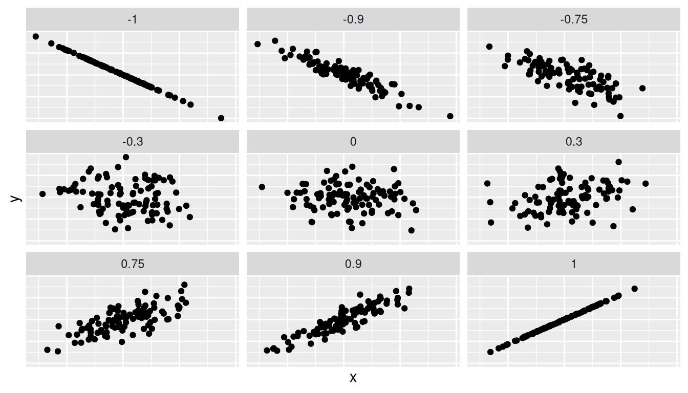
For example, observe in the top right plot that for a correlation coefficient of -0.75 there is a negative linear relationship between \(x\) and \(y\), but it is not as strong as the negative linear relationship between \(x\) and \(y\) when the correlation coefficient is -0.9 or -1.
The correlation coefficient can be computed using the get_correlation() function in the moderndive package. In this case, the inputs to the function are the two numerical variables for which we want to calculate the correlation coefficient.
We put the name of the outcome variable on the left-hand side of the ~ “tilde” sign, while putting the name of the explanatory variable on the right-hand side. This is known as R’s formula notation. We will use this same “formula” syntax with regression later in this chapter.
UN_data_ch5 |>
  get_correlation(formula = fert_rate ~ life_exp)
# A tibble: 1 × 1
cor
<dbl>
1 -0.812An alternative way to compute correlation is to use the cor() summary function within a summarize():
In our case, the correlation coefficient of -0.812 indicates that the relationship between fertility rate and life expectancy is “moderately negative.” There is a certain amount of subjectivity in interpreting correlation coefficients, especially those that are not close to the extreme values of -1, 0, and 1. To develop your intuition about correlation coefficients, play the “Guess the Correlation” 1980’s style video game mentioned in Section 5.4.1.
We now perform the last step in EDA: creating data visualizations. Since both the fert_rate and life_exp variables are numerical, a scatterplot is an appropriate graph to visualize this data. We do this using geom_point() and display the result in Figure 5.2. Furthermore, we set the alpha value to 0.1 to check for any overplotting.
ggplot(UN_data_ch5,
       aes(x = life_exp, y = fert_rate)) +
  geom_point(alpha = 0.1) +
  labs(x = "Life Expectancy", y = "Fertility Rate")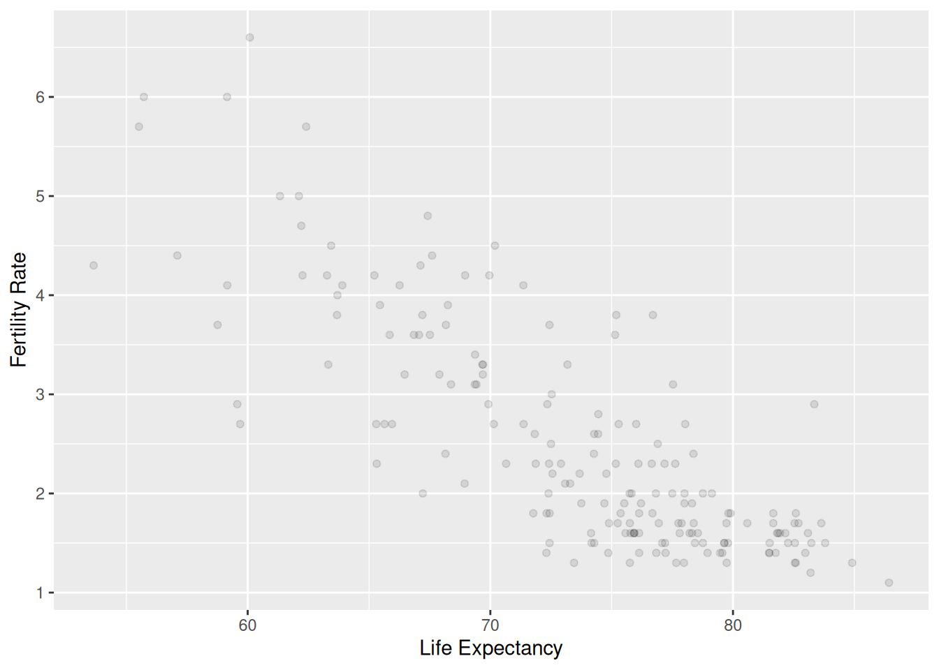
We do not see much for overplotting due to little to no overlap in the points. Most life expectancy entries appear to fall between 70 and 80 years, while most fertility rate entries fall between 1.5 and 3.5 births. Furthermore, while opinions may vary, it is our opinion that the relationship between fertility rate and life expectancy is “moderately negative.” This is consistent with our earlier computed correlation coefficient of -0.812.
We build on the scatterplot in Figure 5.2 by adding a “best-fitting” line: of all possible lines we can draw on this scatterplot, it is the line that “best” fits through the cloud of points. We do this by adding a new geom_smooth(method = "lm", se = FALSE) layer to the ggplot() code that created the scatterplot in Figure 5.2. The method = "lm" argument sets the line to be a “linear model.” The se = FALSE argument suppresses standard error uncertainty bars. (We’ll define the concept of standard error later in Section 7.3.4.)
ggplot(UN_data_ch5, aes(x = life_exp, y = fert_rate)) +
  geom_point(alpha = 0.1) +
  labs(x = "Life Expectancy",
    y = "Fertility Rate",
    title = "Relationship of life expectancy and fertility rate") +
  geom_smooth(method = "lm", se = FALSE)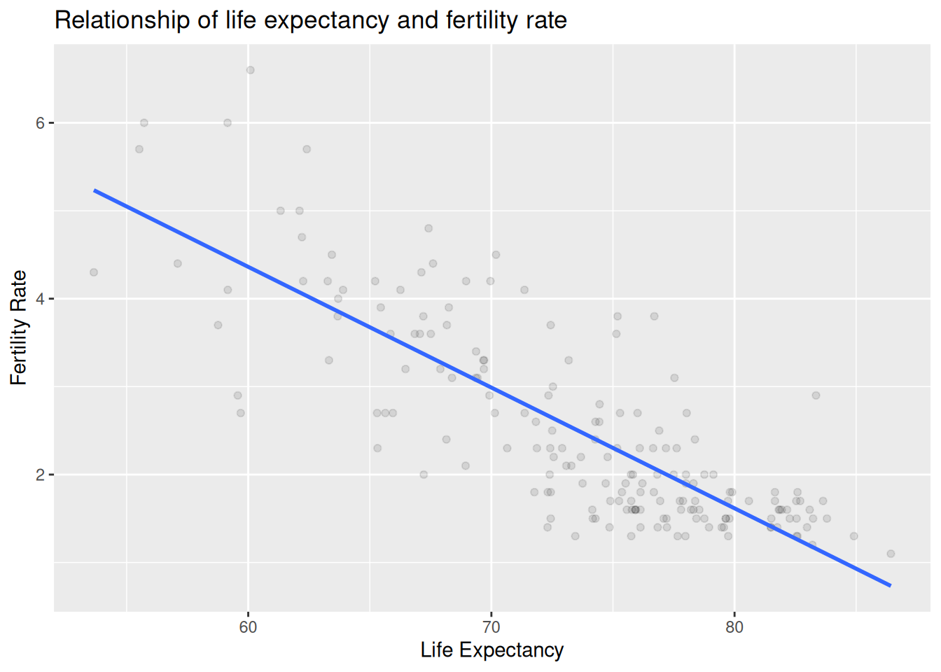
The line in the resulting Figure 5.3 is called a “regression line.” The regression line is a visual summary of the relationship between two numerical variables, in our case the outcome variable fert_rate and the explanatory variable life_exp. The negative slope of the blue line is consistent with our earlier observed correlation coefficient of -0.812 suggesting that there is a negative relationship between these two variables: as a country’s population has higher life expectancy it tends to have a lower fertility rate. We’ll see later, however, that while the correlation coefficient and the slope of a regression line always have the same sign (positive or negative), they typically do not have the same value.
Furthermore, a regression line is “best-fitting” in that it minimizes some mathematical criteria. We present these mathematical criteria in Section 5.3.2, but we suggest you read this subsection only after first reading the rest of this section on regression with one numerical explanatory variable.
Learning Check
(LC5.1) Conduct a new exploratory data analysis with the same outcome variable \(y\) being fert_rate but with obes_rate as the new explanatory variable \(x\). Remember, this involves three things:
- Looking at the raw data values.
- Computing summary statistics.
- Creating data visualizations.
What can you say about the relationship between obesity rate and fertility rate based on this exploration?
# 1) Look at raw values
glimpse(UN_data_ch5)
Rows: 181
Columns: 4
$ iso <chr> "AFG", "ALB", "DZA", "AGO", "ATG", "ARG", "ARM", "AUS", "AUT…
$ life_exp <dbl> 53.6, 79.5, 78.0, 62.1, 77.8, 78.3, 76.1, 83.1, 82.3, 74.2, …
$ fert_rate <dbl> 4.3, 1.4, 2.7, 5.0, 1.6, 1.9, 1.6, 1.6, 1.5, 1.6, 1.4, 1.8, …
$ obes_rate <dbl> 5.5, 21.7, 27.4, 8.2, 18.9, 28.3, 20.2, 29.0, 20.1, 19.9, 31…# 2) Summary statistics
UN_data_ch5 |>
select(fert_rate, obes_rate) |>
moderndive::tidy_summary()# A tibble: 2 × 11
column n group type min Q1 mean median Q3 max sd
<chr> <int> <chr> <chr> <dbl> <dbl> <dbl> <dbl> <dbl> <dbl> <dbl>
1 fert_rate 181 <NA> numeric 1.1 1.6 2.50 2 3.2 6.6 1.15
2 obes_rate 181 <NA> numeric 2.1 9.6 19.3 20.6 25.2 51.6 9.99# 3) Visualizations
ggplot(UN_data_ch5, aes(x = obes_rate, y = fert_rate)) +
geom_point(alpha = 0.2) +
geom_smooth(method = "lm", se = FALSE) +
labs(x = "Obesity rate (2016)", y = "Fertility rate (2022)")`geom_smooth()` using formula = 'y ~ x'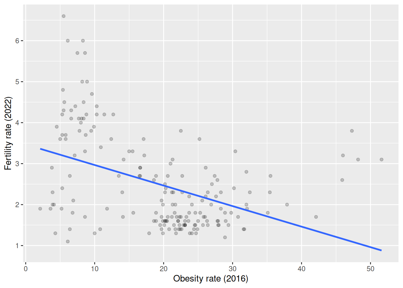
# Optional: correlation
UN_data_ch5 |>
  moderndive::get_correlation(fert_rate ~ obes_rate)
# A tibble: 1 × 1
cor
<dbl>
1 -0.435EDA = raw data + summaries + plot. The scatterplot with the regression line and the correlation quantify direction/strength. This data shows a negative association between obesity rate and fertility rate (points slope down; negative correlation): as obesity rate increases, fertility rate tends to decrease.
(LC5.2) What is the main purpose of performing an exploratory data analysis (EDA) before fitting a regression model?
- A. To predict future values.
- B. To understand the relationship between variables and detect potential issues.
- C. To create more variables.
- D. To generate random samples.
B.
EDA helps you understand relationships, spot outliers/missingness, and check assumptions before modeling, not to predict or fabricate variables.
(LC5.3) Which of the following is correct about the correlation coefficient?
- A. It ranges from -2 to 2.
- B. It only measures the strength of non-linear relationships.
- C. It ranges from -1 to 1 and measures the strength of linear relationships.
- D. It is always zero.
C.
Pearson’s correlation is bounded in [-1, 1] and measures linear association strength/direction.
5.1.2 Simple linear regression
You may recall from secondary/high school algebra that the equation of a line is \(y = a + b\cdot x\). (Note that the \(\cdot\) symbol is equivalent to the \(\times\) “multiply by” mathematical symbol. We’ll use the \(\cdot\) symbol in the rest of this book as it is more succinct.) It is defined by two coefficients \(a\) and \(b\). The intercept coefficient \(a\) is the value of \(y\) when \(x = 0\). The slope coefficient \(b\) for \(x\) is the increase in \(y\) for every increase of one in \(x\). This is also called the “rise over run.”
However, when defining a regression line like the one in Figure 5.3, we use slightly different notation: the equation of the regression line is \(\widehat{y} = b_0 + b_1 \cdot x\) . The intercept coefficient is \(b_0\), so \(b_0\) is the value of \(\widehat{y}\) when \(x = 0\). The slope coefficient for \(x\) is \(b_1\), i.e., the increase in \(\widehat{y}\) for every increase of one in \(x\). Why do we put a “hat” on top of the \(y\)? It’s a form of notation commonly used in regression to indicate that we have a “fitted value,” or the value of \(y\) on the regression line for a given \(x\) value as discussed further in Section 5.1.3.
We know that the regression line in Figure 5.3 has a negative slope \(b_1\) corresponding to our explanatory \(x\) variable life_exp. Why? Because as countries tend to have higher life_exp values, they tend to have lower fert_rate values. However, what is the numerical value of the slope \(b_1\)? What about the intercept \(b_0\)? We do not compute these two values by hand, but rather we use a computer!
We can obtain the values of the intercept \(b_0\) and the slope for life_exp \(b_1\) by outputting the linear regression coefficients. This is done in two steps:
- We first “fit” the linear regression model using the
lm()function and save it indemographics_model. - We get the regression coefficients by applying
coef()todemographics_model.
We first focus on interpreting the regression coefficients, and later revisit the code that produced it. The coefficients are the intercept \(b_0 = 12.599\) and the slope \(b_1 = -0.137\) for life_exp. Thus the equation of the regression line in Figure 5.3 follows:
\[ \begin{aligned} \widehat{y} &= b_0 + b_1 \cdot x\\ \widehat{\text{fertility}\_\text{rate}} &= b_0 + b_{\text{life}\_\text{expectancy}} \cdot \text{life}\_\text{expectancy}\\ &= 12.599 + (-0.137) \cdot \text{life}\_\text{expectancy} \end{aligned} \]
The intercept \(b_0\) = 12.599 is the average fertility rate \(\widehat{y}\) = \(\widehat{\text{fertility}\_\text{rate}}\) for those countries that had a life_exp of 0. Or in graphical terms, where the line intersects the \(y\) axis for \(x\) = 0. Note, however, that while the intercept of the regression line has a mathematical interpretation, it has no practical interpretation here, since observing a life_exp of 0 is impossible. Furthermore, looking at the scatterplot with the regression line in Figure 5.3, no countries had a life expectancy anywhere near 0.
Of greater interest is the slope \(b_{\text{life}\_\text{expectancy}}\) for life_exp of -0.137. This summarizes the relationship between the fertility rate and life expectancy variables. Note that the sign is negative, suggesting a negative relationship between these two variables. This means countries with higher life expectancies tend to have lower fertility rates. Recall that the correlation coefficient is -0.812. They both have the same negative sign, but have a different value. Recall also that the correlation’s interpretation is the “strength of linear association.” The slope’s interpretation is a little different:
For every increase of 1 unit in
life_exp, there is an associated decrease of, on average, 0.137 units offert_rate.
We only state that there is an associated increase and not necessarily a causal increase. Perhaps it may not be that higher life expectancies directly cause lower fertility rates. Instead, wealthier countries could tend to have stronger educational backgrounds, improved health, a higher standard of living, and have lower fertility rates, while at the same time these wealthy countries also tend to have higher life expectancies. Just because two variables are strongly associated, it does not necessarily mean that one causes the other. This is summed up in the often-quoted phrase, “correlation is not necessarily causation.” We discuss this idea further in Section 5.3.1.
A regression coefficient is not a causal effect. A fitted slope tells you how the outcome variable changes on average with the predictor in the data you observed. It does not tell you what would happen if you intervened to change the predictor. Causal claims require either a randomized experiment or careful adjustment for confounders. When you write up a result, prefer language like “associated with” or “predicts” rather than “causes” or “leads to.”
Furthermore, we say that this associated decrease is on average 0.137 units of fert_rate, because you might have two countries whose life_exp values differ by 1 unit, but their difference in fertility rates may not be exactly \(-0.137\). What the slope of \(-0.137\) is saying is that across all possible countries, the average difference in fertility rate between two countries whose life expectancies differ by one is \(-0.137\).
Now that we have learned how to compute the equation for the regression line in Figure 5.3 using the model coefficient values and how to interpret the resulting intercept and slope, we revisit the code that generated these coefficients:
First, we “fit” the linear regression model to the data using the lm() function and save this as demographics_model. When we say “fit,” we mean “find the best fitting line to this data.” lm() stands for “linear model” and is used as lm(y ~ x, data = df_name) where:
-
yis the outcome variable, followed by a tilde~. In our case,yis set tofert_rate. -
xis the explanatory variable. In our case,xis set tolife_exp. - The combination of
y ~ xis called a model formula. (Note the order ofyandx.) In our case, the model formula isfert_rate ~ life_exp. We saw such model formulas earlier with theget_correlation()function in Section 5.1.1. -
df_nameis the name of the data frame that contains the variablesyandx. In our case,datais theUN_data_ch5data frame.
Second, we take the saved model in demographics_model and apply the coef() function to it to obtain the regression coefficients. This gives us the components of the regression equation line: the intercept \(b_0\) and the slope \(b_1\).
Learning Check
(LC5.4) Fit a simple linear regression using lm(fert_rate ~ obes_rate, data = UN_data_ch5) where obes_rate is the new explanatory variable \(x\). Learn about the “best-fitting” line from the regression coefficients by applying the coef() function. How do the regression results match up with your earlier exploratory data analysis?
(Intercept)   obes_rate
     3.4674     -0.0501
# or a tidy table:
moderndive::get_regression_table(m_obesity)# A tibble: 2 × 7
term estimate std_error statistic p_value lower_ci upper_ci
<chr> <dbl> <dbl> <dbl> <dbl> <dbl> <dbl>
1 intercept 3.47 0.168 20.6 0 3.14 3.80
2 obes_rate -0.05 0.008 -6.47 0 -0.065 -0.035The slope sign should match your EDA: typically negative, meaning higher obesity rate is associated with lower fertility. The magnitude tells how much fertility changes per 1-point increase in obesity (on average). If your plot/correlation looked negative, a negative fitted slope confirms that.
(LC5.5) What does the intercept term \(b_0\) represent in simple linear regression?
- A. The change in the outcome for a one-unit change in the explanatory variable.
- B. The predicted value of the outcome when the explanatory variable is zero.
- C. The slope of the regression line.
- D. The correlation between the outcome and explanatory variables.
B.
\(b_0\) is the predicted response when \(x = 0\). It may be outside the data’s range (so often not substantively meaningful), but that’s the definition.
(LC5.6) What best describes the “slope” of a simple linear regression line?
- A. The increase in the explanatory variable for a one-unit increase in the outcome.
- B. The average of the explanatory variable.
- C. The change in the outcome for a one-unit increase in the explanatory variable.
- D. The minimum value of the outcome variable.
C.
The slope is the change in the outcome for a one-unit increase in the explanatory variable, on average.
(LC5.7) What does a negative slope in a simple linear regression indicate?
- A. The outcome variable decreases as the explanatory variable increases.
- B. The explanatory variable remains constant as the outcome variable increases.
- C. The correlation coefficient is zero.
- D. The outcome variable increases as the explanatory variable increases.
A.
As \(x\) increases, the predicted \(y\) decreases (downward trend).
5.1.3 Observed/fitted values and residuals
We just saw how to get the value of the intercept and the slope of a regression line from the output of the coef() function. Now instead say we want information on individual observations. For example, we focus on the 21st of the 181 countries in the UN_data_ch5 data frame in Table 5.2. This corresponds to the UN member state of Bosnia and Herzegovina (BIH).
| iso | life_exp | fert_rate | obes_rate |
|---|---|---|---|
| BIH | 78 | 1.3 | 17.9 |
What is the value \(\widehat{y}\) on the regression line corresponding to this country’s life_exp value of 77.98? In Figure 5.4 we mark three values corresponding to these results for Bosnia and Herzegovina and give their statistical names:
- Circle: The observed value \(y\) = 1.3 is this country’s actual fertility rate.
- Square: The fitted value \(\widehat{y}\) is the value on the regression line for \(x = \texttt{life\_exp} = 77.98\), computed with the intercept and slope in the previous regression table:
\[\widehat{y} = b_0 + b_1 \cdot x = 12.599 + (-0.137) \cdot 77.98 = 1.894\] * Arrow: The length of this arrow is the residual and is computed by subtracting the fitted value \(\widehat{y}\) from the observed value \(y\). The residual can be thought of as a model’s error or “lack of fit” for a particular observation. In the case of this country, it is \(y - \widehat{y} = 1.3 - 1.894 = -0.594\).
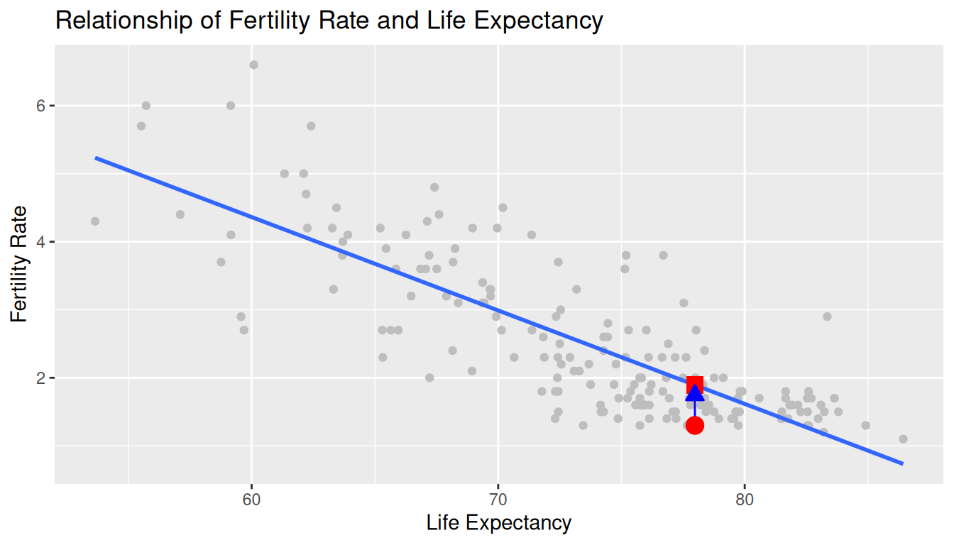
Now say we want to compute both the fitted value \(\widehat{y} = b_0 + b_1 \cdot x\) and the residual \(y - \widehat{y}\) for all 181 UN member states with complete data as of 2024. Recall that each country corresponds to one of the 181 rows in the UN_data_ch5 data frame and also one of the 181 points in the regression plot in Figure 5.4.
We could repeat the previous calculations we performed by hand 181 times, but that would be tedious and time consuming. Instead, we use a computer with the get_regression_points() function. We apply the get_regression_points() function to demographics_model, which is where we saved our lm() model in the previous section. In Table 5.3 we present the results of only the 21st through 24th countries for brevity.
regression_points <- get_regression_points(demographics_model)
regression_points| ID | fert_rate | life_exp | fert_rate_hat | residual |
|---|---|---|---|---|
| 21 | 1.3 | 78.0 | 1.89 | -0.594 |
| 22 | 2.7 | 65.6 | 3.59 | -0.888 |
| 23 | 1.6 | 75.9 | 2.18 | -0.576 |
| 24 | 1.7 | 80.6 | 1.53 | 0.165 |
This function is an example of what is known in computer programming as a wrapper function. It takes other pre-existing functions and “wraps” them into a single function that hides its inner workings. This concept is illustrated in Figure 5.5.
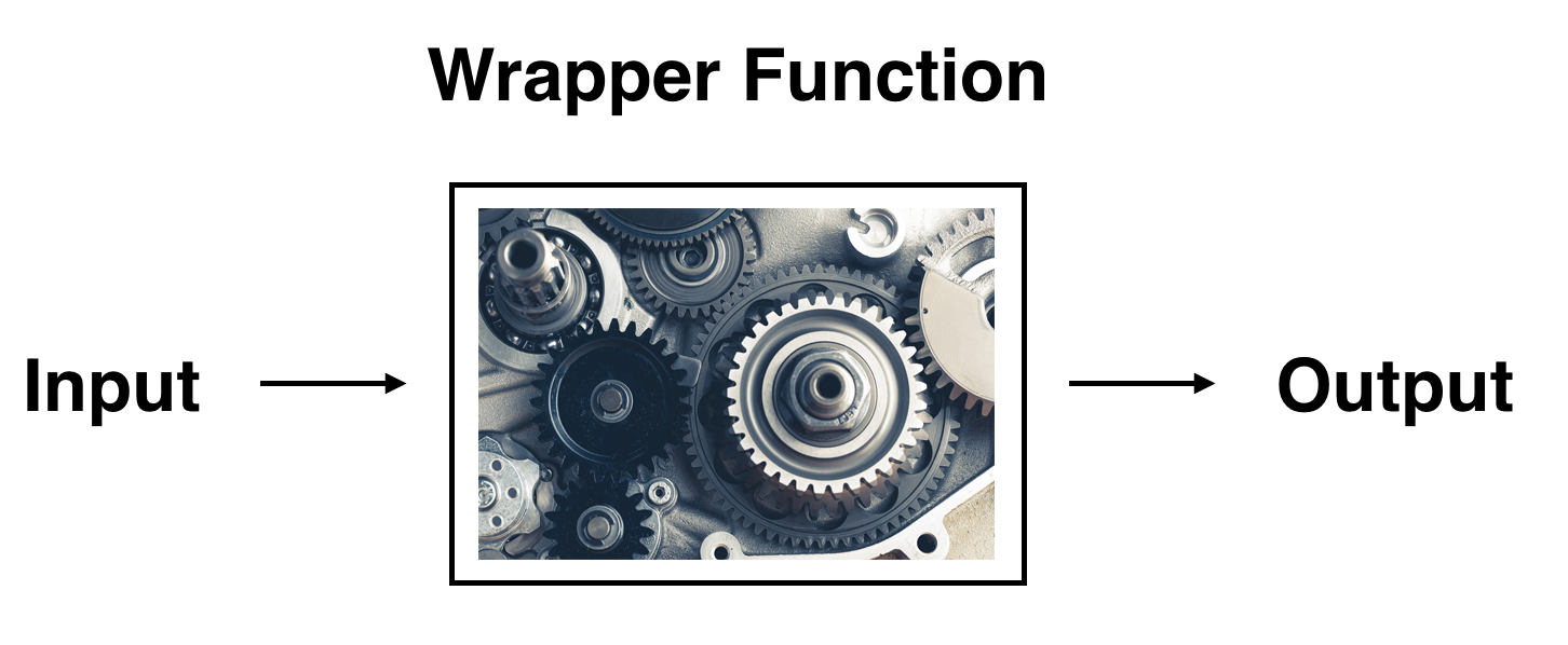
So all you need to worry about is what the inputs look like and what the outputs look like; you leave all the other details “under the hood of the car.” In our regression modeling example, the get_regression_points() function takes a saved lm() linear regression model as input and returns a data frame of the regression predictions as output. If you are interested in learning more about the get_regression_points() function’s inner workings, check out Section 5.3.3.
We inspect the individual columns and match them with the elements of Figure 5.4:
- The
fert_ratecolumn represents the observed outcome variable \(y\). This is the y-position of the 181 black points. - The
life_expcolumn represents the values of the explanatory variable \(x\). This is the x-position of the 181 black points. - The
fert_rate_hatcolumn represents the fitted values \(\widehat{y}\). This is the corresponding value on the regression line for the 181 \(x\) values. - The
residualcolumn represents the residuals \(y - \widehat{y}\). This is the 181 vertical distances between the 181 black points and the regression line.
Just as we did for the 21st country in the UN_data_ch5 dataset (in the first row of the table), we repeat the calculations for the 24th country (in the fourth row of Table 5.3). This corresponds to the country of Brunei (BRN):
-
fert_rate\(= 1.7\) is the observedfert_rate\(y\) for this country. -
life_exp\(= 80.590\) is the value of the explanatory variablelife_exp\(x\) for Brunei. -
fert_rate_hat\(= 1.535 = 12.599 + (-0.137) \cdot 80.590\) is the fitted value \(\widehat{y}\) on the regression line for this country. -
residual\(= 0.165 = 1.7 - 1.535\) is the value of the residual for this country. In other words, the model’s fitted value was off by 0.165 fertility rate units for Brunei.
If you like, you can skip ahead to Section 5.3.2 to learn about the processes behind what makes “best-fitting” regression lines. As a primer, a “best-fitting” line refers to the line that minimizes the sum of squared residuals out of all possible lines we can draw through the points. In Section 5.2, we’ll discuss another common scenario of having a categorical explanatory variable and a numerical outcome variable.
Learning Check
(LC5.8) What is a “wrapper function” in the context of statistical modeling in R?
- A. A function that directly fits a regression model without using any other functions.
- B. A function that combines other functions to simplify complex operations and provide a user-friendly interface.
- C. A function that removes missing values from a dataset before analysis.
- D. A function that only handles categorical data in regression models.
B. Wrapper functions combine other functions into a simpler interface (e.g., moderndive::get_regression_points() wraps broom::augment() and some cleaning).
(LC5.9) Generate a data frame of the residuals of the Learning check model where you used obes_rate as the explanatory \(x\) variable.
m_obesity <- lm(fert_rate ~ obes_rate, data = UN_data_ch5)
resids_df <- moderndive::get_regression_points(m_obesity)
resids_df |> select(obes_rate, fert_rate, fert_rate_hat, residual) |> head()
# A tibble: 6 × 4
obes_rate fert_rate fert_rate_hat residual
<dbl> <dbl> <dbl> <dbl>
1 5.5 4.3 3.19 1.11
2 21.7 1.4 2.38 -0.98
3 27.4 2.7 2.09 0.606
4 8.2 5 3.06 1.94
5 18.9 1.6 2.52 -0.92
6 28.3 1.9 2.05 -0.149get_regression_points() returns observed \(y\), fitted \(\hat y\), and residuals \(y-\hat y\) in a tidy frame, perfect for diagnostics and sorting.
(LC5.10) Which of the following statements is true about the regression line in a simple linear regression model?
- A. The regression line represents the average of the outcome variable.
- B. The regression line minimizes the sum of squared differences between the observed and predicted values.
- C. The regression line always has a slope of zero.
- D. The regression line is only useful when there is no correlation between variables.
B.
OLS chooses the line that minimizes the sum of squared residuals (squared differences between observed and fitted).
5.2 One categorical explanatory variable
It is an unfortunate truth that life expectancy is not the same across all countries in the world. International development agencies are interested in studying these differences in life expectancy in the hopes of identifying where governments should allocate resources to address this problem. In this section, we explore differences in life expectancy in two ways:
- Differences between continents: Are there significant differences in average life expectancy between the six populated continents of the world: Africa, North America, South America, Asia, Europe, and Oceania?
- Differences within continents: How does life expectancy vary within the world’s six continents? For example, is the spread of life expectancy among the countries of Africa larger than the spread of life expectancy among the countries of Asia?
To answer such questions, we use an updated version of the gapminder data frame we visualized in Figure 2.1 in Section 2.1.2 on the grammar of graphics. This updated un_member_states_2024 data we saw earlier in this chapter. It is included in the moderndive package and has international development statistics such as life expectancy, GDP per capita, and population for 193 countries for years near 2024. We use this data for basic regression again, but now using an explanatory variable \(x\) that is categorical, as opposed to the numerical explanatory variable model we used in the previous Section 5.1:
- A numerical outcome variable \(y\) (a country’s life expectancy) and
- A single categorical explanatory variable \(x\) (the continent that the country is a part of).
When the explanatory variable \(x\) is categorical, the concept of a “best-fitting” regression line is a little different than the one we saw previously in Section 5.1 where the explanatory variable \(x\) was numerical. We study these differences shortly in Section 5.2.2, but first we conduct an exploratory data analysis.
5.2.1 Exploratory data analysis
The data on the 193 countries can be found in the un_member_states_2024 data frame included in the moderndive package. However, to keep things simple, we select() only the subset of the variables we’ll consider in this chapter and focus only on rows where we have no missing values with na.omit(). We’ll save this data in a new data frame called gapminder2022:
We perform the first common step in an exploratory data analysis: looking at the raw data values. You can do this by using RStudio’s spreadsheet viewer or by using the glimpse() command as introduced in Section 1.4.3 on exploring data frames:
glimpse(gapminder2022)Rows: 188
Columns: 4
$ country <chr> "Afghanistan", "Albania", "Algeria", "Andorra", "Angola…
$ life_exp <dbl> 53.6, 79.5, 78.0, 83.4, 62.1, 77.8, 78.3, 76.1, 83.1, 8…
$ continent <fct> Asia, Europe, Africa, Europe, Africa, North America, So…
$ gdp_per_capita <dbl> 356, 6810, 4343, 41993, 3000, 19920, 13651, 7018, 65100…Observe that Rows: 188 indicates that there are 188 rows/observations in gapminder2022, where each row corresponds to one country. In other words, the observational unit is an individual country. Furthermore, observe that the variable continent is of type <fct>, which stands for factor, which is R’s way of encoding categorical variables.
A full description of all the variables included in un_member_states_2024 can be found by reading the associated help file (run ?un_member_states_2024 in the console). However, we fully describe only the 4 variables we selected in gapminder2022:
-
country: An identification variable of type character/text used to distinguish the 188 countries in the dataset. -
life_exp: A numerical variable of that country’s life expectancy at birth. This is the outcome variable \(y\) of interest. -
continent: A categorical variable with six levels. Here “levels” correspond to the possible categories: Africa, Asia, Europe, North America, Oceania, and South America. This is the explanatory variable \(x\) of interest. -
gdp_per_capita: A numerical variable of that country’s GDP per capita in US inflation-adjusted dollars that we’ll use as another outcome variable \(y\) in the Learning check at the end of this subsection.
We next look at a random sample of three out of the 188 countries in Table 5.4.
gapminder2022 |> sample_n(size = 3)| country | life_exp | continent | gdp_per_capita |
|---|---|---|---|
| Panama | 77.6 | North America | 17358 |
| Micronesia, Federated States of | 74.4 | Oceania | 3714 |
| Burundi | 67.4 | Africa | 259 |
Random sampling will likely produce a different subset of 3 rows for you than what’s shown. Now that we have looked at the raw values in our gapminder2022 data frame and got a sense of the data, we compute summary statistics. We again apply tidy_summary() from the moderndive package. Recall that this function takes in a data frame, summarizes it, and returns commonly used summary statistics. We take our gapminder2022 data frame, select() only the outcome and explanatory variables life_exp and continent, and pipe them into tidy_summary() in Table 5.5:
gapminder2022 |> select(life_exp, continent) |> tidy_summary()| column | n | group | type | min | Q1 | mean | median | Q3 | max | sd |
|---|---|---|---|---|---|---|---|---|---|---|
| life_exp | 188 | numeric | 53.6 | 69.4 | 73.8 | 75.2 | 78.4 | 89.6 | 6.93 | |
| continent | 52 | Africa | factor | |||||||
| continent | 44 | Asia | factor | |||||||
| continent | 43 | Europe | factor | |||||||
| continent | 23 | North America | factor | |||||||
| continent | 14 | Oceania | factor | |||||||
| continent | 12 | South America | factor |
The tidy_summary() output now reports summaries for categorical variables and for the numerical variables we reviewed before. Let’s focus just on discussing the results for the categorical factor variable continent:
-
n: The number of non-missing entries for each group -
group: Breaks down a categorical variable into its unique levels. For this variable, the groups correspond to Africa, Asia, Europe, North America, Oceania, and South America. -
type: The data type of the variable. Here, it is afactor. -
mintosd: These are missing since calculating the five-number summary, the mean, and standard deviation for categorical variables doesn’t make sense.
Turning our attention to the summary statistics of the numerical variable life_exp, we observe that the global median life expectancy in 2022 was 75.14. Thus, half of the world’s countries (96 countries) had a life expectancy of less than 75.14. The mean life expectancy of 73.55 is lower, however. Why is the mean life expectancy lower than the median?
We can answer this question by performing the last of the three common steps in an exploratory data analysis: creating data visualizations. We visualize the distribution of our outcome variable \(y\) = life_exp in Figure 5.6.
ggplot(gapminder2022, aes(x = life_exp)) +
geom_histogram(binwidth = 5, color = "white") +
labs(x = "Life expectancy",
y = "Number of countries",
title = "Histogram of distribution of worldwide life expectancies")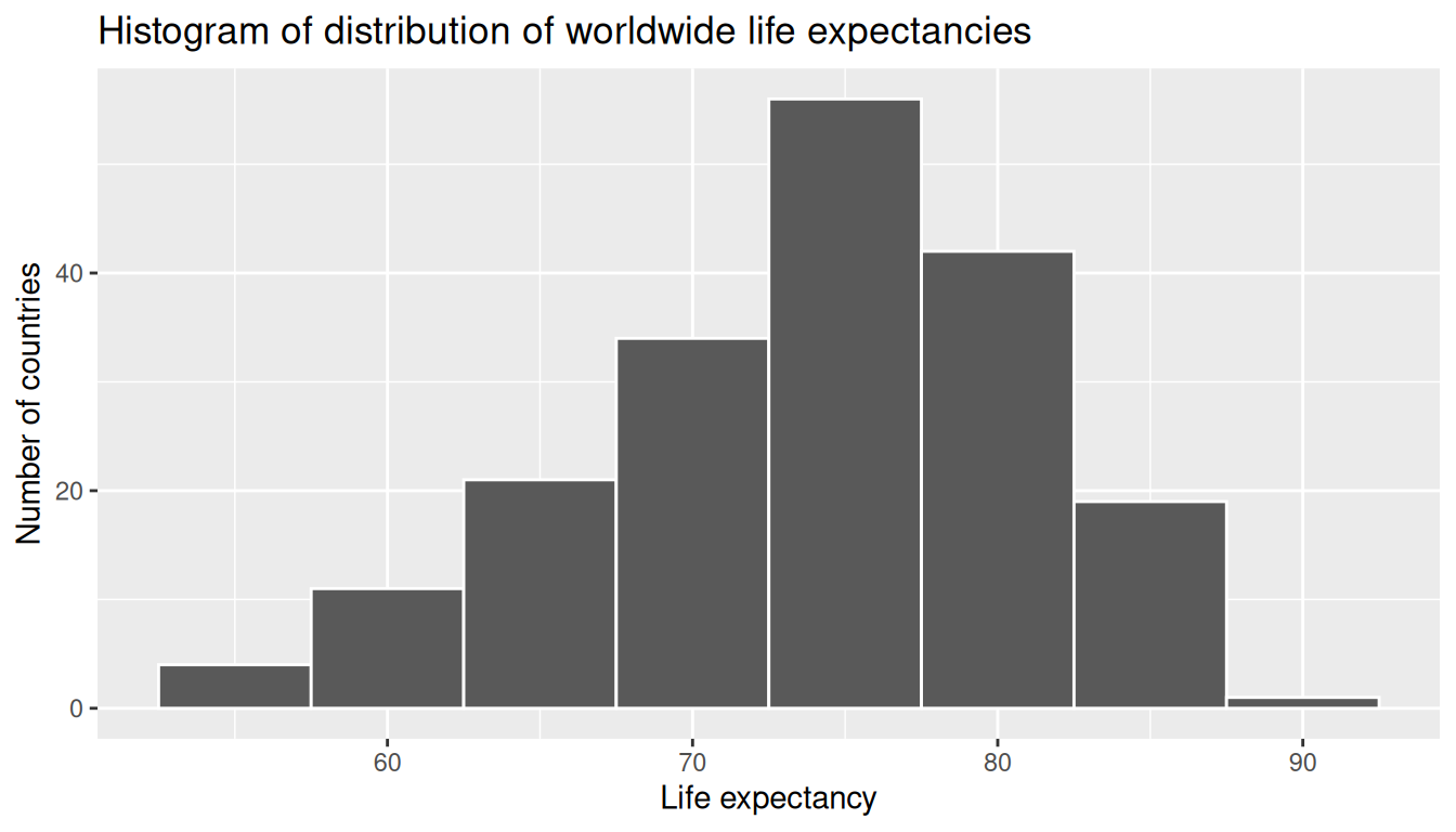
We see that this data is left-skewed, also known as negatively skewed: there are a few countries with low life expectancy that are bringing down the mean life expectancy. However, the median is less sensitive to the effects of such outliers; hence, the median is greater than the mean in this case.
Remember, however, that we want to compare life expectancies both between continents and within continents. In other words, our visualizations need to incorporate some notion of the variable continent. We can do this easily with a faceted histogram. Recall from Section 2.6 that facets allow us to split a visualization by the different values of another variable. We display the resulting visualization in Figure 5.7 by adding a facet_wrap(~ continent, nrow = 2) layer.
ggplot(gapminder2022, aes(x = life_exp)) +
geom_histogram(binwidth = 5, color = "white") +
labs(x = "Life expectancy",
y = "Number of countries",
title = "Histogram of distribution of worldwide life expectancies") +
facet_wrap(~ continent, nrow = 2)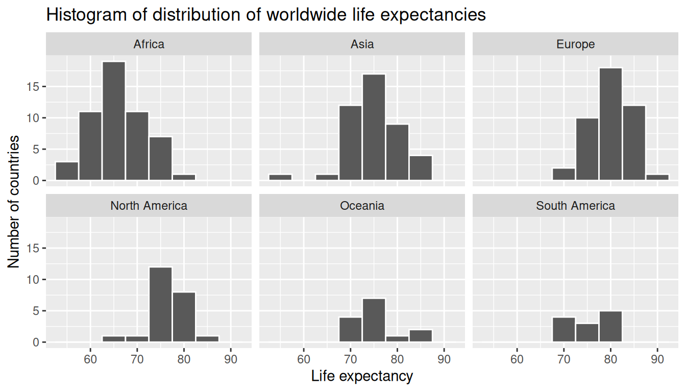
Observe that unfortunately the distribution of African life expectancies is much lower than the other continents. In Europe, life expectancies tend to be higher and furthermore do not vary as much. On the other hand, both Asia and Africa have the most variation in life expectancies.
Recall that an alternative method to visualize the distribution of a numerical variable split by a categorical variable is by using a side-by-side boxplot. We map the categorical variable continent to the \(x\)-axis and the different life expectancies within each continent on the \(y\)-axis in Figure 5.8.
ggplot(gapminder2022, aes(x = continent, y = life_exp)) +
geom_boxplot() +
labs(x = "Continent", y = "Life expectancy",
title = "Life expectancy by continent")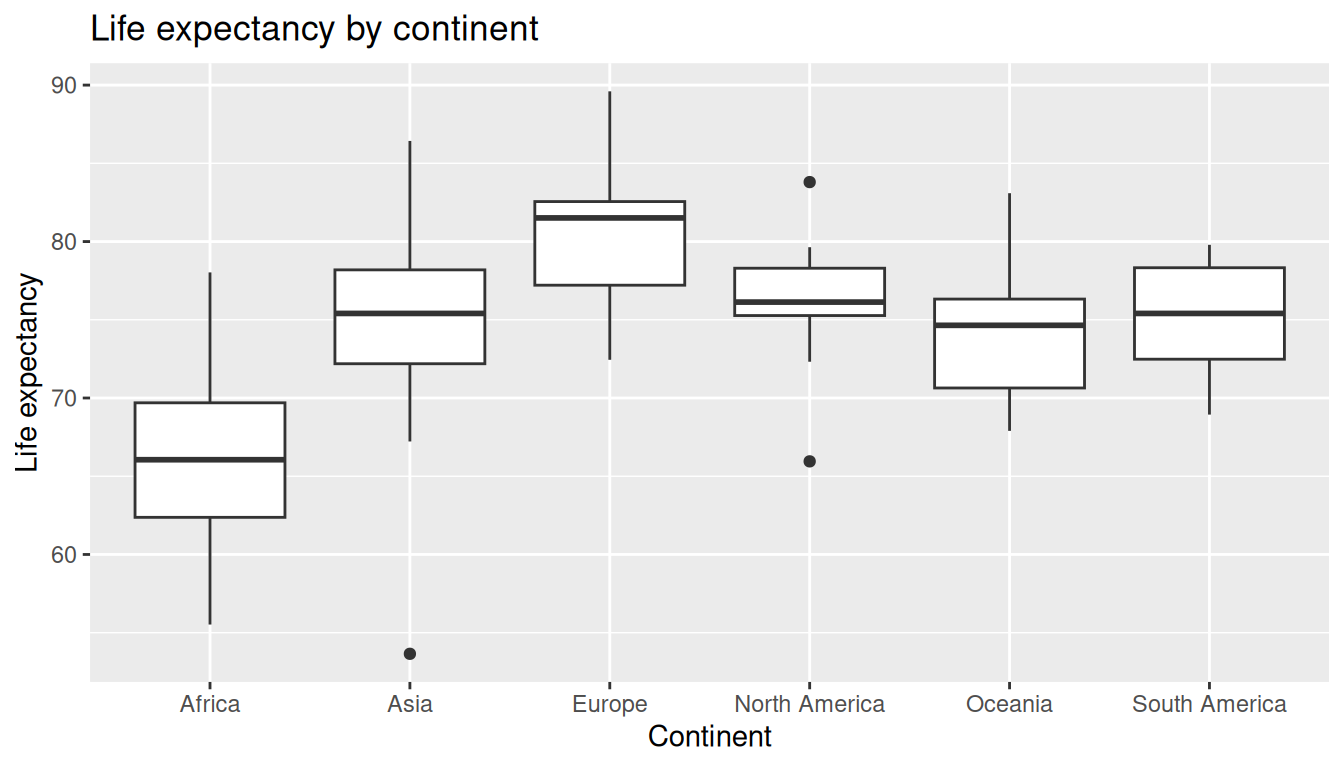
Some people prefer comparing the distributions of a numerical variable between different levels of a categorical variable using a boxplot instead of a faceted histogram. This is because we can make quick comparisons between the categorical variable’s levels with imaginary horizontal lines. For example, observe in Figure 5.8 that we can quickly convince ourselves that Europe has the highest median life expectancies by drawing an imaginary horizontal line near \(y = 81\). Furthermore, as we observed in the faceted histogram in Figure 5.7, Africa and Asia have the largest variation in life expectancy as evidenced by their large interquartile ranges (the size of the boxes).
It’s important to remember, however, that the solid lines in the middle of the boxes correspond to the medians (the middle value) rather than the mean (the average). So, for example, if you look at Asia, the solid line denotes the median life expectancy of around 75 years. This tells us that half of all countries in Asia have a life expectancy below 75 years, whereas half have a life expectancy above 75 years. We compute the median and mean life expectancy for each continent with a little more data wrangling and display the results in Table 5.6.
| continent | median | mean |
|---|---|---|
| Africa | 66.1 | 66.3 |
| Asia | 75.4 | 75.0 |
| Europe | 81.5 | 79.9 |
| North America | 76.1 | 76.3 |
| Oceania | 74.6 | 74.4 |
| South America | 75.4 | 75.2 |
Observe the order of the second column median life expectancy: Africa is lowest, Europe the highest, and the others have similar medians between Africa and Europe. This ordering corresponds to the ordering of the solid black lines inside the boxes in our side-by-side boxplot in Figure 5.8.
We now turn our attention to the values in the third column mean. Using Africa’s mean life expectancy of 66.31 as a baseline for comparison, we start making comparisons to the mean life expectancies of the other four continents and put these values in Table 5.7, which we’ll revisit later on in this section.
- For Asia, it is 74.95 - 66.31 = 8.64 years higher.
- For Europe, it is 79.91 - 66.31 = 13.6 years higher.
- For North America, it is 76.29 - 66.31 = 9.98 years higher.
- For Oceania, it is 74.42 - 66.31 = 8.11 years higher.
- For South America, it is 75.23 - 66.31 = 8.92 years higher.
| continent | mean | Difference versus Africa |
|---|---|---|
| Africa | 66.3 | 0.00 |
| Asia | 75.0 | 8.64 |
| Europe | 79.9 | 13.60 |
| North America | 76.3 | 9.99 |
| Oceania | 74.4 | 8.11 |
| South America | 75.2 | 8.92 |
Learning Check
(LC5.11) Conduct a new exploratory data analysis with the same explanatory variable \(x\) being continent but with gdp_per_capita as the new outcome variable \(y\). What can you say about the differences in GDP per capita between continents based on this exploration?
Rows: 188
Columns: 4
$ country        <chr> "Afghanistan", "Albania", "Algeria", "Andorra", "Angola…
$ life_exp       <dbl> 53.6, 79.5, 78.0, 83.4, 62.1, 77.8, 78.3, 76.1, 83.1, 8…
$ continent      <fct> Asia, Europe, Africa, Europe, Africa, North America, So…
$ gdp_per_capita <dbl> 356, 6810, 4343, 41993, 3000, 19920, 13651, 7018, 65100…# Summaries
gapminder2022 |>
select(gdp_per_capita, continent) |>
moderndive::tidy_summary()# A tibble: 7 × 11
column n group type min Q1 mean median Q3 max sd
<chr> <int> <chr> <chr> <dbl> <dbl> <dbl> <dbl> <dbl> <dbl> <dbl>
1 gdp_per_cap… 188 <NA> nume… 259. 2255. 18473. 6741. 20395. 240862. 30858.
2 continent 52 Afri… fact… NA NA NA NA NA NA NA
3 continent 44 Asia fact… NA NA NA NA NA NA NA
4 continent 43 Euro… fact… NA NA NA NA NA NA NA
5 continent 23 Nort… fact… NA NA NA NA NA NA NA
6 continent 14 Ocea… fact… NA NA NA NA NA NA NA
7 continent 12 Sout… fact… NA NA NA NA NA NA NA # Visualization
ggplot(gapminder2022, aes(x = continent, y = gdp_per_capita)) +
geom_boxplot() +
# Helpful with longer names/categories
coord_flip() +
scale_y_continuous(labels = scales::comma) +
labs(x = "Continent", y = "GDP per capita (USD)")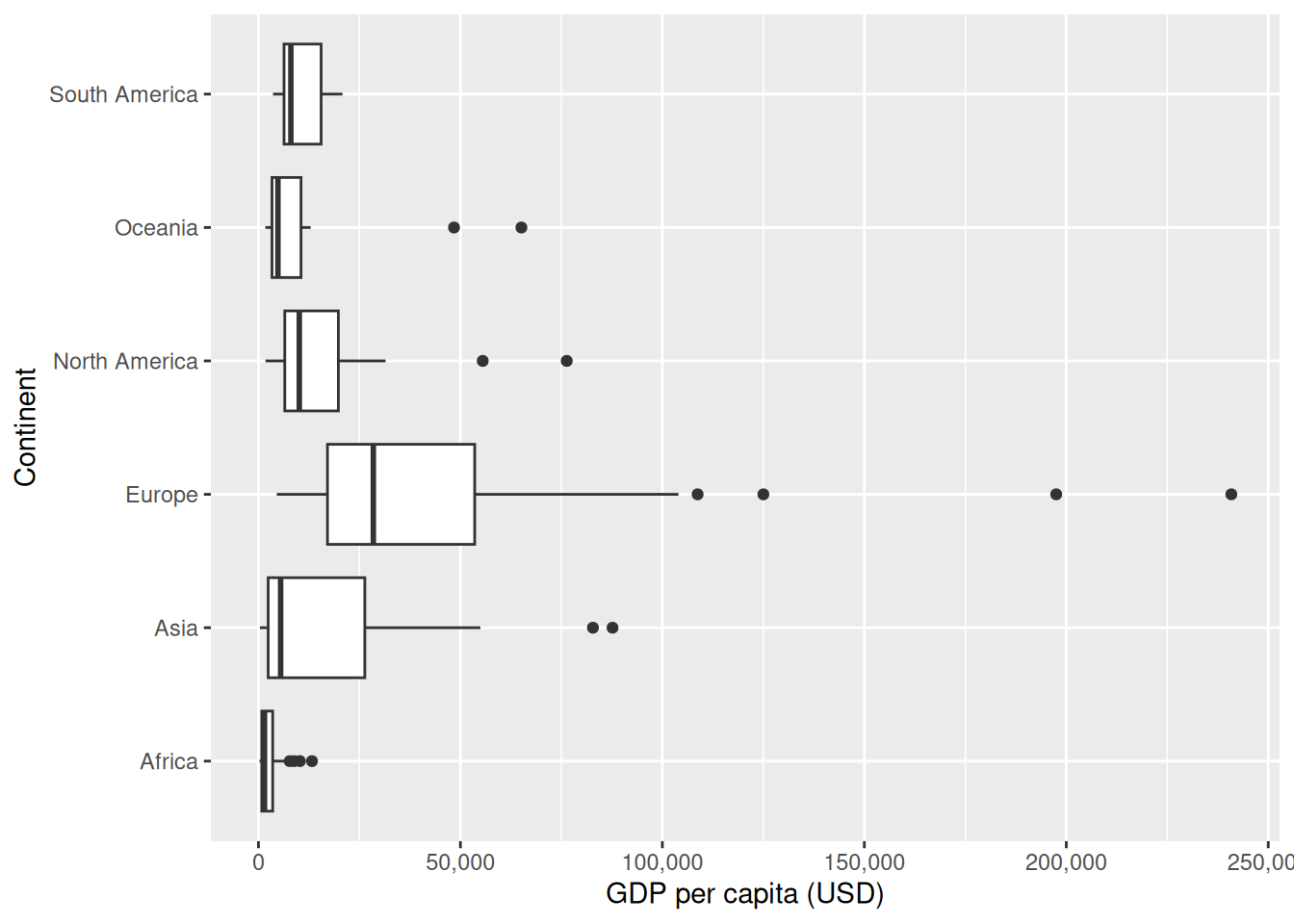
Boxplots/facets reveal distribution and differences. Notice a higher median in Europe and lower in Africa, with Europe showing widest spread.
(LC5.12) When using a categorical explanatory variable in regression, what does the baseline group represent?
- A. The group with the highest mean
- B. The group chosen for comparison with all other groups
- C. The group with the most data points
- D. The group with the lowest standard deviation
B.
The baseline is the reference category against which others are compared (it’s not necessarily largest/smallest by any statistic unless you set it).
5.2.2 Linear regression
In Section 5.1.2 we introduced simple linear regression, which involves modeling the relationship between a numerical outcome variable \(y\) and a numerical explanatory variable \(x\). In our life expectancy example, we now instead have a categorical explanatory variable continent. Our model will not yield a “best-fitting” regression line like in Figure 5.3, but rather offsets relative to a baseline for comparison.
As we did in Section 5.1.2 when studying the relationship between fertility rates and life expectancy, we output the regression coefficients for this model. Recall that this is done in two steps:
- We “fit” the linear regression model using
lm(y ~ x, data)and save it inlife_exp_model. - We get the regression coefficients by applying the
coef()function tolife_exp_model.
           (Intercept)          continentAsia        continentEurope
                 66.31                   8.64                  13.60
continentNorth America       continentOceania continentSouth America
                  9.99                   8.11                   8.92
We once again focus on the values in these coefficient values. Why are there now 6 entries? We break them down one by one:
interceptcorresponds to the mean life expectancy of countries in Africa of 66.31 years.continentAsiacorresponds to countries in Asia and the value +8.64 is the same difference in mean life expectancy relative to Africa we displayed in Table 5.7. In other words, the mean life expectancy of countries in Asia is \(66.31 + 8.64 = 74.95\).continentEuropecorresponds to countries in Europe and the value +13.6 is the same difference in mean life expectancy relative to Africa we displayed in Table 5.7. In other words, the mean life expectancy of countries in Europe is \(66.31 + 13.6 = 79.91\).continentNorth Americacorresponds to countries in North America and the value +9.98 is the same difference in mean life expectancy relative to Africa we displayed in Table 5.7. In other words, the mean life expectancy of countries in North America is \(66.31 + 9.98 = 76.29\).continentOceaniacorresponds to countries in Oceania and the value +8.11 is the same difference in mean life expectancy relative to Africa we displayed in Table 5.7. In other words, the mean life expectancy of countries in Oceania is \(66.31 + 8.11 = 74.42\).continentSouth Americacorresponds to countries in South America and the value +8.92 is the same difference in mean life expectancy relative to Africa we displayed in Table 5.7. In other words, the mean life expectancy of countries in South America is \(66.31 + 8.92 = 75.23\).
To summarize, the 6 values for the regression coefficients correspond to the “baseline for comparison” continent Africa (the intercept) as well as five “offsets” from this baseline for the remaining 5 continents: Asia, Europe, North America, Oceania, and South America.
You might be asking at this point why was Africa chosen as the “baseline for comparison” group. This is the case for no other reason than it comes first alphabetically of the six continents; by default R arranges factors/categorical variables in alphanumeric order. You can change this baseline group to be another continent if you manipulate the variable continent’s factor “levels” using the forcats package. See Chapter 15 of R for Data Science (Grolemund and Wickham 2017) for examples.
We now write the equation for our fitted values \(\widehat{y} = \widehat{\text{life exp}}\).
\[ \begin{aligned} \widehat{y} = \widehat{\text{life exp}} &= b_0 + b_{\text{Asia}}\cdot\mathbb{1}_{\text{Asia}}(x) + b_{\text{Europe}}\cdot\mathbb{1}_{\text{Europe}}(x) \\ & \qquad + b_{\text{North America}}\cdot\mathbb{1}_{\text{North America}}(x) + b_{\text{Oceania}}\cdot\mathbb{1}_{\text{Oceania}}(x) \\ & \qquad + b_{\text{South America}}\cdot\mathbb{1}_{\text{South America}}(x)\\ &= 66.31 + 8.64\cdot\mathbb{1}_{\text{Asia}}(x) + 13.6\cdot\mathbb{1}_{\text{Europe}}(x) \\ & \qquad + 9.98\cdot\mathbb{1}_{\text{North America}}(x) + 8.11\cdot\mathbb{1}_{\text{Oceania}}(x) \\ & \qquad + 8.92\cdot\mathbb{1}_{\text{South America}}(x) \end{aligned} \]
Whoa! That looks daunting! Don’t fret, however, as once you understand what all the elements mean, things simplify greatly. First, \(\mathbb{1}_{A}(x)\) is what’s known in mathematics as an “indicator function.” It returns only one of two possible values, 0 and 1, where
\[ \mathbb{1}_{A}(x) = \left\{ \begin{array}{ll} 1 & \text{if } x \text{ is in } A \\ 0 & \text{otherwise} \end{array} \right. \]
In a statistical modeling context, this is also known as a dummy variable. In our case, we consider the first such indicator variable \(\mathbb{1}_{\text{Asia}}(x)\). This indicator function returns 1 if a country is in Asia, 0 otherwise:
\[ \mathbb{1}_{\text{Asia}}(x) = \left\{ \begin{array}{ll} 1 & \text{if } \text{country } x \text{ is in Asia} \\ 0 & \text{otherwise}\end{array} \right. \]
Second, \(b_0\) corresponds to the intercept as before; in this case, it is the mean life expectancy of all countries in Africa. Third, the \(b_{\text{Asia}}\), \(b_{\text{Europe}}\), \(b_{\text{North America}}\), \(b_{\text{Oceania}}\), and \(b_{\text{South America}}\) represent the 5 “offsets relative to the baseline for comparison” in the regression coefficients.
We put this all together and compute the fitted value \(\widehat{y} = \widehat{\text{life exp}}\) for a country in Africa. Since the country is in Africa, all five indicator functions \(\mathbb{1}_{\text{Asia}}(x)\), \(\mathbb{1}_{\text{Europe}}(x)\), \(\mathbb{1}_{\text{North America}}(x)\), \(\mathbb{1}_{\text{Oceania}}(x)\), and \(\mathbb{1}_{\text{South America}}(x)\) will equal 0, and thus:
\[ \begin{aligned} \widehat{\text{life exp}} &= b_0 + b_{\text{Asia}}\cdot\mathbb{1}_{\text{Asia}}(x) + b_{\text{Europe}}\cdot\mathbb{1}_{\text{Europe}}(x) \\ & \qquad + b_{\text{North America}}\cdot\mathbb{1}_{\text{North America}}(x) + b_{\text{Oceania}}\cdot\mathbb{1}_{\text{Oceania}}(x) \\ & \qquad + b_{\text{South America}}\cdot\mathbb{1}_{\text{South America}}(x) \\ &= 66.31 + 8.64\cdot\mathbb{1}_{\text{Asia}}(x) + 13.6\cdot\mathbb{1}_{\text{Europe}}(x)\\ & \qquad + 9.98\cdot\mathbb{1}_{\text{North America}}(x) + 8.11\cdot\mathbb{1}_{\text{Oceania}}(x) \\ & \qquad + 8.92\cdot\mathbb{1}_{\text{South America}}(x)\\ &= 66.31 + 8.64\cdot 0 + 13.6\cdot 0 + 9.98\cdot 0 + 8.11\cdot 0 + 8.92\cdot 0\\ &= 66.31 \end{aligned} \]
In other words, all that is left is the intercept \(b_0\), corresponding to the average life expectancy of African countries of 66.31 years. Next, say we are considering a country in Asia. In this case, only the indicator function \(\mathbb{1}_{\text{Asia}}(x)\) for Asia will equal 1, while all the others will equal 0, and thus:
\[ \begin{aligned} \widehat{\text{life exp}} &= b_0 + b_{\text{Asia}}\cdot\mathbb{1}_{\text{Asia}}(x) + b_{\text{Europe}}\cdot\mathbb{1}_{\text{Europe}}(x)\\ & \qquad + b_{\text{North America}}\cdot\mathbb{1}_{\text{North America}}(x) + b_{\text{Oceania}}\cdot\mathbb{1}_{\text{Oceania}}(x) \\ & \qquad + b_{\text{South America}}\cdot\mathbb{1}_{\text{South America}}(x) \\ &= 66.31 + 8.64\cdot\mathbb{1}_{\text{Asia}}(x) + 13.6\cdot\mathbb{1}_{\text{Europe}}(x) \\ & \qquad + 9.98\cdot\mathbb{1}_{\text{North America}}(x) + 8.11\cdot\mathbb{1}_{\text{Oceania}}(x) \\ & \qquad + 8.92\cdot\mathbb{1}_{\text{South America}}(x)\\ &= 66.31 + 8.64\cdot 1 + 13.6\cdot 0 + 9.98\cdot 0 + 8.11\cdot 0 + 8.92\cdot 0\\ &= 66.31 + 8.64 \\ & = 74.95 \end{aligned} \]
which is the mean life expectancy for countries in Asia of 74.95 years in Table 5.7. Note the “offset from the baseline for comparison” is +8.64 years.
We do one more. Say we are considering a country in South America. In this case, only the indicator function \(\mathbb{1}_{\text{South America}}(x)\) for South America will equal 1, while all the others will equal 0, and thus:
\[ \begin{aligned} \widehat{\text{life exp}} &= b_0 + b_{\text{Asia}}\cdot\mathbb{1}_{\text{Asia}}(x) + b_{\text{Europe}}\cdot\mathbb{1}_{\text{Europe}}(x) \\ & \qquad + b_{\text{North America}}\cdot\mathbb{1}_{\text{North America}}(x) + b_{\text{Oceania}}\cdot\mathbb{1}_{\text{Oceania}}(x) \\ & \qquad + b_{\text{South America}}\cdot\mathbb{1}_{\text{South America}}(x) \\ &= 66.31 + 8.64\cdot\mathbb{1}_{\text{Asia}}(x) + 13.6\cdot\mathbb{1}_{\text{Europe}}(x)\\ & \qquad + 9.98\cdot\mathbb{1}_{\text{North America}}(x) + 8.11\cdot\mathbb{1}_{\text{Oceania}}(x) + 8.92\cdot\mathbb{1}_{\text{South America}}(x)\\ &= 66.31 + 8.64\cdot 0 + 13.6\cdot 0 + 9.98\cdot 0 + 8.11\cdot 0 + 8.92\cdot 1\\ &= 66.31 + 8.92 \\ & = 75.23 \end{aligned} \]
which is the mean life expectancy for South American countries of 75.23 years in Table 5.7. The “offset from the baseline for comparison” here is +8.64 years.
We generalize this idea a bit. If we fit a linear regression model using a categorical explanatory variable \(x\) that has \(k\) possible categories, the regression table will return an intercept and \(k - 1\) “offsets.” In our case, since there are \(k = 6\) continents, the regression model returns an intercept corresponding to the baseline for comparison group of Africa and \(k - 1 = 5\) offsets corresponding to Asia, Europe, North America, Oceania, and South America.
Understanding a regression table output when you are using a categorical explanatory variable is a topic those new to regression often struggle with. The only real remedy for these struggles is practice, practice, practice. However, once you equip yourselves with an understanding of how to create regression models using categorical explanatory variables, you’ll be able to incorporate many new variables into your models, given the large amount of the world’s data that is categorical.
Learning Check
(LC5.13) Fit a linear regression using lm(gdp_per_capita ~ continent, data = gapminder2022) where gdp_per_capita is the new outcome variable. Get information about the “best-fitting” line from the regression coefficients. How do the regression results match up with the results from your previous exploratory data analysis?
m_gdp <- lm(gdp_per_capita ~ continent, data = gapminder2022)
moderndive::get_regression_table(m_gdp)
# A tibble: 6 × 7
term estimate std_error statistic p_value lower_ci upper_ci
<chr> <dbl> <dbl> <dbl> <dbl> <dbl> <dbl>
1 intercept 2637. 3728. 0.707 0.48 -4718. 9992.
2 continent-Asia 13014. 5506. 2.36 0.019 2150. 23878.
3 continent-Europe 43061. 5541. 7.77 0 32129. 53994.
4 continent-North America 13713. 6731. 2.04 0.043 432. 26995.
5 continent-Oceania 10031. 8094. 1.24 0.217 -5938. 26000.
6 continent-South America 8084. 8609. 0.939 0.349 -8902. 25069.The intercept is the baseline continent’s mean GDP per capita. Each continent coefficient is an offset from the baseline mean. Signs/magnitudes should mirror your boxplot: positive for richer-than-baseline continents, negative for poorer-than-baseline.
(LC5.14) How many “offsets” or differences from the baseline will a regression model output for a categorical variable with 4 levels?
- A. 1
- B. 2
- C. 3
- D. 4
C. (3) With \(k\) categories, you get \(k-1\) offsets plus 1 intercept for the baseline.
5.2.3 Observed/fitted values and residuals
Recall in Section 5.1.3, we defined the following three concepts:
- Observed values \(y\), or the observed value of the outcome variable
- Fitted values \(\widehat{y}\), or the value on the regression line for a given \(x\) value
- Residuals \(y - \widehat{y}\), or the error between the observed value and the fitted value
We obtained these values and other values using the get_regression_points() function from the moderndive package. This time, however, we add an argument setting ID = "country", which uses the variable country in gapminder2022 as an identification variable in the output. This will help contextualize our analysis by matching values to countries.
get_regression_points(life_exp_model, ID = "country")| country | life_exp | continent | life_exp_hat | residual |
|---|---|---|---|---|
| Afghanistan | 53.6 | Asia | 75.0 | -21.300 |
| Albania | 79.5 | Europe | 79.9 | -0.438 |
| Algeria | 78.0 | Africa | 66.3 | 11.720 |
| Angola | 62.1 | Africa | 66.3 | -4.200 |
| Argentina | 78.3 | South America | 75.2 | 3.082 |
| Barbados | 78.5 | North America | 76.3 | 2.255 |
Observe in Table 5.8 that life_exp_hat contains the fitted values \(\widehat{y}\) = \(\widehat{\text{life exp}}\). If you look closely, there are only 6 possible values for life_exp_hat. These correspond to the six mean life expectancies for the 6 continents that we displayed in Table 5.7 and computed using the regression coefficient values.
The residual column is simply \(y - \widehat{y}\) = life_exp - life_exp_hat. These values can be interpreted as the deviation of a country’s life expectancy from its continent’s average life expectancy. For example, observe the first row of Table 5.8 corresponding to Afghanistan. The residual of \(y - \widehat{y} = 53.6 - 74.95 = -21.4\) refers to Afghanistan’s life expectancy being 21.4 years lower than the mean life expectancy of all Asian countries. This is partly explained by the years of war that country has suffered.
Learning Check
(LC5.15) Which interpretation is correct for a positive coefficient in a regression model with a categorical explanatory variable?
- A. It indicates the baseline group.
- B. It represents the mean value of the baseline group.
- C. The corresponding group has a higher response mean than the baseline’s.
- D. The corresponding group has a lower response mean than the baseline’s.
C. A positive coefficient means that group’s mean response is higher than the baseline’s (by that coefficient amount).
(LC5.16) Which of the following statements about residuals in regression is true?
- A. Residuals are the differences between the fitted and observed response values.
- B. Residuals are always positive.
- C. Residuals are not important for model evaluation.
- D. Residuals are the predicted values in the model.
A.
A residual is \(y - \hat y\). It can be positive or negative and is crucial for model fit checks.
(LC5.17) Using either the sorting functionality of RStudio’s spreadsheet viewer or using the data wrangling tools you learned in Chapter 3, identify the five countries with the five smallest (most negative) residuals? What do these negative residuals say about their life expectancy relative to their continents’ life expectancy?
life_exp_model <- lm(life_exp ~ continent, data = gapminder2022)
rp <- moderndive::get_regression_points(life_exp_model, ID = "country")

rp |>
  arrange(residual) |>
  slice(1:5) |>
  select(country, continent, life_exp, life_exp_hat, residual)
# A tibble: 5 × 5
country continent life_exp life_exp_hat residual
<chr> <fct> <dbl> <dbl> <dbl>
1 Afghanistan Asia 53.6 75.0 -21.3
2 Central African Republic Africa 55.5 66.3 -10.8
3 Somalia Africa 55.7 66.3 -10.6
4 Haiti North America 66.0 76.3 -10.3
5 Mozambique Africa 57.1 66.3 -9.21Negative residuals are below their continent’s mean. Their life expectancy is lower than their continent’s average by residual (in magnitude) years.
(LC5.18) Repeat this process, but identify the five countries with the five largest (most positive) residuals. What do these positive residuals say about their life expectancy relative to their continents’ life expectancy?
Selecting by residual# A tibble: 5 × 5
country continent life_exp life_exp_hat residual
<chr> <fct> <dbl> <dbl> <dbl>
1 Algeria Africa 78.0 66.3 11.7
2 Singapore Asia 86.4 75.0 11.5
3 Libya Africa 77.2 66.3 10.9
4 Tunisia Africa 76.8 66.3 10.5
5 Japan Asia 84.9 75.0 9.96Positive residuals are above their continent’s mean (higher life expectancy than their continent average by residual years).
5.3 Related topics
5.3.1 Correlation is not necessarily causation
Throughout this chapter we have been cautious when interpreting regression slope coefficients. We always discussed the “associated” effect of an explanatory variable \(x\) on an outcome variable \(y\). For example, our statement from Section 5.1.2 that “for every increase of 1 unit in life_exp, there is an associated decrease of on average 0.137 units of fert_rate.” We include the term “associated” to be extra careful not to suggest we are making a causal statement. So while life_exp is negatively correlated with fert_rate, we can’t necessarily make any statements about life expectancy’s direct causal effect on fertility rates without more information.
Here is another example depicted in Figure 5.9: a not-so-great medical doctor goes through medical records and finds that patients who slept with their shoes on tended to wake up more with headaches. So this doctor declares, “Sleeping with shoes on causes headaches!”

However, there is a good chance that if someone is sleeping with their shoes on, it is potentially because they are intoxicated from alcohol. Furthermore, higher levels of drinking leads to more hangovers, and hence more headaches. The amount of alcohol consumption here is what’s known as a confounding/lurking variable. It “lurks” behind the scenes, confounding the causal relationship (if any) of “sleeping with shoes on” with “waking up with a headache.” We can summarize this in Figure 5.10 with a causal graph where Y is a response variable and X is a treatment variable whose causal effect we are interested in.
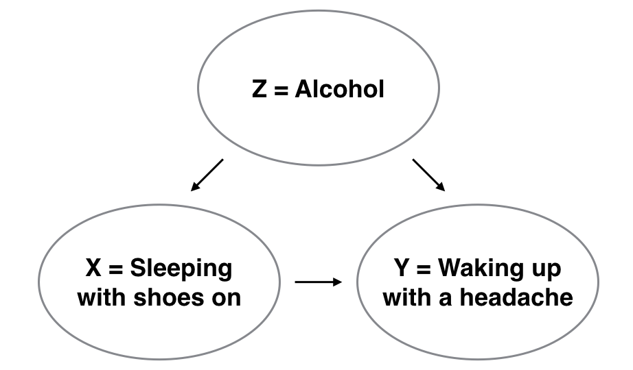
To study the relationship between Y and X, we could use a regression model where the outcome variable is set to Y and the explanatory variable is set to be X, as you’ve been doing throughout this chapter. However, Figure 5.10 also includes a third variable with arrows pointing at both X and Y:
- Z is a confounding variable that affects both X and Y, thereby “confounding” their relationship. Here the confounding variable is alcohol.
Alcohol will cause people to be both more likely to sleep with their shoes on as well as be more likely to wake up with a headache. Thus any regression model of the relationship between X and Y should also use Z as an explanatory variable. In other words, our doctor needs to take into account who had been drinking the night before. In the next chapter, we’ll start covering multiple regression models that allow us to incorporate more than one variable in our regression models.
Establishing causation is a tricky problem and frequently takes either carefully designed experiments or methods to control for the effects of confounding variables. Both these approaches attempt, as best they can, either to take all possible confounding variables into account or negate their impact. This allows researchers to focus only on the relationship of interest: the relationship between the outcome variable Y and the treatment variable X.
As you read news stories, be careful not to fall into the trap of thinking that correlation necessarily implies causation. Check out the Spurious Correlations website for some comical examples of variables that are correlated, but are not causally related.
Coming back to our UN member states data, a confounding variable could be the level of economic development of a country. This could affect both life expectancy and fertility rates. A proxy for looking at the level of economic development could be the Human Development Index (HDI). It measures a country’s average achievements in three basic aspects of human development: health (life expectancy), education (mean and expected years of schooling), and standard of living (gross national income per capita). This is stored in the hdi_2022 column of un_member_states_2024. We explore its relationship with life expectancy and fertility rates:
ggplot(data = un_member_states_2024,
       aes(x = hdi_2022, y = life_expectancy_2022)) +
  geom_point() +
  labs(x = "Human Development Index (HDI)", y = "Life Expectancy")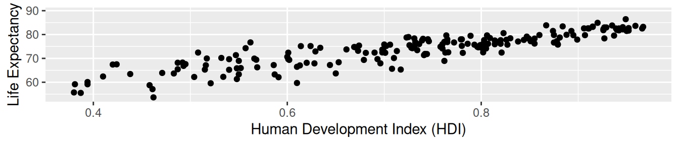
ggplot(data = un_member_states_2024,
       aes(x = hdi_2022, y = fertility_rate_2022)) +
  geom_point() +
  labs(x = "Human Development Index (HDI)", y = "Fertility Rate")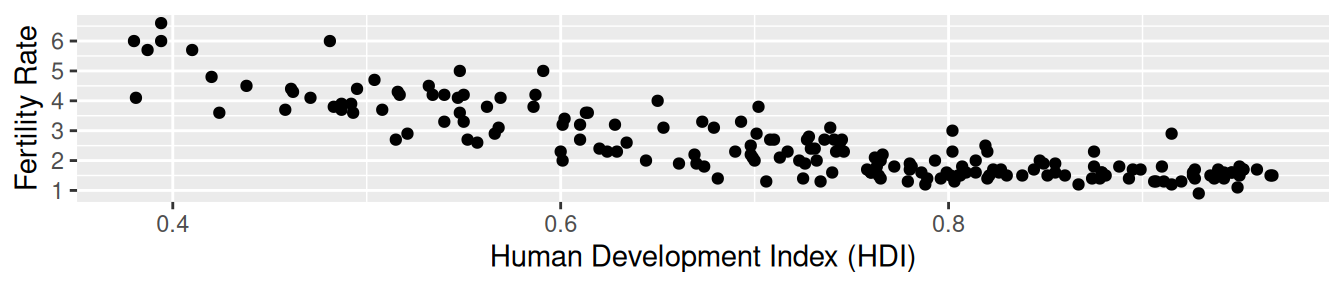
un_member_states_2024 |>
  get_correlation(life_expectancy_2022 ~ hdi_2022, na.rm = TRUE)
# A tibble: 1 × 1
cor
<dbl>
1 0.889un_member_states_2024 |>
get_correlation(fertility_rate_2022 ~ hdi_2022, na.rm = TRUE)# A tibble: 1 × 1
cor
<dbl>
1 -0.849Looking at both of the scatterplots above, we see a strong positive association between the Human Development Index (HDI) and life expectancy, one that curves and flattens out among the countries with the highest HDI values, as well as a strong negative correlation between the Human Development Index (HDI) and fertility rates. The correlation coefficients between the Human Development Index (HDI) and life expectancy, as well as the Human Development Index (HDI) and fertility rates, are also given. These findings as well as some additional understanding of socioeconomic factors suggest that the Human Development Index (HDI) is a confounding variable in the relationship between life expectancy and fertility rates.
5.3.2 Best-fitting line
Regression lines are also known as “best-fitting” lines. But what do we mean by “best”? We unpack the criteria that is used in regression to determine “best.” Recall Figure 5.4, where for Bosnia and Herzegovina we marked the observed value \(y\) with a circle, the fitted value \(\widehat{y}\) with a square, and the residual \(y - \widehat{y}\) with an arrow. We re-display Figure 5.4 in the top-left plot of Figure 5.11 in addition to three more arbitrarily chosen countries:
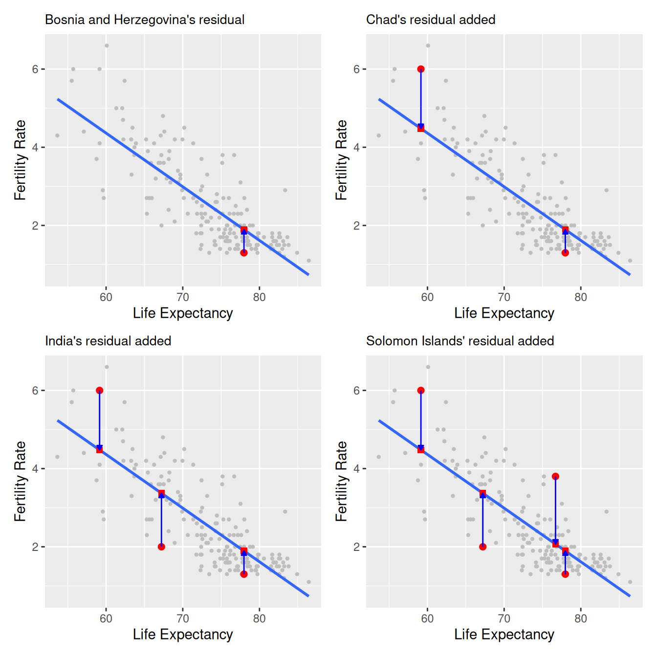
The four plots refer to:
- The country of Bosnia and Herzegovina had a life expectancy \(x = 77.98\) and fertility rate \(y = 1.3\). The residual in this case is \(1.3 - 1.894 = -0.594\), which we mark with an blue arrow in the top-left plot.
- The addition of Chad, which had a life expectancy \(x = 59.15\) and fertility rate \(y = 6\). The residual in this case is \(6 - 4.479 = 1.521\), which we mark with a new blue arrow in the top-right plot.
- The addition of India, which had a life expectancy \(x = 67.22\) and fertility rate \(y = 2\). The residual in this case is \(2 - 3.371 = -1.371\), which we mark with a new blue arrow in the bottom-left plot.
- The addition of the Solomon Islands, which had a life expectancy \(x = 76.7\) and fertility rate \(y = 3.8\). The residual in this case is \(3.8 - 2.069 = 1.731\), which we mark with a new blue arrow in the bottom-right plot.
Now say we repeated this process of computing residuals for all 181 countries with complete information, then we squared all the residuals, and then we summed them. We call this quantity the sum of squared residuals; it is a measure of the lack of fit of a model. Larger values of the sum of squared residuals indicate a bigger lack of fit. This corresponds to a worse-fitting model.
If the regression line fits all the points perfectly, then the sum of squared residuals is 0. This is because if the regression line fits all the points perfectly, then the fitted value \(\widehat{y}\) equals the observed value \(y\) in all cases, and hence the residual \(y - \widehat{y}\) = 0 in all cases, and the sum of even a large number of 0’s is still 0.
Furthermore, of all possible lines we can draw through the cloud of 181 points, the regression line minimizes this value. In other words, the regression and its corresponding fitted values \(\widehat{y}\) minimizes the sum of the squared residuals:
\[ \sum_{i=1}^{n}(y_i - \widehat{y}_i)^2 \]
We use our data-wrangling tools to compute the sum of squared residuals exactly:
# Fit regression model and regression points
demographics_model <- lm(fert_rate ~ life_exp, data = UN_data_ch5)
regression_points <- get_regression_points(demographics_model)

# Compute sum of squared residuals
regression_points |>
  mutate(squared_residuals = residual^2) |>
  summarize(sum_of_squared_residuals = sum(squared_residuals))
[1] 81.3Any other straight line drawn in the figure would yield a sum of squared residuals greater than 81.265. This is a mathematically guaranteed fact that you can prove using calculus and linear algebra. That’s why alternative names for the linear regression line are the best-fitting line and the least-squares line.
Why do we square the residuals (i.e., the arrow lengths)? So that both positive and negative deviations of the same amount are treated equally. (That being said, while taking the absolute value of the residuals would also treat both positive and negative deviations of the same amount equally, squaring the residuals is used for reasons related to calculus: taking derivatives and minimizing functions. To learn more we suggest you consult a textbook on mathematical statistics.)
Learning Check
(LC5.19) Note in Figure 5.12 there are 3 points marked with dots and:
- The “best” fitting solid regression line in blue
- An arbitrarily chosen dotted red line
- Another arbitrarily chosen dashed green line
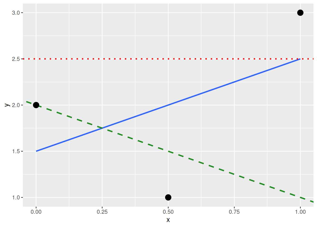
Compute the sum of squared residuals by hand for each line. Show that the regression line in blue has the smallest value of these three lines.
- The “best” fitting solid regression line in blue:
\[ \sum_{i=1}^{n}(y_i - \widehat{y}_i)^2 = (2.0-1.5)^2+(1.0-2.0)^2+(3.0-2.5)^2 = 1.5 \]
- An arbitrarily chosen dotted red line:
\[ \sum_{i=1}^{n}(y_i - \widehat{y}_i)^2 = (2.0-2.5)^2+(1.00-2.5)^2+(3.0-2.5)^2 = 2.75 \]
- Another arbitrarily chosen dashed green line:
\[ \sum_{i=1}^{n}(y_i - \widehat{y}_i)^2 = (2.0-2.0)^2+(1.0-1.5)^2+(3.0-1.0)^2 = 4.25 \]
As calculated, \(1.5 < 2.75 < 4.25\). Therefore, we show that the regression line in blue has the smallest value of the residual sum of squares.
5.3.3 get_regression_x() functions
Recall in this chapter we introduced a wrapper function from the moderndive package:
-
get_regression_points()that returns point-by-point information from a regression model in Section 5.1.3.
What is going on behind the scenes with the get_regression_points() function? We mentioned in Section 5.1.2 that this was an example of a wrapper function. Such functions take other pre-existing functions and “wrap” them into single functions that hide the user from their inner workings. This way all the user needs to worry about is what the inputs look like and what the outputs look like. In this subsection, we’ll “get under the hood” of these functions and see how the “engine” of these wrapper functions works.
The get_regression_points() function is a wrapper function, returning information about the individual points involved in a regression model like the fitted values, observed values, and the residuals. get_regression_points() uses the augment() function in the broom package to produce the data shown in Table 5.9. Additionally, it uses clean_names() from the janitor package (Firke 2024) to clean up the variable names.
| fert_rate | life_exp | fitted | resid |
|---|---|---|---|
| 4.3 | 53.6 | 5.23 | -0.934 |
| 1.4 | 79.5 | 1.69 | -0.289 |
| 2.7 | 78.0 | 1.89 | 0.813 |
| 5.0 | 62.1 | 4.07 | 0.928 |
| 1.6 | 77.8 | 1.92 | -0.318 |
| 1.9 | 78.3 | 1.85 | 0.052 |
| 1.6 | 76.1 | 2.15 | -0.548 |
| 1.6 | 83.1 | 1.19 | 0.408 |
| 1.5 | 82.3 | 1.30 | 0.195 |
| 1.6 | 74.2 | 2.42 | -0.819 |
In this case, it outputs only the variables of interest to students learning regression: the outcome variable \(y\) (fert_rate), all explanatory/predictor variables (life_exp), all resulting fitted values \(\hat{y}\) used by applying the equation of the regression line to life_exp, and the residual \(y - \hat{y}\).
If you are even more curious about how these and other wrapper functions work, take a look at the source code for these functions on GitHub.
Quick checks
Ten questions to assess your understanding. Several are designed around common misconceptions — read each option carefully before peeking at the answer.
Q5-1. In the model lm(fert_rate ~ life_exp, data = UN_data_ch5), what does the slope coefficient represent?
- The expected
fert_ratewhenlife_expis 0 - The total variance in
fert_ratethat is explained bylife_exp - The expected change in
fert_rateper extra year oflife_exp - The correlation between
fert_rateandlife_exp
(c) Slope = expected change in \(y\) per one-unit change in \(x\): here, the expected change in fert_rate for each additional year of life_exp. The intercept (option a) is the predicted \(y\) when \(x = 0\).
Q5-2. A residual is:
- The slope of the least-squares fitted line
- The sum of squared errors across all the data points
- The R-squared value reported by the model
- The vertical gap from a point to the fitted line
(d) \(e_i = y_i - \hat{y}_i\). Small residuals (in aggregate) suggest the model fits well.
Q5-3. A correlation coefficient of \(r = -0.78\) between two variables means:
- The variables are unrelated
- The variables have a perfect linear relationship
- There is a strong negative linear relationship
- The relationship is causal
(c) Negative sign = inverse relationship; \(|r|\) close to 1 = strong. Causation requires a randomized experiment or careful confounding adjustment, not just a strong correlation.
Q5-4. The chapter’s regression lm(fert_rate ~ life_exp, data = UN_data_ch5) produces an intercept of about 12.6. Should you interpret this as “a country with a life expectancy of 0 years is predicted to have a fertility rate of about 12.6”?
- Yes, that’s exactly what the intercept means, and it’s a useful summary here
- The intercept is wrong; the model needs refitting
- No; an intercept never has a meaningful interpretation
- Mathematically yes; not meaningful, it extrapolates outside the data
(d) The intercept has a practical interpretation only when \(x = 0\) falls within (or near) the observed range of \(x\). A life expectancy of 0 is impossible — the observed values run from roughly 54 to 86 years — so the math is fine, but the line just isn’t valid that far from the data.
Q5-5. For one observation, the observed value is \(y = 80\) kg and the fitted value from the line is \(\widehat{y} = 76\) kg. The residual for this point is:
- \(76 - 80 = -4\) (fitted minus observed)
- \(80 - 76 = 4\) (observed minus fitted)
- \(80 + 76 = 156\)
- \(80 / 76 \approx 1.05\)
(b) A residual is observed minus fitted: \(\text{residual} = y - \widehat{y}\). A positive residual means the point sits above the regression line (the model under-predicted), a negative one means it sits below. The get_regression_points() table makes this columnwise: \(y\), \(\widehat{y}\), and residual = y - y_hat.
Q5-6. A regression has slope = 2.5 for weight ~ height (kg ~ cm). The correct interpretation:
- Weight increases 2.5 kg on average per additional cm of height
- Height causes an increase in weight
- Every tall person weighs exactly 2.5 kg more than every short person
- Weight equals 2.5 times height
(a) “On average” is critical. The slope describes a population-level average relationship, individual people vary around the line. Causation (b) requires more than a regression: an experiment or careful confounder adjustment.
Q5-7. A correlation of \(r = 0.95\) between two variables guarantees:
- A strong linear relationship
- The variables are normally distributed
- Causation
- The slope is 0.95
(a) Correlation only captures linear association. It says nothing about causation, doesn’t equal the slope value (slopes depend on units; \(r\) is unitless), and doesn’t imply normality.
Q5-8. A scatterplot shows a clear U-shaped pattern. You compute the correlation and get \(r \approx 0\). Why is this misleading?
- The data must contain an error
- \(r\) measures only linear association
- Linear regression always gives \(r = 0\) for U-shapes
- You need to collect more data
(b) Always plot the data first. A near-zero \(r\) does not mean “no relationship”; it means “no linear relationship”. A U-shape has zero linear trend but a strong non-linear pattern.
Q5-9. “Least squares” regression chooses the slope and intercept that:
- Make every residual exactly equal to 0
- Minimize the sum of the signed residuals (\(\sum (y_i - \widehat{y}_i)\))
- Maximize the slope of the fitted line
- Minimize the sum of squared residuals (\(\sum (y_i - \widehat{y}_i)^2\))
(d) That’s where the name comes from: least (smallest possible) squares (of the residuals). Why square? Squaring (i) makes negative and positive residuals contribute equally, so they can’t cancel out, and (ii) counts a residual that’s twice as far off four times as much. Be careful with that second property: it means a single far-off point can pull the line noticeably, so least squares is not outlier-resistant; squaring is exactly what lets one extreme observation exert outsized influence. (Fits that are resistant, like minimizing the sum of absolute residuals, are much less moved by one stray point.) This is why Chapter 10 returns to outliers and influential observations. Option (b) is wrong because positive and negative residuals would cancel; option (a) is impossible unless every point already lies on a single line.
Q5-10. In lm(weight ~ sex, data = vball) (a regression with one categorical predictor, levels F and M; vball is a volleyball-athlete dataset you’ll work with in Chapter 10), the fitted value \(\widehat{\text{weight}}\) for any male volleyball player equals:
- The mean weight among male players in
vball - Zero, since
Mis not the baseline level - The overall mean weight across all
vballplayers - The slope coefficient
sexMon its own
(a) A regression with one categorical predictor reduces to “predict each group’s mean for that group.” The intercept is the baseline group’s mean; each non-baseline coefficient (here sexM) is the difference between that group’s mean and the baseline’s. That’s why get_regression_points() for a categorical-predictor model gives fitted values that line up exactly with vball |> group_by(sex) |> summarize(mean(weight)).
| Function | What it does | Quick example |
|---|---|---|
lm(y ~ x, data = df) |
Fit a simple linear regression | lm(fert_rate ~ life_exp, data = UN_data_ch5) |
coef(model) |
Regression coefficients (intercept + slope(s)) | coef(demographics_model) |
get_regression_points(model) |
Tidy table of fitted values + residuals per observation | get_regression_points(model) |
cor(x, y) |
Pearson correlation coefficient | cor(UN_data_ch5$fert_rate, UN_data_ch5$life_exp) |
geom_smooth(method = "lm", se = FALSE) |
Overlay a fitted regression line on a ggplot
|
... + geom_smooth(method = "lm", se = FALSE) |
Exercises
The end-of-chapter exercises use planets (6,278 planet-rows × 28 columns, one row per confirmed exoplanet) from the exoplanetdata package. The natural numerical pair is mass_earth (Earth masses) and radius_earth (Earth radii); the natural categorical predictor is discovery_method. Solutions are available to instructors separately.
Difficulty stars: ★ warm-up, ★★ standard application, ★★★ critical thinking. Solutions are available to instructors separately.
Setup and EDA
EX5.1 (★) Meet the data. Before fitting anything, get to know the dataset this chapter’s exercises revolve around: planets from the exoplanetdata package. Run ?planets (the same page lives on the package website at https://moderndive.github.io/exoplanetdata/reference/planets.html) and answer from the documentation:
- What is the observational unit: what does one row represent, and where does the data come from?
- How many rows and variables should you expect?
- What do
radius_earthandmass_earthmeasure, and in what units?
- What do
- This chapter uses
discovery_methodas a categorical variable: what does the documentation say it records?
- This chapter uses
Finish by confirming your answer to (b) with glimpse(planets).
EX5.2 (★) Filter planets (from the exoplanetdata package) to complete cases on radius_earth, mass_earth, discovery_method, and eq_temp_k (drop rows missing any of these), and save the result as planets_lite. How many rows remain?
EX5.3 (★) Compute summary statistics (mean, sd, min, max) for radius_earth and mass_earth in planets_lite.
EX5.4 (★) Build a scatterplot of mass_earth (y) vs radius_earth (x) on planets_lite. Roughly describe the relationship.
EX5.5 (★★) Compute the correlation between radius_earth and mass_earth with get_correlation(). Interpret the value in one sentence.
EX5.6 (★★) A colleague hands you a single number about planets_lite (“the correlation between radius and mass is about 0.44”) and claims that’s all anyone needs to know about the relationship. Reproduce that number with get_correlation(), then make the scatterplot. Name two specific features of the radius-mass relationship that are plainly visible in the scatter but that no correlation value could ever tell you. (Learning check LC5.2 asked why EDA comes first; here you demonstrate it.)
Simple linear regression: one numerical predictor
EX5.7 (★) Fit a simple linear regression of planet mass_earth on radius_earth (use the planets_lite data; call the model model_mass_radius). Then use coef(model_mass_radius) to print the regression coefficients, the intercept and the radius_earth slope.
EX5.8 (★★) Interpret the slope coefficient on radius_earth. Use units in your sentence.
EX5.9 (★★) Interpret the intercept. Why is the literal interpretation (“expected mass of a planet with 0 Earth-radii”) misleading?
EX5.10 (★★★) Repeat EX5.7 but for only planets discovered by Radial Velocity (filter planets_lite to discovery_method == "Radial Velocity") and call the model model_mass_radius_rv. Compare the two slopes, does mass rise faster or slower with radius for radial-velocity planets vs the full sample?
Observed/fitted values and residuals
EX5.11 (★★) Use get_regression_points(model_mass_radius) to inspect fitted values and residuals. Print the first 5 rows, then answer from what you see:
- Which of the first five planets does the model over-predict, and which does it under-predict?
- What does a positive residual mean for planet 1, in one sentence?
- Verify planet 1’s fitted value (
mass_earth_hat) by hand: plug itsradius_earthinto the intercept and slope fromcoef(model_mass_radius).
- Verify planet 1’s fitted value (
EX5.12 (★★) Use the model to predict the mass of a planet with radius_earth = 10. Pull the intercept and slope from coef(model_mass_radius) and compute intercept + slope * 10 by hand. (No need for any special prediction function, a fitted line is just y = a + bx.)
Simple linear regression: one categorical predictor
EX5.13 (★★) Create pl2 by filtering planets_lite to the two most common discovery methods ("Transit" and "Radial Velocity"), then build side-by-side boxplots of mass_earth by discovery_method. The gas-giant tail will squash the boxes, so zoom the y-axis with coord_cartesian(ylim = c(0, 600)), which crops the view without changing the boxes (unlike filtering the data first, which would recompute them). Which method’s planets have the higher median mass, and what does that tell you about how each method finds planets?
EX5.14 (★★) Fit model_mass_method <- lm(mass_earth ~ discovery_method, data = pl2) and print coef(model_mass_method). Which method is the baseline (absorbed into the intercept)?
EX5.15 (★★) Interpret the intercept of model_mass_method in one sentence, what does it represent?
EX5.16 (★★) Interpret the discovery_methodTransit coefficient, what does it represent? Connect it to a difference of group means.
EX5.17 (★★★) Compute the two group means directly with dplyr (group_by(discovery_method) |> summarize(mean(mass_earth))). Confirm that intercept = mean of the baseline group, and intercept + slope = mean of the other group.
EX5.18 (★★★) On the full planets_lite (all discovery methods), compare the mean mass_earth by discovery_method. Which method finds the most massive planets on average, and why does that make physical sense?
EX5.19 (★★★) Filter to the 5 most common discovery methods (most planet-rows). Fit lm(mass_earth ~ discovery_method) and read the coefficients, each non-baseline method gets its own. Interpret one of them.
Observed/fitted values and residuals
EX5.20 (★★) Using model_mass_radius, find the planet with the largest positive residual (most underpredicted) and the one with the largest negative residual (most overpredicted). Report each planet’s planet_name, radius_earth, and mass_earth. In one sentence each, what does the sign of the residual mean for that specific planet?
EX5.21 (★★★) Using get_regression_points(model_mass_radius), compute the sum of the residual column. What value do you get (approximately)? Briefly, why is the sum of residuals forced to be (essentially) zero whenever the regression model includes an intercept? (The chapter discusses the sum of squared residuals; this zero-sum fact is one step beyond it; reason it out from what the intercept does to the line’s height.)
Simple linear regression: one categorical predictor
EX5.22 (★★★) From model_mass_method (EX 5.14), pull get_regression_points(). Confirm that each planet’s residual equals its mass_earth minus the group mean for its discovery_method. (Match the per-method means from EX 5.17.) Why must this be true for a regression with a single categorical predictor?
Residuals, diagnostics, and model fit
EX5.23 (★★★) A handful of planets are extreme outliers in mass given their radius. Identify the top 5 by absolute residual from model_mass_radius, reporting each planet’s planet_name and discovery_method alongside its radius_earth, mass_earth, and residual.
EX5.24 (★★★) What single piece of evidence would convince you that a single straight line is not a good model for mass_earth ~ radius_earth on planets_lite?
Need a hint?
get_regression_points() gives you the columns you need. Residual plots formally belong to Chapter 10, but you can build one with this chapter’s tools.
Correlation is not necessarily causation
EX5.25 (★★★) Build a regression of radius_earth on discovery_year for planets_lite. Report and interpret the slope, with units, in one sentence.
EX5.26 (★★★) A reader sees your slope from EX5.25 and concludes “being discovered more recently causes planets to be smaller” (i.e., planets are shrinking over time). Use the chapter’s discussion of correlation vs causation to refute this in 2-3 sentences.
EX5.27 (★★★) discovery_method is plausibly a strong confounder of the mass-radius relationship (it shapes which planets enter the catalog). What’s a simple way to control for discovery method without fitting a model with two predictors yet?
Best-fitting line
EX5.28 (★★) Make the least-squares idea concrete on a tiny toy dataset: x = c(1.5, 2.4, 3.1, 4.8), y = c(2.3, 4.1, 5.4, 8.9). (a) Fit lm(y ~ x) and read off the slope and intercept. (b) Compute the fitted values \(\hat{y}_i\) and the residuals \(y_i - \hat{y}_i\). (c) Sum the squared residuals (SSE). (d) Without re-fitting, replace the slope with 1.5 (keep the intercept from lm()) and recompute the SSE. Confirm it’s larger than the lm() SSE. Why must that be true for any slope you try?
get_regression_*() companion functions
EX5.29 (★★) Section 5.3.3 introduces get_regression_points(), the moderndive companion that reports the observed \(y\), the fitted \(\widehat{y}\), and the residual for a fitted model. Re-fit model_mass_radius <- lm(mass_earth ~ radius_earth, data = planets_lite), apply get_regression_points(model_mass_radius), and in one sentence name the unit of information it returns (one row per ____ ?). (Two sibling functions round out the family: get_regression_table() returns the inference table (Chapter 10’s central tool) and get_regression_summaries() returns model-fit summaries, introduced in extension EX 5.47.)
Critical thinking and synthesis
EX5.30 (★★★) Pick two discovery methods and fit a regression mass_earth ~ radius_earth to each separately. Compare the slopes, what does that imply about pooling them in a single model?
EX5.31 (★★★) Why does the baseline level matter for interpreting categorical regression, but not for the model’s predictions?
EX5.32 (★★★) Name two situations in which a linear regression model is a poor choice.
EX5.33 (★★★) Build a categorical regression of your choosing (one categorical predictor with at least 3 levels), interpret the intercept and one slope coefficient, and write a 1-sentence headline finding.
EX5.34 (★★) A regression call lm(mass_earth ~ radius_earth, data = planets) will succeed even though many rows have NA in mass_earth or radius_earth. What does R do silently? (The chapter sidesteps this by filtering to complete cases before fitting, as in EX 5.2. What happens if you skip that step?)
EX5.35 (★★★) Name two questions about exoplanets that this dataset cannot answer with regression alone. For each, what extra data would help?
EX5.36 (★★★) Open exploration: pick any discovery method (or planet subset), fit a regression with lm() that tests a question you find interesting, read the coefficients with coef(), and write your finding as a one-sentence headline. (Overall model-fit measures such as R² only appear in the extension exercises (EX 5.47 introduces them), so keep your headline to the coefficients for now.)
Extensions
The exercises below deliberately introduce functions and concepts beyond what this chapter teaches — log transformations, predict(), new packages, foreshadowing later chapters. They are optional, aimed at readers who want to push further. The main Exercises and Quick checks above stick strictly to what this chapter covers.
EX5.37 (◆◆) get_correlation() for multi-predictor correlations (moderndive). Chapter 5 introduces correlation on one pair at a time. The current moderndive package extends get_correlation() to accept many predictors on the right-hand side, returning a tidy long tibble by default (one row per predictor) or a wide one with wide = TRUE. Try both forms on planets_lite with mass_earth ~ radius_earth + eq_temp_k. Why is this more useful than calling get_correlation() separately for each predictor when you have many candidates?
EX5.38 (◆◆) predict() for many new points at once. EX 5.12 had you plug into the fitted equation by hand. R’s built-in predict() does the same thing for any number of new rows in a single call. Build a small new_planets data frame with three radii (e.g., 1, 5, 15 Earth-radii) and predict their masses. Why is predict() the right tool when you want to apply a fitted model to many new observations at once?
EX5.39 (◆◆◆) Confidence intervals on the mean prediction. predict(..., interval = "confidence") adds lwr/upr columns: the 95 % CI for the mean response at each new x value. (Chapter 10 will formally derive these.) Run the snippet. The CI is narrow at typical radii and wider at extreme ones, why?
EX5.40 (◆◆) loess vs lm smoothers. geom_smooth(method = "loess") draws a locally-fitted curve that bends to follow the data; geom_smooth(method = "lm") draws the best straight line. Plot both on the mass_earth vs radius_earth scatter and compare. Where do the two smoothers agree, and where does the loess curve depart from the line, at the lower end, the upper end, or both? What would that departure tell you about the appropriateness of a simple-LR model? Then run a cheap sensitivity check: redraw the same two smoothers on planets_lite |> filter(radius_earth < 25) (planets_lite contains a handful of planets with far larger radii) and compare against the full-data version. What changes about each smoother, and what does that tell you about how much a few extreme points steer the fits?
EX5.41 (◆◆◆) Bootstrap inference on a correlation with infer. Chapter 5 reports the observed correlation; the infer package (which you’ll meet fully in Chapter 8) lets you put a 95 % confidence interval around it by bootstrapping, resampling the planets with replacement many times. Using specify(mass_earth ~ radius_earth) |> generate(reps = 1000, type = "bootstrap") |> calculate(stat = "correlation"), build a bootstrap distribution of the radius-mass correlation and compute its 95 % CI with get_confidence_interval(). Briefly: what does it mean that the interval does not contain 0? (For more, the infer package’s documentation website at https://infer.tidymodels.org/ explains the specify/generate/calculate workflow with visual examples, a good companion as you preview Chapter 8.)
EX5.42 (◆◆◆) Polynomial regression with poly(). Fitting a curve (instead of a line) is as simple as lm(y ~ poly(x, 2)), and the current moderndive package surfaces the original x column cleanly in get_regression_points() rather than the raw basis matrix. Try a degree-2 polynomial on mass_earth ~ radius_earth. Does the quadratic term meaningfully change the R² (the share of variation in \(y\) the model accounts for; EX 5.47 gives it a fuller treatment) vs the simple linear regression from EX 5.7, and what does your answer suggest about the right fix for this curve?
EX5.43 (◆◆◆) Regression through the origin. lm(y ~ x - 1) forces the intercept to be zero, meaning “predict 0 when x = 0.” For the chapter’s fertility model an intercept at life_exp = 0 had no practical meaning (and EX 5.9’s mass intercept was even negative), but for mass_earth ~ radius_earth the origin is physically meaningful, a planet of zero radius should have zero mass. Fit both lm(mass_earth ~ radius_earth) and lm(mass_earth ~ radius_earth - 1) and compare. Does the physically-sensible origin make through-the-origin the right model here? When is it appropriate?
EX5.44 (◆◆) summary(lm) vs get_regression_table(). get_regression_table() returns a clean tidy tibble, readable, plot-friendly, easy to filter. Base R’s summary() prints a richer output with residual quartiles, the F-statistic (foreshadowing Ch 10), and R²/adjusted R² (introduced in extension EX 5.47). Run both. When would you reach for summary() instead of get_regression_table()?
EX5.45 (◆◆◆) broom as an alternative tidier. The broom package provides three tidiers that span the use cases of moderndive’s get_regression_*() family, tidy() for coefficients, glance() for one-row model summaries, augment() for per-observation fitted-and-residual tables. Run all three on model_mass_radius. How does augment() differ from get_regression_points()? When might you prefer broom over moderndive?
EX5.46 (◆◆◆) geom_categorical_model() for one-categorical-predictor regression (moderndive). Chapter 5’s lm(mass_earth ~ discovery_method) produces group means, one estimate per level of the categorical predictor. moderndive::geom_categorical_model() is a custom ggplot geom that draws those fitted group means right on a plot of the raw data, with CI bands. Build the plot on pl2 for mass_earth ~ discovery_method. How does this visualization make the regression fit visible in a way get_regression_table() alone doesn’t?
EX5.47 (◆◆) R² via get_regression_summaries() (moderndive). The book’s chapters never develop R² (Chapter 10 focuses on inference for the coefficients), so this extension introduces it: R² is the share of the variation in \(y\) that the fitted line accounts for, on a 0-to-1 scale. Run get_regression_summaries(model_mass_radius) and report R². Interpret it in one sentence (in context). (Later chapters’ extension exercises refer back to this one.)
EX5.48 (◆◆) R² in plain English. R² (computed by get_regression_summaries(model)$r_squared; introduced in the previous extension, EX 5.47) is the share of the variation in \(y\) that the fitted line accounts for. Translate model_mass_radius’s R² into a plain-English sentence aimed at someone with no statistics background, name the units, the comparison (“100% would be a perfect line through every point”), and avoid jargon.
5.4 Conclusion
5.4.1 Additional resources
An R script file of all R code used in this chapter is available here.
As we suggested in Section 5.1.1, interpreting coefficients that are not close to the extreme values of -1, 0, and 1 can be somewhat subjective. To help develop your sense of correlation coefficients, we suggest you play the 80s-style video game called, “Guess the Correlation,” at http://guessthecorrelation.com/ previewed in Figure 5.13.
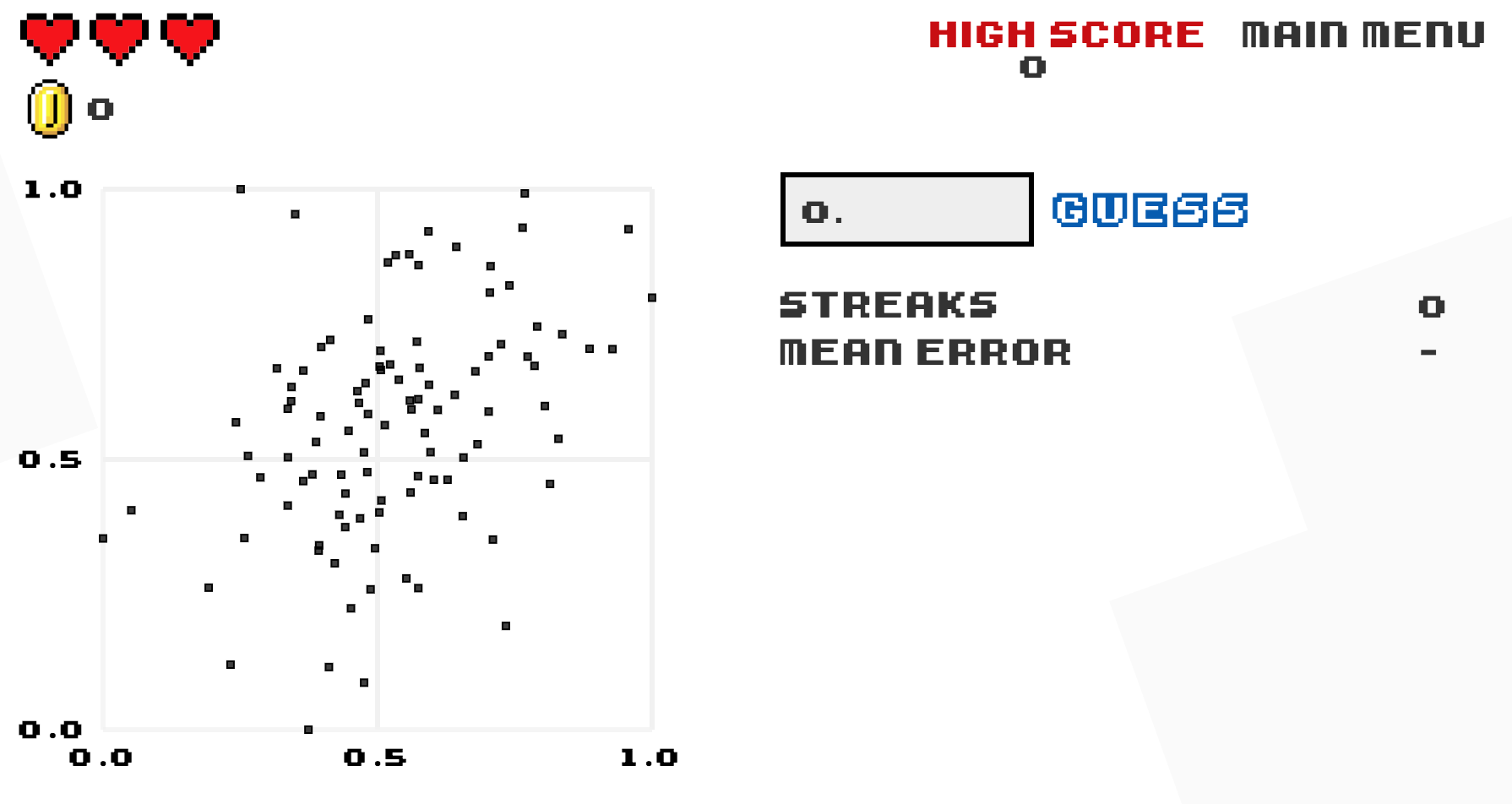
5.4.2 What’s to come?
In this chapter, you’ve studied the term simple linear regression, where you fit models that only have one explanatory variable. In Chapter 6, we’ll study multiple regression, where our regression models can now have more than one explanatory variable moving a little bit more advanced than the basic form of simple linear regression! In particular, we’ll consider two scenarios: regression models with one numerical and one categorical explanatory variable and regression models with two numerical explanatory variables. This will allow you to construct more sophisticated and more powerful models, all in the hopes of better explaining your outcome variable \(y\).