4 Data Importing and Tidy Data
- Recognize when a dataset is in tidy format (each variable a column, each observation a row)
- Convert a “wide” dataset to tidy format with
tidyr::pivot_longer()(and back withpivot_wider()) - Import spreadsheet data into R from CSV files using
readr::read_csv() - Identify the role of the
tidyverse“umbrella” package
In Section 1.2.1, we introduced the concept of a data frame in R: a rectangular spreadsheet-like representation of data where the rows correspond to observations and the columns correspond to variables describing each observation. In Section 1.4, we started exploring our first data frame: the flights data frame included in the nycflights23 package. In Chapter 2, we created visualizations based on the data included in flights and other data frames such as weather. In Chapter 3, we learned how to take existing data frames and transform/modify them to suit our ends.
In this final chapter of the “Data Science with tidyverse” portion of the book, we extend some of these ideas by discussing a type of data formatting called “tidy” data. You will see that having data stored in “tidy” format is about more than just what the everyday definition of the term “tidy” might suggest: having your data “neatly organized.” Instead, we define the term “tidy” as it’s used by data scientists who use R, outlining a set of rules by which data is saved.
Knowledge of this type of data formatting was not necessary for our treatment of data visualization in Chapter 2 and data wrangling in Chapter 3. This is because all the data used were already in “tidy” format. In this chapter, we’ll now see that this format is essential to using the tools we covered up until now. Furthermore, it will also be useful for all subsequent chapters in this book when we cover regression and statistical inference. First, however, we’ll show you how to import spreadsheet data in R.
Needed packages
Let’s load all the packages needed for this chapter (this assumes you’ve already installed them). If needed, read Section 1.3 for information on how to install and load R packages.
Note that when you load the fivethirtyeight package, you’ll receive the following message:
Some larger datasets need to be installed separately, like senators and house_district_forecast. To install these, we recommend you install the fivethirtyeightdata package by running: install.packages(‘fivethirtyeightdata’, repos = ‘https://fivethirtyeightdata.github.io/drat/’, type = ‘source’)
This message can be ignored for the purposes of this book, but if you’d like to explore these larger datasets, you can install the fivethirtyeightdata package as suggested.
4.1 Importing data
Up to this point, we’ve almost entirely used data stored inside of an R package. Say instead you have your own data saved on your computer or somewhere online. How can you analyze this data in R? Spreadsheet data is often saved in one of the following three formats:
First, a Comma Separated Values .csv file. You can think of a .csv file as a bare-bones spreadsheet where:
- Each line in the file corresponds to one row of data/one observation.
- Values for each line are separated with commas. In other words, the values of different variables are separated by commas in each row.
- The first line is often, but not always, a header row indicating the names of the columns/variables.
Second, an Excel .xlsx spreadsheet file. This format is based on Microsoft’s proprietary Excel software. As opposed to bare-bones .csv files, .xlsx Excel files contain a lot of meta-data (data about data). Recall we saw a previous example of meta-data in Section 3.4 when adding “group structure” meta-data to a data frame by using the group_by() verb. Some examples of Excel spreadsheet meta-data include the use of bold and italic fonts, colored cells, different column widths, and formula macros.
Third, a Google Sheets file, which is a “cloud” or online-based way to work with a spreadsheet. Google Sheets allows you to download your data in both comma separated values .csv and Excel .xlsx formats. One way to import Google Sheets data in R is to go to the Google Sheets menu bar -> File -> Download as -> Select “Microsoft Excel” or “Comma-separated values” and then load that data into R. A more advanced way to import Google Sheets data in R is by using the googlesheets4 package, a method we leave to a more advanced data science book.
We’ll cover two methods for importing .csv and .xlsx spreadsheet data in R: one using the console and the other using RStudio’s graphical user interface, abbreviated as “GUI.”
4.1.1 Using the console
First, let’s import a Comma Separated Values .csv file that exists on the internet. The .csv file dem_score.csv contains ratings of the level of democracy in different countries spanning 1952 to 1992 and is accessible at https://moderndive.com/data/dem_score.csv. Let’s use the read_csv() function from the readr (Wickham et al. 2026) package to read it off the web, import it into R, and save it in a data frame called dem_score.
# A tibble: 96 × 10
   country    `1952` `1957` `1962` `1967` `1972` `1977` `1982` `1987` `1992`
   <chr>       <dbl>  <dbl>  <dbl>  <dbl>  <dbl>  <dbl>  <dbl>  <dbl>  <dbl>
 1 Albania        -9     -9     -9     -9     -9     -9     -9     -9      5
 2 Argentina      -9     -1     -1     -9     -9     -9     -8      8      7
 3 Armenia        -9     -7     -7     -7     -7     -7     -7     -7      7
 4 Australia      10     10     10     10     10     10     10     10     10
 5 Austria        10     10     10     10     10     10     10     10     10
 6 Azerbaijan     -9     -7     -7     -7     -7     -7     -7     -7      1
 7 Belarus        -9     -7     -7     -7     -7     -7     -7     -7      7
 8 Belgium        10     10     10     10     10     10     10     10     10
 9 Bhutan        -10    -10    -10    -10    -10    -10    -10    -10    -10
10 Bolivia        -4     -3     -3     -4     -7     -7      8      9      9
# ℹ 86 more rows
In this dem_score data frame, the minimum value of -10 corresponds to a highly autocratic nation, whereas a value of 10 corresponds to a highly democratic nation. Note also that backticks surround the different variable names. Variable names in R by default are not allowed to start with a number nor include spaces, but we can get around this fact by surrounding the column name with backticks. We’ll revisit the dem_score data frame in a case study in the upcoming Section 4.3.
Note that the read_csv() function included in the readr package is different than the read.csv() function that comes installed with R. While the difference in the names might seem trivial (an _ instead of a .), the read_csv() function is, in our opinion, easier to use since it can more easily read data off the web and generally imports data at a much faster speed. Furthermore, the read_csv() function included in the readr saves data frames as tibbles by default.
4.1.2 Using RStudio’s interface
Let’s read in the exact same data, but this time from an Excel file saved on your computer. Furthermore, we’ll do this using RStudio’s graphical interface instead of running read_csv() in the console. First, download the Excel file dem_score.xlsx by going to https://moderndive.com/data/dem_score.xlsx, then
- Go to the Files pane of RStudio.
- Navigate to the directory (i.e., folder on your computer) where the downloaded
dem_score.xlsxExcel file is saved. For example, this might be in your Downloads folder. - Click on
dem_score.xlsx. - Click “Import Dataset…”
At this point, you should see a screen pop-up like in Figure 4.1. After clicking on the “Import” button on the bottom right of Figure 4.1, RStudio will save this spreadsheet’s data in a data frame called dem_score and display its contents in the spreadsheet viewer.
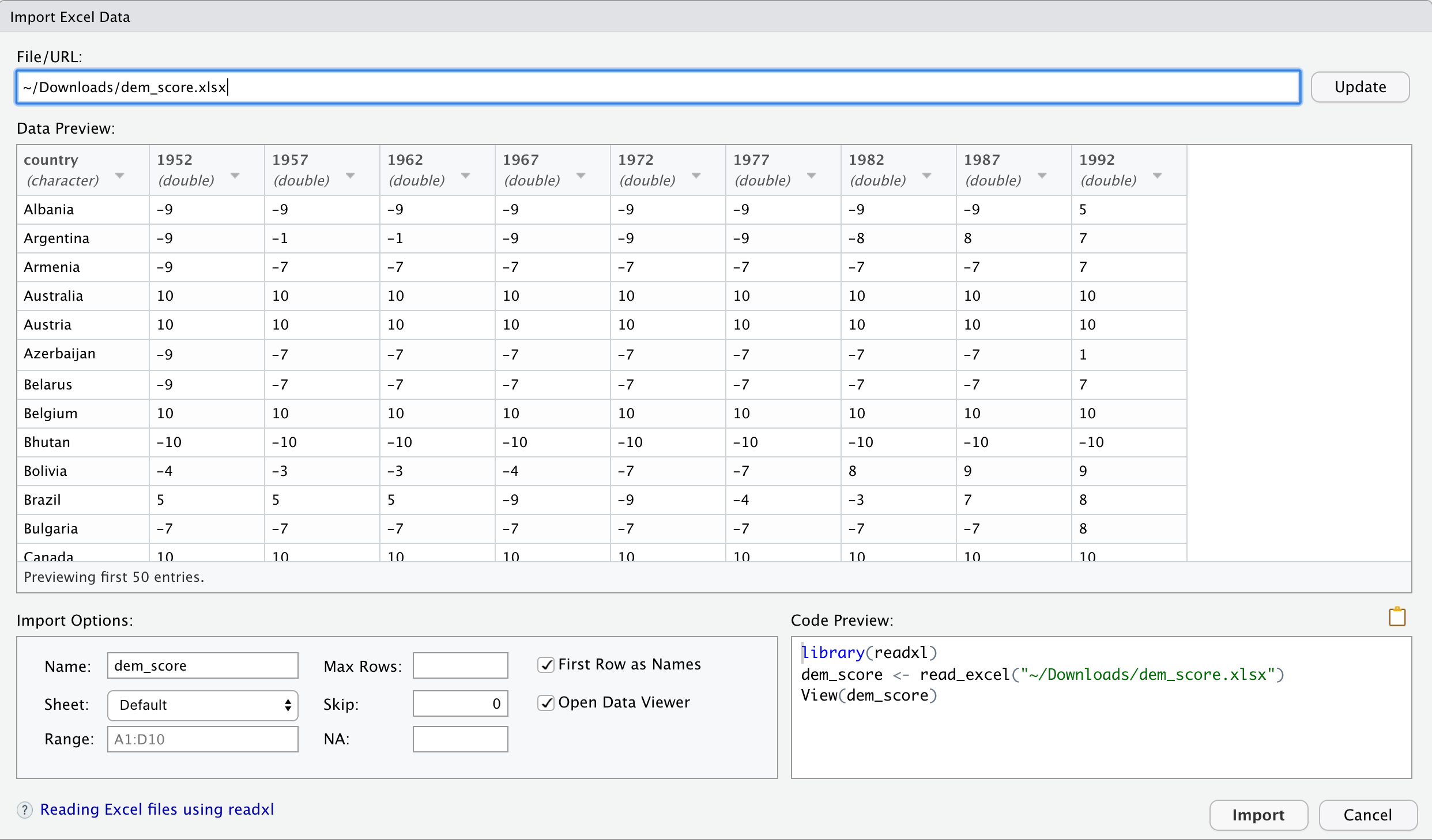
Furthermore, note the “Code Preview” block in the bottom right of Figure 4.1. You can copy and paste this code to reload your data again later programmatically, instead of repeating this manual point-and-click process.
4.2 Tidy data
Let’s now switch gears and learn about the concept of “tidy” data format with a motivating example from the fivethirtyeight package. The fivethirtyeight package (Kim et al. 2021) provides access to the datasets used in many articles published by the data journalism website, FiveThirtyEight.com. For a complete list of all 128 datasets included in the fivethirtyeight package, check out the package webpage by going to: https://fivethirtyeight-r.netlify.app/articles/fivethirtyeight.html.
Let’s focus our attention on the drinks data frame and look at its first 5 rows:
# A tibble: 5 × 5
country beer_servings spirit_servings wine_servings total_litres_of_pure…¹
<chr> <int> <int> <int> <dbl>
1 Afghanistan 0 0 0 0
2 Albania 89 132 54 4.9
3 Algeria 25 0 14 0.7
4 Andorra 245 138 312 12.4
5 Angola 217 57 45 5.9
# ℹ abbreviated name: ¹total_litres_of_pure_alcoholAfter reading the help file by running ?drinks, you’ll see that drinks is a data frame containing results from a survey of the average number of servings of beer, spirits, and wine consumed in 193 countries. This data was originally reported on FiveThirtyEight.com in Mona Chalabi’s article: “Dear Mona Followup: Where Do People Drink The Most Beer, Wine And Spirits?”.
Let’s apply some of the data-wrangling verbs we learned in Chapter 3 on the drinks data frame:
-
filter()to only consider 4 countries: the United States, China, Italy, and Saudi Arabia, then -
select()all columns excepttotal_litres_of_pure_alcoholby using the-sign, then -
rename()beer_servings,spirit_servings, andwine_servingstobeer,spirit, andwine, respectively.
and save the resulting data frame in drinks_smaller:
# A tibble: 4 × 4
  country       beer spirit  wine
  <chr>        <int>  <int> <int>
1 China           79    192     8
2 Italy           85     42   237
3 Saudi Arabia     0      5     0
4 USA            249    158    84
Let’s now ask ourselves a question: “Using the drinks_smaller data frame, how would we create the side-by-side barplot in Figure 4.2?”. Recall we saw barplots displaying two categorical variables in Section 2.8.3.
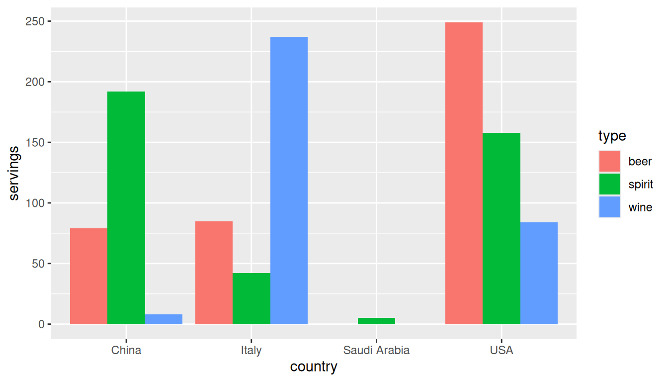
Let’s break down the grammar of graphics we introduced in Section 2.1:
- The categorical variable
countrywith four levels (China, Italy, Saudi Arabia, USA) would have to be mapped to thex-position of the bars. - The numerical variable
servingswould have to be mapped to they-position of the bars (the height of the bars). - The categorical variable
typewith three levels (beer, spirit, wine) would have to be mapped to thefillcolor of the bars.
Observe that drinks_smaller has three separate variables beer, spirit, and wine. In order to use the ggplot() function to recreate the barplot in Figure 4.2 however, we need a single variable type with three possible values: beer, spirit, and wine. We could then map this type variable to the fill aesthetic of our plot. In other words, to recreate the barplot in Figure 4.2, our data frame would have to look like this:
drinks_smaller_tidy# A tibble: 12 × 3
country type servings
<chr> <chr> <int>
1 China beer 79
2 Italy beer 85
3 Saudi Arabia beer 0
4 USA beer 249
5 China spirit 192
6 Italy spirit 42
7 Saudi Arabia spirit 5
8 USA spirit 158
9 China wine 8
10 Italy wine 237
11 Saudi Arabia wine 0
12 USA wine 84Observe that while drinks_smaller and drinks_smaller_tidy are both rectangular in shape and contain the same 12 numerical values (3 alcohol types by 4 countries), they are formatted differently. drinks_smaller is formatted in what’s known as “wide” format, whereas drinks_smaller_tidy is formatted in what’s known as “long/narrow” format.
In the context of data science in R, long/narrow format is also known as “tidy” format. In order to use the ggplot2 and dplyr packages for data visualization and data wrangling, your input data frames must be in “tidy” format. Thus, all non-“tidy” data must be converted to “tidy” format first. Before we convert non-“tidy” data frames like drinks_smaller to “tidy” data frames like drinks_smaller_tidy, let’s define “tidy” data.
4.2.1 Definition of tidy data
You have surely heard the word “tidy” in your life:
- “Tidy up your room!”
- “Write your homework in a tidy way, so it is easier to provide feedback.”
- Marie Kondo’s best-selling book, The Life-Changing Magic of Tidying Up: The Japanese Art of Decluttering and Organizing, and Netflix TV series Tidying Up with Marie Kondo.
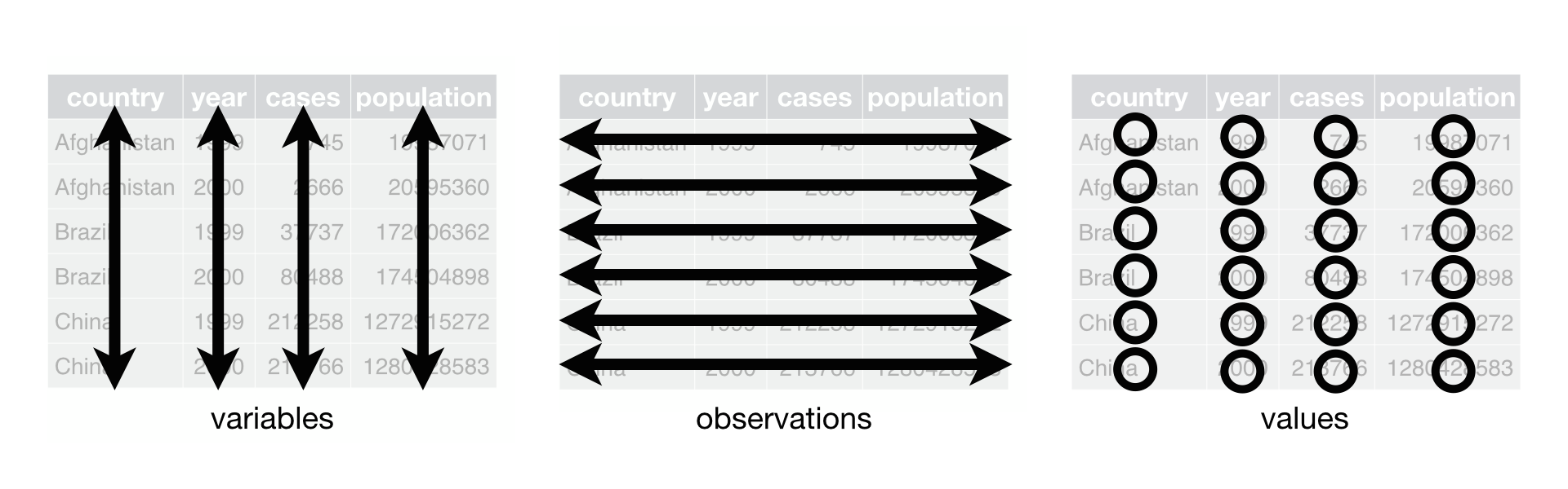
What does it mean for your data to be “tidy”? While “tidy” has a clear English meaning of “organized,” the word “tidy” in data science using R means that your data follows a standardized format. We will follow Hadley Wickham’s British English definition of “tidy” data (Wickham 2014) shown also in Figure 4.3:
A dataset is a collection of values, usually either numbers (if quantitative) or strings AKA text data (if qualitative/categorical). Values are organised in two ways. Every value belongs to a variable and an observation. A variable contains all values that measure the same underlying attribute (like height, temperature, duration) across units. An observation contains all values measured on the same unit (like a person, or a day, or a city) across attributes.
“Tidy” data is a standard way of mapping the meaning of a dataset to its structure. A dataset is messy or tidy depending on how rows, columns and tables are matched up with observations, variables and types. In tidy data:
- Each variable forms a column.
- Each observation forms a row.
- Each type of observational unit forms a table.
For example, say you have the following table of stock prices in Table 4.1:
| Date | Boeing stock price | Amazon stock price | Google stock price |
|---|---|---|---|
| 2009-01-01 | $173.55 | $174.90 | $174.34 |
| 2009-01-02 | $172.61 | $171.42 | $170.04 |
Although the data is in a rectangular spreadsheet format, it is not “tidy.” There are three variables (date, stock name, and stock price), but not three separate columns. In tidy data, each variable should have its own column, as shown in Table 4.2. Both tables present the same information, but in different formats.
| Date | Stock Name | Stock Price |
|---|---|---|
| 2009-01-01 | Boeing | $173.55 |
| 2009-01-01 | Amazon | $174.90 |
| 2009-01-01 | $174.34 | |
| 2009-01-02 | Boeing | $172.61 |
| 2009-01-02 | Amazon | $171.42 |
| 2009-01-02 | $170.04 |
On the other hand, consider the data in Table 4.3.
| Date | Boeing Price | Weather |
|---|---|---|
| 2009-01-01 | $173.55 | Sunny |
| 2009-01-02 | $172.61 | Overcast |
In this case, even though the variable “Boeing Price” occurs just like in our non-“tidy” data in Table 4.1, the data is “tidy” since there are three variables for each of three unique pieces of information: Date, Boeing price, and the Weather that day.
Learning Check
(LC4.1) What are common characteristics of “tidy” data frames?
Rows correspond to observations, while columns correspond to variables. Each type of observational unit is stored in its own table.
(LC4.2) What makes “tidy” data frames useful for organizing data?
Tidy datasets are an organized way of viewing data. This format is required for the ggplot2 and dplyr packages for data visualization and wrangling. They provide a consistent, standardized structure so that functions work seamlessly together across packages. This uniform format makes it easier to wrangle, visualize, and analyze data without reshaping it repeatedly.
4.2.2 Converting to tidy data
In this book so far, you’ve only seen data frames that were already in “tidy” format. Furthermore, for the rest of this book, you’ll mostly only see data frames that are already in “tidy” format as well. This is not always the case however with all datasets in the world. If your original data frame is in wide (non-“tidy”) format and you would like to use the ggplot2 or dplyr packages, you will first have to convert it to “tidy” format. To do so, we recommend using the pivot_longer() function in the tidyr package (Wickham et al. 2025).
Going back to our drinks_smaller data frame from earlier:
drinks_smaller# A tibble: 4 × 4
country beer spirit wine
<chr> <int> <int> <int>
1 China 79 192 8
2 Italy 85 42 237
3 Saudi Arabia 0 5 0
4 USA 249 158 84We convert it to “tidy” format by using the pivot_longer() function from the tidyr package as follows:
drinks_smaller_tidy <- drinks_smaller |>
  pivot_longer(names_to = "type",
               values_to = "servings",
               cols = -country)
drinks_smaller_tidy
# A tibble: 12 × 3
country type servings
<chr> <chr> <int>
1 China beer 79
2 China spirit 192
3 China wine 8
4 Italy beer 85
5 Italy spirit 42
6 Italy wine 237
7 Saudi Arabia beer 0
8 Saudi Arabia spirit 5
9 Saudi Arabia wine 0
10 USA beer 249
11 USA spirit 158
12 USA wine 84We set the arguments to pivot_longer() as follows:
-
names_tohere corresponds to the name of the variable in the new “tidy”/long data frame that will contain the column names of the original data. Observe how we setnames_to = "type". In the resultingdrinks_smaller_tidy, the columntypecontains the three types of alcoholbeer,spirit, andwine. Sincetypeis a variable name that doesn’t appear indrinks_smaller, we use quotation marks around it. You’ll receive an error if you just usenames_to = typehere. -
values_tohere is the name of the variable in the new “tidy” data frame that will contain the values of the original data. Observe how we setvalues_to = "servings"since each of the numeric values in each of thebeer,wine, andspiritcolumns of thedrinks_smallerdata corresponds to a value ofservings. In the resultingdrinks_smaller_tidy, the columnservingscontains the 4 \(\times\) 3 = 12 numerical values. Note again thatservingsdoesn’t appear as a variable indrinks_smallerso it again needs quotation marks around it for thevalues_toargument. - The third argument
colsis the columns in thedrinks_smallerdata frame you either want to or don’t want to “tidy.” Observe how we set this to-countryindicating that we don’t want to “tidy” thecountryvariable indrinks_smallerand rather onlybeer,spirit, andwine. Sincecountryis a column that appears indrinks_smallerwe don’t put quotation marks around it.
The third argument here of cols is a little nuanced, so let’s consider code that’s written slightly differently but that produces the same output:
drinks_smaller |>
  pivot_longer(names_to = "type",
               values_to = "servings",
cols = c(beer, spirit, wine))Note that the third argument now specifies which columns we want to “tidy” with c(beer, spirit, wine), instead of the columns we don’t want to “tidy” using -country. We use the c() function to create a vector of the columns in drinks_smaller that we’d like to “tidy.” Note that since these three columns appear one after another in the drinks_smaller data frame, we could also do the following for the cols argument:
drinks_smaller |>
  pivot_longer(names_to = "type",
               values_to = "servings",
               cols = beer:wine)
With our drinks_smaller_tidy “tidy” formatted data frame, we can now produce the barplot you saw in Figure 4.2 using geom_col(). This is done in Figure 4.4. Recall from Section 2.8 on barplots that we use geom_col() and not geom_bar(), since we would like to map the “pre-counted” servings variable to the y-aesthetic of the bars.
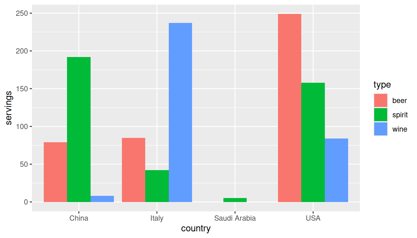
r n_countries countries using geom_col().
Converting “wide” format data to “tidy” format often confuses new R users. The only way to learn to get comfortable with the pivot_longer() function is with practice, practice, and more practice using different datasets. For example, run ?pivot_longer and look at the examples in the bottom of the help file. We’ll show another example of using pivot_longer() to convert a “wide” formatted data frame to “tidy” format in Section 4.3.
If however you want to convert a “tidy” data frame to “wide” format, you will need to use the pivot_wider() function instead. Run ?pivot_wider and look at the examples in the bottom of the help file for examples.
You can also view examples of both pivot_longer() and pivot_wider() on the tidyverse.org webpage. There’s a nice example to check out the different functions available for data tidying and a case study using data from the World Health Organization on that webpage. Furthermore, each week the R4DS Online Learning Community posts a dataset in the weekly #TidyTuesday event that might serve as a nice place for you to find other data to explore and transform.
Learning Check
(LC4.3) Take a look at the airline_safety data frame included in the fivethirtyeight data package. Run the following:
airline_safetyAfter reading the help file by running ?airline_safety, we see that airline_safety is a data frame containing information on different airline companies’ safety records. This data was originally reported on the data journalism website, FiveThirtyEight.com, in Nate Silver’s article, “Should Travelers Avoid Flying Airlines That Have Had Crashes in the Past?”. Let’s only consider the variables airline and those relating to fatalities for simplicity:
airline_safety_smaller <- airline_safety |>
  select(airline, starts_with("fatalities"))
airline_safety_smaller
# A tibble: 56 × 3
airline fatalities_85_99 fatalities_00_14
<chr> <int> <int>
1 Aer Lingus 0 0
2 Aeroflot 128 88
3 Aerolineas Argentinas 0 0
4 Aeromexico 64 0
5 Air Canada 0 0
6 Air France 79 337
7 Air India 329 158
8 Air New Zealand 0 7
9 Alaska Airlines 0 88
10 Alitalia 50 0
# ℹ 46 more rowsThis data frame is not in “tidy” format. How would you convert this data frame to be in “tidy” format, in particular so that it has a variable fatalities_years indicating the incident year and a variable count of the fatality counts?
airline_safetyAfter reading the help file by running ?airline_safety, we see that airline_safety is a data frame containing information on different airlines companies’ safety records. This data was originally reported on the data journalism website FiveThirtyEight.com in Nate Silver’s article “Should Travelers Avoid Flying Airlines That Have Had Crashes in the Past?”. Let’s only consider the variables airline and those relating to fatalities for simplicity:
airline_safety_smaller <- airline_safety |>
  select(airline, starts_with("fatalities"))
airline_safety_smaller
# A tibble: 56 × 3
airline fatalities_85_99 fatalities_00_14
<chr> <int> <int>
1 Aer Lingus 0 0
2 Aeroflot 128 88
3 Aerolineas Argentinas 0 0
4 Aeromexico 64 0
5 Air Canada 0 0
6 Air France 79 337
7 Air India 329 158
8 Air New Zealand 0 7
9 Alaska Airlines 0 88
10 Alitalia 50 0
# ℹ 46 more rowsThis data frame is not in “tidy” format. How would you convert this data frame to be in “tidy” format, in particular so that it has a variable fatalities_years indicating the incident year and a variable count of the fatality counts?
Solution:
This can been done using the pivot_longer() function from the tidyr package:
airline_safety_smaller_tidy <- airline_safety_smaller |>
  pivot_longer(
    names_to = "fatalities_years",
    values_to = "count",
    cols = -airline
  )
airline_safety_smaller_tidy
# A tibble: 112 × 3
airline fatalities_years count
<chr> <chr> <int>
1 Aer Lingus fatalities_85_99 0
2 Aer Lingus fatalities_00_14 0
3 Aeroflot fatalities_85_99 128
4 Aeroflot fatalities_00_14 88
5 Aerolineas Argentinas fatalities_85_99 0
6 Aerolineas Argentinas fatalities_00_14 0
7 Aeromexico fatalities_85_99 64
8 Aeromexico fatalities_00_14 0
9 Air Canada fatalities_85_99 0
10 Air Canada fatalities_00_14 0
# ℹ 102 more rowsIf you look at the resulting airline_safety_smaller_tidy data frame in the spreadsheet viewer, you’ll see that the variable fatalities_years has 2 possible values: "fatalities_85_99" and "fatalities_00_14", corresponding to the 2 columns of airline_safety_smaller we tidied.
Note that prior to tidyr version 1.0.0 released to CRAN in September 2019, this could also have been done using the gather() function from the tidyr package. The gather() function still works, but its further development has stopped in favor of pivot_longer().
airline_safety_smaller_tidy <- airline_safety_smaller |>
  gather(key = fatalities_years, value = count, -airline)
airline_safety_smaller_tidy
# A tibble: 112 × 3
airline fatalities_years count
<chr> <chr> <int>
1 Aer Lingus fatalities_85_99 0
2 Aeroflot fatalities_85_99 128
3 Aerolineas Argentinas fatalities_85_99 0
4 Aeromexico fatalities_85_99 64
5 Air Canada fatalities_85_99 0
6 Air France fatalities_85_99 79
7 Air India fatalities_85_99 329
8 Air New Zealand fatalities_85_99 0
9 Alaska Airlines fatalities_85_99 0
10 Alitalia fatalities_85_99 50
# ℹ 102 more rows
4.2.3 nycflights23 package
Recall the nycflights23 package we introduced in Section 1.4 with data about all domestic flights departing from New York City in 2023. Let’s revisit the flights data frame by running View(flights). We saw that flights has a rectangular shape, with each of its 435,352 rows corresponding to a flight and each of its 19 columns corresponding to different characteristics/measurements of each flight. This satisfied the first two criteria of the definition of “tidy” data from Section 4.2.1: that “Each variable forms a column” and “Each observation forms a row.” But what about the third property of “tidy” data that “Each type of observational unit forms a table”?
Recall that we saw in Section 1.4.3 that the observational unit for the flights data frame is an individual flight. In other words, the rows of the flights data frame refer to characteristics/measurements of individual flights. Also included in the nycflights23 package are other data frames with their rows representing different observational units (Ismay et al. 2025):
-
airlines: translation between two letter IATA carrier codes and airline company names (14 in total). The observational unit is an airline company. -
planes: aircraft information about each of 4,840 planes used, i.e., the observational unit is an aircraft. -
weather: hourly meteorological data (about 8,736 observations) for each of the three NYC airports, i.e., the observational unit is an hourly measurement of weather at one of the three airports. -
airports: airport names and locations. The observational unit is an airport.
The organization of the information into these five data frames follows the third “tidy” data property: observations corresponding to the same observational unit should be saved in the same table, i.e., data frame. You could think of this property as the old English expression: “birds of a feather flock together.”
4.3 Case study: democracy in Guatemala
In this section, we’ll show you another example of how to convert a data frame that isn’t in “tidy” format (“wide” format) to a data frame that is in “tidy” format (“long/narrow” format). We’ll do this using the pivot_longer() function from the tidyr package again.
Furthermore, we’ll make use of functions from the ggplot2 and dplyr packages to produce a time-series plot showing how the democracy scores have changed over the 40 years from 1952 to 1992 for Guatemala. Recall that we saw time-series plots in Section 2.4 on creating linegraphs using geom_line().
Let’s use the dem_score data frame we imported in Section 4.1, but focus on only data corresponding to Guatemala.
guat_dem <- dem_score |>
  filter(country == "Guatemala")
guat_dem
# A tibble: 1 × 10
country `1952` `1957` `1962` `1967` `1972` `1977` `1982` `1987` `1992`
<chr> <dbl> <dbl> <dbl> <dbl> <dbl> <dbl> <dbl> <dbl> <dbl>
1 Guatemala 2 -6 -5 3 1 -3 -7 3 3Let’s lay out the grammar of graphics we saw in Section 2.1.
First we know we need to set data = guat_dem and use a geom_line() layer, but what is the aesthetic mapping of variables? We’d like to see how the democracy score has changed over the years, so we need to map:
-
yearto the x-position aesthetic and -
democracy_scoreto the y-position aesthetic
Now we are stuck in a predicament, much like with our drinks_smaller example in Section 4.2. We see that we have a variable named country, but its only value is "Guatemala". We have other variables denoted by different year values. Unfortunately, the guat_dem data frame is not “tidy” and hence is not in the appropriate format to apply the grammar of graphics, and thus we cannot use the ggplot2 package just yet.
We need to take the values of the columns corresponding to years in guat_dem and convert them into a new “names” variable called year. Furthermore, we need to take the democracy score values in the inside of the data frame and turn them into a new “values” variable called democracy_score. Our resulting data frame will have three columns: country, year, and democracy_score. Recall that the pivot_longer() function in the tidyr package does this for us:
guat_dem_tidy <- guat_dem |>
  pivot_longer(names_to = "year",
               values_to = "democracy_score",
               cols = -country,
               names_transform = list(year = as.integer))
guat_dem_tidy
# A tibble: 9 × 3
country year democracy_score
<chr> <int> <dbl>
1 Guatemala 1952 2
2 Guatemala 1957 -6
3 Guatemala 1962 -5
4 Guatemala 1967 3
5 Guatemala 1972 1
6 Guatemala 1977 -3
7 Guatemala 1982 -7
8 Guatemala 1987 3
9 Guatemala 1992 3We set the arguments to pivot_longer() as follows:
-
names_tois the name of the variable in the new “tidy” data frame that will contain the column names of the original data. Observe how we setnames_to = "year". In the resultingguat_dem_tidy, the columnyearcontains the years where Guatemala’s democracy scores were measured. -
values_tois the name of the variable in the new “tidy” data frame that will contain the values of the original data. Observe how we setvalues_to = "democracy_score". In the resultingguat_dem_tidythe columndemocracy_scorecontains the 1 \(\times\) 9 = 9 democracy scores as numeric values. - The third argument is the columns you either want to or don’t want to “tidy.” Observe how we set this to
cols = -countryindicating that we don’t want to “tidy” thecountryvariable inguat_demand rather only variables1952through1992. - The last argument of
names_transformtells R what type of variableyearshould be set to. Without specifying that it is anintegeras we’ve done here,pivot_longer()will set it to be a character value by default.
We can now create the time-series plot in Figure 4.5 to visualize how democracy scores in Guatemala have changed from 1952 to 1992 using a geom_line(). Furthermore, we’ll use the labs() function in the ggplot2 package to add informative labels to all the aes()thetic attributes of our plot, in this case the x and y positions.
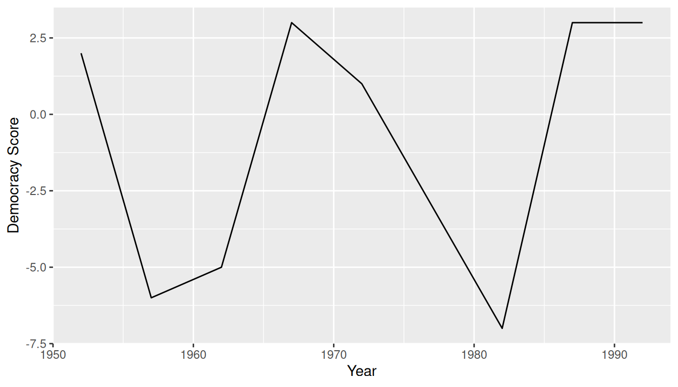
Note that if we forgot to include the names_transform argument specifying that year was not of character format, we would have gotten an error here since geom_line() wouldn’t have known how to sort the character values in year in the right order.
Learning Check
(LC4.4) Convert the dem_score data frame into a “tidy” data frame and assign the name of dem_score_tidy to the resulting long-formatted data frame.
Running the following in the console:
dem_score_tidy <- dem_score |>
  pivot_longer(
    names_to = "year", values_to = "democracy_score",
    cols = -country
  )
Let’s now compare the dem_score and dem_score_tidy. dem_score has democracy score information for each year in columns, whereas in dem_score_tidy there are explicit variables year and democracy_score. While both representations of the data contain the same information, we can only use ggplot() to create plots using the dem_score_tidy data frame.
dem_score# A tibble: 96 × 10
country `1952` `1957` `1962` `1967` `1972` `1977` `1982` `1987` `1992`
<chr> <dbl> <dbl> <dbl> <dbl> <dbl> <dbl> <dbl> <dbl> <dbl>
1 Albania -9 -9 -9 -9 -9 -9 -9 -9 5
2 Argentina -9 -1 -1 -9 -9 -9 -8 8 7
3 Armenia -9 -7 -7 -7 -7 -7 -7 -7 7
4 Australia 10 10 10 10 10 10 10 10 10
5 Austria 10 10 10 10 10 10 10 10 10
6 Azerbaijan -9 -7 -7 -7 -7 -7 -7 -7 1
7 Belarus -9 -7 -7 -7 -7 -7 -7 -7 7
8 Belgium 10 10 10 10 10 10 10 10 10
9 Bhutan -10 -10 -10 -10 -10 -10 -10 -10 -10
10 Bolivia -4 -3 -3 -4 -7 -7 8 9 9
# ℹ 86 more rowsdem_score_tidy# A tibble: 864 × 3
country year democracy_score
<chr> <chr> <dbl>
1 Albania 1952 -9
2 Albania 1957 -9
3 Albania 1962 -9
4 Albania 1967 -9
5 Albania 1972 -9
6 Albania 1977 -9
7 Albania 1982 -9
8 Albania 1987 -9
9 Albania 1992 5
10 Argentina 1952 -9
# ℹ 854 more rows(LC4.5) Read in the life expectancy data stored at https://moderndive.com/data/le_mess.csv and convert it to a “tidy” data frame.
The code is similar:
life_expectancy <- read_csv("https://moderndive.com/data/le_mess.csv")
life_expectancy_tidy <- life_expectancy |>
  pivot_longer(
    names_to = "year",
    values_to = "life_expectancy",
    cols = -country
  )
We observe the same structure with respect to year in life_expectancy vs life_expectancy_tidy as we did in dem_score vs dem_score_tidy:
life_expectancy# A tibble: 202 × 67
country `1951` `1952` `1953` `1954` `1955` `1956` `1957` `1958` `1959` `1960`
<chr> <dbl> <dbl> <dbl> <dbl> <dbl> <dbl> <dbl> <dbl> <dbl> <dbl>
1 Afghan… 27.1 27.7 28.2 28.7 29.3 29.8 30.3 30.9 31.4 31.9
2 Albania 54.7 55.2 55.8 56.6 57.4 58.4 59.5 60.6 61.8 62.9
3 Algeria 43.0 43.5 44.0 44.4 44.9 45.4 45.9 46.4 47.0 47.5
4 Angola 31.0 31.6 32.1 32.7 33.2 33.8 34.3 34.9 35.4 36.0
5 Antigu… 58.3 58.8 59.3 59.9 60.4 60.9 61.4 62.0 62.5 63.0
6 Argent… 61.9 62.5 63.1 63.6 64.0 64.4 64.7 65 65.2 65.4
7 Armenia 62.7 63.1 63.6 64.1 64.5 65 65.4 65.9 66.4 66.9
8 Aruba 59.0 60.0 61.0 61.9 62.7 63.4 64.1 64.7 65.2 65.7
9 Austra… 68.7 69.1 69.7 69.8 70.2 70.0 70.3 70.9 70.4 70.9
10 Austria 65.2 66.8 67.3 67.3 67.6 67.7 67.5 68.5 68.4 68.8
# ℹ 192 more rows
# ℹ 56 more variables: `1961` <dbl>, `1962` <dbl>, `1963` <dbl>, `1964` <dbl>,
# `1965` <dbl>, `1966` <dbl>, `1967` <dbl>, `1968` <dbl>, `1969` <dbl>,
# `1970` <dbl>, `1971` <dbl>, `1972` <dbl>, `1973` <dbl>, `1974` <dbl>,
# `1975` <dbl>, `1976` <dbl>, `1977` <dbl>, `1978` <dbl>, `1979` <dbl>,
# `1980` <dbl>, `1981` <dbl>, `1982` <dbl>, `1983` <dbl>, `1984` <dbl>,
# `1985` <dbl>, `1986` <dbl>, `1987` <dbl>, `1988` <dbl>, `1989` <dbl>, …life_expectancy_tidy# A tibble: 13,332 × 3
country year life_expectancy
<chr> <chr> <dbl>
1 Afghanistan 1951 27.1
2 Afghanistan 1952 27.7
3 Afghanistan 1953 28.2
4 Afghanistan 1954 28.7
5 Afghanistan 1955 29.3
6 Afghanistan 1956 29.8
7 Afghanistan 1957 30.3
8 Afghanistan 1958 30.9
9 Afghanistan 1959 31.4
10 Afghanistan 1960 31.9
# ℹ 13,322 more rows
4.4 tidyverse package
Notice at the beginning of the chapter we loaded the following four packages, which are among four of the most frequently used R packages for data science:
Recall that ggplot2 is for data visualization, dplyr is for data wrangling, readr is for importing spreadsheet data into R, and tidyr is for converting data to “tidy” format. There is a much quicker way to load these packages than by individually loading them: by installing and loading the tidyverse package. The tidyverse package acts as an “umbrella” package whereby installing/loading it will install/load multiple packages at once for you.
After installing the tidyverse package as you would a normal package as seen in Section 1.3, running:
would be the same as running:
The purrr, tibble, stringr, and forcats are left for a more advanced book; check out R for Data Science to learn about these packages.
For the remainder of this book, we’ll start every chapter by running library(tidyverse), instead of loading the various component packages individually. The tidyverse “umbrella” package gets its name from the fact that all the functions in all its packages are designed to have common inputs and outputs: data frames are in “tidy” format. This standardization of input and output data frames makes transitions between different functions in the different packages as seamless as possible. For more information, check out the tidyverse.org webpage for the package.
Quick checks
Ten questions to assess your understanding. Several are designed around common misconceptions — read each option carefully before peeking at the answer.
Q4-1. A dataset is in tidy format when:
- It has no missing values
- Variables in columns, observations in rows
- The column names are lowercase, with no spaces
- The data is sorted alphabetically
(b) Tidy data is about structure, not contents. Wickham’s three rules are: variables in columns, observations in rows, observational units in their own tables. Tidy is unrelated to whether data is “clean” (free of errors or missing values).
Q4-2. What does pivot_longer() do?
- Reshapes data from wide to long format
- Joins two data frames
- Sorts a data frame by the longest column
- Adds new columns to a data frame
(a) pivot_longer() collapses multiple columns into key/value pairs, producing a longer (and usually tidier) data frame. The inverse is pivot_wider().
Q4-3. When would you use read_csv() instead of base R’s read.csv()?
- When the file has fewer than 1000 rows
- They are exactly equivalent
- When you want a
tibbleand speed - Only when the file is read from a URL
(c) As the chapter notes, readr::read_csv() can more easily read data off the web, generally imports data at a much faster speed, and saves data frames as tibbles by default, unlike base R’s read.csv().
Q4-4. A data frame has columns country, 1990, 1995, 2000, 2005, population values per country per year. Why is this NOT tidy?
- It’s missing a primary key
-
yearhas no column of its own - Column names cannot start with numbers
- The country values are repeated
(b) Variables (here, year and population) belong in their own columns. Encoding year in column names means the year variable is hidden in metadata. pivot_longer(cols = -country, names_to = "year", values_to = "population") fixes it.
Q4-5. When using pivot_longer(), what does the names_to argument refer to?
- The names of the columns to leave unchanged
- The package to load
- The new column that holds the old names
- The destination file name
(c) names_to names the new column that will receive the values currently sitting in the names of the columns being pivoted. (values_to names the new column that holds the cell values.) The naming is symmetric: names_to ↔︎ from old column NAMES; values_to ↔︎ from old column VALUES.
Q4-6. After pivot_longer(), the resulting data frame typically has:
- An error
- The same dimensions
- Fewer rows and more columns, like
pivot_wider() - More rows and fewer columns
(d) That’s why it’s called “longer”; many columns become two columns (key + value), and each row’s data spreads across multiple new rows.
Q4-7. read_csv("data.csv") errors with could not find function "read_csv". The most likely cause is:
- The file
data.csvdoesn’t exist - The
readrpackage isn’t loaded - RStudio is broken
- The file is corrupted
(b) “Could not find function” almost always means the package isn’t loaded, not that the file is wrong. Note the specific error message, it’s about the function, not the file.
Q4-8. A dataset has name (string), age (number), and is_student (TRUE/FALSE). How many variables and observations does ONE row represent?
- 0 variables and 3 observations
- Depends on the data
- 1 variable and 3 observations
- 3 variables and 1 observation
(d) A row is one observation; columns are variables. “Wide” vs “tidy” is about how variables are arranged, not how observations are counted.
Q4-9. Is “wide format” always wrong?
- No; wide is often easier for humans to read
- Yes; only tidy is acceptable
- Yes, wide formats cannot be analyzed correctly
- Wide formats only work in Excel
(a) Tidy is the right format for tidyverse-style analysis, but wide can be more readable and is sometimes required by other tools. The skill is knowing when to pivot between them.
Q4-10. library(tidyverse) loads which packages?
- The R Markdown packages
knitrandbookdown - Only base R functions
- Just
ggplot2and its extensions - The eight core tidyverse packages
(d) tidyverse is an “umbrella” package that loads the eight core tidyverse packages in one call: ggplot2, dplyr, tidyr, readr, purrr, tibble, stringr, and forcats. It’s a convenience, not a separate code library: the actual functions still live in the individual packages.
| Function | What it does | Quick example |
|---|---|---|
read_csv("path") |
Read a CSV (returns a tibble) | read_csv("https://moderndive.com/data/dem_score.csv") |
pivot_longer(cols, names_to, values_to) |
Reshape wide → long (tidy) | df |> pivot_longer(cols = -country, names_to = "year", values_to = "score") |
pivot_wider(names_from, values_from) |
Reshape long → wide (the inverse of pivot_longer()) |
See ?pivot_wider for examples |
library(tidyverse) |
Load ggplot2, dplyr, tidyr, readr, and friends in one call |
library(tidyverse) |
Exercises
The end-of-chapter exercises ask you to apply the chapter’s ideas to a new dataset: bob_ross from the fivethirtyeight package. Each row is one episode of The Joy of Painting (1983–1994); each of the 67 element columns is a 0/1 indicator for whether a given object (mountain, cabin, tree, …) appeared in that episode. The dataset is a textbook example of wide format — making it a perfect playground for pivot_longer() and pivot_wider().
Difficulty is signaled with stars: ★ warm-up, ★★ standard application, ★★★ critical thinking.
You can run code in the WebR cells right beneath each prompt — no installation needed. Solutions are available to instructors separately.
Setup and first look
EX4.1 (★) Meet the data. Load fivethirtyeight and dplyr, then get to know bob_ross two ways. First run ?bob_ross (the same page lives on the package website at https://fivethirtyeight-r.netlify.app/reference/bob_ross.html): (a) What does one row represent, and what FiveThirtyEight story was this data collected for? (b) Of the 71 documented variables, what do the several dozen beyond the first few identifiers all have in common? Then run glimpse(bob_ross) to confirm the row and column counts. Keep your answer to (b) in mind. That wide block of same-shaped columns is exactly the design this chapter’s tidying tools exist for.
Importing data
EX4.2 (★) Suppose someone published a CSV version of the dataset at https://example.com/bob-ross.csv. Write the single line of code you would use, with readr, to read it into a tibble called br.
EX4.3 (★★) A teammate runs read_csv("athletes.csv") and is surprised that the age column comes in as character rather than numeric. They expected to compute means on it. After a peek, the column has "unknown" mixed in with the digits. Outline two strategies to fix this: (a) one during the import (passing an argument to read_csv()), (b) one after the import (with a mutate()). Why does the at-import fix usually win on cleanliness?
Need a hint?
For (a): read_csv() has an na = argument that lists which strings should be read as missing.
Recognizing tidy structure
EX4.4 (★) The first four columns of bob_ross (episode, season, episode_num, title) are identification variables, not measurement variables. Explain in one sentence why.
EX4.5 (★) Without running any code, predict: what are the only two possible values that any of the 67 indicator columns (e.g., mountain, tree) can take? Then verify by running bob_ross |> select(tree) |> tidy_summary(). tidy_summary() is from the moderndive package (you met it in extension EX 1.16, and Chapter 5 discusses it further); read your answer off its min and max columns.
EX4.6 (★) Is bob_ross in tidy format? Justify by referring to the three rules of tidy data.
EX4.7 (★) Two variables are encoded in the names of the 67 indicator columns. What are they?
Need a hint?
Think about what each column name represents and what the cell values represent.
EX4.8 (★★) The episode column contains values like "S01E01", "S01E02". How many distinct pieces of information are packed into this single column? Are those pieces already separated out elsewhere in bob_ross, and if so, which columns hold them? If they weren’t, what kind of tool would you reach for to split a combined code like this? (The tidyr package ships helpers for exactly this: browse its reference index at https://tidyr.tidyverse.org/reference/ and search the page for “separate” to discover the family; they go beyond this book.)
EX4.9 (★) What is the observational unit of bob_ross? Phrase your answer as “one row of bob_ross represents one ____.”
Pivoting longer
EX4.10 (★★) Use pivot_longer() to reshape bob_ross so that all 67 indicator columns become two columns: one called element (the old name) and one called present (the 0/1 value). Save the result to bob_long.
EX4.11 (★★) bob_ross has 403 rows and 67 indicator columns. Predict the number of rows in bob_long before you check. Then verify with nrow().
EX4.12 (★★) After pivoting, each row of bob_long represents one ___ in one ___. Fill in the blanks.
EX4.13 (★★) Why does using cols = -c(episode, season, episode_num, title) work better than listing all 67 element columns by name in pivot_longer()?
Summarizing the long-form data
EX4.14 (★) Count how many episodes feature a cabin.
Need a hint?
An indicator column of 0/1 sums to the number of 1s.
EX4.15 (★★) Filter bob_long to rows where present == 1 and call the result bob_present. How many rows does it have, and what does that count tell you about the show as a whole?
EX4.16 (★★) Using bob_long (or bob_present), find the top 10 most-painted elements across all episodes.
EX4.17 (★★) How many distinct elements appear in the very first episode of season 1?
EX4.18 (★★) Which season has the highest average number of elements per painting? Group by season, average the per-episode element counts, and sort. Does the most elaborate season fall near the start or end of the run?
EX4.19 (★★) Did Bob Ross ever paint a barn? In how many episodes? In what fraction of his run does a barn appear?
EX4.20 (★★) Which episode features the largest number of distinct elements? Print its episode, title, and total element count.
EX4.21 (★★★) For each season, find the single most-painted element (with ties broken arbitrarily). Are there elements that dominate one season but not another? Use slice_max() (a dplyr verb that keeps the top row(s) within each group) on the season-grouped counts.
Visualizing the long-form data
EX4.22 (★★) Build a horizontal bar chart of the top 15 elements by total appearance count across the full series. Use ggplot2.
EX4.23 (★★) Plot the number of episodes per season featuring tree as a line graph (season on the x-axis). Was Bob’s tree habit consistent?
EX4.24 (★★★) Build a faceted bar chart showing the top 5 elements within each season (one panel per season). Comment on whether the rankings shift over time. Use slice_max() (a dplyr verb that keeps the top rows within each group) for the per-season top 5.
Pivoting wider
EX4.25 (★★★) Section 4.2.2 notes that to go the other direction, from tidy/long back to wide, you use pivot_wider(), the inverse of pivot_longer(). It takes names_from (the column whose values become the new column names) and values_from (the column supplying the cell values). Run ?pivot_wider for its full argument list and examples.
Starting from bob_long, use pivot_wider() to reconstruct a wide data frame (you’ll need to pick the right names_from and values_from columns yourself) and confirm its dimensions match the original bob_ross. (Later exercises reuse pivot_wider() as introduced here.)
Case study: democracy in Guatemala
EX4.26 (★★) The case study in Section 4.3 tidies the dem_score data frame (imported with read_csv() from https://moderndive.com/data/dem_score.csv; it is not part of any package), one column per year of democracy score; you built that tidy version yourself in Learning check LC4.4. This exercise pushes past it.
- Without running code, identify which variable is hiding inside the column names.
- Predict the tidy frame’s dimensions before pivoting: with 96 countries and 9 year columns, how many rows and how many columns should the tidy version have? Verify.
- The chapter plotted Guatemala’s score on its own. Extend that to a comparison: filter the tidy data to Guatemala and two of its neighbors (say Mexico and Honduras) and draw one linegraph with
color = country. Which of the three had the rockiest democratic trajectory over 1952-1992?
- The chapter plotted Guatemala’s score on its own. Extend that to a comparison: filter the tidy data to Guatemala and two of its neighbors (say Mexico and Honduras) and draw one linegraph with
tidyverse package
EX4.27 (★) What is the difference between library(tidyverse) and library(tidyr)? Which one would suffice for the pivots in this set of exercises, and which is more convenient?
Critical thinking and open exploration
EX4.28 (★★★) The wide format is sometimes more convenient than the long format. Give one analytical question that is easier to answer in bob_ross (wide) than in bob_long (long).
EX4.29 (★★★) Pick one element whose frequency surprises you (high or low). Write 2–3 sentences interpreting why that frequency might make sense given what you know, or suspect, about the show.
EX4.30 (★★★) Name two questions about Bob Ross’s painting style that this dataset cannot answer. For each, explain what additional data you would need.
EX4.31 (★★★) Open exploration: find one pattern the chapter examples did not uncover and create a chart that communicates it clearly. State your finding in a single sentence above the chart.
Extensions
The exercises below deliberately introduce functions and concepts beyond what this chapter teaches — log transformations, predict(), new packages, foreshadowing later chapters. They are optional, aimed at readers who want to push further. The main Exercises and Quick checks above stick strictly to what this chapter covers.
EX4.32 (◆◆◆) pivot_wider() with values_fn and id_cols. The chapter’s pivot_wider() (Section 4.2.2) assumes each output cell maps to exactly one input row. When several rows feed the same cell, you must tell it how to combine them: values_fn takes an aggregation function (here sum), and id_cols names the column(s) that identify each output row. Both arguments go beyond the chapter (EX 4.34 explores values_fn further). Starting from bob_long, build a season × element count matrix: one row per season, one column per element, each cell counting the episodes that season featuring that element.
EX4.33 (◆◆◆) pivot_longer(names_pattern = ...). When column names pack multiple pieces of info (e.g., score_pre / score_post), a single capture-group regex passed to names_pattern splits each name into its own destination column, turning two dimensions of structure into two tidy columns in one pivot. The starter builds its toy table with tibble::tribble(...), a helper from the tibble package (one of the tidyverse packages from Section 4.4) that lets you type a small tibble row-by-row, with ~name marking each column header. Run the snippet, then describe in one sentence what the four output rows per id represent.
EX4.34 (◆◆◆) pivot_wider(values_fn = ...). When the cells you want to fill require aggregation (multiple input rows feed each output cell), pass an aggregation function to values_fn. Use it on olympic_athletes to build a wide table with one row per noc and columns for Summer and Winter athlete counts in 1992 (the last year the Summer and Winter Games shared a calendar year; they have alternated on a two-year cycle since 1994). Why is values_fn necessary here, but not in the standard “long → wide” pivot from the chapter?
EX4.35 (◆◆◆) List-columns with nest() / unnest(). A list-column is a column where each cell holds an entire object (e.g., a smaller data frame). nest() collapses your data by group, unnest() expands it back. This pattern is the gateway to fitting one model per group, plotting one chart per group, or storing per-group artifacts alongside the metadata. Run the snippet above. Briefly: what kind of analysis becomes natural with nested data that’s awkward with flat data?
EX4.36 (◆◆) Reading Excel files with readxl::read_excel(). Real-world data often arrives as .xlsx files with multiple sheets, merged-cell headers, and trailing notes rows. read_excel("path.xlsx", sheet = 1, skip = 0) is the workhorse, sheet picks which tab, skip discards header rows, range = "B2:F100" reads a sub-range. If you have an Excel file available, try reading it; otherwise, describe in 2 sentences when read_excel() would be the right choice over read_csv().
EX4.37 (◆◆) Standardizing messy column names with janitor::clean_names(). Imported data often has column names like "Total Medals (2024)" or "Gold!!", readable by humans, painful to type in code. janitor::clean_names() rewrites every column name into snake_case ASCII (total_medals_2024, gold). Run it on the messy tibble. In a real workflow, the very first step after read_csv() or read_excel() is often |> clean_names(). Why?
EX4.38 (◆◆) Saving data with readr::write_csv(). Once you’ve wrangled a dataset, you’ll usually want to save the result for downstream work. write_csv() is the tidyverse-style writer (no row names, UTF-8 by default, fast). Save just the 2024 Summer medal table to a temp file and read it back to confirm the round-trip preserved the data. Briefly: why prefer write_csv() over base R’s write.csv()?
EX4.39 (◆◆◆) tidyr::complete() for implicit missing combinations. If your data lacks a row for some combination of variables (e.g., a Games where one sex didn’t compete), summary tables silently skip those cells, a hidden form of missingness. complete(year, sex, fill = list(n = 0)) fills in every (year × sex) pair, defaulting missing counts to 0. Run the snippet. Why is this safer than just plotting the original counts and assuming the gaps are zeros?
EX4.40 (◆◆) drop_na() vs filter(!is.na()). Both remove rows with missing values; drop_na(col1, col2) is shorter and reads more clearly when you have many columns. drop_na() with no arguments drops rows with any NA, convenient but easy to misuse if you’d rather drop only by specific columns. Run both forms and confirm they return the same row count. When would drop_na() (no args) silently remove more rows than you intended?
EX4.41 (◆◆) distinct() for deduplication. With no arguments, distinct() keeps only fully-unique rows. With column names, it deduplicates on those columns (and .keep_all = TRUE keeps the other columns from the first matching row). Run the three lines above. How many olympic_athletes rows are exact duplicates? How many unique athletes appear in the dataset (vs the row count, which is athlete-events)?
EX4.42 (◆◆◆) Long vs wide trade-offs. Section 4.2 noted that “tidy” (long) format is what dplyr/ggplot2 expect. But there are real cases where wide format is preferable. In 2-3 sentences each, give an example of when wide would be the right format for:
- (a) human reading (a printed summary table)
- (b) another tool (e.g., a stats procedure or external software)
- (c) storage on disk (file size or query speed)
For each, explain why wide beats long for that specific purpose.
4.5 Conclusion
4.5.1 Additional resources
An R script file of all R code used in this chapter is available here.
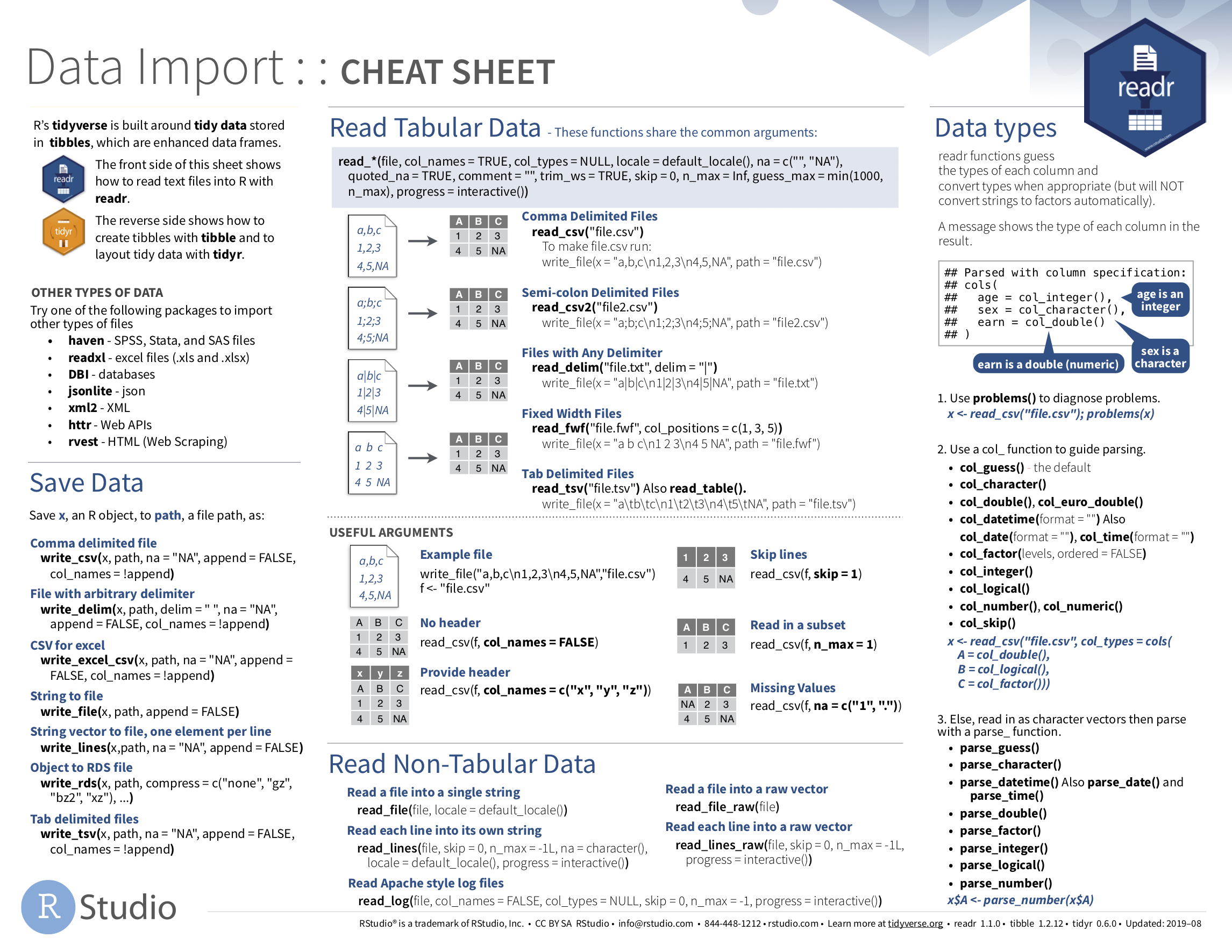
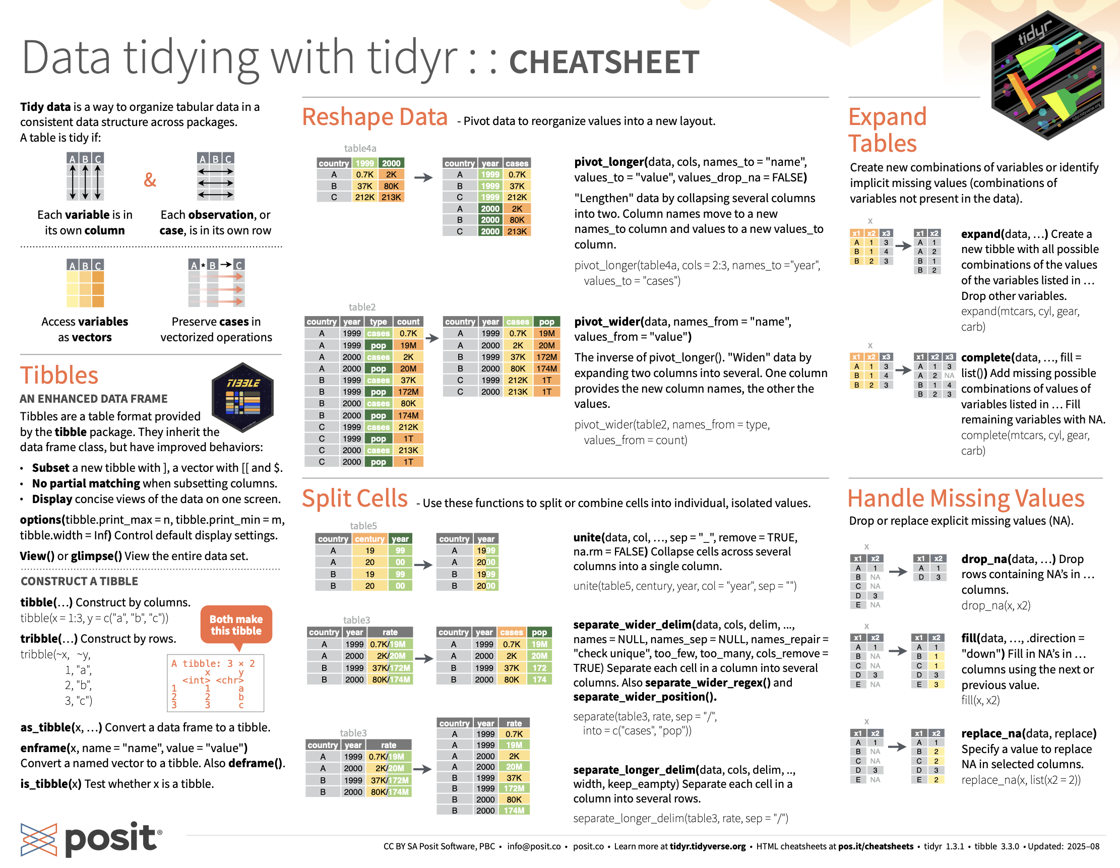
If you want to learn more about using the readr and tidyr package, we suggest that you check out RStudio’s “Data Import Cheat Sheet.” In the current version of RStudio in mid-2025, you can access this cheatsheet by going to the RStudio Menu Bar -> Help -> Cheat Sheets -> “Browse Cheat Sheets…” -> Scroll down the page to the “Data import with readr, readxl, and googlesheets4…” for information on using the readr, readxl and googlesheets4 packages to import data and the “Data tidying with tidyr cheatsheet” for information on using the tidyr package to “tidy” data. You can see a preview of both cheatsheets in the figures below.
4.5.2 What’s to come?
Congratulations! You’ve completed the “Data Science with tidyverse” portion of this book. We’ll now move to the “Statistical modeling with moderndive” portion of this book in Chapter 5 and Chapter 6, where you’ll leverage your data visualization and wrangling skills to model relationships between different variables in data frames.
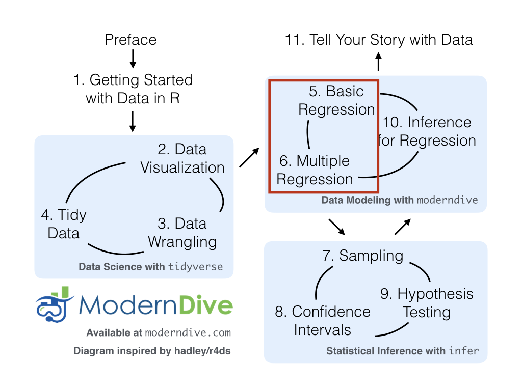
However, we’re going to leave Chapter 10 on “Inference for Regression” until after we’ve covered statistical inference in Chapter 7, Chapter 8, and Chapter 9. Onwards and upwards into Statistical/Data Modeling as shown in Figure 4.8!