
2 Data Visualization
- Apply the grammar of graphics framework to construct statistical plots
- Build the 5 named graphs (scatterplots, linegraphs, histograms, boxplots, barplots) using
ggplot2 - Modify aesthetic properties of a plot (color, size, transparency, position)
- Use facets to split a plot into panels by a categorical variable
We begin the development of your data science toolbox with data visualization. By visualizing data, we gain valuable insights we couldn’t initially obtain from just looking at the raw data values. We’ll use the ggplot2 package, as it provides an easy way to customize your plots. ggplot2 is rooted in the data visualization theory known as the grammar of graphics (Wilkinson 2005), developed by Leland Wilkinson.
At their most basic, graphics/plots/charts (we use these terms interchangeably in this book) provide a nice way to explore the patterns in data, such as the presence of outliers, distributions of individual variables, and relationships between groups of variables. Graphics are designed to emphasize the findings and insights you want your audience to understand. This does, however, require a balancing act. On the one hand, you want to highlight as many interesting findings as possible. On the other hand, you don’t want to include so much information that it overwhelms your audience.
As we will see, plots also help us to identify patterns and outliers in our data. We’ll see that a common extension of these ideas is to compare the distribution of one numerical variable, such as what are the center and spread of the values, as we go across the levels of a different categorical variable.
Needed packages
Let’s load all the packages needed for this chapter (this assumes you’ve already installed them). Read Section 1.3 for information on how to install and load R packages.
2.1 The grammar of graphics
We start with a discussion of a theoretical framework for data visualization known as “the grammar of graphics.” This framework serves as the foundation for the ggplot2 package which we’ll use extensively in this chapter. Think of how we construct and form sentences in English by combining different elements, like nouns, verbs, articles, subjects, objects, etc. We can’t just combine these elements in any arbitrary order; we must do so following a set of rules known as a linguistic grammar. Similarly to a linguistic grammar, “the grammar of graphics” defines a set of rules for constructing statistical graphics by combining different types of layers. This grammar was created by Leland Wilkinson (Wilkinson 2005) and has been implemented in a variety of data visualization software platforms like R, but also Plotly and Tableau.
2.1.1 Components of the grammar
In short, the grammar tells us that:
A statistical graphic is a
mappingofdatavariables toaesthetic attributes ofgeometric objects.
Specifically, we can break a graphic into the following three essential components:
-
data: the dataset containing the variables of interest. -
geom: the geometric object in question. This refers to the type of object we can observe in a plot. For example: points, lines, and bars. -
aes: aesthetic attributes of the geometric object. For example, x/y position, color, shape, and size. Aesthetic attributes are mapped to variables in the dataset.
You might be wondering why we wrote the terms data, geom, and aes in a computer code type font. We’ll see very shortly that we’ll specify the elements of the grammar in R using these terms. However, let’s first break down the grammar with an example.
2.1.2 Gapminder data
In February 2006, a Swedish physician and data advocate named Hans Rosling gave a TED talk titled “The best stats you’ve ever seen” where he presented global economic, health, and development data from the website gapminder.org. For example, for data on 142 countries in 2007, let’s consider only a few countries in Table 2.1 as a peek into the data.
| Country | Continent | Life Expectancy | Population | GDP per Capita |
|---|---|---|---|---|
| Afghanistan | Asia | 43.8 | 31889923 | 975 |
| Albania | Europe | 76.4 | 3600523 | 5937 |
| Algeria | Africa | 72.3 | 33333216 | 6223 |
Each row in this table corresponds to a country in 2007. For each row, we have 5 columns:
- Country: Name of country.
- Continent: Which of the five continents the country is part of. Note that “Americas” includes countries in both North and South America and that Antarctica is excluded.
- Life Expectancy: Life expectancy in years.
- Population: Number of people living in the country.
- GDP per Capita: Gross domestic product (in US dollars).
Now consider Figure 2.1, which plots this for all 142 of the data’s countries.
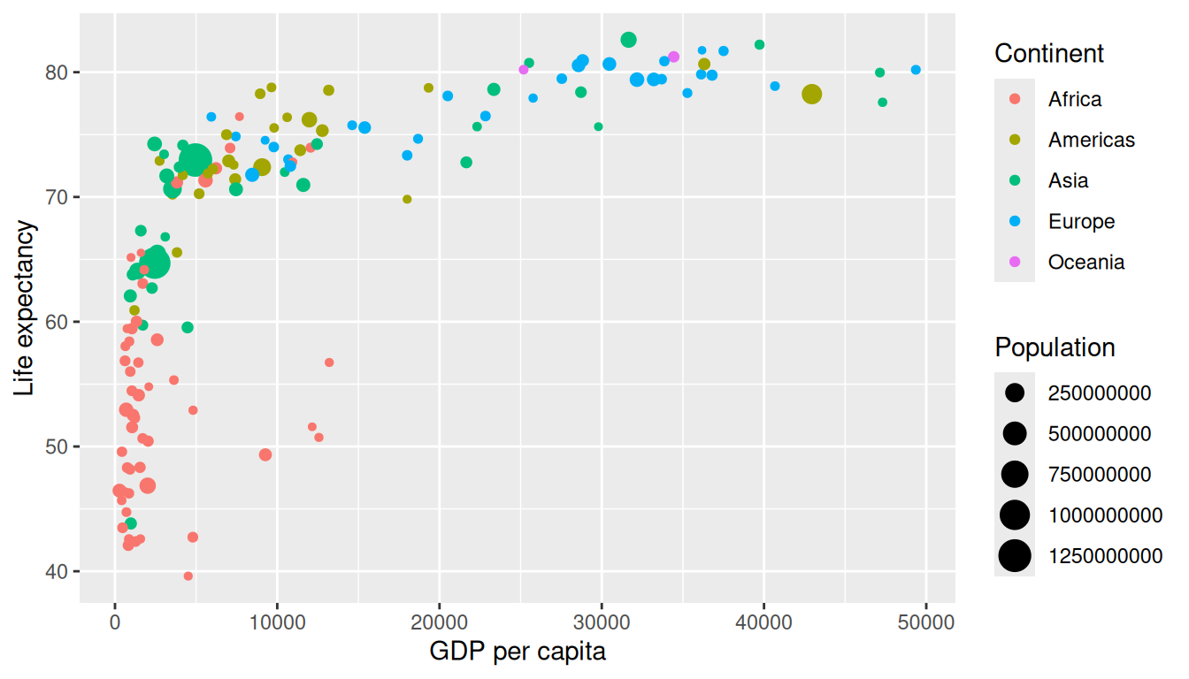
Let’s view this plot through the grammar of graphics:
- The
datavariable GDP per Capita gets mapped to thex-positionaesthetic of the points. - The
datavariable Life Expectancy gets mapped to they-positionaesthetic of the points. - The
datavariable Population gets mapped to thesizeaesthetic of the points. - The
datavariable Continent gets mapped to thecoloraesthetic of the points.
We’ll see shortly that data corresponds to the particular data frame where our data is saved and that “data variables” correspond to particular columns in the data frame. Furthermore, the type of geometric object considered in this plot are points. That being said, while in this example we are considering points, graphics are not limited to just points. We can also use lines, bars, and other geometric objects.
Let’s summarize the three essential components of the grammar in Table 2.2.
| data variable | aes | geom |
|---|---|---|
| GDP per Capita | x | point |
| Life Expectancy | y | point |
| Population | size | point |
| Continent | color | point |
2.1.3 Other components
There are other components of the grammar of graphics we can control as well. As you start to delve deeper into the grammar of graphics, you’ll start to encounter these topics more frequently. In this book, we’ll keep things simple and only work with these two additional components:
-
faceting breaks up a plot into several plots split by the values of another variable (Section 2.6) -
positionadjustments for barplots (Section 2.8)
Other more complex components like scales and coordinate systems are left for a more advanced text such as R for Data Science (Grolemund and Wickham 2017). Generally speaking, the grammar of graphics allows for a high degree of customization of plots and also a consistent framework for easily updating and modifying them.
2.1.4 ggplot2 package
In this book, we will use the ggplot2 package for data visualization, which is an implementation of the grammar of graphics for R (Wickham et al. 2026). As we noted earlier, a lot of the previous section was written in a computer code type font. This is because the various components of the grammar of graphics are specified in the ggplot() function included in the ggplot2 package. For the purposes of this book, we’ll always provide the ggplot() function with the following arguments (i.e., inputs) at a minimum:
- The data frame where the variables exist: the
dataargument. - The mapping of the variables to aesthetic attributes: the
mappingargument which specifies theaesthetic attributes involved.
After we’ve specified these components, we then add layers to the plot using the + sign. The most essential layer to add to a plot is the layer that specifies which type of geometric object we want the plot to involve: points, lines, bars, and others. Other layers we can add to a plot include the plot title, axes labels, visual themes for the plots, and facets (which we’ll see in Section 2.6).
Let’s now put the theory of the grammar of graphics into practice.
2.2 Five named graphs – the 5NG
In order to keep things simple in this book, we will only focus on five different types of graphics, each with a commonly given name. We term these “five named graphs” or in abbreviated form, the 5NG:
- scatterplots
- linegraphs
- histograms
- boxplots
- barplots
We’ll also present some variations of these plots, but with this basic repertoire of five graphics in your toolbox, you can visualize a wide array of different variable types. Note that certain plots are only appropriate for categorical variables, while others are only appropriate for numerical variables.
2.3 5NG#1: Scatterplots
The simplest of the 5NG are scatterplots, also called bivariate plots. They allow you to visualize the relationship between two numerical variables. While you may already be familiar with scatterplots, let’s view them through the lens of the grammar of graphics we presented in Section 2.1. Specifically, we will visualize the relationship between the following two numerical variables in the envoy_flights data frame included in the moderndive package:
-
dep_delay: departure delay on the horizontal “x” axis and -
arr_delay: arrival delay on the vertical “y” axis
for Envoy Air flights leaving NYC in 2023. In other words, envoy_flights does not consist of all flights that left NYC in 2023, but rather only those flights where carrier is MQ (which is Envoy Air’s carrier code).
Learning Check
(LC2.1) Take a look at both the flights data frame from the nycflights23 package and the envoy_flights data frame from the moderndive package by running View(flights) and View(envoy_flights). In what respect do these data frames differ? For example, think about the number of rows in each dataset.
envoy_flights is a subset of flights containing only rows where carrier == "MQ" (Envoy Air). It has the same columns but fewer rows than flights.
2.3.1 Scatterplots via geom_point
Let’s now go over the code that will create the desired scatterplot, while keeping in mind the grammar of graphics framework we introduced in Section 2.1. Let’s take a look at the code and break it down piece-by-piece.
ggplot(data = envoy_flights, mapping = aes(x = dep_delay, y = arr_delay)) +
geom_point()Within the ggplot() function, we specify two of the components of the grammar of graphics as arguments (i.e., inputs):
- The
dataas theenvoy_flightsdata frame viadata = envoy_flights. - The
aestheticmappingby settingmapping = aes(x = dep_delay, y = arr_delay). Specifically, the variabledep_delaymaps to thexposition aesthetic, while the variablearr_delaymaps to theyposition.
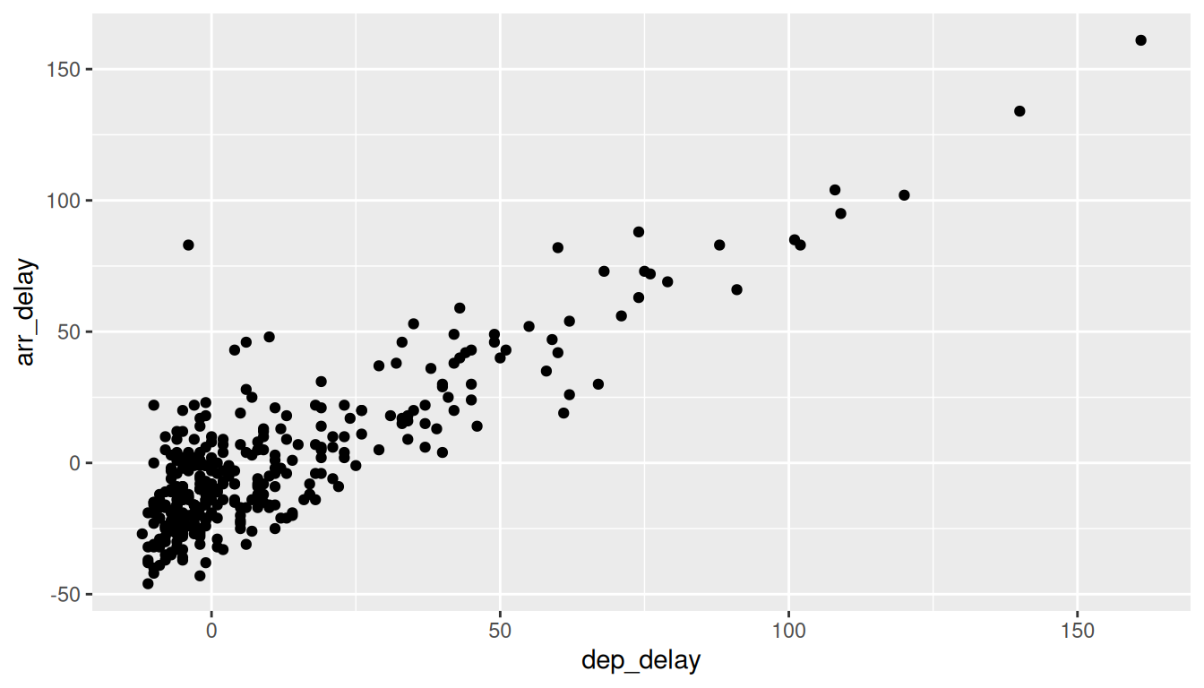
We then add a layer to the ggplot() function call using the + sign. The added layer in question specifies the third component of the grammar: the geometric object. In this case, the geometric object is set to be points by specifying geom_point(). After running these two lines of code in your console, you’ll notice two outputs: a warning message and the graphic shown in Figure 2.2.
Warning: Removed 3 rows containing missing values or values outside the scale range
(`geom_point()`).
Let’s first unpack the graphic in Figure 2.2. Observe that a positive relationship exists between dep_delay and arr_delay: as departure delays increase, arrival delays tend to also increase. Observe also the large mass of points clustered near (0, 0), the point indicating flights that neither departed nor arrived late.
Let’s turn our attention to the warning message. R is alerting us to the fact that three rows were ignored due to them being missing. For these three rows, either the value for dep_delay or arr_delay or both were missing (recorded in R as NA), and thus these rows were ignored in our plot.
Before we continue, let’s make a few more observations about this code that created the scatterplot. Note that the + sign comes at the end of lines, and not at the beginning. You’ll get an error in R if you put it at the beginning of a line. When adding layers to a plot, you are encouraged to start a new line after the + (by pressing the Return/Enter button on your keyboard) so that the code for each layer is on a new line. As we add more and more layers to plots, you’ll see this will greatly improve the legibility of your code.
To stress the importance of adding the layer specifying the geometric object, consider Figure 2.3 where no layers are added. Because the geometric object was not specified, we have a blank plot that is not very useful!
Learning Check
(LC2.2) What are practical reasons why dep_delay and arr_delay have a positive relationship?
If a plane leaves late, it often loses its departure slot, encounters downstream congestion/spacing, and arrives late as well. Crewing/turnaround buffers can’t fully absorb big late departures, so late out often leads to late in (though some time can be made up while in flight).
(LC2.3) What variables in the weather data frame would you expect to have a negative correlation (i.e., a negative relationship) with dep_delay? Why? Remember that we are focusing on numerical variables here. Hint: Explore the weather dataset by using the View() function.
Visibility (visib) and pressure (pressure)—higher values usually mean clearer, calmer weather and thus fewer delays (negative relationship). (By contrast, precip, wind_speed, wind_gust would tend to be positively related to delays.)
(LC2.4) Why do you believe there is a cluster of points near (0, 0)? What does (0, 0) correspond to in terms of the Envoy Air flights?
(0, 0) is on-time departure and on-time arrival. Many flights leave and arrive close to schedule, producing a dense cluster around the origin.
(LC2.5) What are some other features of the plot that stand out to you?
Different people will answer this one differently. One answer is most flights depart and arrive less than an hour late.
(LC2.6) Create a new scatterplot using different variables in the envoy_flights data frame by modifying the example given.
Many possibilities for this one, see the plot below. Is there a pattern in departure delay depending on when the flight is scheduled to depart? Interestingly, there seems to be only a few blocks of time where flights depart with Envoy.
ggplot(data = envoy_flights, mapping = aes(x = dep_time, y = dep_delay)) +
  geom_point()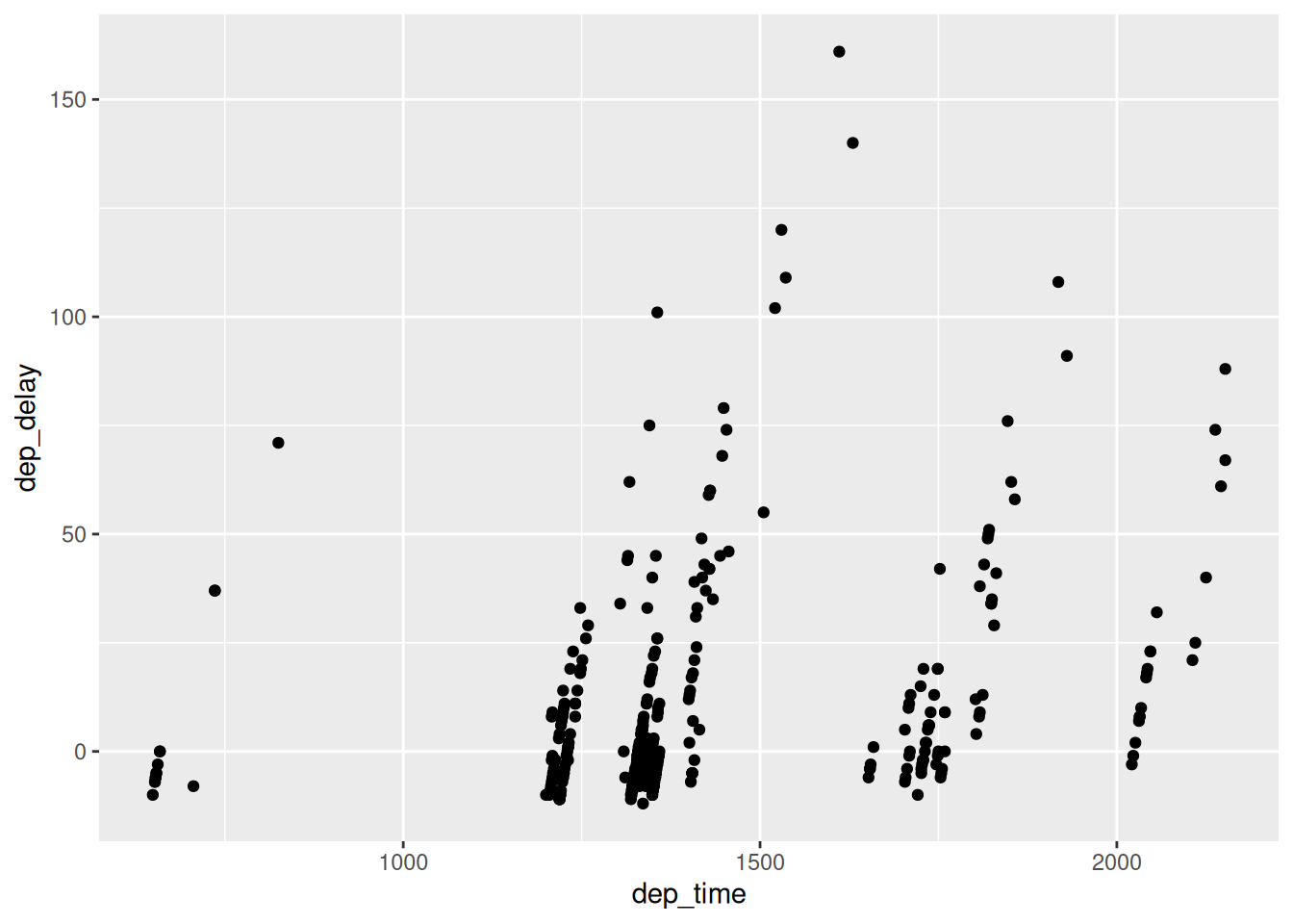
2.3.2 Overplotting
The large mass of points near (0, 0) in Figure 2.2 can cause some confusion since it is hard to tell the true number of points that are plotted. This is the result of a phenomenon called overplotting. As one may guess, this corresponds to points being plotted on top of each other over and over again. When overplotting occurs, it is difficult to know the number of points being plotted. There are two methods to address the issue of overplotting. Either by
- Adjusting the transparency of the points or
- Adding a little random “jitter” (or random “nudges”) to each of the points.
Method 1: Changing the transparency
The first way of addressing overplotting is to change the transparency/opacity of the points by setting the alpha argument in geom_point(). We can change the alpha argument to be any value between 0 and 1, where 0 sets the points to be 100% transparent and 1 sets the points to be 100% opaque. By default, alpha is set to 1. In other words, if we don’t explicitly set an alpha value, R will use alpha = 1.
Note how the following code is identical to the code in Section 2.3 that created the scatterplot with overplotting, but with alpha = 0.2 added to the geom_point() function:
ggplot(data = envoy_flights, mapping = aes(x = dep_delay, y = arr_delay)) +
  geom_point(alpha = 0.2)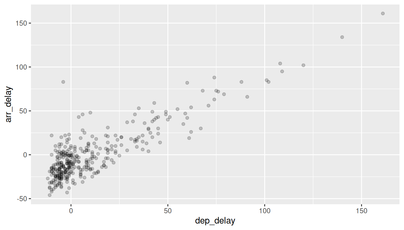
The key feature to note in Figure 2.4 is that the transparency of the points is cumulative: areas with a high-degree of overplotting are darker, whereas areas with a lower degree are less dark. Note, furthermore, that there is no aes() surrounding alpha = 0.2. This is because we are not mapping a variable to an aesthetic attribute, but rather merely changing the default setting of alpha. In fact, if you change the second line to read geom_point(aes(alpha = 0.2)), you won’t get the plot you intended: a meaningless legend labeled 0.2 appears, and the points’ transparency is chosen by ggplot2’s alpha scale rather than set to the 0.2 you asked for.
Constants belong outside aes(), variables belong inside. When you write aes(alpha = 0.2), ggplot2 maps the constant 0.2 as if it were a data variable: it adds a meaningless legend labeled 0.2, and the actual transparency is picked by its alpha scale — not the 0.2 you intended. Use aes(alpha = a_column_name) to map a data variable to transparency, or geom_point(alpha = 0.2) to set a fixed value. Same logic applies to color, size, shape, etc.
Method 2: Jittering the points
The second way of addressing overplotting is by jittering all the points. This means giving each point a small “nudge” in a random direction. You can think of “jittering” as shaking the points around a bit on the plot. Let’s illustrate using a simple example first. Say we have a data frame with 4 identical rows of x and y values: (0,0), (0,0), (0,0), and (0,0). In Figure 2.5, we present both the regular scatterplot of these 4 points (on the left) and its jittered counterpart (on the right).
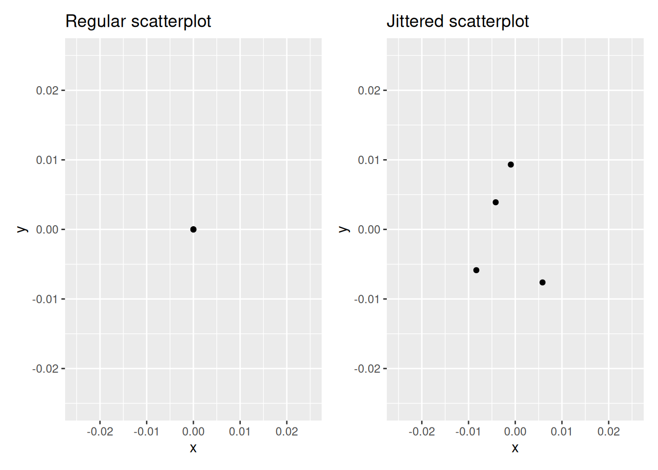
In the left-hand regular scatterplot, observe that the 4 points are superimposed on top of each other. While we know there are 4 values being plotted, this fact might not be apparent to others. In the right-hand jittered scatterplot, it is now plainly evident that this plot involves four points since each point is given a random “nudge.”
Keep in mind, however, that jittering is strictly a visualization tool; even after creating a jittered scatterplot, the original values saved in the data frame remain unchanged.
To create a jittered scatterplot, instead of using geom_point(), we use geom_jitter(). Observe how the following code is very similar to the code that created the scatterplot with overplotting in Section 2.3.1, but with geom_point() replaced with geom_jitter().
ggplot(data = envoy_flights, mapping = aes(x = dep_delay, y = arr_delay)) +
  geom_jitter(width = 30, height = 30)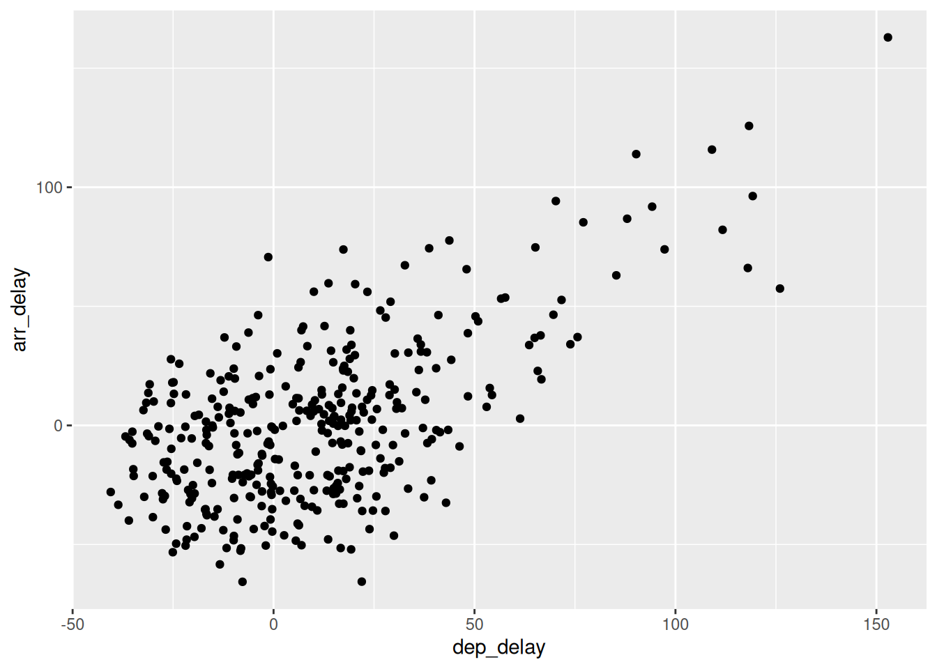
In order to specify how much jitter to add, we adjusted the width and height arguments to geom_jitter(). This corresponds to how hard you’d like to shake the plot in horizontal x-axis units and vertical y-axis units, respectively. In this case, both axes are in minutes. How much jitter should we add using the width and height arguments? On the one hand, it is important to add just enough jitter to break any overlap in points, but on the other hand, not so much that we completely alter the original pattern in points.
As can be seen in the resulting Figure 2.6, in this case jittering doesn’t really provide much new insight. In this particular case, it can be argued that changing the transparency of the points by setting alpha proved more effective. When would it be better to use a jittered scatterplot? When would it be better to alter the points’ transparency? There is no single right answer that applies to all situations. You need to make a subjective choice and own that choice. At the very least when confronted with overplotting, however, we suggest you make both types of plots and see which one better emphasizes the point you are trying to make.
Learning Check
(LC2.7) Why is setting the alpha argument value useful with scatterplots? What further information does it give you that a regular scatterplot cannot?
Lower alpha reveals point density under overplotting—darker regions indicate where many points overlap, which a regular opaque scatterplot hides.
(LC2.8) After viewing Figure 2.4, give an approximate range of arrival delays and departure delays that occur most frequently. How has that region changed compared to when you observed the same plot without alpha = 0.2 set in Figure 2.2?
The densest region is near zero (roughly within about -25 minutes for both departure and arrival). With transparency, that high-density core is much clearer than in the opaque plot.
2.3.3 Summary
Scatterplots display the relationship between two numerical variables. They are among the most commonly used plots because they can provide an immediate way to see the trend in one numerical variable versus another. However, if you try to create a scatterplot where either one of the two variables is not numerical, you might get strange results. Be careful!
With medium to large datasets, you may need to play around with the different modifications to scatterplots we saw such as changing the transparency/opacity of the points or by jittering the points. This tweaking is often a fun part of data visualization, since you’ll have the chance to see different relationships emerge as you tinker with your plots.
2.4 5NG#2: Linegraphs
The next of the five named graphs are linegraphs. Linegraphs show the relationship between two numerical variables when the variable on the x-axis, also called the explanatory variable, is of a sequential nature. In other words, there is an inherent ordering to the variable.
The most common examples of linegraphs have some notion of time on the x-axis: hours, days, weeks, years, etc. Since time is sequential, we connect consecutive observations of the variable on the y-axis with a line. Linegraphs that have some notion of time on the x-axis are also called time series plots. Let’s illustrate linegraphs using another dataset in the nycflights23 package: the weather data frame.
Let’s explore the weather data frame from the nycflights23 package by running View(weather) and glimpse(weather). Furthermore, let’s read the associated help file by running ?weather to bring up the help file.
Observe that there is a variable called wind_speed of hourly wind speed recordings in miles per hour at weather stations near all three major airports in New York City: Newark (origin code EWR), John F. Kennedy International (JFK), and LaGuardia (LGA).
However, instead of considering hourly wind speeds for all days in 2023 for all three airports, for simplicity let’s only consider hourly wind speeds at Newark airport for the first 15 days in January. This data is accessible in the early_january_2023_weather data frame included in the moderndive package. In other words, early_january_2023_weather contains hourly weather observations for origin equal to EWR (Newark’s airport code), month equal to 1, and day less than or equal to 15.
Learning Check
(LC2.9) Take a look at both the weather data frame from the nycflights23 package and the early_january_2023_weather data frame from the moderndive package by running View(weather) and View(early_january_2023_weather). In what respect do these data frames differ?
early_january_2023_weather is a subset: only origin == "EWR", month == 1, and day <= 15. Same variables; fewer rows.
(LC2.10) View() the flights data frame again. Why does the time_hour variable uniquely identify the hour of the measurement, whereas the hour variable does not?
time_hour encodes date + hour (a POSIXct timestamp in R). hour alone repeats 0–23 every day (and across airports), so it’s not unique.
2.4.1 Linegraphs via geom_line
Let’s create a time series plot (as seen in Figure 2.7) of the hourly wind speeds saved in the early_january_2023_weather data frame by using geom_line() to create a linegraph, instead of using geom_point() like we used previously to create scatterplots:
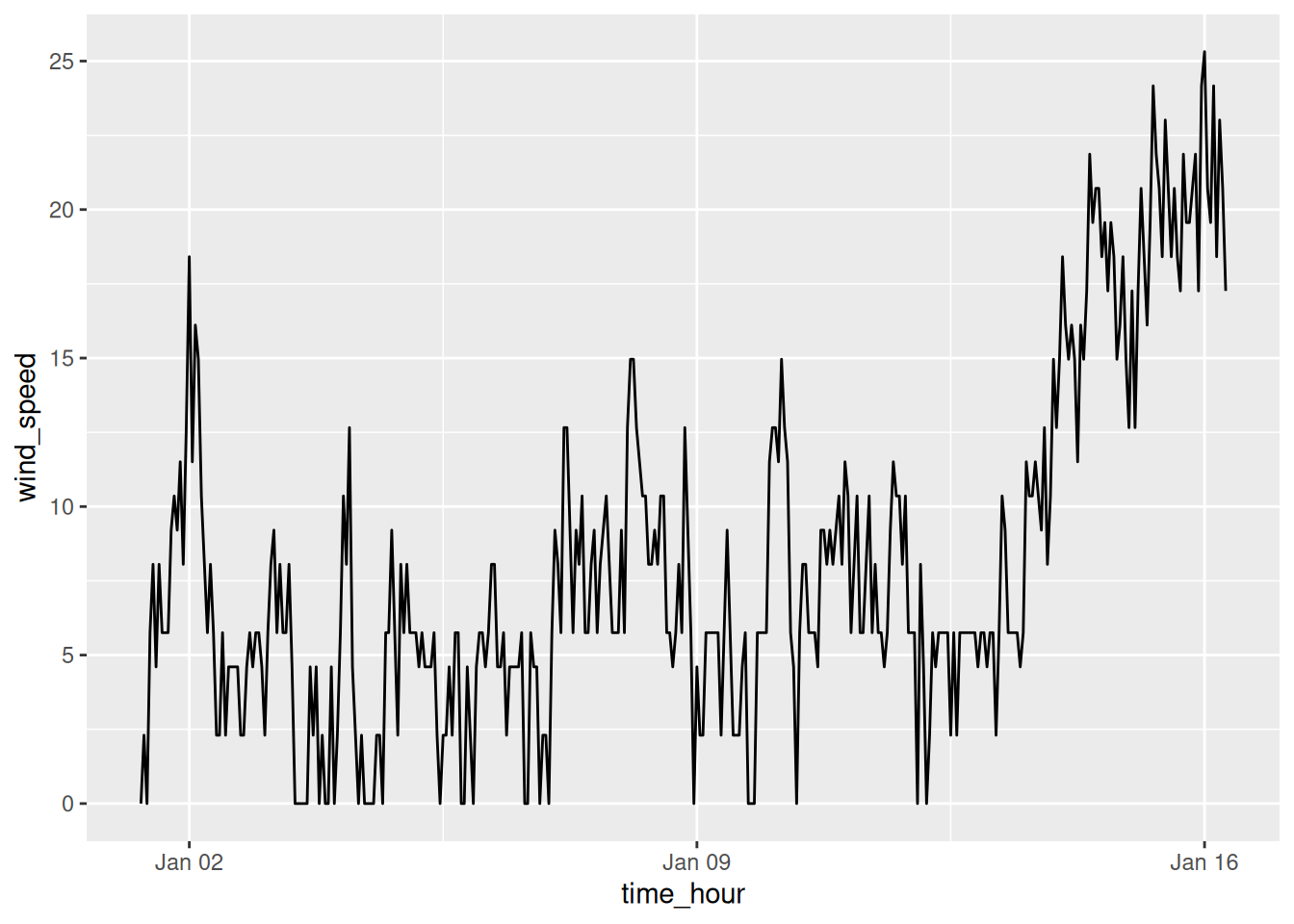
Much as with the ggplot() code that created the scatterplot of departure and arrival delays for Envoy Air flights in Figure 2.2, let’s break down this code piece-by-piece in terms of the grammar of graphics:
Within the ggplot() function call, we specify two of the components of the grammar of graphics as arguments:
- The
datato be theearly_january_2023_weatherdata frame by settingdata = early_january_2023_weather. - The
aestheticmappingby settingmapping = aes(x = time_hour, y = wind_speed). Specifically, the variabletime_hourmaps to thexposition aesthetic, while the variablewind_speedmaps to theyposition aesthetic.
We add a layer to the ggplot() function call using the + sign. The layer in question specifies the third component of the grammar: the geometric object in question. In this case, the geometric object is a line set by specifying geom_line().
Learning Check
(LC2.11) Why should linegraphs be avoided when there is not a clear ordering of the horizontal axis?
Connecting points implies a meaningful sequence/continuity. Without a real order, lines suggest patterns that don’t exist and can mislead.
(LC2.12) Why are linegraphs frequently used when time is the explanatory variable on the x-axis?
Time is inherently ordered; connecting adjacent times shows trends and changes over time smoothly.
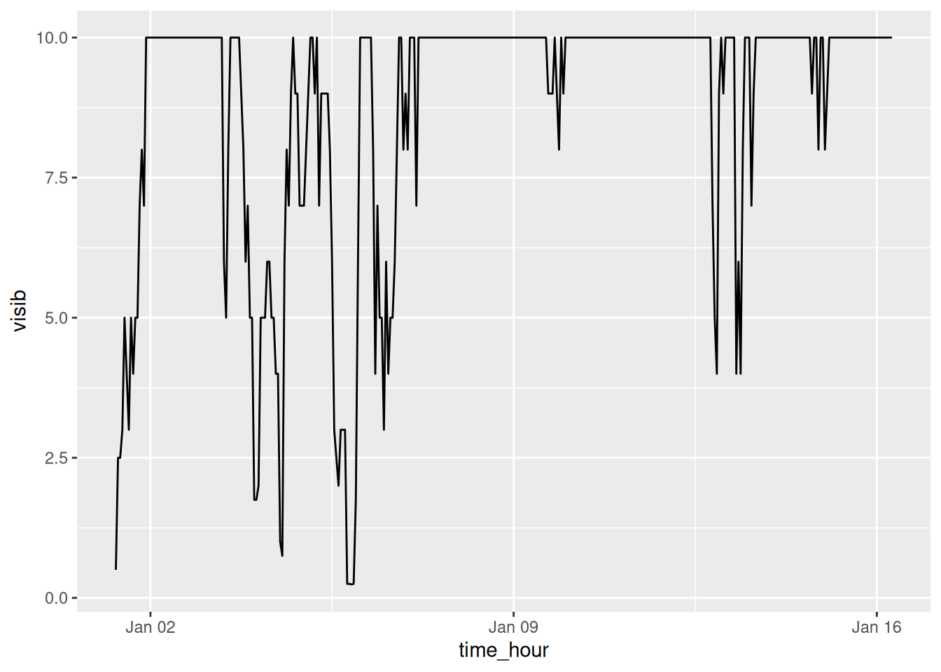
(LC2.13) Plot a time series of a variable other than wind_speed for Newark Airport in the first 15 days of January 2023. Try to select a variable that doesn’t have a lot of missing (NA) values.
2.4.2 Summary
Linegraphs, just like scatterplots, display the relationship between two numerical variables. However, it is preferred to use linegraphs over scatterplots when the variable on the x-axis (i.e., the explanatory variable) has an inherent ordering, such as some notion of time.
2.5 5NG#3: Histograms
Let’s consider the wind_speed variable in the weather data frame once again, but unlike with the linegraphs in Section 2.4, let’s say we don’t care about its relationship with time, but rather we only care about how the values of wind_speed distribute. In other words:
- What are the smallest and largest values?
- What is the “center” or “most typical” value?
- How do the values spread out?
- What are frequent and infrequent values?
One way to visualize this distribution of this single variable wind_speed is to plot them on a horizontal line as we do in Figure 2.8:
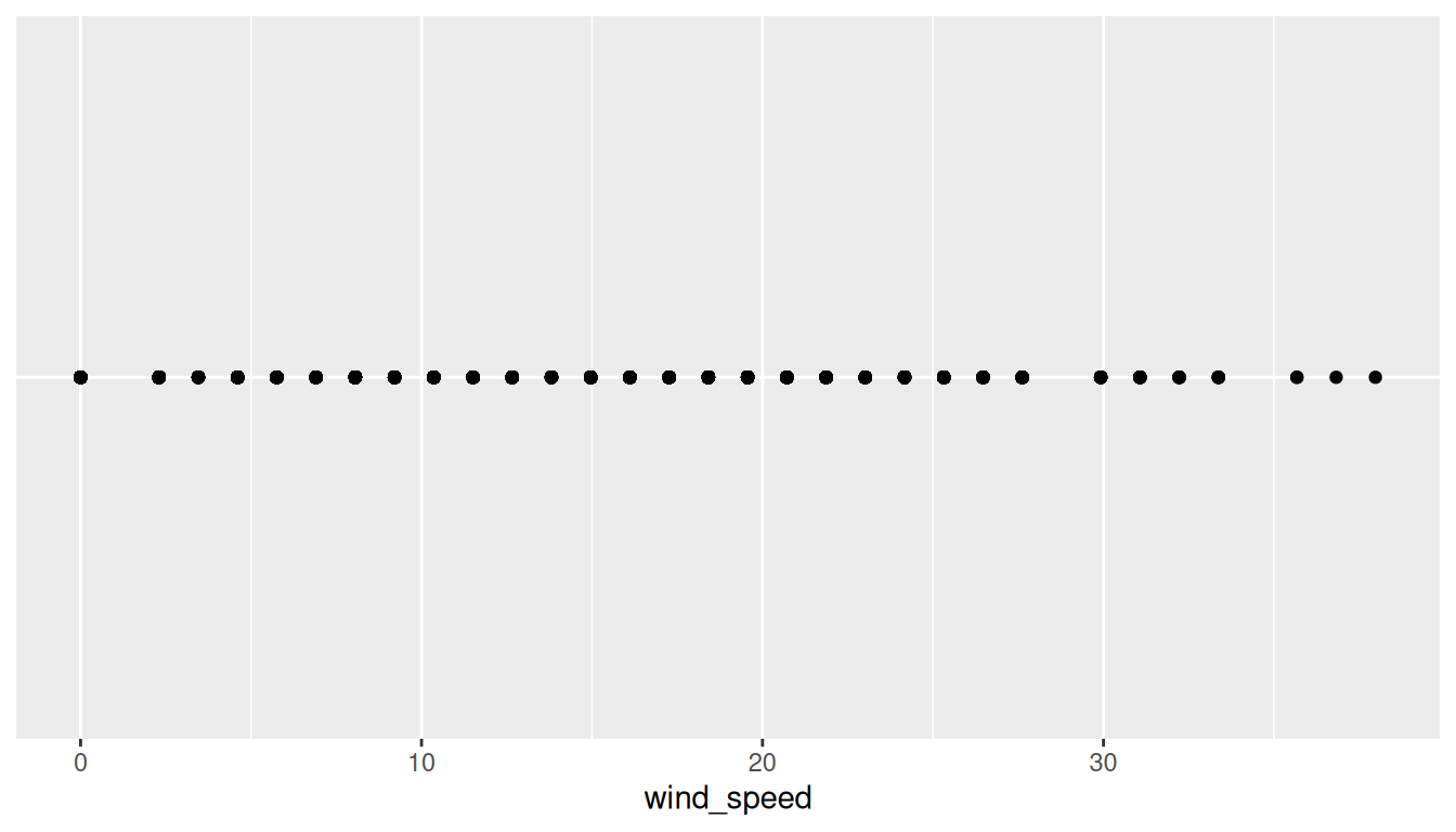
This gives us a general idea of how the values of wind_speed distribute: observe that wind speeds vary from around 0 miles per hour (0 kilometers per hour) up to 38 miles per hour (approximately 61 kilometers per hour). There appear to be more recorded wind speeds between 0 and 20 miles per hour (mph) than outside this range. However, because of the high degree of overplotting in the points, it’s hard to get a sense of exactly how many values are between, say, 10 mph and 15 mph.
What is commonly produced instead of Figure 2.8 is known as a histogram. A histogram is a plot that visualizes the distribution of a numerical value as follows:
- We first cut up the x-axis into a series of bins, where each bin represents a range of values.
- For each bin, we count the number of observations that fall in the range corresponding to that bin.
- Then for each bin, we draw a bar whose height marks the corresponding count.
Let’s drill-down on an example of a histogram, shown in Figure 2.9.

Let’s focus only on wind speeds between 10 mph and 25 mph for now. Observe that there are three bins of equal width between 10 mph and 25 mph. Thus we have three bins of width 5 mph each: one bin for the 10-15 mph range, another bin for the 15-20 mph range, and another bin for the 20-25 mph range. Since:
- The bin for the 10-15 mph range has a height of around 8000. In other words, around 8000 of the hourly wind speed recordings are between 10 mph and 15 mph.
- The bin for the 15-20 mph range has a height of around 2400. In other words, around 2400 of the hourly wind speed recordings are between 15 mph and 20 mph.
- The bin for the 20-25 mph range has a height of around 700. In other words, around 700 of the hourly wind speed recordings are between 20 mph and 25 mph.
All eight bins spanning 0 mph to 40 mph on the x-axis have this interpretation.
2.5.1 Histograms via geom_histogram
Let’s now present the ggplot() code to plot your first histogram! Unlike with scatterplots and linegraphs, there is now only one variable being mapped in aes(): the single numerical variable wind_speed. The y-aesthetic of a histogram, the count of the observations in each bin, gets computed for you automatically. Furthermore, the geometric object layer is now a geom_histogram(). After running the following code, you’ll see the histogram in Figure 2.10 as well as warning messages. We’ll discuss the warning messages first.
ggplot(data = weather, mapping = aes(x = wind_speed)) +
  geom_histogram()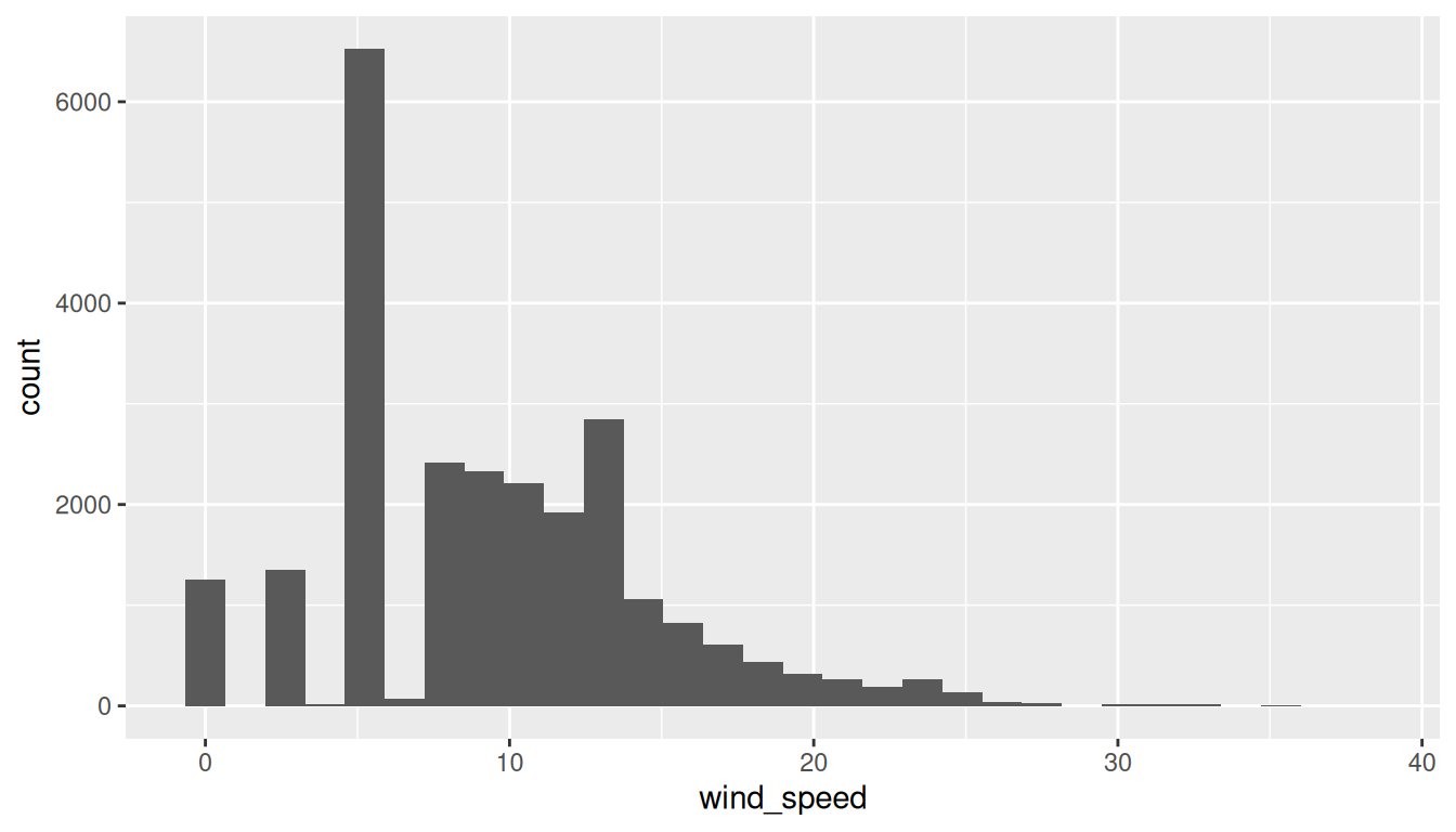
`stat_bin()` using `bins=30`. Pick better value with `binwidth`.Warning: Removed 1033 rows containing non-finite outside the scale range (`stat_bin()`).The first message is telling us that the histogram was constructed using bins = 30 for 30 equally spaced bins. This is known in computer programming as a default value; unless you override this default number of bins with a number you specify, R will choose 30 by default. We’ll see in the next section how to change the number of bins to another value than the default.
The second warning message is telling us something similar to the warning message we received when we ran the code to create a scatterplot of departure and arrival delays for Envoy Air flights in Figure 2.2: that because some rows have missing NA value for wind_speed, they were omitted from the histogram. R is just giving us a friendly heads-up that this was the case.
Now let’s unpack the resulting histogram in Figure 2.10. Observe that values above 30 mph are rather rare. However, because of the large number of bins, it’s hard to get a sense for which range of wind speeds is spanned by each bin; everything is one giant amorphous blob. So let’s add white vertical borders demarcating the bins by adding a color = "white" argument to geom_histogram() and ignore the warning about setting the number of bins to a better value:
ggplot(data = weather, mapping = aes(x = wind_speed)) +
  geom_histogram(color = "white")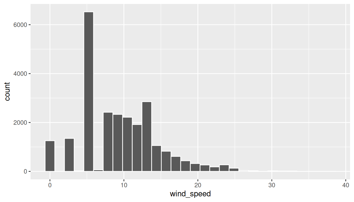
We now have an easier time associating ranges of wind speeds to each of the bins in Figure 2.11. We can also vary the color of the bars by setting the fill argument. For example, you can set the bin colors to be “blue steel” by setting fill = "steelblue":
ggplot(data = weather, mapping = aes(x = wind_speed)) +
  geom_histogram(color = "white", fill = "steelblue")
If you’re curious, run colors() to see all 657 possible choices of colors in R!
2.5.2 Adjusting the bins
Observe in Figure 2.11 that in the 10-20 mph range there appear to be roughly 8 bins. Thus each bin has width 10 divided by 8, or 1.25 mph, which is not a very easily interpretable range to work with. Let’s improve this by adjusting the number of bins in our histogram in one of two ways:
- By adjusting the number of bins via the
binsargument togeom_histogram(). - By adjusting the width of the bins via the
binwidthargument togeom_histogram().
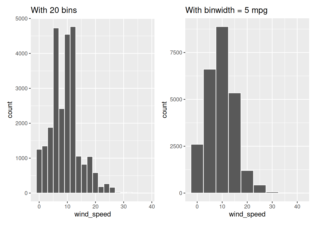
Using the first method, we have the power to specify how many bins we would like to cut the x-axis up in. As mentioned in the previous section, the default number of bins is 30. We can override this default, to say 20 bins, as follows:
ggplot(data = weather, mapping = aes(x = wind_speed)) +
  geom_histogram(bins = 20, color = "white")
Using the second method, instead of specifying the number of bins, we specify the width of the bins by using the binwidth argument in the geom_histogram() layer. For example, let’s set the width of each bin to be five mph.
ggplot(data = weather, mapping = aes(x = wind_speed)) +
  geom_histogram(binwidth = 5, color = "white")
We compare both resulting histograms side-by-side in Figure 2.12.
Learning Check
(LC2.14) What does changing the number of bins from 30 to 20 tell us about the distribution of wind speeds?
Fewer, wider bins smooth the histogram, making the overall pattern clearer (most observations at lower speeds), while sacrificing fine detail.
(LC2.15) Would you classify the distribution of wind speeds as symmetric or skewed in one direction or another?
Right-skewed—a concentration at low speeds with a tail extending to higher wind speeds.
(LC2.16) What would you guess is the “center” value in this distribution? Why did you make that choice?
Around ~10 mph. The tallest bins cluster roughly in the 5–15 mph range, so the typical value is near 10.
(LC2.17) Is this data spread out greatly from the center or is it close? Why?
Moderate spread: most values are between 0–20 mph, with relatively few beyond 30 mph (a right tail but not extremely wide).
2.5.3 Summary
Histograms, unlike scatterplots and linegraphs, present information on only a single numerical variable. Specifically, they are visualizations of the distribution of the numerical variable in question.
2.6 Facets
Before continuing with the next of the 5NG, let’s briefly introduce a new concept called faceting. Faceting is used when we’d like to split a particular visualization by the values of another variable. This will create multiple copies of the same type of plot with matching x and y axes, but whose content will differ.
For example, suppose we were interested in looking at how the histogram of hourly wind speed recordings at the three NYC airports we saw in Figure 2.9 differed in each month. We could “split” this histogram by the 12 possible months in a given year. In other words, we would plot histograms of wind_speed for each month separately. We do this by adding facet_wrap(~ month) layer. Note the ~ is a “tilde” and can generally be found on the key next to the “1” key on US keyboards. The tilde is required and you’ll receive the error Error in as.quoted(facets) : object 'month' not found if you don’t include it here.
ggplot(data = weather, mapping = aes(x = wind_speed)) +
  geom_histogram(binwidth = 5, color = "white") +
  facet_wrap(~ month)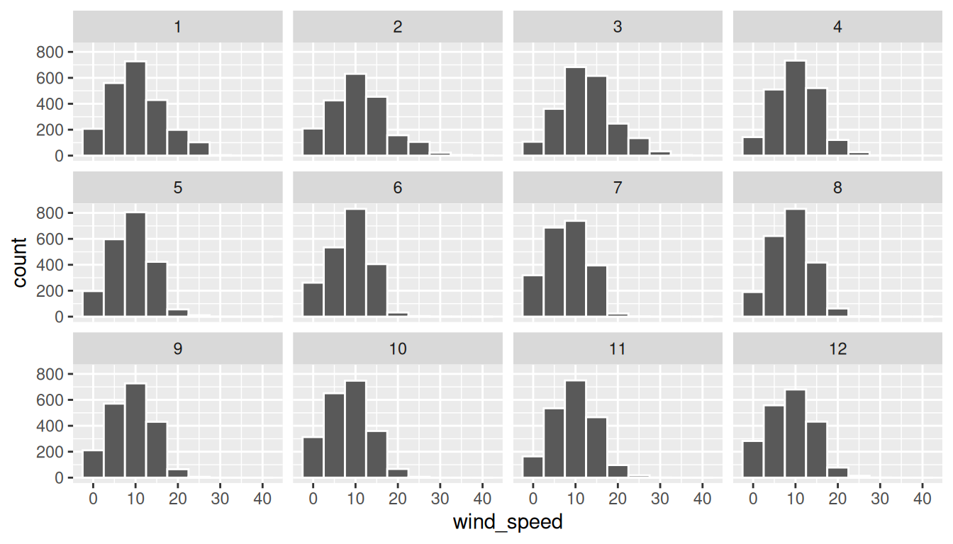
We can also specify the number of rows and columns in the grid by using the nrow and ncol arguments inside of facet_wrap(). For example, say we would like our faceted histogram to have 4 rows instead of 3. We simply add an nrow = 4 argument to facet_wrap(~ month).
ggplot(data = weather, mapping = aes(x = wind_speed)) +
  geom_histogram(binwidth = 5, color = "white") +
  facet_wrap(~ month, nrow = 4)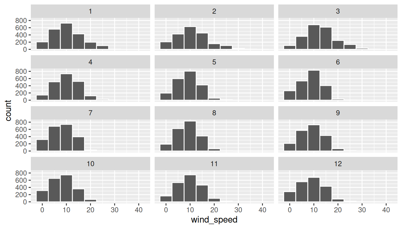
Observe in both Figure 2.13 and Figure 2.14 the majority of wind speed observations for all months are clustered between 0 and 20 mph, with very few observations exceeding 30 mph. The histograms show a similar shape across months, with most distributions having a similar largest count and a few larger speed outliers, indicating that lower wind speeds are more common than higher wind speeds.
Learning Check
(LC2.18) What other things do you notice about this faceted plot? How does a faceted plot help us see relationships between two variables?
Distributions look similar across months, with some months slightly windier. Faceting puts months in comparable panels with shared scales, making cross-month contrasts easy.
(LC2.19) What do the numbers 1-12 correspond to in the plot? What about 10, 20, and 30?
1–12 = months of the year. 10, 20, 30 = wind speed tick marks (mph) on the x-axis.
(LC2.20) For which types of datasets would faceted plots not work well in comparing relationships between variables? Give an example describing the nature of these variables and other important characteristics.
When the facetting variable has many levels (e.g., hundreds of ZIP codes) or few observations per level, producing tiny, sparse panels that are hard to compare.
(LC2.21) Does the wind_speed variable in the weather dataset have a lot of variability? Why do you say that?
Some, but mostly concentrated: many observations between 0–20 mph, with fewer high-speed outliers. So variability exists with a right tail, but the bulk is low-to-moderate.
2.7 5NG#4: Boxplots
While faceted histograms are one type of visualization used to compare the distribution of a numerical variable split by the values of another variable, another type of visualization that achieves this same goal is a side-by-side boxplot. A boxplot is constructed from the information provided in the five-number summary of a numerical variable. To keep things simple for now, let’s only consider the 2057 recorded hourly wind speed recordings for the month of April, each represented as a jittered point in Figure 2.15.
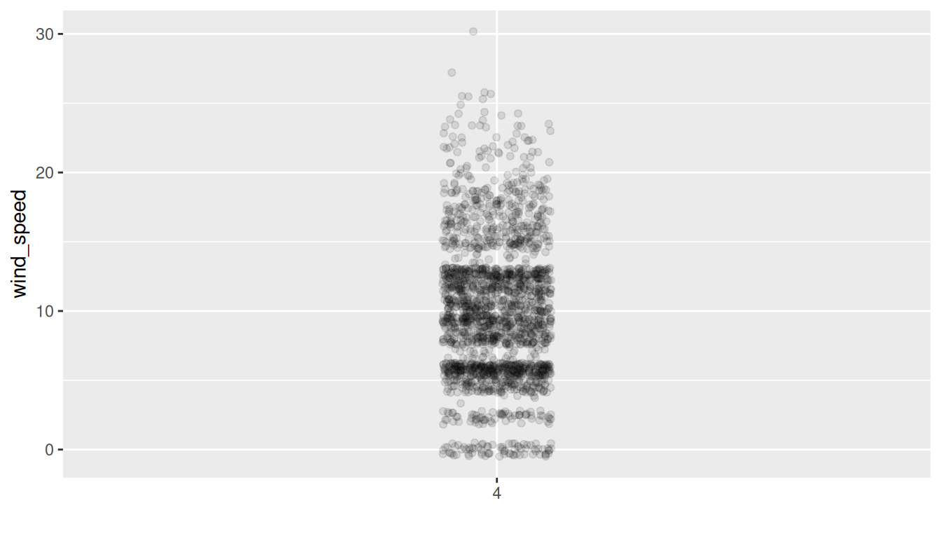
These 2057 observations have the following five-number summary:
- Minimum: 0 mph
- First quartile (25th percentile): 5.8 mph
- Median (second quartile, 50th percentile): 9.2 mph
- Third quartile (75th percentile): 12.7 mph
- Maximum: 29.92 mph
In the leftmost plot of Figure 2.16, let’s mark these 5 values with dashed horizontal lines on top of the 2057 points. In the middle plot of Figure 2.16 let’s add the boxplot. In the rightmost plot of Figure 2.16, let’s remove the points and the dashed horizontal lines for clarity’s sake.
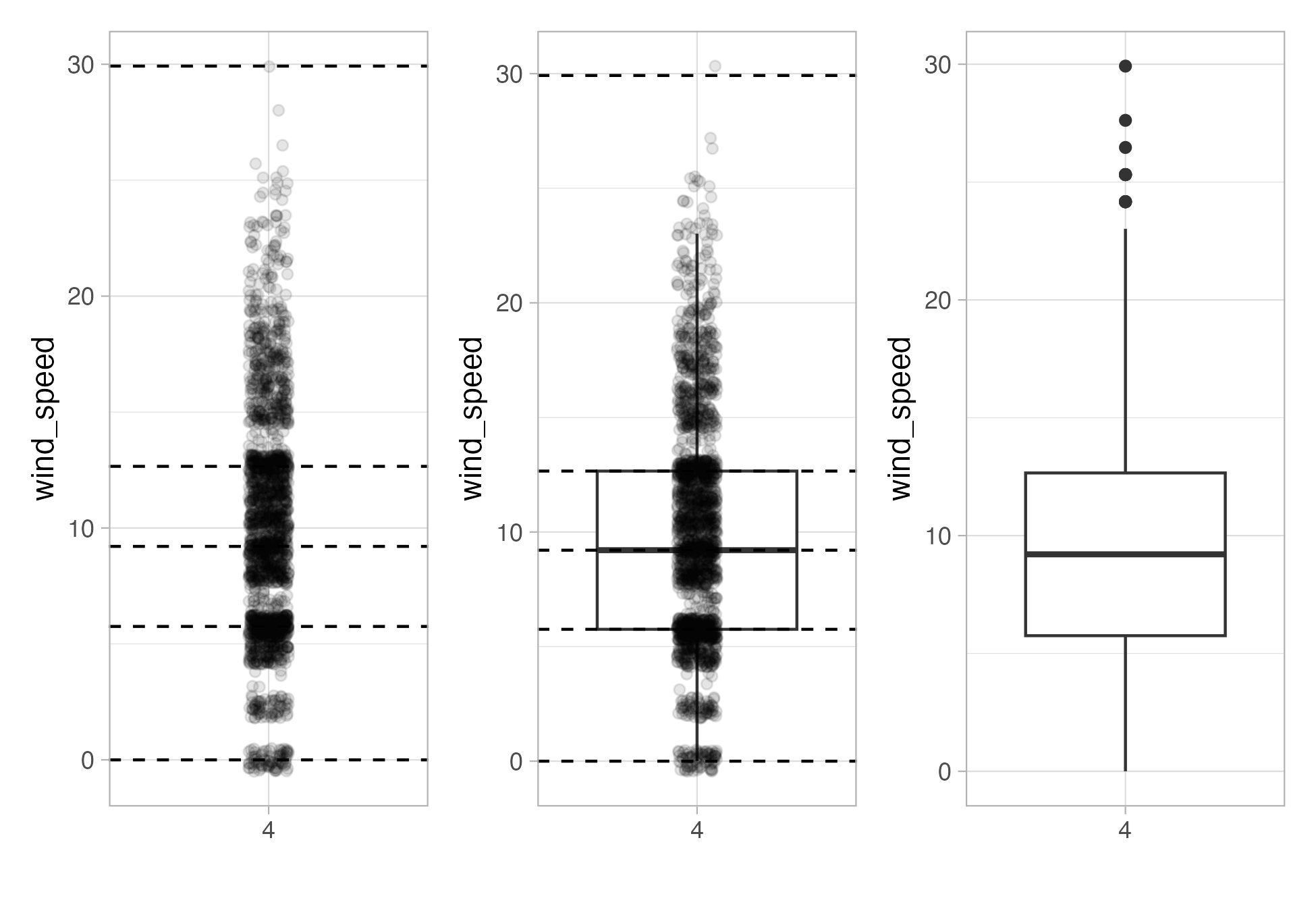
What the boxplot does is visually summarize the 2057 points by cutting the wind speed recordings into quartiles at the dashed lines, where each quartile contains roughly 2057 \(\div\) 4 \(\approx\) 514 observations. Thus
- 25% of points fall below the bottom edge of the box, which is the first quartile of 5.8 mph. In other words, 25% of observations were below 5.8 mph.
- 25% of points fall between the bottom edge of the box and the solid middle line, which is the median of 9.2 mph. Thus, 25% of observations were between 5.8 mph and 9.2 mph and 50% of observations were below 9.2 mph.
- 25% of points fall between the solid middle line and the top edge of the box, which is the third quartile of 12.7 mph. It follows that 25% of observations were between 9.2 mph and 12.7 mph and 75% of observations were below 12.7 mph.
- 25% of points fall above the top edge of the box. In other words, 25% of observations were above 12.7 mph.
- The middle 50% of points lie within the interquartile range (IQR) between the first and third quartile. Thus, the IQR for this example is 12.7 - 5.8 = 6.905 mph. The interquartile range measures a numerical variable’s spread.
Furthermore, in the rightmost plot of Figure 2.16, we see the whiskers of the boxplot. The whiskers stick out from either end of the box up to the smallest and largest observed wind speeds that are within 1.5 \(\times\) the interquartile range from either end of the box; in this case of the April wind speeds, no more than 1.5 \(\times\) 6.905 mph = 10.357 mph from either end of the box. Here the bottom whisker reaches all the way down to the minimum observed wind speed of 0 mph, but the top whisker stops short of the maximum of 29.92 mph. Any observed values outside the reach of the whiskers get marked with points called outliers, which are marked here, and we’ll discuss further in the next section.
2.7.1 Boxplots via geom_boxplot
Let’s now create a side-by-side boxplot of hourly wind speeds split by the 12 months as we did previously with the faceted histograms. We do this by mapping the month variable to the x-position aesthetic, the wind_speed variable to the y-position aesthetic, and by adding a geom_boxplot() layer:
ggplot(data = weather, mapping = aes(x = month, y = wind_speed)) +
  geom_boxplot()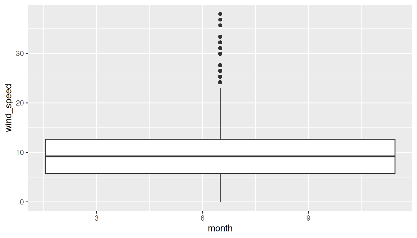
Warning message:
1: Continuous x aesthetic -- did you forget aes(group=...)?
Observe in Figure 2.17 that this plot does not provide information about wind speed separated by month. The first warning message tells us why. It says that we have a “continuous” (or numerical variable) on the x-position aesthetic. Boxplots, however, require a categorical variable to be mapped to the x-position aesthetic.
We can convert the numerical variable month into a factor categorical variable by using the factor() function. After applying factor(month), month goes from having just the numerical values 1, 2, …, and 12 to having an associated ordering. With this ordering, ggplot() now knows how to work with this variable to produce the plot.
ggplot(data = weather, mapping = aes(x = factor(month), y = wind_speed)) +
  geom_boxplot()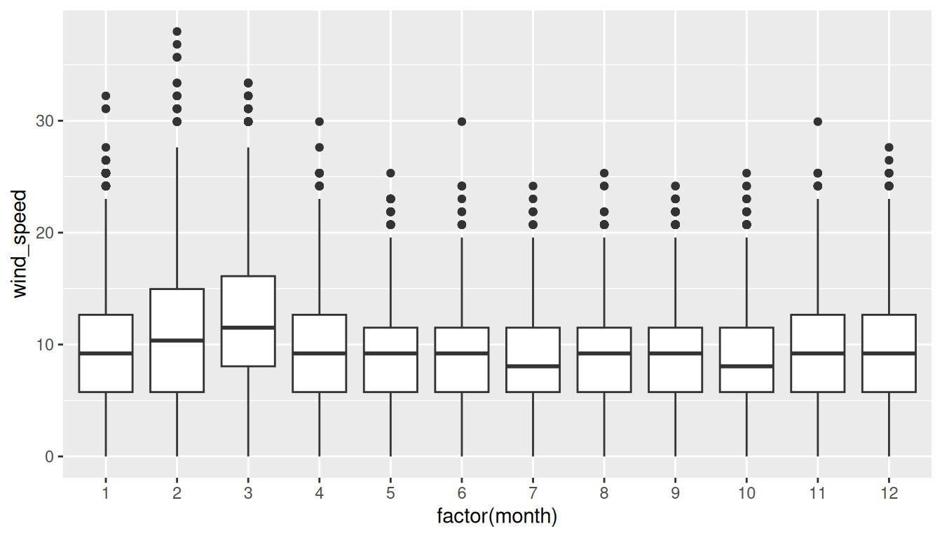
The resulting Figure 2.18 shows 12 separate “box and whiskers” plots similar to the rightmost plot of Figure 2.16 of only April wind speeds. Thus the different boxplots are shown “side-by-side.”
- The “box” portions of the visualization represent the 1st quartile, the median (the 2nd quartile), and the 3rd quartile.
- The height of each box (the value of the 3rd quartile minus the value of the 1st quartile) is the interquartile range (IQR). It is a measure of the spread of the middle 50% of values, with longer boxes indicating more variability.
- The “whisker” portions of these plots extend out from the bottoms and tops of the boxes and represent points less than the 25th percentile and greater than the 75th percentile, respectively. They’re set to extend out no more than \(1.5 \times IQR\) units away from either end of the boxes. We say “no more than” because the ends of the whiskers have to correspond to observed wind speeds. The length of these whiskers shows how the data outside the middle 50% of values vary, with longer whiskers indicating more variability.
- The dots representing values falling outside the whiskers are called outliers. These can be thought of as anomalous (“out-of-the-ordinary”) values.
It is important to keep in mind that the definition of an outlier is somewhat arbitrary and not absolute. In this case, they are defined by the length of the whiskers, which are no more than \(1.5 \times IQR\) units long for each boxplot. Looking at this side-by-side plot we can see that the months of February and March have higher median wind speeds as evidenced by the higher solid lines in the middle of the boxes. We can easily compare wind speeds across months by drawing imaginary horizontal lines across the plot. Furthermore, the heights of the 12 boxes as quantified by the interquartile ranges are informative too; they tell us about variability, or spread, of wind speeds recorded in a given month.
Learning Check
(LC2.22) What do the dots at the top of the plot for January correspond to? Explain what might have occurred in January to produce these points.
Outliers (unusually high winds). Likely stormy or gusty winter days causing much higher wind speeds.
(LC2.23) Which months seem to have the highest variability in wind speed? What reasons can you give for this?
Winter months (e.g., Jan–Mar) show wider spread likely due to seasonal systems bringing stronger, more variable winds.
(LC2.24) We looked at the distribution of the numerical variable wind_speed split by the numerical variable month that we converted using the factor() function in order to make a side-by-side boxplot. Why would a boxplot of wind_speed split by the numerical variable pressure similarly converted to a categorical variable using the factor() not be informative?
pressure is continuous with many distinct values; turning it into a factor yields lots of tiny groups with few points each. This leads to clutter that is hard to interpret.
(LC2.25) Boxplots provide a simple way to identify outliers. Why may outliers be easier to identify when looking at a boxplot instead of a faceted histogram?
Boxplots explicitly mark outliers as points; histograms spread counts across bins, so rare extreme values don’t stand out as clearly.
2.7.2 Summary
Side-by-side boxplots provide us with a way to compare the distribution of a numerical variable across multiple values of another variable. One can see where the median falls across the different groups by comparing the solid lines in the center of the boxes.
To study the spread of a numerical variable within one of the boxes, look at both the length of the box and also how far the whiskers extend from either end of the box. Outliers are even more easily identified when looking at a boxplot than when looking at a histogram as they are marked with distinct points.
2.8 5NG#5: Barplots
Both histograms and boxplots are tools to visualize the distribution of numerical variables. Another commonly desired task is to visualize the distribution of a categorical variable. This is a simpler task, as we are simply counting different categories within a categorical variable, also known as the levels of the categorical variable. Often the best way to visualize these different counts, also known as frequencies, is with barplots (also called barcharts).
One complication, however, is how your data is represented. Is the categorical variable of interest “pre-counted” or not? For example, run the following code that manually creates two data frames representing a collection of fruit: 3 apples and 2 oranges.
We see both the fruits and fruits_counted data frames represent the same collection of fruit. Whereas fruits just lists the fruit individually…
# A tibble: 5 × 1
  fruit
  <chr>
1 apple
2 apple
3 orange
4 apple
5 orange
… fruits_counted has a variable number which represents the “pre-counted” values of each fruit.
# A tibble: 2 × 2
  fruit  number
  <chr>   <dbl>
1 apple       3
2 orange      2
Depending on how your categorical data is represented, you’ll need to add a different geometric layer type to your ggplot() to create a barplot, as we now explore.
2.8.1 Barplots via geom_bar or geom_col
Let’s generate barplots using these two different representations of the same basket of fruit: 3 apples and 2 oranges. Using the fruits data frame where all 5 fruits are listed individually in 5 rows, we map the fruit variable to the x-position aesthetic and add a geom_bar() layer:
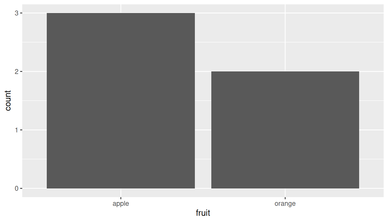
However, using the fruits_counted data frame where the fruits have been “pre-counted,” we once again map the fruit variable to the x-position aesthetic. Here, we also map the number variable to the y-position aesthetic, and add a geom_col() layer instead.
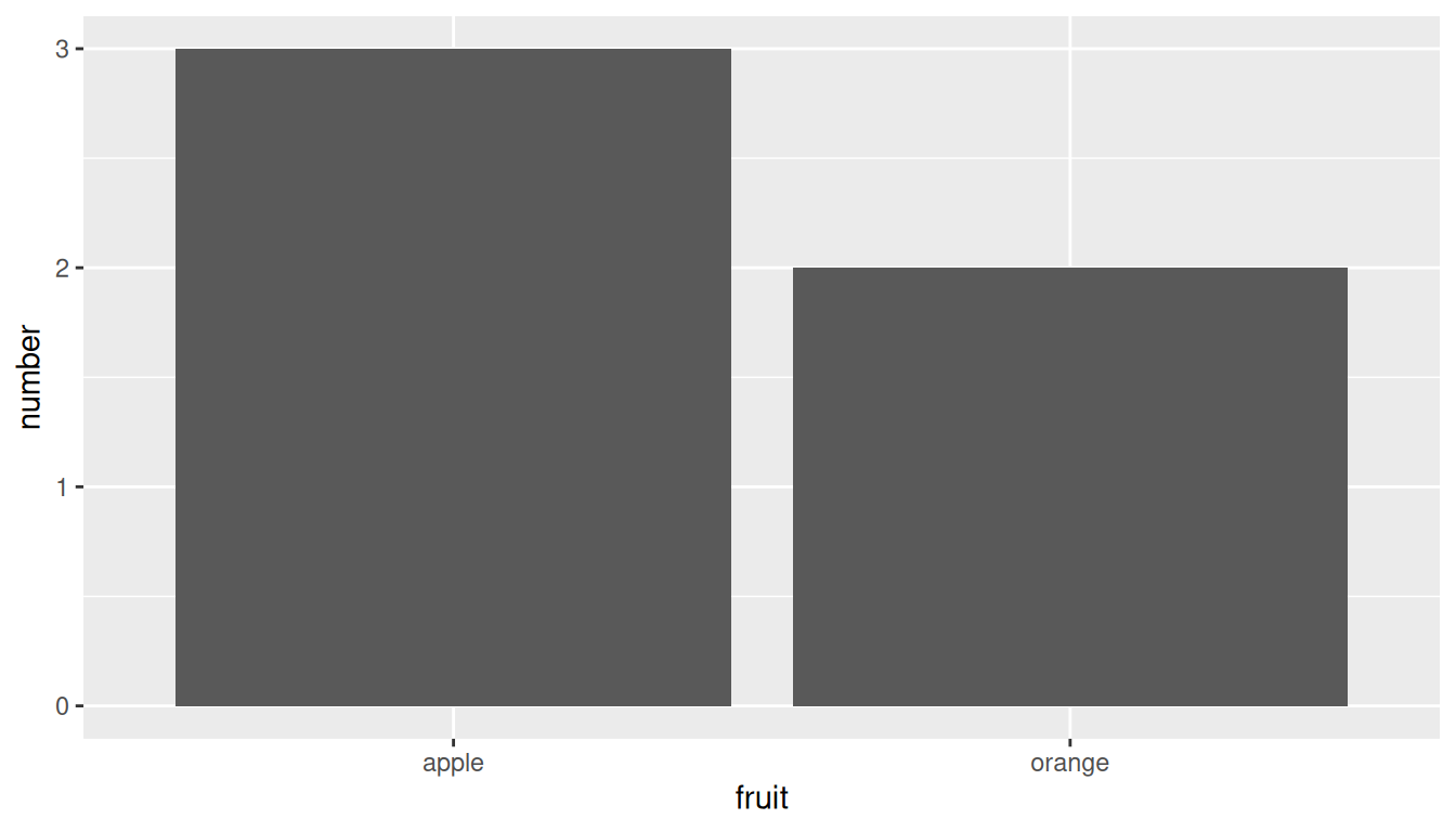
Compare the barplots in Figure 2.19 and Figure 2.20. They are identical because they reflect counts of the same five fruits. However, depending on how our categorical data is represented, either “pre-counted” or not, we must add a different geom layer. When the categorical variable whose distribution you want to visualize
- Is not pre-counted in your data frame, we use
geom_bar(). - Is pre-counted in your data frame, we use
geom_col()with the y-position aesthetic mapped to the variable that has the counts.
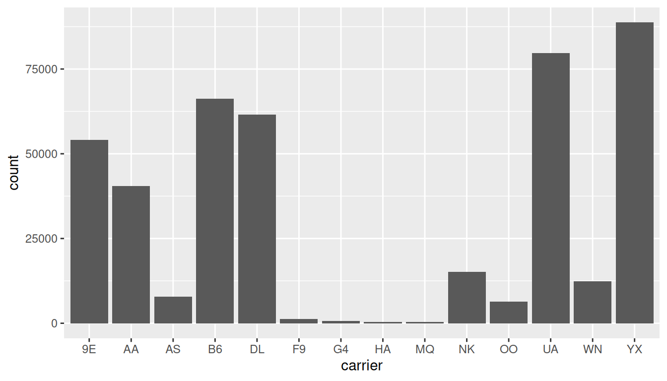
Let’s now go back to the flights data frame in the nycflights23 package and visualize the distribution of the categorical variable carrier. In other words, let’s visualize the number of domestic flights out of New York City each airline company flew in 2023. Recall from Section 1.4.3 when you first explored the flights data frame, you saw that each row corresponds to a flight. In other words, the flights data frame is more like the fruits data frame than the fruits_counted data frame because the flights have not been pre-counted by carrier. Thus we should use geom_bar() instead of geom_col() to create a barplot. Much like a geom_histogram(), there is only one variable in the aes() aesthetic mapping: the variable carrier gets mapped to the x-position. As a difference though, histograms have bars that touch whereas bar graphs have white space between the bars going from left to right.
geom_bar().
Observe in Figure 2.21 that Republic Airline (YX), United Airlines (UA), and JetBlue Airways (B6) had the most flights depart NYC in 2023. If you don’t know which airlines correspond to which carrier codes, then run View(airlines) to see a directory of airlines. For example, AA is American Airlines Inc. Alternatively, say you had a data frame where the number of flights for each carrier was pre-counted as in Table 2.3.
| carrier | number |
|---|---|
| 9E | 54141 |
| AA | 40525 |
| AS | 7843 |
| B6 | 66169 |
| DL | 61562 |
| F9 | 1286 |
| G4 | 671 |
| HA | 366 |
| MQ | 357 |
| NK | 15189 |
| OO | 6432 |
| UA | 79641 |
| WN | 12385 |
| YX | 88785 |
In order to create a barplot visualizing the distribution of the categorical variable carrier in this case, we would now use geom_col() instead of geom_bar(), with an additional y = number in the aesthetic mapping on top of the x = carrier. The resulting barplot would be identical to Figure 2.21.
Learning Check
(LC2.26) Why are histograms inappropriate for categorical variables?
Histograms assume a numeric, ordered x-axis and contiguous bins. Categorical levels aren’t numeric or ordered in that sense.
(LC2.27) What is the difference between histograms and barplots?
Histograms: numeric variable, contiguous bins (no gaps), y = counts/density. Barplots: categorical variable, separate bars with gaps, y = counts (or given frequencies).
(LC2.28) How many Alaska Air flights departed NYC in 2023?
7,843 flights (carrier == "AS").
(LC2.29) What was the 7th highest airline for departed flights from NYC in 2023? How could we better present the table to get this answer quickly?
Sorted by departures, the 7th highest is NK (Spirit Airlines) with 15,189 flights. A descending sort of the table or an ordered barplot makes rankings clearer at a glance.
2.8.2 Must avoid pie charts!
One of the most common plots used to visualize the distribution of categorical data is the pie chart. While they may seem harmless enough, pie charts actually present a problem in that humans are unable to judge angles well.
As Naomi Robbins describes in her book, Creating More Effective Graphs (Robbins 2013), we overestimate angles greater than 90 degrees and we underestimate angles less than 90 degrees. In other words, it is difficult for us to determine the relative size of one piece of the pie compared to another.
Let’s examine the same data used in our previous barplot of the number of flights departing NYC by airline in Figure 2.21, but this time we will use a pie chart in Figure 2.22. Try to answer the following questions:
- How much smaller is the portion of the pie for Hawaiian Airlines Inc. (
HA) compared to United Airlines (UA)? - What is the third largest carrier in terms of departing flights?
- How many carriers have fewer flights than Delta Air Lines Inc. (
DL)?
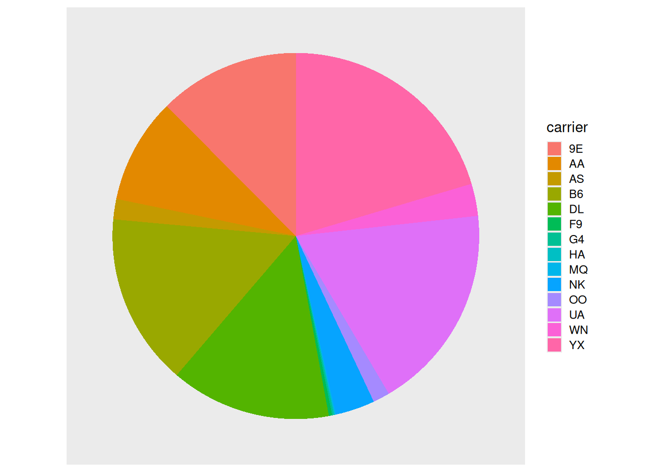
While it is quite difficult to answer these questions when looking at the pie chart in Figure 2.22, we can much more easily answer these questions using the barchart in Figure 2.21. This is true since barplots present the information in a way such that comparisons between categories can be made with single horizontal lines, whereas pie charts present the information in a way such that comparisons must be made by comparing angles.
Learning Check
(LC2.30) Why should pie charts be avoided and replaced by barplots?
Humans compare lengths better than angles/areas. Pie charts distort judgments (angles > 90 degrees overestimated, < 90 degrees underestimated); barplots enable clean, one-axis comparisons.
(LC2.31) Why do you think people continue to use pie charts?
Familiar defaults in some plotting software, perceived simplicity/aesthetics, and stakeholder expectations (even though they’re harder to read accurately).
2.8.3 Two categorical variables
Barplots are a very common way to visualize the frequency of different categories, or levels, of a single categorical variable. Another use of barplots is to visualize the joint distribution of two categorical variables at the same time.
Let’s examine the joint distribution of outgoing domestic flights from NYC by carrier as well as origin, in other words, the number of flights for each carrier and origin combination. This corresponds to the number of American Airlines flights from JFK, the number of American Airlines flights from LGA, the number of American Airlines flights from EWR, the number of Endeavor Air flights from JFK, and so on. Recall the ggplot() code that created the barplot of carrier frequency in Figure 2.21:
We can now map the additional variable origin by adding a fill = origin inside the aes() aesthetic mapping.
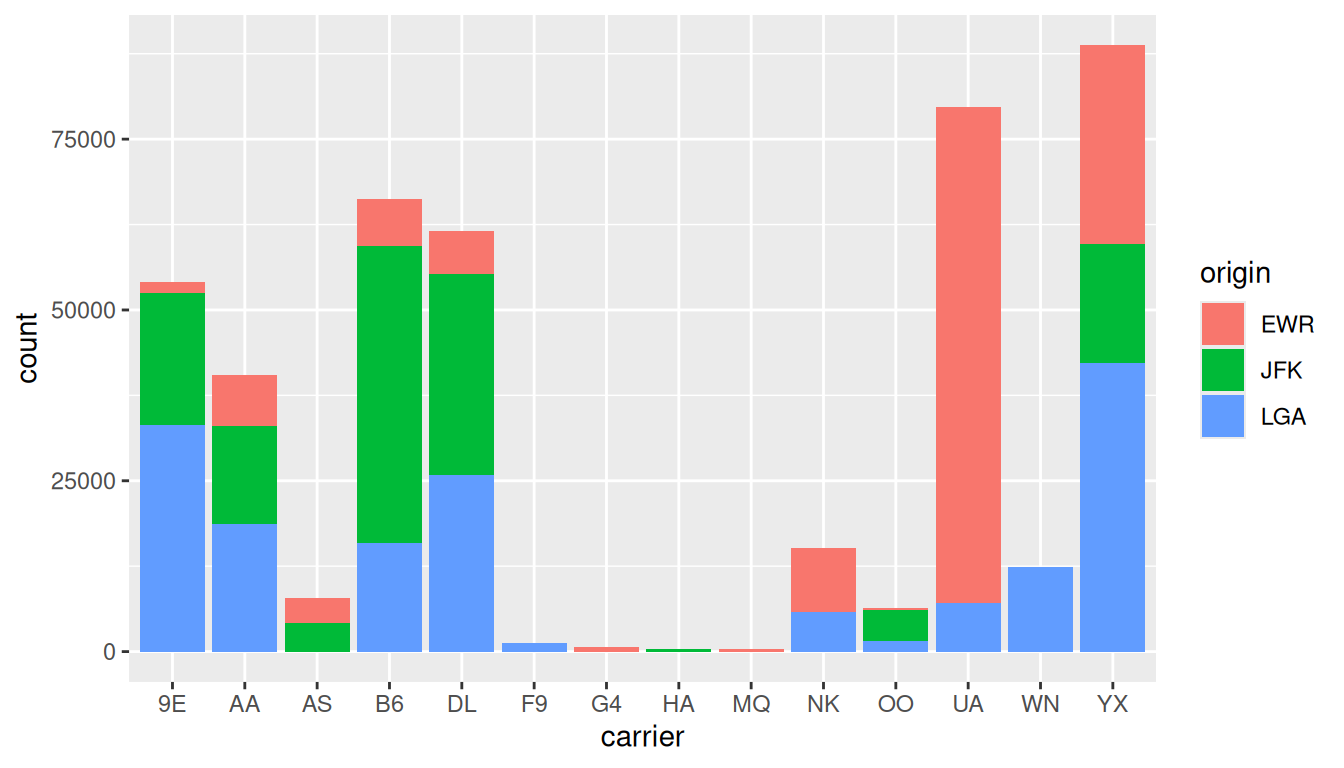
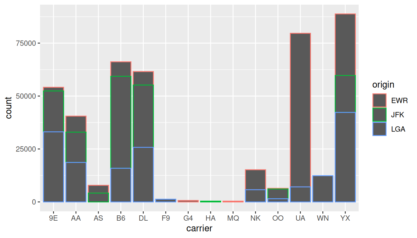
Figure 2.23 is an example of a stacked barplot. While simple to make, in certain aspects it is not ideal. For example, it is difficult to compare the heights of the different colors between the bars, corresponding to comparing the number of flights from each origin airport between the carriers.
Before we continue, let’s address some common points of confusion among new R users. First, the fill aesthetic corresponds to the color used to fill the bars, while the color aesthetic corresponds to the color of the outline of the bars. This is identical to how we added color to our histogram in Section 2.5.1: we set the outline of the bars to white by setting color = "white" and the colors of the bars to blue steel by setting fill = "steelblue". Observe in Figure 2.24 that mapping origin to color and not fill yields grey bars with different colored outlines.
Second, note that fill is another aesthetic mapping much like x-position; thus we were careful to include it within the parentheses of the aes() mapping. The following code, where the fill aesthetic is specified outside the aes() mapping will yield an error. This is a fairly common error that new ggplot users make:
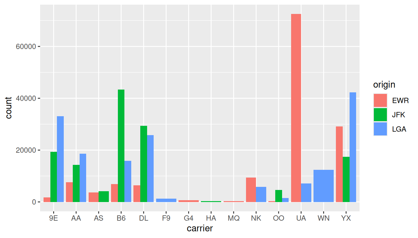
An alternative to stacked barplots are side-by-side barplots, also known as dodged barplots, as seen in Figure 2.25. The code to create a side-by-side barplot is identical to the code to create a stacked barplot, but with a position = "dodge" argument added to geom_bar(). In other words, we are overriding the default barplot type, which is a stacked barplot, and specifying it to be a side-by-side barplot instead.
Lastly, another type of barplot is a faceted barplot. Recall in Section 2.6 we visualized the distribution of hourly wind speeds at the 3 NYC airports split by month using facets. We apply the same principle to our barplot visualizing the frequency of carrier split by origin. Instead of mapping origin to fill we include it as the variable to create small multiples of the plot across the levels of origin in Figure 2.26.
ggplot(data = flights, mapping = aes(x = carrier)) +
geom_bar() +
facet_wrap(~ origin, ncol = 1)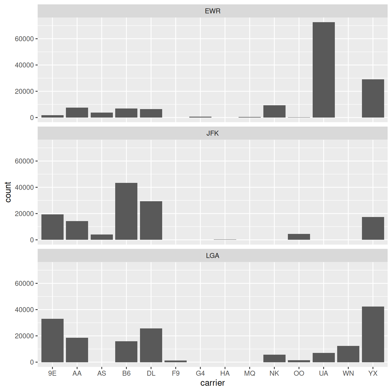
Learning Check
(LC2.32) What kinds of questions are not easily answered by looking at Figure 2.23?
Comparing origins across carriers is hard (segments lack a common baseline). It’s also hard to see small differences within stacked segments.
(LC2.33) What can you say, if anything, about the relationship between airline and airport in NYC in 2023 in regard to the number of departing flights?
Carriers show airport specialization patterns. Some airlines have many more departures from one NYC airport than the others.
(LC2.34) Why might the side-by-side barplot be preferable to a stacked barplot in this case?
They give each origin a common baseline within each carrier, making cross-origin comparisons straightforward.
(LC2.35) What are the disadvantages of using a dodged barplot, in general?
Can clutter with many categories; labels/legend get busy; totals are harder to read; bars become thin and harder to compare when levels proliferate.
(LC2.36) Why is the faceted barplot preferred to the side-by-side and stacked barplots in this case?
Separate panels per origin reduce clutter and keep shared scales, making it easier to rank carriers within each airport and compare patterns across airports.
(LC2.37) What information about the different carriers at different airports is more easily seen in the faceted barplot?
Which carriers dominate each airport, clear rankings within each airport, and presence/absence of specific carriers at specific airports, without the visual interference of stacking or dodging.
2.8.4 Summary
Barplots are a common way of displaying the distribution of a categorical variable, or in other words the frequency with which the different categories (also called levels) occur. They are easy to understand and make it easy to make comparisons across levels. Furthermore, when trying to visualize the relationship of two categorical variables, you have many options: stacked barplots, side-by-side barplots, and faceted barplots. Depending on what aspect of the relationship you are trying to emphasize, you will need to make a choice between these three types of barplots and own that choice.
Quick checks
Ten questions to assess your understanding. Several are designed around common misconceptions — read each option carefully before peeking at the answer.
Q2-1. Which component of the grammar of graphics is responsible for telling ggplot2 what kind of mark to draw (points, bars, lines)?
- the data
- the faceting specification
- the geometric object
- the aesthetic mapping
(c) geom_*() functions specify the visual mark; aes() is the mapping between data and visual properties; data is the data frame.
Q2-2. Why does ggplot(data = flights, mapping = aes(x = dep_delay, y = arr_delay)) produce a blank plot?
- The
+operator is missing -
geom_point()must come beforeggplot() -
dep_delayandarr_delayaren’t variables inflights - No
geom_*()layer was added
(d) Without a geom_*() layer, ggplot2 has no instructions for what to draw. Add + geom_point() (or another geom) to see the result.
Q2-3. Which named graph is most appropriate for visualizing the distribution of a single numerical variable?
- Histogram
- Scatterplot
- Barplot
- Linegraph
(a) Histograms show the distribution of one numerical variable. Barplots are for categorical variables; scatterplots show two numerical variables; linegraphs are for sequential x-axis data.
Q2-4. A student writes geom_point(aes(alpha = 0.2)) expecting all points to be 20% opaque. Instead, they get an unexpected legend showing alpha values. Why?
-
geom_point()doesn’t support constant alpha values - Alpha must be between 0 and 1
-
0.2insideaes()is mapped like a data variable -
aes()always creates a legend
(c) Constants belong OUTSIDE aes(). aes(alpha = 0.2) says “map the value 0.2 to alpha”, so ggplot adds a meaningless legend labeled 0.2 and routes the value through its alpha scale; the plotted transparency is whatever the scale chooses, not 0.2. The fix: geom_point(alpha = 0.2) sets alpha as a constant. Same logic for color, size, shape, etc.
Q2-5. What is the difference between geom_bar() and geom_col()?
-
geom_bar()counts rows;geom_col()usesyvalues - They’re identical
-
geom_col()makes a column chart only;geom_bar()makes a row chart -
geom_col()is deprecated
(a) Use geom_bar() when each row in your data is one observation to be tallied (e.g., one row per flight). Use geom_col() when the data is already summarized (you have explicit y values).
Q2-6. A pie chart shows market share for 5 companies. The slices look similar in size. The chapter argues this is a poor choice because:
- Pie charts are always wrong
- Pie charts use too much ink
- R’s pie chart function distorts the slice proportions
- Humans judge angles less accurately than lengths
(d) Naomi Robbins (and many others) point out: angles are hard to judge accurately. Bar lengths are easy. A bar chart of the same data lets the reader compare values at a glance.
Q2-7. In ggplot(), why must the + come at the end of a line, not the beginning of the next?
- Convention only
- Both placements are valid
- A trailing
+tells R the statement isn’t finished - RStudio moves the
+to the correct place automatically
(c) R reads code line by line. Ending a line with + tells the parser the statement isn’t complete. Starting a line with + would make R think the previous line was complete and now you’re starting a fresh expression that begins with + (an error).
Q2-8. A scatterplot of dep_delay vs arr_delay shows a dense black blob near (0, 0). Which technique does NOT address overplotting?
- Adding more bins to the plot
- Using
geom_jitter()to perturb each point slightly - Setting
alpha = 0.1for transparency - Subsetting the data to fewer observations
(a) Bins are a histogram concept; scatterplots don’t have bins. The other three are real overplotting remedies; alpha makes density visible, jitter spreads coincident points, subsetting reduces overlap.
Q2-9. What does + facet_wrap(~ origin) do?
- Filters the data to one origin
- Draws one panel per
originvalue - Plots all the data colored by
origin - Sorts the data by
originlevel
(b) Faceting splits one plot into a grid of panels by a categorical variable. Distinct from coloring (which overlays groups on one set of axes) and from filtering (which drops data).
Q2-10. In a side-by-side boxplot of wind speed by month, you see many small dots above the upper whiskers. What do they represent?
- Mean wind speeds
- Outliers under the IQR rule
- Confidence interval endpoints
- Errors in the data
(b) Boxplot dots beyond the whiskers are statistical outliers under the IQR rule: typically values above \(Q_3 + 1.5 \times \text{IQR}\) or below \(Q_1 - 1.5 \times \text{IQR}\). They’re not necessarily errors, just values unusually far from the bulk of the data.
| Function | What it does | Quick example |
|---|---|---|
ggplot(data, aes(...)) |
Initialize a plot with data and aesthetic mappings | ggplot(flights, aes(x = dep_delay, y = arr_delay)) |
+ geom_point() |
Add a scatterplot layer | ... + geom_point(alpha = 0.2) |
+ geom_line() |
Add a linegraph layer | ... + geom_line() |
+ geom_histogram(bins = N) |
Add a histogram of one numerical variable | ... + geom_histogram(bins = 30) |
+ geom_boxplot() |
Add a boxplot layer | ... + geom_boxplot() |
+ geom_bar() / + geom_col()
|
Bars from raw rows / from pre-counted data | ... + geom_bar() |
+ facet_wrap(~ var) |
Split the plot into panels by a variable | ... + facet_wrap(~ origin) |
position = "dodge" |
Side-by-side (dodged) bars instead of stacked | ... + geom_bar(position = "dodge") |
+ labs(...) |
Add title, axis labels, and caption (see EX 2.11) | ... + labs(title = "...", x = "...", y = "...") |
Exercises
The end-of-chapter exercises ask you to apply the chapter’s ideas to a new dataset: olympic_athletes from the olympicAthletes package. It contains one row per athlete-event participation across every Olympic Games from 1896 to 2026 — roughly 315,000 rows with variables for sex, age, height (cm), weight (kg), team, noc (3-letter country code), games, year, season, city_local_latin/city_english, sport, event, and medal. Two companion data frames — medal_table (medal counts per Games × NOC, 1896–2026) and editions (metadata for every Games, 1896–2026) — round out the package.
Difficulty is signaled with stars: ★ warm-up, ★★ standard application, ★★★ critical thinking. Solutions are available to instructors separately.
Setup and exploration
EX2.1 (★) Load olympicAthletes, then run glimpse() on each of the three datasets. How many rows and how many columns does each have?
EX2.2 (★) For each column in olympic_athletes, classify it as numerical or categorical. There are some that look numerical but behave categorically, name at least one and justify.
EX2.3 (★) year stores ordered values like 1896, 1900, 1904, …, 2020, 2024. Why is treating year as numerical (continuous x-axis on a linegraph) often more useful than treating it as categorical? When would the categorical interpretation be useful?
EX2.4 (★) Build the simplest scatterplot you can: weight (y) vs height (x) on olympic_athletes. When the plot renders, R will print a warning like Removed N rows containing missing values (geom_point). Read the warning and report N. What does that tell you about which athlete-rows have complete bio data, and why might older Games be over-represented in the missing rows?
Grammar of graphics
EX2.5 (★) Run the snippet below. Identify the three pieces of the grammar of graphics at play: the data, the aesthetic mappings (which variable is assigned to which of x, y, and color?), and the geom. Bonus: if you wanted to layer individual points on top of the boxes, which kind of layer would you add? (The worked solution’s bonus overlay uses geom_jitter() with position_jitter(), a ggplot2 helper the book doesn’t cover, supplied there only so the random shake is reproducible — not something to learn.)
Scatterplots
EX2.6 (★★) Build a scatterplot of weight (y) vs height (x) for athletes at the Paris 2024 Summer Games (the olympic_athletes_2024 dataset, the Paris 2024 subset of olympic_athletes; not to be confused with paris_2024_top_medals, which holds medal counts, not athletes). What overall pattern do you see? Do you see overplotting?
EX2.7 (★★) Modify your Paris 2024 scatterplot (the olympic_athletes_2024 dataset) to color points by sex, keeping alpha = 0.3 to ease the overplotting. What pattern does coloring reveal that the single-color version hid?
EX2.8 (★★) Set alpha = 0.05 on geom_point() for the scatterplot of athletes at the Paris 2024 Summer Games (the olympic_athletes_2024 dataset). Compare to the un-faded version. Where is the densest cluster?
EX2.9 (★★) Use the gymnastics_athletes dataset (no filtering needed) and rebuild the Height vs Weight scatterplot. How does the cloud differ from the all-sport view?
EX2.10 (★★) Use the basketball_athletes dataset (no filtering needed) and rebuild. Compared with gymnastics, where on the (Height, Weight) plane do basketball athletes sit?
EX2.11 (★★) Labeling a plot with labs(...). Section 2.3 built this jittered scatterplot of Envoy Airlines flight delays:
ggplot(data = envoy_flights, mapping = aes(x = dep_delay, y = arr_delay)) +
  geom_jitter(width = 30, height = 30)
A plot’s title, axis labels, and caption are added as one more layer with labs(title = ..., x = ..., y = ..., caption = ...), a function the book uses behind the scenes but doesn’t formally cover. Here it is applied to the Envoy chart:
ggplot(data = envoy_flights, mapping = aes(x = dep_delay, y = arr_delay)) +
  geom_jitter(width = 30, height = 30) +
  labs(
    title   = "Envoy Airlines flights that depart late tend to arrive late",
    x       = "Departure delay (minutes)",
    y       = "Arrival delay (minutes)",
    caption = "Source: envoy_flights (moderndive)"
  )
Your turn: build a scatterplot of weight (y) vs height (x) for the Paris 2024 athletes (olympic_athletes_2024), then add a labs(...) layer of your own giving it a title, x and y axis labels with units (cm and kg), and a caption naming the data source. Why are good labels especially important when you share a plot with someone who can’t see your code?
EX2.12 (★★) Using medal_table, make a scatterplot of gold (y) vs year (x) with color = season (add some transparency). Each point is one (Games, NOC), where an NOC (National Olympic Committee) is a country/team’s three-letter code. Why do the Summer points climb far higher than the Winter points? (Putting year on the x-axis here sets up the linegraphs coming in EX 2.13.)
Linegraphs
EX2.13 (★★) Using editions (one row per Games, participants counted), plot participants (y) vs year (x) as a linegraph with color = season so Summer and Winter are two separate lines. Has the number of athletes per Games grown, and in which season faster?
EX2.14 (★★) Your EX 2.13 linegraph has a sharp downward spike in the Summer line at 1956. That’s not a bug in your code, it’s in the data. Inspect the editions rows for 1956 (e.g., View(editions), then scroll to 1956) and read the notes column. What happened, and why does it pull the Summer line down? (You’ll learn the wrangling tools to merge the split rows in Chapter 3.)
Histograms
EX2.15 (★★) Build a histogram of age for all athletes. What’s the rough median? Are there suspicious values (very young / very old)?
EX2.16 (★★) Try bins = 10, then bins = 80. Which gives a more honest view of the age distribution? Why?
EX2.17 (★★) Plot a histogram of height for all athletes, then add facet_wrap(~ season) to compare Winter and Summer side by side. Which season’s athletes are taller on average?
EX2.18 (★★) A peer claims “Olympic athletes are mostly in their 20s.” Use a histogram to support or refute this claim with a one-sentence answer.
Facets
EX2.19 (★★) Using team_sport_athletes (a built-in slice of three team sports, Basketball, Volleyball, and Curling), make a height vs weight scatterplot and add facet_wrap(~ season) to split Summer and Winter into separate panels. What does faceting reveal that a single combined cloud would hide?
EX2.20 (★★) Build a faceted histogram of age, one panel per season. How do the two distributions differ? Tip (beyond the chapter): the chapter deliberately defers facet_wrap()’s scales argument, but it’s worth a sneak peek here. Look at what changes when you add scales = "free_y" as an argument to the facet_wrap() call.
EX2.21 (★★) Using olympic_athletes_2024, make a height vs weight scatterplot and add facet_wrap(~ medal) to split athletes by their medal result. Does an athlete’s physique look related to whether they medalled?
Boxplots
EX2.22 (★★) Using team_sport_athletes (a built-in slice of three team sports: Basketball and Volleyball compete in Summer, Curling in Winter), build side-by-side boxplots of age by season. Which season’s athletes skew older, and by how much at the median?
EX2.23 (★★) A colleague proposes comparing weight across sports with a single chart that puts every sport on the x-axis, one boxplot for each of the 69 sports in olympic_athletes. What practical problems would that chart have, and what would you do instead?
EX2.24 (★★★) A boxplot of weight for one sport shows many “outlier” dots above the upper whisker. Are these necessarily data errors? Justify in 1–2 sentences.
EX2.25 (★★) Build side-by-side boxplots of height by sex for olympic_athletes. Reading off the plot (eyeballing is fine): each sex’s median height, and which sex shows the wider IQR.
Barplots
EX2.26 (★★) The built-in paris_2024_top_medals records the top-10 countries by total medals at the 2024 Summer Games, in pre-counted long form (one row per country and medal type, with a count). Because the counts are pre-computed, use geom_col() rather than geom_bar(). Build a stacked horizontal barplot of count by country (put count on x and reorder(country, count) on y so the biggest winners sort to the top), filled by medal. Here reorder(country, count) is a new-to-us tool the book doesn’t cover: it re-sorts a categorical variable by a numeric one, and you can use it exactly as written in the parentheses above. Which country topped the table, and how is each country’s haul split across gold, silver, and bronze?
EX2.27 (★★) geom_bar() is for raw, un-counted data, it tallies the rows for you. Build a geom_bar() of athlete-event rows by season on the full olympic_athletes (one row per athlete-event). Which season has more participations, and by roughly how much? (Contrast EX2.26, where paris_2024_top_medals was already counted, so you used geom_col() with a count column.)
EX2.28 (★★) In EX 2.27, geom_bar() counted the raw olympic_athletes rows for you. Now build the same two-bar chart the geom_col() way, starting from a pre-counted table. The olympicAthletes package ships one ready-made: season_counts has one row per season with n, the number of athlete-event rows for that season (like the pre-computed count column in EX 2.26). First print season_counts and say in a sentence what each of its two rows stores. Then plot it with geom_col(), mapping x = season and y = n. You should reproduce EX 2.27’s chart exactly. What would go wrong if you swapped the geoms, geom_col() on the raw rows, or geom_bar() on season_counts?
EX2.29 (★★★) Run the starter to draw a pie chart of the top-10 NOCs’ total Paris 2024 medals (it uses coord_polar(theta = "y"), a ggplot2 function the book never covers, to bend a stacked bar into a circle; it’s supplied so you can see the pie, not something to learn). Then show the same data as a barplot with geom_col(): put count on x and country on y; each country’s medal rows stack into one bar, and country’s levels are already ordered by total medals, so the bars come out sorted for free. Using each chart in turn, try to answer: who won more total medals, Great Britain or France? One of the two charts answers this instantly and the other can’t. Which, and why? Connect your answer to the chapter’s case against pie charts (§2.8.2).
EX2.30 (★★) Rebuild your EX 2.26 plot of paris_2024_top_medals, but switch the stacked bars to side-by-side with position = "dodge". What becomes easier to compare in the dodged version that was harder in the stacked one?
Critical thinking and open exploration
EX2.31 (★★★) Imagine a news outlet posts a chart of “USA’s medal dominance” using a y-axis that starts at 50 (cropping the bar baseline). Explain in 2–3 sentences how the chart misleads viewers, and what a more honest chart would look like.
EX2.32 (★★★) Pick any chart you’ve built in this chapter and write a short chart caption (2–3 sentences) suitable for publishing in a news article. The caption should:
- state the finding
- identify the data source
- flag one caveat about the data (e.g., missingness, selection, sample size)
Compare your caption to the chart’s labs(title = ..., caption = ...) and revise either as needed.
EX2.33 (★★★) This chapter introduced the 5 named graphs (5NG): scatterplot, linegraph, histogram, boxplot, barplot. For each of the five, write one sentence describing a question about Olympic athletes that the geom would be the right tool to answer. (No code required, this is a matching-question-to-geom exercise.) When you’re done, pick one of your five questions and identify which Ch 2 exercise from this chapter most closely resembles it.
EX2.34 (★★★) Re-run your EX 2.4 scatterplot of weight vs height on the full olympic_athletes (the starter uses alpha = 0.2 so lone extreme points stay visible). One point sits farther right than any other, the tallest athlete ever to compete at the Games. Reading straight off the plot, estimate that athlete’s coordinates: roughly how tall (cm, the x-position) and how heavy (kg, the y-position)? What sport would you guess, given where the point sits relative to the rest of the cloud?
EX2.35 (★★★) Using editions, build a scatterplot of medal_events (y) vs participants (x), colored by season. Are bigger Games (more athletes) also more medal-rich? Does the pattern look the same for Summer and Winter?
EX2.36 (★★★) Open exploration: using any of the three datasets, find one pattern that surprises you. Build the single chart that communicates it best, and write a one-sentence headline above it.
Grammar and linegraph practice
EX2.37 (★★) Grammar check-up. Section 2.1 defines a statistical graphic as a mapping of data variables to aesthetic attributes of geometric objects, and then names two “other components” the book works with: faceting and position adjustments. Run the snippet below, then classify each piece of the code by grammar component:
team_sport_athletes-
x = height,y = weight, andcolor = seasoninsideaes() geom_point()-
alpha = 0.1. Careful: it sits outsideaes(). Is it an aesthetic mapping? facet_wrap(~ sex)
Finally: which of the two “other components” from Section 2.1 does this plot use, and which one is absent?
EX2.38 (★★) Build a linegraph from scratch. The usa_summer_medals dataset (a built-in slice of medal_table) has one row per Summer Games the USA attended. Build a linegraph of gold (y) vs year (x) with geom_line(), written in the book’s named style ggplot(data = ..., mapping = aes(...)). Add a labs() layer with a title and informative axis labels, and consider a geom_point() layer so each individual Games gets a visible dot.
Then interpret: the line has two dramatic spikes. Which years, and what’s the story behind each? And one subtlety: the USA has no 1980 row at all. How does the linegraph handle that, and would a reader even notice?
Extensions
The exercises below deliberately introduce functions and concepts beyond what this chapter teaches — log transformations, predict(), new packages, foreshadowing later chapters. They are optional, aimed at readers who want to push further. The main Exercises and Quick checks above stick strictly to what this chapter covers.
EX2.39 (◆◆) Themes. ggplot’s default look isn’t the only option. Try theme_minimal(), theme_bw(), and theme_classic() on the basketball scatterplot from EX 2.10. Which would you reach for in a printed report vs. a slide deck? Why?
EX2.40 (◆◆) Color-blind-safe palettes. Default ggplot colors look bright but aren’t always distinguishable for readers with color-vision deficiencies. The viridis palette family (scale_color_viridis_d() for discrete, scale_color_viridis_c() for continuous) is designed to be both attractive and perceptually robust. Apply it to a Height-vs-Weight scatter colored by season. How does the visual distinction compare to the default?
EX2.41 (◆◆) Saving plots to file. ggsave() saves the last plot (or a named plot object) to disk in your preferred format and dimensions. Save a histogram of age as a 6-inch × 4-inch PNG at 300 DPI. Then save the same plot as a PDF. Which format is better for inclusion in a printed report? In a website? Why? (Check ?ggsave for its full list of arguments, format, width/height/units, dpi, and bg.)
EX2.42 (◆◆) Annotating plots with annotate(). At the Paris 2024 Games, the very tallest athletes were overwhelmingly basketball players: most athletes 205 cm or taller played basketball, and the tallest athlete at the Games, 224 cm, was one too. On your olympic_athletes_2024 scatterplot of weight (y) vs height (x), use annotate("rect", ...) to shade the 205–225 cm height band (an xmin/xmax strip; ymin = -Inf, ymax = Inf makes it span the full plot height) and annotate("text", ...) to drop a single label on it, e.g. “basketball territory”. Briefly: what’s the difference between annotate() and geom_text() for labeling individual points?
EX2.43 (◆◆) Violin plots. geom_violin() combines a boxplot’s summary with a density’s shape, wide where data is dense, narrow where sparse. Overlay a geom_violin() and a narrow geom_boxplot() for height across three sports. What does the violin show that a boxplot alone hides?
Need a hint?
Modality.
EX2.44 (◆◆◆) Nonlinear smoothing with loess. geom_smooth(method = "loess") draws a locally-fitted curve through the data, no equation required, handy for spotting shape before committing to a model. Build a Height-vs-Weight scatterplot of the built-in gymnastics_athletes and overlay both a loess curve and a straight lm line. Where (if anywhere) does the loess curve depart from the straight line? (This previews Chapter 5, which formally introduces linear regression with method = "lm".)
EX2.45 (◆◆◆) Interactive ggplots with plotly::ggplotly(). A single function call turns any ggplot into an interactive widget, readers can hover for tooltips, zoom, and pan. Try it on a height-vs-weight scatter colored by sport. When is the interactive version genuinely more useful than a static one? When does it just add load time without adding insight?
EX2.46 (◆◆◆) Composing multiple plots with patchwork. The patchwork package lets you arrange ggplots in arbitrary grids using + (side-by-side), / (stacked), and parentheses. Build a 2-on-top, 1-on-bottom layout showing histograms of age, height, and weight. Briefly, why is patchwork a better choice here than building a faceted plot with facet_wrap()?
EX2.47 (◆◆◆) ylim() vs coord_cartesian(). Both restrict the y-axis range, but ylim() removes points outside the range before statistics like geom_smooth() run, while coord_cartesian(ylim = ...) zooms the view after statistics run. Run the starter code below, which builds the ylim() version and the coord_cartesian() version side by side. Why does the smoother differ between the two panels?
EX2.48 (◆◆) Binned counts for dense scatterplots (geom_bin2d()). When a scatterplot has tens of thousands of overlapping points, even alpha struggles to show where the data piles up. geom_bin2d() divides the plane into a grid of rectangular cells and colors each by how many points land in it, turning overplotting into an honest 2D density map. Build a geom_bin2d() plot of weight (y) vs height (x) for athletics_athletes (try bins = 40). Where is the single densest cell, and what does it tell you about the “typical” Olympic physique that an alpha-faded scatterplot only hinted at?
EX2.49 (◆◆) Faceting a barplot. Using paris_2024_top_medals, build a geom_col() of count by country (sorted with reorder()), then add facet_wrap(~ medal) to get one panel per medal type. Do the same countries lead in gold, silver, and bronze, or does the ranking shift by medal type?
EX2.50 (◆◆) Take your EX 2.26 stacked barplot of paris_2024_top_medals and switch geom_col() to position = "fill". New tool: position = "fill" isn’t covered in the book (the chapter shows only stacked and position = "dodge"). It rescales each stacked bar so the segments show proportions instead of counts. Every country’s bar now reaches 100 %, showing the composition of its haul. Which of the top-10 countries had the most gold-heavy medal mix, and what information does the proportional view give up compared with the stacked counts?
2.9 Conclusion
2.9.1 Summary table
Let’s recap all five of the five named graphs (5NG) in Table 2.4 summarizing their differences. Using these 5NG, you’ll be able to visualize the distributions and relationships of variables contained in a wide array of datasets. This will be even more the case as we start to map more variables to more of each geometric object’s aesthetic attribute options, further unlocking the awesome power of the ggplot2 package.
| Named graph | Shows | Geometric object | Notes | |
|---|---|---|---|---|
| 1 | Scatterplot | Relationship between 2 numerical variables | geom_point() |
|
| 2 | Linegraph | Relationship between 2 numerical variables | geom_line() |
Used when there is a sequential order to x-variable, e.g., time |
| 3 | Histogram | Distribution of 1 numerical variable | geom_histogram() |
Facetted histograms show the distribution of 1 numerical variable split by the values of another variable |
| 4 | Boxplot | Distribution of 1 numerical variable split by the values of another variable | geom_boxplot() |
|
| 5 | Barplot | Distribution of 1 categorical variable |
geom_bar() when counts are not pre-counted, geom_col() when counts are pre-counted |
Stacked, side-by-side, and faceted barplots show the joint distribution of 2 categorical variables |
2.9.2 Function argument specification
Let’s go over some important points about specifying the arguments (i.e., inputs) to functions. Run the following two segments of code:
You’ll notice that both code segments create the same barplot, even though in the second segment we omitted the data = and mapping = code argument names. This is because the ggplot() function by default assumes that the data argument comes first and the mapping argument comes second. As long as you specify the data frame in question first and the aes() mapping second, you can omit the explicit statement of the argument names data = and mapping =.
Going forward for the rest of this book, all ggplot() code will be like the second segment: with the data = and mapping = explicit naming of the argument omitted with the default ordering of arguments respected. We’ll do this for brevity’s sake; it’s common to see this style when reviewing other R users’ code.
2.9.3 Additional resources
An R script file of all R code used in this chapter is available here.
If you want to further unlock the power of the ggplot2 package for data visualization, we suggest that you check out RStudio’s “Data Visualization with ggplot2” cheatsheet. This cheatsheet summarizes much more than what we’ve discussed in this chapter. In particular, it presents many more than the 5 geometric objects we covered in this chapter while providing quick and easy-to-read visual descriptions. For all the geometric objects, it also lists all the possible aesthetic attributes one can tweak. In the current version of RStudio in mid-2025, you can access this cheatsheet by going to the RStudio Menu Bar -> Help -> Cheatsheets -> “Data Visualization with ggplot2.” You can see a preview in the figure below. Alternatively, you can download the cheat sheet by going to the Posit Cheatsheets page with this link.
2.9.4 What’s to come
Recall in Figure 2.2 in Section 2.3 we visualized the relationship between departure delay and arrival delay for Envoy Air flights only, rather than all flights. This data is saved in the envoy_flights data frame from the moderndive package.
In reality, the envoy_flights data frame is merely a subset of the flights data frame from the nycflights23 package consisting of all flights that left NYC in 2023. We created envoy_flights using the following code that uses the dplyr package for data wrangling:
This code takes the flights data frame and filter() it to only return the 357 rows where carrier is equal to "MQ", Envoy Air’s carrier code. (Recall from Section 1.2 that testing for equality is specified with == and not =.) The code then cycles back to save the output in a new data frame called envoy_flights using the <- assignment operator.
Similarly, recall in Figure 2.7 in Section 2.4 we visualized hourly wind speed recordings at Newark airport only for the first 15 days of January 2023. This data is saved in the early_january_2023_weather data frame from the moderndive package.
In reality, the early_january_2023_weather data frame is merely a subset of the weather data frame from the nycflights23 package consisting of all hourly weather observations in 2023 for all three NYC airports. We created early_january_2023_weather using the following dplyr code:
This code pares down the weather data frame to a new data frame early_january_2023_weather consisting of hourly wind speed recordings only for origin == "EWR", month == 1, and day less than or equal to 15.
These two code segments are a preview of Chapter 3 on data wrangling using the dplyr package. Data wrangling is the process of transforming and modifying existing data with the intent of making it more appropriate for analysis purposes. For example, these two code segments used the filter() function to create new data frames (envoy_flights and early_january_2023_weather) by choosing only a subset of rows of existing data frames (flights and weather). In the next chapter, we’ll formally introduce the filter() and other data-wrangling functions as well as the pipe operator |> which allows you to combine multiple data-wrangling actions into a single sequential chain of actions. On to Chapter 3 on data wrangling!