
D Learning Check Solutions
If you detect any errors or have suggestions regarding these solutions, please file an issue at the ModernDive GitHub repository or, ideally, create a Pull Request on GitHub on the same repository making the suggested changes yourself (into the v2 branch) for us to review. Thanks!
D.1 Chapter 1 Solutions
(LC1.1) Repeat the earlier installation steps … for dplyr, nycflights23, and knitr.
Solution: In RStudio → Packages tab → Install → enter dplyr, nycflights23, knitr → Install.
(Or run install.packages(c("dplyr","nycflights23","knitr")) in the Console.)
(LC1.2) “Load” the dplyr, nycflights23, and knitr packages as well by repeating the earlier steps.
Solution:
(LC1.3) What does any ONE row in this flights dataset refer to?
Solution: B. Data on a flight (one departure) from a NYC airport in 2023.
(LC1.4) What are some other examples in this dataset of categorical variables? What makes them different than quantitative variables?
Solution: Hint: Type ?flights in the console to see what all the variables mean!
- Categorical:
-
carrierthe company -
destthe destination -
flightthe flight number. Even though this is a number, its simply a label. Example United 1545 is not less than United 1714
-
- Quantitative:
-
distancethe distance in miles -
time_hourtime
-
(LC1.5) What do lat, lon, alt, tz, dst, and tzone describe in airports? (Best guess.)
Solution:
-
lat= latitude,lon= longitude -
alt= airport altitude (likely feet) -
tz= time zone offset from UTC (hours) -
dst= daylight savings time code/indicator -
tzone= time zone name (IANA string)
(LC1.6) Provide variables in a data frame where at least one is an ID variable and at least two are not.
Solution: In the weather data frame, the combination of origin, year, month, day, hour are identification variables as they identify the observation in question.
* Anything else pertains to observations: temp, humid, wind_speed, etc.
(LC1.7) Look at the help file for airports. Revise your earlier guesses about lat, lon, alt, tz, dst, tzone as needed.
Solution:
-
lat,lon: geographic latitude/longitude of the airport -
alt: altitude (feet) -
tz: hours offset from UTC (e.g., −5 for Eastern Standard Time) -
dst: daylight saving time indicator (e.g., “A” = observes DST, etc., per help file coding) -
tzone: IANA time zone name (e.g.,"America/New_York")
This documentation is also available on the package website here.
D.2 Chapter 2 Solutions
Needed packages
(LC2.1) Take a look at both the flights data frame from the nycflights23 package and the envoy_flights data frame from the moderndive package by running View(flights) and View(envoy_flights). In what respect do these data frames differ? For example, think about the number of rows in each dataset.
Solution: envoy_flights is a subset of flights containing only rows where carrier == "MQ" (Envoy Air). It has the same columns but fewer rows than flights.
(LC2.2) What are practical reasons why dep_delay and arr_delay have a positive relationship?
Solution: If a plane leaves late, it often loses its departure slot, encounters downstream congestion/spacing, and arrives late as well. Crewing/turnaround buffers can’t fully absorb big late departures, so late out often leads to late in (though some time can be made up while in flight).
(LC2.3) What variables in weather would you expect to have a negative correlation with dep_delay? Why?
Solution: Visibility (visib) and pressure (pressure)—higher values usually mean clearer, calmer weather and thus fewer delays (negative relationship). (By contrast, precip, wind_speed, wind_gust would tend to be positively related to delays.)
(LC2.4) Why do you believe there is a cluster of points near (0, 0)? What does (0, 0) correspond to in terms of the Envoy Air flights?
Solution: (0, 0) is on-time departure and on-time arrival. Many flights leave and arrive close to schedule, producing a dense cluster around the origin.
(LC2.5) What are some other features of the plot that stand out to you?
Solution: Different people will answer this one differently. One answer is most flights depart and arrive less than an hour late.
(LC2.6) Create a new scatterplot with different variables in envoy_flights.
Solution: Many possibilities for this one, see the plot below. Is there a pattern in departure delay depending on when the flight is scheduled to depart? Interestingly, there seems to be only a few blocks of time where flights depart with Envoy.
ggplot(data = envoy_flights, mapping = aes(x = dep_time, y = dep_delay)) +
  geom_point()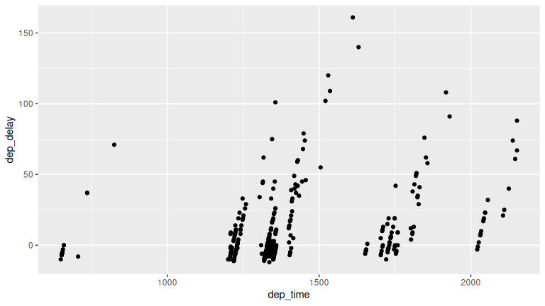
(LC2.7) Why is setting alpha useful with scatterplots?
Solution: Lower alpha reveals point density under overplotting—darker regions indicate where many points overlap, which a regular opaque scatterplot hides.
(LC2.8) After viewing Figure 2.4, give an approximate range of arrival delays and departure delays that occur most frequently. How has that region changed compared to when you observed the same plot without alpha = 0.2 set in Figure 2.2?
Solution: The densest region is near zero (roughly within about -25 minutes for both departure and arrival). With transparency, that high-density core is much clearer than in the opaque plot.
(LC2.9) Take a look at both the weather data frame from the nycflights23 package and the early_january_2023_weather data frame from the moderndive package by running View(weather) and View(early_january_2023_weather). In what respect do these data frames differ?
Solution: early_january_2023_weather is a subset: only origin == "EWR", month == 1, and day <= 15. Same variables; fewer rows.
(LC2.10) View() the flights data frame again. Why does the time_hour variable uniquely identify the hour of the measurement, whereas the hour variable does not?
Solution: time_hour encodes date + hour (a POSIXct timestamp in R). hour alone repeats 0–23 every day (and across airports), so it’s not unique.
(LC2.11) Why should linegraphs be avoided when there is not a clear ordering of the horizontal axis?
Solution: Connecting points implies a meaningful sequence/continuity. Without a real order, lines suggest patterns that don’t exist and can mislead.
(LC2.12) Why are linegraphs frequently used when time is the explanatory variable on the x-axis?
Solution: Time is inherently ordered; connecting adjacent times shows trends and changes over time smoothly.
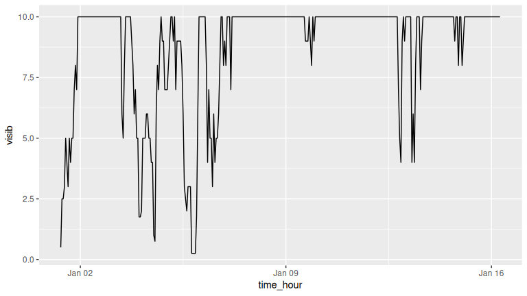
(LC2.13) Plot a time series of a variable other than wind_speed for Newark Airport in the first 15 days of January 2023. Try to select a variable that doesn’t have a lot of missing (NA) values.
Solution:
One example is visibility.
(LC2.14) What does changing the number of bins from 30 to 20 tell us about the distribution of wind speeds?
Solution: Fewer, wider bins smooth the histogram, making the overall pattern clearer (most observations at lower speeds), while sacrificing fine detail.
(LC2.15) Would you classify the distribution of wind speeds as symmetric or skewed in one direction or another?
Solution: Right-skewed—a concentration at low speeds with a tail extending to higher wind speeds.
(LC2.16) What would you guess is the “center” value in this distribution? Why did you make that choice?
Solution: Around ~10 mph. The tallest bins cluster roughly in the 5–15 mph range, so the typical value is near 10.
(LC2.17) Is this data spread out greatly from the center or is it close? Why?
Solution: Moderate spread: most values are between 0–20 mph, with relatively few beyond 30 mph (a right tail but not extremely wide).
(LC2.18) What other things do you notice about this faceted plot? How does a faceted plot help us see relationships between two variables?
Solution: Distributions look similar across months, with some months slightly windier. Faceting puts months in comparable panels with shared scales, making cross-month contrasts easy.
(LC2.19) What do 1–12 correspond to? What about 10, 20, 30?
Solution: 1–12 = months of the year. 10, 20, 30 = wind speed tick marks (mph) on the x-axis.
(LC2.20) For which types of datasets would faceted plots not work well in comparing relationships between variables? Give an example describing the nature of these variables and other important characteristics.
Solution: When the facetting variable has many levels (e.g., hundreds of ZIP codes) or few observations per level, producing tiny, sparse panels that are hard to compare.
(LC2.21) Does the wind_speed variable in the weather dataset have a lot of variability? Why do you say that?
Solution: Some, but mostly concentrated: many observations between 0–20 mph, with fewer high-speed outliers. So variability exists with a right tail, but the bulk is low-to-moderate.
(LC2.22) What do the dots at the top of the plot for January correspond to? Explain what might have occurred in January to produce these points.
Solution: Outliers (unusually high winds). Likely stormy or gusty winter days causing much higher wind speeds.
(LC2.23) Which months have the highest variability in wind speed? Why?
Solution: Winter months (e.g., Jan–Mar) show wider spread likely due to seasonal systems bringing stronger, more variable winds.
(LC2.24) We looked at the distribution of the numerical variable wind_speed split by the numerical variable month that we converted using the factor() function in order to make a side-by-side boxplot. Why would a boxplot of wind_speed split by the numerical variable pressure similarly converted to a categorical variable using the factor() not be informative?
Solution: pressure is continuous with many distinct values; turning it into a factor yields lots of tiny groups with few points each. This leads to clutter that is hard to interpret.
(LC2.25) Boxplots provide a simple way to identify outliers. Why may outliers be easier to identify when looking at a boxplot instead of a faceted histogram?
Solution: Boxplots explicitly mark outliers as points; histograms spread counts across bins, so rare extreme values don’t stand out as clearly.
(LC2.26) Why are histograms inappropriate for categorical variables?
Solution: Histograms assume a numeric, ordered x-axis and contiguous bins. Categorical levels aren’t numeric or ordered in that sense.
(LC2.27) What is the difference between histograms and barplots?
Solution: Histograms: numeric variable, contiguous bins (no gaps), y = counts/density. Barplots: categorical variable, separate bars with gaps, y = counts (or given frequencies).
(LC2.28) How many Alaska Air flights departed NYC in 2023?
Solution: 7,843 flights (carrier == "AS").
(LC2.29) What was the 7th highest airline for departed flights from NYC in 2023? How could we better present the table to get this answer quickly?
Solution: Sorted by departures, the 7th highest is NK (Spirit Airlines) with 15,189 flights. A descending sort of the table or an ordered barplot makes rankings clearer at a glance.
(LC2.30) Why should pie charts be avoided and replaced by barplots?
Solution: Humans compare lengths better than angles/areas. Pie charts distort judgments (angles > 90 degrees overestimated, < 90 degrees underestimated); barplots enable clean, one-axis comparisons.
(LC2.31) Why do you think people continue to use pie charts?
Solution: Familiar defaults in some plotting software, perceived simplicity/aesthetics, and stakeholder expectations (even though they’re harder to read accurately).
(LC2.32) What kinds of questions are not easily answered by looking at Figure 2.23?
Solution: Comparing origins across carriers is hard (segments lack a common baseline). It’s also hard to see small differences within stacked segments.
(LC2.33) What can you say, if anything, about the relationship between airline and airport in NYC in 2023 in regard to the number of departing flights?
Solution: Carriers show airport specialization patterns. Some airlines have many more departures from one NYC airport than the others.
(LC2.34) Why might the side-by-side barplot be preferable to a stacked barplot in this case?
Solution: They give each origin a common baseline within each carrier, making cross-origin comparisons straightforward.
(LC2.35) What are the disadvantages of using a dodged barplot, in general?
Solution: Can clutter with many categories; labels/legend get busy; totals are harder to read; bars become thin and harder to compare when levels proliferate.
(LC2.36) Why is the faceted barplot preferred to the side-by-side and stacked barplots in this case?
Solution: Separate panels per origin reduce clutter and keep shared scales, making it easier to rank carriers within each airport and compare patterns across airports.
(LC2.37) What information about the different carriers at different airports is more easily seen in the faceted barplot?
Solution: Which carriers dominate each airport, clear rankings within each airport, and presence/absence of specific carriers at specific airports, without the visual interference of stacking or dodging.
D.3 Chapter 3 Solutions
Needed packages
(LC3.1) What’s another way of using the “not” operator ! to filter only the rows that are not going to Burlington, VT nor Seattle, WA in the flights data frame? Test this out using the previous code.
Solution:
# Original in book
not_BTV_SEA <- flights |>
  filter(!(dest == "BTV" | dest == "SEA"))

# Alternative way
not_BTV_SEA <- flights |>
  filter(!dest == "BTV" & !dest == "SEA")

# Yet another way
not_BTV_SEA <- flights |>
  filter(dest != "BTV", dest != "SEA")
(LC3.2) Say a doctor is studying the effect of smoking on lung cancer for a large number of patients who have records measured at five-year intervals. She notices that a large number of patients have missing data points because the patient has died, so she chooses to ignore these patients in her analysis. What is wrong with this doctor’s approach?
Solution: That introduces survivorship bias / informative dropout. Missingness is not at random (death is related to smoking/cancer). Excluding them biases effects toward healthier survivors and underestimates harm.
(LC3.3) Modify the above summarize function to create summary_temp to also use the n() summary function: summarize(count = n()). What does the returned value correspond to?
Solution:
summary_windspeed <- weather |>
  summarize(mean = mean(wind_speed, na.rm = TRUE),
            std_dev = sd(wind_speed, na.rm = TRUE),
            count = n())
count is the number of rows summarized (per group if grouped). It does not ignore NAs unless you pre-filter.
(LC3.4) Why doesn’t the following code work? Run the code line-by-line instead of all at once, and then look at the data. In other words, select and then run summary_windspeed <- weather |> summarize(mean = mean(wind_speed, na.rm = TRUE)) first.
summary_windspeed <- weather |>
  summarize(mean = mean(wind_speed, na.rm = TRUE)) |>
summarize(std_dev = sd(wind_speed, na.rm = TRUE))Solution: After the first summarize() you have a 1-row data frame with only mean; wind_speed no longer exists, so the second summarize(sd(wind_speed)) errors. Compute both in one step to fix it:
(LC3.5) Recall from Chapter 2 when we looked at wind speeds by months in NYC. What does the standard deviation column in the summary_monthly_temp data frame tell us about temperatures in NYC throughout the year?
| month | mean | std_dev |
|---|---|---|
| 1 | 42.8 | 6.37 |
| 2 | 40.3 | 10.32 |
| 3 | 43.9 | 6.76 |
| 4 | 56.0 | 9.64 |
| 5 | 62.4 | 8.45 |
| 6 | 69.6 | 6.47 |
| 7 | 79.2 | 5.51 |
| 8 | 75.3 | 5.05 |
| 9 | 70.1 | 9.09 |
| 10 | 61.0 | 7.80 |
| 11 | 47.0 | 7.91 |
| 12 | 43.9 | 6.79 |
Solution: The SD shows within-month variability of temperatures. The largest spread for a given month was in February with the second highest in April. This would lead us to expect different temperatures on different days in those months compared to months like July and August that have the smallest standard deviations.
(LC3.6) What code would be required to get the mean and standard deviation wind speed for each day in 2023 for NYC?
Solution:
weather |>
  group_by(year, month, day) |>
  summarize(mean_ws = mean(wind_speed, na.rm = TRUE),
            sd_ws = sd(wind_speed, na.rm = TRUE),
            .groups = "drop")
# A tibble: 364 × 5
year month day mean_ws sd_ws
<int> <int> <int> <dbl> <dbl>
1 2023 1 1 8.39110 4.56829
2 2023 1 2 5.45022 2.49590
3 2023 1 3 4.76295 3.29083
4 2023 1 4 5.30637 2.84225
5 2023 1 5 5.57809 2.93970
6 2023 1 6 6.24937 3.76913
7 2023 1 7 10.8525 2.81767
8 2023 1 8 8.34316 3.37724
9 2023 1 9 8.26324 4.19758
10 2023 1 10 8.49308 2.53893
# ℹ 354 more rowsNote: group_by(day) is not enough, because day is a value between 1-31. We need to group_by(year, month, day).
(LC3.7) Recreate by_monthly_origin, but instead of grouping via group_by(origin, month), group variables in a different order group_by(month, origin). What differs in the resulting dataset?
by_monthly_origin| month | origin | count |
|---|---|---|
| 1 | EWR | 11623 |
| 1 | JFK | 10918 |
| 1 | LGA | 13479 |
| 2 | EWR | 10991 |
| 2 | JFK | 10567 |
| 2 | LGA | 13203 |
| 3 | EWR | 12593 |
| 3 | JFK | 12158 |
| 3 | LGA | 14763 |
| 4 | EWR | 12022 |
| 4 | JFK | 11638 |
| 4 | LGA | 13816 |
| 5 | EWR | 12371 |
| 5 | JFK | 11822 |
| 5 | LGA | 14517 |
| 6 | EWR | 11339 |
| 6 | JFK | 11014 |
| 6 | LGA | 13568 |
| 7 | EWR | 11646 |
| 7 | JFK | 11188 |
| 7 | LGA | 13377 |
| 8 | EWR | 11561 |
| 8 | JFK | 11130 |
| 8 | LGA | 14074 |
| 9 | EWR | 11373 |
| 9 | JFK | 10760 |
| 9 | LGA | 13372 |
| 10 | EWR | 11805 |
| 10 | JFK | 10920 |
| 10 | LGA | 13861 |
| 11 | EWR | 10737 |
| 11 | JFK | 10520 |
| 11 | LGA | 13264 |
| 12 | EWR | 10517 |
| 12 | JFK | 10413 |
| 12 | LGA | 12432 |
In by_monthly_origin the month column is now first and the rows are sorted by month instead of origin. If you compare the values of count in by_origin_monthly and by_monthly_origin using the View() function, you’ll see that the values are actually the same, just presented in a different order.
Solution: The counts are identical; only the grouping structure and column order of the grouping keys in the result differ (and potentially the default post-summarize grouping retained/dropped message).
(LC3.8) How could we identify how many flights left each of the three airports for each carrier?
Solution:
count_flights_by_airport <- flights |>
  group_by(origin, carrier) |>
  summarize(num = n(), .groups = "drop") |>
  arrange(origin, desc(num))
count_flights_by_airport| origin | carrier | num |
|---|---|---|
| EWR | UA | 72545 |
| EWR | YX | 29077 |
| EWR | NK | 9430 |
| EWR | AA | 7559 |
| EWR | B6 | 6855 |
| EWR | DL | 6355 |
| EWR | AS | 3676 |
| EWR | 9E | 1728 |
| EWR | G4 | 671 |
| EWR | MQ | 357 |
| EWR | OO | 325 |
| JFK | B6 | 43418 |
| JFK | DL | 29424 |
| JFK | 9E | 19316 |
| JFK | YX | 17436 |
| JFK | AA | 14319 |
| JFK | OO | 4602 |
| JFK | AS | 4167 |
| JFK | HA | 366 |
| LGA | YX | 42272 |
| LGA | 9E | 33097 |
| LGA | DL | 25783 |
| LGA | AA | 18647 |
| LGA | B6 | 15896 |
| LGA | WN | 12385 |
| LGA | UA | 7096 |
| LGA | NK | 5759 |
| LGA | OO | 1505 |
| LGA | F9 | 1286 |
Note: the n() function counts rows, whereas the sum(VARIABLE_NAME) function sums all values of a certain numerical variable VARIABLE_NAME.
(LC3.9) How does the filter() operation differ from a group_by() followed by a summarize()?
Solution: filter() keeps/discards rows based on conditions (no aggregation). group_by()+summarize() collapses rows into group-level statistics.
(LC3.10) What do positive values of the gain variable in flights correspond to? What about negative values? And what about a zero value?
Solution: gain = dep_delay - arr_delay.
Positive ⇒ made up time (arrived earlier/less late than departure delay).
Negative ⇒ lost time (arrived even later relative to departure delay).
Zero ⇒ no change.
- Say a flight departed 20 minutes late, i.e.
dep_delay = 20. - Then arrived 10 minutes late, i.e.
arr_delay = 10. - Then
gain = dep_delay - arr_delay = 20 - 10 = 10is positive, so it “made up/gained time in the air.” - 0 means the departure and arrival time were the same, so no time was made up in the air. We see in most cases that the
gainis near 0 minutes. - I never understood this. If the pilot says “we’re going make up time in the air” because of delay by flying faster, why don’t you always just fly faster to begin with?
(LC3.11) Could we create the dep_delay and arr_delay columns by simply subtracting dep_time from sched_dep_time and similarly for arrivals? Try the code out and explain any differences between the result and what actually appears in flights.
Solution: Not reliably. dep_time/sched_dep_time are clock times (hhmm) and can cross midnight; simple subtraction ignores rollovers/time parsing. The provided dep_delay/arr_delay already account for that logic. You can’t do direct arithmetic on times. The difference in time between 12:03 and 11:59 is 4 minutes, but 1203-1159 = 44.
(LC3.12) What can we say about the distribution of gain? Describe it in a few sentences using the plot and the gain_summary data frame values.
Solution: The histogram is centered near 0 with most flights having small gains/losses, and long tails in both directions. Median is near 0 at 11; a few flights gain or lose a lot of minutes, but that’s uncommon.
(LC3.13) Looking at Figure 3.7, when joining flights and weather (or, in other words, matching the hourly weather values with each flight), why do we need to join by all of year, month, day, hour, and origin, and not just hour?
Solution: hour repeats every day and at all three origins. You need year, month, day, hour, origin to uniquely identify the correct hourly record at the correct airport. hour is simply a value between 0 and 23; to identify a specific hour, we need to know which year, month, day and at which airport.
(LC3.14) What surprises you about the top 10 destinations from NYC in 2023?
Solution: Answers vary. Example: heavy traffic to Florida hubs and ORD/ATL; west-coast volumes lower/higher than intuition. Also, the high number of flights to Boston; wouldn’t it be easier and quicker to take the train?
(LC3.15) What are some advantages of data in normal forms? What are some disadvantages?
Solution: Pros: less redundancy, consistent updates, smaller storage, clean joins. Cons: Need more joins, queries can be harder/slower, less convenient for quick, denormalized reporting.
(LC3.16) What are some ways to select all three of the dest, air_time, and distance variables from flights? Give the code showing how to do this in at least three different ways.
Solution:
flights |> select(dest, air_time, distance)
flights |> select(c(dest, air_time, distance))
flights |> select(dest:distance)
# If you check out the dplyr help pages you'll also see `any_of()`
flights |> select(any_of(c("dest","air_time","distance")))
(LC3.17) How could one use starts_with, ends_with, and contains to select columns from the flights data frame? Provide three different examples in total: one for starts_with, one for ends_with, and one for contains.
Solution:
flights |> select(starts_with("sched_"))     # e.g., sched_dep_time, sched_arr_time
flights |> select(ends_with("_delay"))       # dep_delay, arr_delay
flights |> select(contains("time"))          # dep_time, arr_time, sched_*_time, etc.
(LC3.18) Why might we want to use the select() function on a data frame?
Solution: To focus on relevant variables, declutter views, speed up downstream operations/joins, and reduce memory.
(LC3.19) Create a new data frame that shows the top 5 airports with the largest arrival delays from NYC in 2023.
Solution:
top5_arr_delay <- flights |>
  group_by(dest) |>
  summarize(mean_arr_delay = mean(arr_delay, na.rm = TRUE), .groups="drop") |>
  arrange(desc(mean_arr_delay)) |>
  top_n(n = 5) |>
  # Useful for looking up the name of the airports!
  inner_join(airports, by = c("dest" = "faa")) |>
  # Can rename with select too!
  select(dest, airport_name = name, mean_arr_delay)
top5_arr_delay
# A tibble: 5 × 3
dest airport_name mean_arr_delay
<chr> <chr> <dbl>
1 PSE Mercedita Airport 37.5549
2 ANC Ted Stevens Anchorage International Airport 36.4505
3 RNO Reno Tahoe International Airport 34.4341
4 ABQ Albuquerque International Sunport 26.7156
5 ONT Ontario International Airport 26.1388(LC3.20) Using the datasets included in the nycflights23 package, compute the available seat miles for each airline sorted in descending order. After completing all the necessary data wrangling steps, the resulting data frame should have 13 rows (one for each airline) and 2 columns (airline name and available seat miles). Here are some hints:
-
Crucial: Unless you are very confident in what you are doing, it is worthwhile to not starting coding right away, but rather first sketch out on paper all the necessary data wrangling steps not using exact code, but rather high-level pseudocode that is informal yet detailed enough to articulate what you are doing. This way you won’t confuse what you are trying to do (the algorithm) with how you are going to do it (writing
dplyrcode). - Take a close look at all the datasets using the
View()function:flights,weather,planes,airports, andairlinesto identify which variables are necessary to compute available seat miles. - Figure 3.7 above showing how the various datasets can be joined will also be useful.
- Consider the data wrangling verbs in Table 3.2 as your toolbox!
Solution: Here are some examples of student-written pseudocode. Based on our own pseudocode, let’s first display the entire solution.
flights |>
  inner_join(planes, by = "tailnum") |>
  select(carrier, seats, distance) |>
  mutate(ASM = seats * distance) |>
  group_by(carrier) |>
  summarize(ASM = sum(ASM, na.rm = TRUE)) |>
  arrange(desc(ASM))
# A tibble: 13 × 2
carrier ASM
<chr> <dbl>
1 UA 18753552904
2 B6 18302094316
3 DL 15282765973
4 AA 11173950579
5 NK 3880566315
6 YX 3512338372
7 AS 2974953367
8 9E 2501279760
9 WN 1986242879
10 HA 683807124
11 OO 325167024
12 F9 230428926
13 MQ 16311790Let’s now break this down step-by-step. To compute the available seat miles for a given flight, we need the distance variable from the flights data frame and the seats variable from the planes data frame, necessitating a join by the key variable tailnum as illustrated in Figure 3.7. To keep the resulting data frame easy to view, we’ll select() only these two variables and carrier:
flights |>
  inner_join(planes, by = "tailnum") |>
  select(carrier, seats, distance)
# A tibble: 424,068 × 3
carrier seats distance
<chr> <int> <dbl>
1 UA 149 2500
2 DL 222 760
3 B6 200 1576
4 B6 20 636
5 UA 149 488
6 AA 162 1085
7 B6 246 1576
8 AA 162 719
9 UA 178 1400
10 NK 190 1065
# ℹ 424,058 more rowsNow for each flight we can compute the available seat miles ASM by multiplying the number of seats by the distance via a mutate():
flights |>
  inner_join(planes, by = "tailnum") |>
  select(carrier, seats, distance) |>
  # Added:
  mutate(ASM = seats * distance)
# A tibble: 424,068 × 4
carrier seats distance ASM
<chr> <int> <dbl> <dbl>
1 UA 149 2500 372500
2 DL 222 760 168720
3 B6 200 1576 315200
4 B6 20 636 12720
5 UA 149 488 72712
6 AA 162 1085 175770
7 B6 246 1576 387696
8 AA 162 719 116478
9 UA 178 1400 249200
10 NK 190 1065 202350
# ℹ 424,058 more rowsNext we want to sum the ASM for each carrier. We achieve this by first grouping by carrier and then summarizing using the sum() function:
flights |>
  inner_join(planes, by = "tailnum") |>
  select(carrier, seats, distance) |>
  mutate(ASM = seats * distance) |>
  # Added:
  group_by(carrier) |>
  summarize(ASM = sum(ASM))
# A tibble: 13 × 2
carrier ASM
<chr> <dbl>
1 9E 2501279760
2 AA 11173950579
3 AS 2974953367
4 B6 18302094316
5 DL 15282765973
6 F9 230428926
7 HA 683807124
8 MQ 16311790
9 NK 3880566315
10 OO 325167024
11 UA 18753552904
12 WN 1986242879
13 YX 3512338372However, because for certain carriers certain flights have missing NA values, the resulting table also returns NA’s. We can eliminate these by adding a na.rm = TRUE argument to sum(), telling R that we want to remove the NA’s in the sum. We saw this in Section 3.3:
flights |>
  inner_join(planes, by = "tailnum") |>
  select(carrier, seats, distance) |>
  mutate(ASM = seats * distance) |>
  group_by(carrier) |>
  # Modified:
  summarize(ASM = sum(ASM, na.rm = TRUE))
# A tibble: 13 × 2
carrier ASM
<chr> <dbl>
1 9E 2501279760
2 AA 11173950579
3 AS 2974953367
4 B6 18302094316
5 DL 15282765973
6 F9 230428926
7 HA 683807124
8 MQ 16311790
9 NK 3880566315
10 OO 325167024
11 UA 18753552904
12 WN 1986242879
13 YX 3512338372Finally, we arrange() the data in desc()ending order of ASM.
flights |>
  inner_join(planes, by = "tailnum") |>
  select(carrier, seats, distance) |>
  mutate(ASM = seats * distance) |>
  group_by(carrier) |>
  summarize(ASM = sum(ASM, na.rm = TRUE)) |>
  # Added:
  arrange(desc(ASM))
# A tibble: 13 × 2
carrier ASM
<chr> <dbl>
1 UA 18753552904
2 B6 18302094316
3 DL 15282765973
4 AA 11173950579
5 NK 3880566315
6 YX 3512338372
7 AS 2974953367
8 9E 2501279760
9 WN 1986242879
10 HA 683807124
11 OO 325167024
12 F9 230428926
13 MQ 16311790While the above data frame is correct, the IATA carrier code is not always useful. For example, what carrier is WN? We can address this by joining with the airlines dataset using carrier is the key variable. While this step is not absolutely required, it goes a long way to making the table easier to make sense of. It is important to be empathetic with the ultimate consumers of your presented data!
flights |>
  inner_join(planes, by = "tailnum") |>
  select(carrier, seats, distance) |>
  mutate(ASM = seats * distance) |>
  group_by(carrier) |>
  summarize(ASM = sum(ASM, na.rm = TRUE)) |>
  arrange(desc(ASM)) |>
  # Added:
  inner_join(airlines, by = "carrier") |>
  select(-carrier)
# A tibble: 13 × 2
ASM name
<dbl> <chr>
1 18753552904 United Air Lines Inc.
2 18302094316 JetBlue Airways
3 15282765973 Delta Air Lines Inc.
4 11173950579 American Airlines Inc.
5 3880566315 Spirit Air Lines
6 3512338372 Republic Airline
7 2974953367 Alaska Airlines Inc.
8 2501279760 Endeavor Air Inc.
9 1986242879 Southwest Airlines Co.
10 683807124 Hawaiian Airlines Inc.
11 325167024 SkyWest Airlines Inc.
12 230428926 Frontier Airlines Inc.
13 16311790 Envoy Air D.4 Chapter 4 Solutions
Needed packages
library(dplyr)
library(ggplot2)
library(readr)
library(tidyr)
library(nycflights23)
library(fivethirtyeight)
(LC4.1) What are common characteristics of “tidy” datasets?
Solution: Rows correspond to observations, while columns correspond to variables. Each type of observational unit is stored in its own table.
(LC4.2) What makes “tidy” datasets useful for organizing data?
Solution: Tidy datasets are an organized way of viewing data. This format is required for the ggplot2 and dplyr packages for data visualization and wrangling. They provide a consistent, standardized structure so that functions work seamlessly together across packages. This uniform format makes it easier to wrangle, visualize, and analyze data without reshaping it repeatedly.
(LC4.3) Take a look the airline_safety data frame included in the fivethirtyeight data. Run the following:
airline_safetyAfter reading the help file by running ?airline_safety, we see that airline_safety is a data frame containing information on different airlines companies’ safety records. This data was originally reported on the data journalism website FiveThirtyEight.com in Nate Silver’s article “Should Travelers Avoid Flying Airlines That Have Had Crashes in the Past?”. Let’s ignore the incl_reg_subsidiaries and avail_seat_km_per_week variables for simplicity:
airline_safety_smaller <- airline_safety |>
  select(-c(incl_reg_subsidiaries, avail_seat_km_per_week))
airline_safety_smaller
# A tibble: 56 × 7
airline incidents_85_99 fatal_accidents_85_99 fatalities_85_99 incidents_00_14 fatal_accidents_00_14 fatalities_00_14
<chr> <int> <int> <int> <int> <int> <int>
1 Aer Li… 2 0 0 0 0 0
2 Aerofl… 76 14 128 6 1 88
3 Aeroli… 6 0 0 1 0 0
4 Aerome… 3 1 64 5 0 0
5 Air Ca… 2 0 0 2 0 0
6 Air Fr… 14 4 79 6 2 337
7 Air In… 2 1 329 4 1 158
8 Air Ne… 3 0 0 5 1 7
9 Alaska… 5 0 0 5 1 88
10 Alital… 7 2 50 4 0 0
# ℹ 46 more rowsThis data frame is not in “tidy” format. How would you convert this data frame to be in “tidy” format, in particular so that it has a variable incident_type_years indicating the incident type/year and a variable count of the counts?
Solution:
This can been done using the pivot_longer() function from the tidyr package:
airline_safety_smaller_tidy <- airline_safety_smaller |>
  pivot_longer(
    names_to = "incident_type_years",
    values_to = "count",
    cols = -airline
  )
airline_safety_smaller_tidy
# A tibble: 336 × 3
airline incident_type_years count
<chr> <chr> <int>
1 Aer Lingus incidents_85_99 2
2 Aer Lingus fatal_accidents_85_99 0
3 Aer Lingus fatalities_85_99 0
4 Aer Lingus incidents_00_14 0
5 Aer Lingus fatal_accidents_00_14 0
6 Aer Lingus fatalities_00_14 0
7 Aeroflot incidents_85_99 76
8 Aeroflot fatal_accidents_85_99 14
9 Aeroflot fatalities_85_99 128
10 Aeroflot incidents_00_14 6
# ℹ 326 more rowsIf you look at the resulting airline_safety_smaller_tidy data frame in the spreadsheet viewer, you’ll see that the variable incident_type_years has 6 possible values: "incidents_85_99", "fatal_accidents_85_99", "fatalities_85_99", "incidents_00_14", "fatal_accidents_00_14", "fatalities_00_14" corresponding to the 6 columns of airline_safety_smaller we tidied.
Note that prior to tidyr version 1.0.0 released to CRAN in September 2019, this could also have been done using the gather() function from the tidyr package. The gather() function still works, but its further development has stopped in favor of pivot_longer().
airline_safety_smaller_tidy <- airline_safety_smaller |>
  gather(key = incident_type_years, value = count, -airline)
airline_safety_smaller_tidy
# A tibble: 336 × 3
airline incident_type_years count
<chr> <chr> <int>
1 Aer Lingus incidents_85_99 2
2 Aeroflot incidents_85_99 76
3 Aerolineas Argentinas incidents_85_99 6
4 Aeromexico incidents_85_99 3
5 Air Canada incidents_85_99 2
6 Air France incidents_85_99 14
7 Air India incidents_85_99 2
8 Air New Zealand incidents_85_99 3
9 Alaska Airlines incidents_85_99 5
10 Alitalia incidents_85_99 7
# ℹ 326 more rows(LC4.4) Convert the dem_score data frame into
a tidy data frame and assign the name of dem_score_tidy to the resulting long-formatted data frame.
Solution: Running the following in the console:
dem_score_tidy <- dem_score |>
  pivot_longer(
    names_to = "year", values_to = "democracy_score",
    cols = -country
  )
Let’s now compare the dem_score and dem_score_tidy. dem_score has democracy score information for each year in columns, whereas in dem_score_tidy there are explicit variables year and democracy_score. While both representations of the data contain the same information, we can only use ggplot() to create plots using the dem_score_tidy data frame.
dem_score# A tibble: 96 × 10
country `1952` `1957` `1962` `1967` `1972` `1977` `1982` `1987` `1992`
<chr> <dbl> <dbl> <dbl> <dbl> <dbl> <dbl> <dbl> <dbl> <dbl>
1 Albania -9 -9 -9 -9 -9 -9 -9 -9 5
2 Argentina -9 -1 -1 -9 -9 -9 -8 8 7
3 Armenia -9 -7 -7 -7 -7 -7 -7 -7 7
4 Australia 10 10 10 10 10 10 10 10 10
5 Austria 10 10 10 10 10 10 10 10 10
6 Azerbaijan -9 -7 -7 -7 -7 -7 -7 -7 1
7 Belarus -9 -7 -7 -7 -7 -7 -7 -7 7
8 Belgium 10 10 10 10 10 10 10 10 10
9 Bhutan -10 -10 -10 -10 -10 -10 -10 -10 -10
10 Bolivia -4 -3 -3 -4 -7 -7 8 9 9
# ℹ 86 more rows
dem_score_tidy# A tibble: 864 × 3
country year democracy_score
<chr> <chr> <dbl>
1 Albania 1952 -9
2 Albania 1957 -9
3 Albania 1962 -9
4 Albania 1967 -9
5 Albania 1972 -9
6 Albania 1977 -9
7 Albania 1982 -9
8 Albania 1987 -9
9 Albania 1992 5
10 Argentina 1952 -9
# ℹ 854 more rows(LC4.5) Read in the life expectancy data stored at https://moderndive.com/v2/data/le_mess.csv and convert it to a tidy data frame.
Solution: The code is similar:
life_expectancy <- read_csv("https://moderndive.com/data/le_mess.csv")
life_expectancy_tidy <- life_expectancy |>
  pivot_longer(
    names_to = "year",
    values_to = "life_expectancy",
    cols = -country
  )
We observe the same structure with respect to year in life_expectancy vs life_expectancy_tidy as we did in dem_score vs dem_score_tidy:
life_expectancy# A tibble: 202 × 67
country `1951` `1952` `1953` `1954` `1955` `1956` `1957` `1958` `1959` `1960` `1961` `1962` `1963` `1964` `1965`
<chr> <dbl> <dbl> <dbl> <dbl> <dbl> <dbl> <dbl> <dbl> <dbl> <dbl> <dbl> <dbl> <dbl> <dbl> <dbl>
1 Afghanistan 27.13 27.67 28.19 28.73 29.27 29.8 30.34 30.86 31.4 31.94 32.47 33.01 33.53 34.07 34.6
2 Albania 54.72 55.23 55.85 56.59 57.45 58.42 59.48 60.6 61.75 62.87 63.92 64.84 65.6 66.18 66.59
3 Algeria 43.03 43.5 43.96 44.44 44.93 45.44 45.94 46.45 46.97 47.5 48.02 48.55 49.07 49.58 50.09
4 Angola 31.05 31.59 32.14 32.69 33.24 33.78 34.33 34.88 35.43 35.98 36.53 37.08 37.63 38.18 38.74
5 Antigua and… 58.26 58.8 59.34 59.87 60.41 60.93 61.45 61.97 62.48 62.97 63.46 63.93 64.38 64.81 65.23
6 Argentina 61.93 62.54 63.1 63.59 64.03 64.41 64.73 65 65.22 65.39 65.53 65.64 65.74 65.84 65.95
7 Armenia 62.67 63.13 63.6 64.07 64.54 65 65.45 65.92 66.39 66.86 67.33 67.82 68.3 68.78 69.26
8 Aruba 58.96 60.01 60.98 61.87 62.69 63.42 64.09 64.68 65.2 65.66 66.07 66.44 66.79 67.11 67.44
9 Australia 68.71 69.11 69.69 69.84 70.16 70.03 70.31 70.86 70.43 70.87 71.14 70.91 70.97 70.63 70.96
10 Austria 65.24 66.78 67.27 67.3 67.58 67.7 67.46 68.46 68.39 68.75 69.72 69.51 69.64 70.13 69.92
# ℹ 192 more rows
# ℹ 51 more variables: `1966` <dbl>, `1967` <dbl>, `1968` <dbl>, `1969` <dbl>, `1970` <dbl>, `1971` <dbl>,
# `1972` <dbl>, `1973` <dbl>, `1974` <dbl>, `1975` <dbl>, `1976` <dbl>, `1977` <dbl>, `1978` <dbl>, `1979` <dbl>,
# `1980` <dbl>, `1981` <dbl>, `1982` <dbl>, `1983` <dbl>, `1984` <dbl>, `1985` <dbl>, `1986` <dbl>, `1987` <dbl>,
# `1988` <dbl>, `1989` <dbl>, `1990` <dbl>, `1991` <dbl>, `1992` <dbl>, `1993` <dbl>, `1994` <dbl>, `1995` <dbl>,
# `1996` <dbl>, `1997` <dbl>, `1998` <dbl>, `1999` <dbl>, `2000` <dbl>, `2001` <dbl>, `2002` <dbl>, `2003` <dbl>,
# `2004` <dbl>, `2005` <dbl>, `2006` <dbl>, `2007` <dbl>, `2008` <dbl>, `2009` <dbl>, `2010` <dbl>, `2011` <dbl>, …
life_expectancy_tidy# A tibble: 13,332 × 3
country year life_expectancy
<chr> <chr> <dbl>
1 Afghanistan 1951 27.13
2 Afghanistan 1952 27.67
3 Afghanistan 1953 28.19
4 Afghanistan 1954 28.73
5 Afghanistan 1955 29.27
6 Afghanistan 1956 29.8
7 Afghanistan 1957 30.34
8 Afghanistan 1958 30.86
9 Afghanistan 1959 31.4
10 Afghanistan 1960 31.94
# ℹ 13,322 more rowsD.5 Chapter 5 Solutions
Needed packages
UN_data_ch5 <- un_member_states_2024 |>
  select(iso,
         life_exp = life_expectancy_2022,
         fert_rate = fertility_rate_2022,
         obes_rate = obesity_rate_2016)|>
  na.omit()
(LC5.1) Conduct a new EDA with y = fert_rate and x = obes_rate. What can you say about the relationship?
Solution:
# 1) Look at raw values
glimpse(UN_data_ch5)
Rows: 181
Columns: 4
$ iso <chr> "AFG", "ALB", "DZA", "AGO", "ATG", "ARG", "ARM", "AUS", "AUT", "AZE", "BHS", "BHR", "BGD", "BRB", "B…
$ life_exp <dbl> 53.6, 79.5, 78.0, 62.1, 77.8, 78.3, 76.1, 83.1, 82.3, 74.2, 76.1, 79.9, 74.7, 78.5, 74.3, 81.9, 75.8…
$ fert_rate <dbl> 4.3, 1.4, 2.7, 5.0, 1.6, 1.9, 1.6, 1.6, 1.5, 1.6, 1.4, 1.8, 1.9, 1.6, 1.5, 1.6, 2.0, 4.7, 1.4, 2.5, …
$ obes_rate <dbl> 5.5, 21.7, 27.4, 8.2, 18.9, 28.3, 20.2, 29.0, 20.1, 19.9, 31.6, 29.8, 3.6, 23.1, 24.5, 22.1, 24.1, 9…
# 2) Summary statistics
UN_data_ch5 |>
  select(fert_rate, obes_rate) |>
  moderndive::tidy_summary()
# A tibble: 2 × 11
column n group type min Q1 mean median Q3 max sd
<chr> <int> <chr> <chr> <dbl> <dbl> <dbl> <dbl> <dbl> <dbl> <dbl>
1 fert_rate 181 <NA> numeric 1.1 1.6 2.50110 2 3.2 6.6 1.15041
2 obes_rate 181 <NA> numeric 2.1 9.6 19.2785 20.6 25.2 51.6 9.98920
# 3) Visualizations
ggplot(UN_data_ch5, aes(x = obes_rate, y = fert_rate)) +
  geom_point(alpha = 0.2) +
  geom_smooth(method = "lm", se = FALSE) +
  labs(x = "Obesity rate (2016)", y = "Fertility rate (2022)")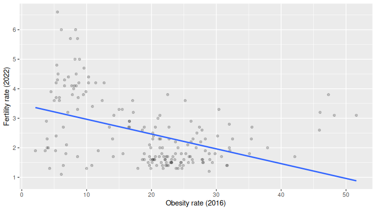
# Optional: correlation
UN_data_ch5 |>
  moderndive::get_correlation(fert_rate ~ obes_rate)
# A tibble: 1 × 1
cor
<dbl>
1 -0.435236EDA = raw data + summaries + plot. The scatterplot with the regression line and the correlation quantify direction/strength. This data shows a negative association between obesity rate and fertility rate (points slope down; negative correlation): as obesity rate increases, fertility rate tends to decrease.
(LC5.2) Main purpose of EDA?
Solution: B.
EDA helps you understand relationships, spot outliers/missingness, and check assumptions before modeling, not to predict or fabricate variables.
(LC5.3) Which is correct about the correlation coefficient?
Solution: C.
Pearson’s correlation is bounded in [-1, 1] and measures linear association strength/direction.
(LC5.4) Fit a simple linear regression using lm(fert_rate ~ obes_rate, data = UN_data_ch5) where obes_rate is the new explanatory variable \(x\). Learn about the “best-fitting” line from the regression coefficients by applying the coef() function. How do the regression results match up with your earlier exploratory data analysis?
Solution:
(Intercept)   obes_rate
     3.4674     -0.0501
# or a tidy table:
moderndive::get_regression_table(m_obesity)
# A tibble: 2 × 7
term estimate std_error statistic p_value lower_ci upper_ci
<chr> <dbl> <dbl> <dbl> <dbl> <dbl> <dbl>
1 intercept 3.467 0.168 20.618 0 3.136 3.799
2 obes_rate -0.05 0.008 -6.468 0 -0.065 -0.035The slope sign should match your EDA: typically negative, meaning higher obesity rate is associated with lower fertility. The magnitude tells how much fertility changes per 1-point increase in obesity (on average). If your plot/correlation looked negative, a negative fitted slope confirms that.
(LC5.5) What does the intercept \(b_0\) represent?
Solution: B.
\(b_0\) is the predicted response when \(x = 0\). It may be outside the data’s range (so often not substantively meaningful), but that’s the definition.
(LC5.6) What best describes the “slope”?
Solution: C.
The slope is the change in the outcome for a one-unit increase in the explanatory variable, on average.
(LC5.7) What does a negative slope indicate?
Solution: A.
As \(x\) increases, the predicted \(y\) decreases (downward trend).
(LC5.8) What is a “wrapper function”?
Solution: B.
Wrapper functions combine other functions into a simpler interface (e.g., moderndive::get_regression_points() wraps broom::augment() and some cleaning).
(LC5.9) Create a data frame of residuals for the obesity model.
Solution:
m_obesity <- lm(fert_rate ~ obes_rate, data = UN_data_ch5)
resids_df <- moderndive::get_regression_points(m_obesity)
resids_df |> select(obes_rate, fert_rate, fert_rate_hat, residual) |> head()
# A tibble: 6 × 4
obes_rate fert_rate fert_rate_hat residual
<dbl> <dbl> <dbl> <dbl>
1 5.5 4.3 3.192 1.108
2 21.7 1.4 2.38 -0.98
3 27.4 2.7 2.094 0.606
4 8.2 5 3.056 1.944
5 18.9 1.6 2.52 -0.92
6 28.3 1.9 2.049 -0.149get_regression_points() returns observed \(y\), fitted \(\hat y\), and residuals \(y-\hat y\) in a tidy frame, perfect for diagnostics and sorting.
(LC5.10) True statement about the regression line?
Solution: B.
OLS chooses the line that minimizes the sum of squared residuals (squared differences between observed and fitted).
(LC5.11) EDA with x = continent, y = gdp_per_capita.
Solution:
gapminder2022 <- un_member_states_2024 |>
  select(country, life_exp = life_expectancy_2022, continent, gdp_per_capita) |>
  na.omit()

# Raw look
glimpse(gapminder2022)
Rows: 188
Columns: 4
$ country <chr> "Afghanistan", "Albania", "Algeria", "Andorra", "Angola", "Antigua and Barbuda", "Argentina", "…
$ life_exp <dbl> 53.6, 79.5, 78.0, 83.4, 62.1, 77.8, 78.3, 76.1, 83.1, 82.3, 74.2, 76.1, 79.9, 74.7, 78.5, 74.3,…
$ continent <fct> Asia, Europe, Africa, Europe, Africa, North America, South America, Asia, Oceania, Europe, Asia…
$ gdp_per_capita <dbl> 356, 6810, 4343, 41993, 3000, 19920, 13651, 7018, 65100, 52085, 7762, 31458, 30147, 2688, 20239…
# Summaries
gapminder2022 |>
  select(gdp_per_capita, continent) |>
  moderndive::tidy_summary()
# A tibble: 7 × 11
column n group type min Q1 mean median Q3 max sd
<chr> <int> <chr> <chr> <dbl> <dbl> <dbl> <dbl> <dbl> <dbl> <dbl>
1 gdp_per_capita 188 <NA> numeric 259.025 2255.36 18472.8 6741.29 20395.5 240862. 30858.0
2 continent 52 Africa factor NA NA NA NA NA NA NA
3 continent 44 Asia factor NA NA NA NA NA NA NA
4 continent 43 Europe factor NA NA NA NA NA NA NA
5 continent 23 North America factor NA NA NA NA NA NA NA
6 continent 14 Oceania factor NA NA NA NA NA NA NA
7 continent 12 South America factor NA NA NA NA NA NA NA
# Visualization
ggplot(gapminder2022, aes(x = continent, y = gdp_per_capita)) +
  geom_boxplot() +
  # Helpful with longer names/categories
  coord_flip() +
  scale_y_continuous(labels = scales::comma) +
  labs(x = "Continent", y = "GDP per capita (USD)")
Boxplots/facets reveal distribution and differences. Notice a higher median in Europe and lower in Africa, with Europe showing widest spread.
(LC5.12) Baseline group in categorical regression?
Solution: B.
The baseline is the reference category against which others are compared (it’s not necessarily largest/smallest by any statistic unless you set it).
(LC5.13) Fit lm(gdp_per_capita ~ continent, data = gapminder2022) and compare to EDA.
Solution:
m_gdp <- lm(gdp_per_capita ~ continent, data = gapminder2022)
moderndive::get_regression_table(m_gdp)
# A tibble: 6 × 7
term estimate std_error statistic p_value lower_ci upper_ci
<chr> <dbl> <dbl> <dbl> <dbl> <dbl> <dbl>
1 intercept 2637.1 3727.63 0.707 0.48 -4717.83 9992.03
2 continent: Asia 13014.3 5506.08 2.364 0.019 2150.33 23878.2
3 continent: Europe 43061.4 5540.65 7.772 0 32129.2 53993.5
4 continent: North America 13713.5 6731.31 2.037 0.043 432.033 26994.9
5 continent: Oceania 10031.0 8093.58 1.239 0.217 -5938.28 26000.4
6 continent: South America 8083.51 8608.60 0.939 0.349 -8901.98 25069.0 The intercept is the baseline continent’s mean GDP per capita. Each continent coefficient is an offset from the baseline mean. Signs/magnitudes should mirror your boxplot: positive for richer-than-baseline continents, negative for poorer-than-baseline.
(LC5.14) How many “offsets” for 4 levels?
Solution: C. (3) With \(k\) categories, you get \(k-1\) offsets plus 1 intercept for the baseline.
(LC5.15) Positive coefficient in a categorical model means?
Solution: C. A positive coefficient means that group’s mean response is higher than the baseline’s (by that coefficient amount).
(LC5.16) Which is true about residuals?
Solution: A.
A residual is \(y - \hat y\). It can be positive or negative and is crucial for model fit checks.
(LC5.17) Find the five most negative residuals; interpret.
Solution:
life_exp_model <- lm(life_exp ~ continent, data = gapminder2022)
rp <- moderndive::get_regression_points(life_exp_model, ID = "country")

rp |>
  arrange(residual) |>
  slice(1:5) |>
  select(country, continent, life_exp, life_exp_hat, residual)
# A tibble: 5 × 5
country continent life_exp life_exp_hat residual
<chr> <fct> <dbl> <dbl> <dbl>
1 Afghanistan Asia 53.65 74.95 -21.3
2 Central African Republic Africa 55.52 66.31 -10.79
3 Somalia Africa 55.72 66.31 -10.59
4 Haiti North America 65.95 76.295 -10.345
5 Mozambique Africa 57.1 66.31 -9.21 Negative residuals are below their continent’s mean. Their life expectancy is lower than their continent’s average by residual (in magnitude) years.
(LC5.18) Find the five most positive residuals; interpret.
Solution:
rp |>
  arrange(desc(residual)) |>
  top_n(n = 5) |>
  select(country, continent, life_exp, life_exp_hat, residual)
# A tibble: 5 × 5
country continent life_exp life_exp_hat residual
<chr> <fct> <dbl> <dbl> <dbl>
1 Algeria Africa 78.03 66.31 11.72
2 Singapore Asia 86.43 74.95 11.48
3 Libya Africa 77.18 66.31 10.87
4 Tunisia Africa 76.82 66.31 10.51
5 Japan Asia 84.91 74.95 9.96Positive residuals are above their continent’s mean (higher life expectancy than their continent average by residual years).
(LC5.19) Compute the sum of squared residuals (SSR) for three lines in the toy example and show the regression line is smallest.
Solution:
- The “best” fitting solid regression line in blue:
\[ \sum_{i=1}^{n}(y_i - \widehat{y}_i)^2 = (2.0-1.5)^2+(1.0-2.0)^2+(3.0-2.5)^2 = 1.5 \]
- An arbitrarily chosen dotted red line:
\[ \sum_{i=1}^{n}(y_i - \widehat{y}_i)^2 = (2.0-2.5)^2+(1.00-2.5)^2+(3.0-2.5)^2 = 2.75 \]
- Another arbitrarily chosen dashed green line:
\[ \sum_{i=1}^{n}(y_i - \widehat{y}_i)^2 = (2.0-2.0)^2+(1.0-1.5)^2+(3.0-1.0)^2 = 4.25 \]
As calculated, \(1.5 < 2.75 < 4.25\). Therefore, we show that the regression line in blue has the smallest value of the residual sum of squares.
D.6 Chapter 6 Solutions
Needed packages
UN_data_ch6 <- un_member_states_2024 |>
  select(country,
         life_expectancy_2022,
         fertility_rate_2022,
         income_group_2024)|>
  na.omit()|>
  rename(life_exp = life_expectancy_2022,
         fert_rate = fertility_rate_2022,
         income = income_group_2024)|>
  mutate(income = factor(income,
                         levels = c("Low income", "Lower middle income",
                                    "Upper middle income", "High income")))
credit_ch6 <- Credit |> as_tibble() |>
  select(debt = Balance, credit_limit = Limit,
         income = Income, credit_rating = Rating, age = Age)
(LC6.1) What is the goal of including an interaction term?
Solution: B.
It lets the effect of one explanatory variable depend on the level of another.
(LC6.2) How do main effects plus interactions change coefficient interpretation?
Solution: C.
Coefficients become conditional effects that depend on the interacting variable(s).
(LC6.3) Which statement about dummy variables is correct?
Solution: B.
They encode categorical variables with at least two levels.
(LC6.4) Model with one categorical and one numerical regressor, no interactions: interpretation?
Solution: B.
All categories share the same slope; only intercepts differ.
(LC6.5) Compute observed responses, fitted values, and residuals for the no interaction model.
Solution: Use the fitted no interaction model and generate regression points:
model_no_int <- lm(fert_rate ~ life_exp + income, data = UN_data_ch6)
pts_no_int <- get_regression_points(model_no_int)
# Columns include fert_rate (observed y), fert_rate_hat (fitted ŷ), and residual = y - ŷ
head(pts_no_int)
# A tibble: 6 × 6
ID fert_rate life_exp income fert_rate_hat residual
<int> <dbl> <dbl> <fct> <dbl> <dbl>
1 1 4.3 53.65 Low income 5.369 -1.069
2 2 1.4 79.47 Upper middle income 1.531 -0.131
3 3 2.7 78.03 Lower middle income 2.197 0.503
4 4 5 62.11 Lower middle income 3.799 1.201
5 5 1.6 77.8 High income 1.872 -0.272
6 6 1.9 78.31 Upper middle income 1.648 0.252Interpretation: for each row, compare fert_rate to fert_rate_hat; the residual is their difference.
(LC6.6) Main benefit of visualizing fitted values and residuals?
Solution: B.
To assess model assumptions like linearity and constant variance.
(LC6.7) EDA for debt with credit_rating and age. What can you say?
Solution: Make scatterplots and summaries; compute correlations:
credit_ch6 |>
  select(debt, credit_rating, age) |>
  tidy_summary()
# A tibble: 3 × 11
column n group type min Q1 mean median Q3 max sd
<chr> <int> <chr> <chr> <dbl> <dbl> <dbl> <dbl> <dbl> <dbl> <dbl>
1 debt 400 <NA> numeric 0 68.75 520.015 459.5 863 1999 459.759
2 credit_rating 400 <NA> numeric 93 247.25 354.94 344 437.25 982 154.724
3 age 400 <NA> numeric 23 41.75 55.6675 56 70 98 17.2498
ggplot(credit_ch6, aes(credit_rating, debt)) +
  geom_point() +
  geom_smooth(method = "lm", se = FALSE) +
  labs(x = "Credit rating", y = "Debt ($)")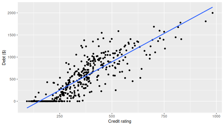
ggplot(credit_ch6, aes(age, debt)) +
  geom_point() +
  geom_smooth(method = "lm", se = FALSE) +
  labs(x = "Age", y = "Debt ($)")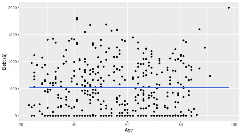
                 debt credit_rating     age
debt          1.00000         0.864 0.00184
credit_rating 0.86363         1.000 0.10316
age           0.00184         0.103 1.00000
Patterns to look for: higher credit ratings often associate with lower debt; age can show weak or nonlinear association. Your plots and correlations should guide the final statement.
(LC6.8) Fit lm(debt ~ credit_rating + age, data = credit_ch6) and compare to EDA.
Solution: Fit and read coefficients, then check signs and magnitudes against your plots.
m_ca <- lm(debt ~ credit_rating + age, data = credit_ch6)
get_regression_table(m_ca)
# A tibble: 3 × 7
term estimate std_error statistic p_value lower_ci upper_ci
<chr> <dbl> <dbl> <dbl> <dbl> <dbl> <dbl>
1 intercept -269.581 44.806 -6.017 0 -357.668 -181.494
2 credit_rating 2.593 0.074 34.84 0 2.447 2.74
3 age -2.351 0.668 -3.521 0 -3.663 -1.038Interpretation: the coefficient on credit_rating is the partial effect holding age fixed; same for age. If EDA showed debt decreasing as rating increases, expect a negative coefficient on credit_rating. If age showed a weak relationship, expect a small coefficient or consider adding nonlinear terms if residual plots suggest curvature.
(LC6.9) Interpretation of a regression coefficient in multiple regression.
Solution: A.
It is the additional effect of a regressor/predictor variable on the response after accounting for other regressors.
(LC6.10) Characteristic of the best fitting plane with two numerical regressors.
Solution: C.
It minimizes the sum of squared residuals over all observations.
(LC6.11) What does the intercept represent with two explanatory variables?
Solution: D.
The expected response when all regressors are zero.
(LC6.12) What is a partial slope?
Solution: A.
The additional effect of a regressor on the response after the others are taken into account.
D.7 Chapter 7 Solutions
Needed packages
(LC7.1) Why is it important to mix the balls before a new sample?
Solution: To randomize selection and reduce dependence or bias between samples.
(LC7.2) Why didn’t all students get the same sample proportion?
Solution: Sampling variation. Different random samples from the same population yield different statistics.
(LC7.3) Why can’t we study sampling variation with only one virtual sample?
Solution: One sample shows only one outcome. Many samples are needed to observe variability and form a sampling distribution.
(LC7.4) Why didn’t we take 1000 samples of 50 balls by hand?
Solution: It is impractical and time consuming. Simulation is fast, scalable, and reproducible.
(LC7.5) From the 1000-sample histogram, is 30% red in \(n = 50\) likely? What about 10%?
Solution: 30% is plausible though less common. 10% is very unlikely.
(LC7.6) As in Figure 7.12 comparing sample sizes, what about the center of the histograms?
Solution: C. The center of each histogram seems to be about the same, regardless of the sample size.
(LC7.7) As the sample size increases, the histogram gets narrower. What happens to the sample proportions?
Solution: A. They vary less.
(LC7.8) Why use random sampling when constructing sampling distributions?
Solution: B. To minimize bias and make inferences about the population.
(LC7.9) Why construct a histogram of sample means or proportions in a simulation study?
Solution: A. To visualize the distribution and assess normality or other patterns.
(LC7.10) In the bowl activity, what is the population parameter? Do we know its value? How can we know it exactly?
Solution: The population parameter is the true proportion of red balls, \(p\). We can know it exactly by counting all balls and computing the proportion in the full population.
(LC7.11) How did we ensure the shovel samples were random?
Solution: By mixing the bowl between samples and sampling with replacement so each ball has equal chance on each draw.
(LC7.12) What is the expected value of the sample mean in the context of sampling distributions?
Solution: B. The population mean.
(LC7.13) What is the role of the Central Limit Theorem in inference?
Solution: B. It says the sampling distribution of the sample mean approaches normal as the sample size becomes large, regardless of the population distribution.
(LC7.14) What does “sampling variation” refer to?
Solution: B. Differences in sample statistics due to random sampling.
(LC7.15) How does increasing the sample size affect the standard error of the sample mean?
Solution: B. It decreases the standard error.
(LC7.16) When does the sampling distribution of the sample mean approximate normal?
Solution:
- When the population is normal: yes, for any \(n\).
- When the sample size is very large: yes, by the CLT.
- When the sample size is sufficiently large regardless of population: yes, by the CLT.
- When the population is uniform: approximately normal if \(n\) is large, but not necessarily for small \(n\).
(LC7.17) In comparing two samples, why do we add variances when finding the SE of a difference?
Solution: B. Adding variances reflects the total uncertainty contributed by both independent samples.
(LC7.18) For large samples, what is the shape of the sampling distribution of the difference in sample proportions?
Solution: B. Bell shaped, approximating a normal distribution.
D.8 Chapter 8 Solutions
Needed packages
(LC8.1) What is the expected value of the sample mean weight of almonds in a large sample according to the sampling distribution theory?
Solution: D. On average, the sample mean equals the population mean (unbiased), though any single sample can vary.
(LC8.2) What is a point estimate and how does it differ from an interval estimate?
Solution: B. A point estimate is one number (e.g., \(\bar x\)). An interval estimate gives a plausible range that accounts for sampling variability.
(LC8.3) What does the population mean (\(\mu\)) represent in the almond activity?
Solution: C. It’s the average weight of all 5,000 almonds (the full population), not just a sample.
(LC8.4) Which best describes the population standard deviation (\(\sigma\)) in the almond activity?
Solution: B. \(\sigma\) measures spread around the population mean, not the sample mean.
(LC8.5) Why use the sample mean to estimate the population mean?
Solution: B. \(\bar x\) is an unbiased estimator of \(\mu\); across repeated samples it hits \(\mu\) on average.
(LC8.6) How is the standard error of the sample mean calculated here?
Solution: B. \(SE(\bar x)=\sigma/\sqrt{n}\); larger \(n\) shrinks variability of \(\bar x\).
(LC8.7) What does a 95% confidence interval represent here?
Solution: C. Before sampling, the procedure yields intervals that capture \(\mu\) 95% of the time; numerically that’s \(\bar x \pm 1.96\times SE\).
(LC8.8) Why does the \(t\) distribution have thicker tails than the standard normal?
Solution: D. Using \(s\) instead of \(\sigma\) adds uncertainty; \(t\) accounts for this with heavier tails.
(LC8.9) Effect of increasing degrees of freedom on the \(t\) distribution?
Solution: B. Tails thin and the distribution approaches the standard normal as df increases.
(LC8.10) What is the chief difference between a bootstrap distribution and a sampling distribution?
Solution: A bootstrap distribution resamples from the original sample (with replacement), while a sampling distribution resamples from the entire population.
(LC8.11) Looking at the bootstrap distribution for the sample mean in Figure 8.14, between what two values would you say most values lie?
Solution: Roughly between 3.60 and 3.75 grams.
(LC8.12) Which of the following is true about the confidence level when constructing a confidence interval?
Solution: A. The confidence level sets the interval’s width and affects how likely it is to contain the true parameter.
(LC8.13) How does increasing the sample size affect the width of a confidence interval for a given confidence level?
Solution: C. It decreases the width, making the estimate more precise.
(LC8.14) Construct a 95% confidence interval for the median weight of all almonds with the percentile method. Is it appropriate to also use the standard-error method?
Solution: The percentile method is appropriate for the median.
bootstrap_distribution <- almonds_sample |>
  specify(response = weight) |>
  generate(reps = 1000) |>
  calculate(stat = "median")
percentile_ci <- bootstrap_distribution |>
  get_confidence_interval(level = 0.95, type = "percentile")
percentile_ci
# A tibble: 1 × 2
lower_ci upper_ci
<dbl> <dbl>
1 3.3 4The standard-error method is not ideal, because SE-based formulas assume symmetry/normality, which may not hold for medians. The standard-error method is not appropriate here, because the bootstrap distribution is not bell-shaped:
visualize(bootstrap_distribution)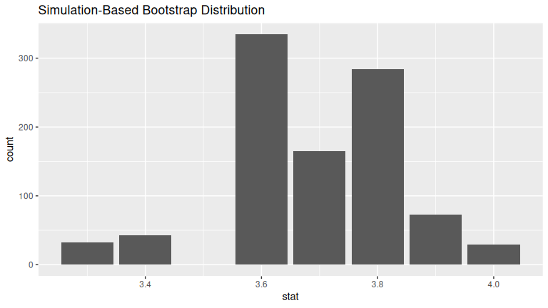
(LC8.15) What are the advantages of using infer for building confidence intervals?
Solution: Clearer, step-by-step workflow; consistent syntax across CI and hypothesis testing; easier extension to multi-variable cases; and built-in visualization tools.
(LC8.16) What is the main purpose of bootstrapping in statistical inference?
Solution: B. To generate multiple samples from the original data for estimating parameters.
(LC8.17) Which function denotes the variables of interest for inference?
Solution: C. specify().
(LC8.18) What is a key difference between the percentile method and the standard error method for constructing confidence intervals using bootstrap samples?
Solution: B. Percentile method takes the middle 95% of bootstrap statistics; the SE method centers on the original sample mean and adds/subtracts 1.96 × bootstrap SE.
D.9 Chapter 9 Solutions
Needed packages
library(tidyverse)
library(infer)
library(moderndive)
library(nycflights23)
library(ggplot2movies)
(LC9.1) Why does the given code produce an error with stat = "diff in means"?
Solution:
Because the response variable popular_or_not is categorical, not numerical. The statistic "diff in means" requires a numeric response. With categorical responses, you must use "diff in props".
(LC9.2) Why are we relatively confident that the distributions of the sample proportions approximate the population distributions?
Solution: Because the sample sizes are large (1000 songs per genre). With large, representative random samples, sample proportions are good approximations of population proportions due to the Law of Large Numbers and the Central Limit Theorem.
(LC9.3) Using the definition of p-value, what does the p-value represent in the Spotify test?
Solution: It is the probability, assuming no true difference in popularity between metal and deep house, of obtaining a sample difference in proportions as large as or larger than the observed one in favor of metal.
(LC9.4) How did Allen Downey’s diagram help us conclude whether a difference existed between popularity rates?
Solution: We followed the steps: (1) specify variables and hypotheses, (2) assume the null universe of no difference, (3) simulate data under this null by permutation, (4) calculate the observed test statistic and compare it to the null distribution, and (5) compute the p-value. Since the observed difference lay far in the tail of the null distribution, the p-value was small, leading us to reject the null and conclude metal songs are more popular.
(LC9.5) What is wrong about saying, “The defendant is innocent” in a US trial?
Solution: The court can only conclude “not guilty.” This means insufficient evidence to convict, not proof of innocence. Similarly, in hypothesis testing, we “fail to reject” \(H_0\) but never “accept” it as true.
(LC9.6) What is the purpose of hypothesis testing?
Solution: To assess whether sample evidence provides enough support to reject a null hypothesis about a population parameter, under controlled risk of error.
(LC9.7) What are some flaws with hypothesis testing, and how could we alleviate them?
Solution: Flaws:
- Overreliance on arbitrary cutoffs (e.g., \(p < 0.05\)).
- Misinterpretation of “failing to reject” as proof of \(H_0\).
- Sensitivity to sample size (tiny effects significant with large \(n\)).
Alleviations: Report effect sizes, confidence intervals, and use context-specific significance levels rather than fixed thresholds.
(LC9.8) Comparing \(\alpha = 0.1\) and \(\alpha = 0.01\), which has a higher chance of Type I Error?
Solution: \(\alpha = 0.1\). A larger \(\alpha\) increases the probability of rejecting \(H_0\) when it is actually true.
(LC9.9) Conduct the same analysis comparing action versus romance movies using the median rating instead of the mean. What was different and what was the same?
Solution:
# In calculate() step replace "diff in means" with "diff in medians"
null_distribution_movies_median <- movies_sample |>
  specify(formula = rating ~ genre) |>
  hypothesize(null = "independence") |>
  generate(reps = 1000, type = "permute") |>
  calculate(stat = "diff in medians", order = c("Action", "Romance"))

# compute observed "diff in medians"
obs_diff_medians <- movies_sample |>
  specify(formula = rating ~ genre) |>
  calculate(stat = "diff in medians", order = c("Action", "Romance"))
obs_diff_medians
Response: rating (numeric)
Explanatory: genre (factor)
# A tibble: 1 × 1
stat
<dbl>
1 -1.55
# Visualize p-value. Observing this difference in medians under H0
# is very unlikely! Suggesting H0 is false, similarly to when we used
# "diff in means" as the test statistic.
visualize(null_distribution_movies_median, bins = 10) +
  shade_p_value(obs_stat = obs_diff_medians, direction = "both")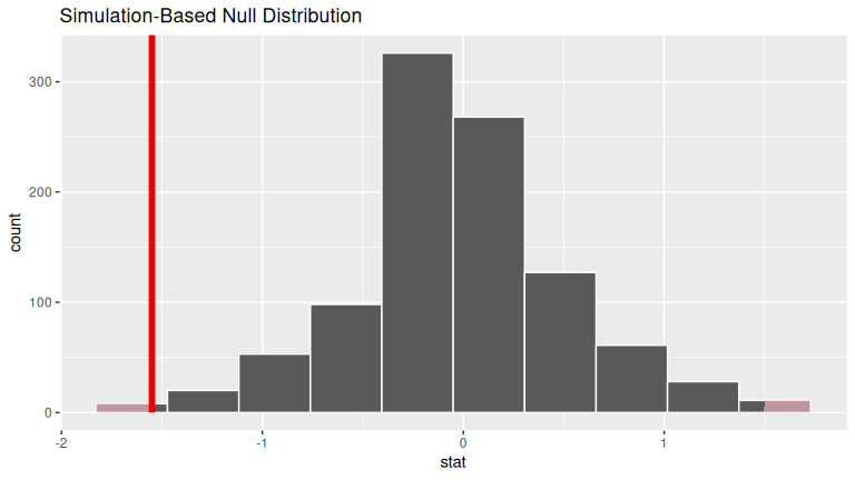
# p-value is very small, just like when we used "diff in means"
# as the test statistic.
null_distribution_movies_median |>
  get_p_value(obs_stat = obs_diff_medians, direction = "both")
# A tibble: 1 × 1
p_value
<dbl>
1 0.008(LC9.10) What conclusions can you make from viewing the faceted histogram of rating versus genre that you could not see with the boxplot?
Solution:
From the faceted histogram, we can also see the comparison of rating versus genre over each year, but we cannot conclude them from the boxplot.
(LC9.11) Describe how we used Allen Downey’s diagram to conclude if a statistical difference existed.
Solution:
We (1) stated variables and hypotheses, (2) assumed the null universe where action and romance have the same mean, (3) generated shuffled datasets under this null, (4) calculated the difference in sample means for each, (5) compared the observed difference to this null distribution, and (6) computed the \(p\)-value. If the \(p\)-value is larger than \(\alpha\), we failed to reject \(H_0\); otherwise, we reject \(H_0\) and conclude a statistical difference existed.
(LC9.12) Why are we relatively confident that the distributions of the sample ratings approximate the population distributions?
Solution: Because the sample of movies was taken randomly from the full IMDb database and has reasonable size, making it representative. By the Central Limit Theorem, with sufficiently large \(n\), sample-based statistics approximate population parameters well.
(LC9.13) Using the definition of \(p\)-value, what does the \(p\)-value represent here?
Solution: It is the probability, assuming no true difference in mean ratings between action and romance movies, of obtaining a sample mean difference at least as extreme (in either direction) as the observed difference.
(LC9.14) What is the value of the \(p\)-value for this two-sided test?
Solution: The \(p\)-value here is \(0.004\).
(LC9.15) Test your wrangling and EDA skills:
- Create an action/romance-only data frame from
movies. - Make boxplots and faceted histograms of IMDb rating by genre.
- Compare these with the sample plots.
Solution:
- Use
dplyrandtidyrto create the necessary data frame focused on only action and romance movies (but not both) from themoviesdata frame in theggplot2moviespackage.
action_romance <- movies |>
  select(title, year, rating, Action, Romance) |>
  filter((Action == 1 | Romance == 1) & !(Action == 1 & Romance == 1)) |>
  mutate(genre = ifelse(Action == 1, "Action", "Romance"))
Note above:
- In the
filter()command that(Action == 1 | Romance == 1)picks out the movies that are either action or romance while the!(Action == 1 & Romance == 1)leaves out the movies that are classified as both. - In the
mutate()we useifelse()to create a new variablegenrewhose values are either"Action"or"Romance".
- Make a boxplot and a faceted histogram of this population data comparing ratings of action and romance movies from IMDb.
# Faceted histogram
ggplot(action_romance, aes(rating)) +
  geom_histogram() +
  facet_wrap(~genre)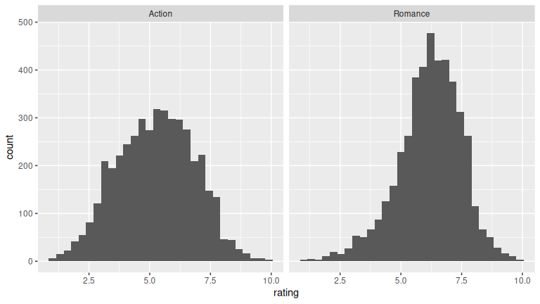
# Boxplot
ggplot(action_romance, aes(y = rating, x = genre)) +
  geom_boxplot()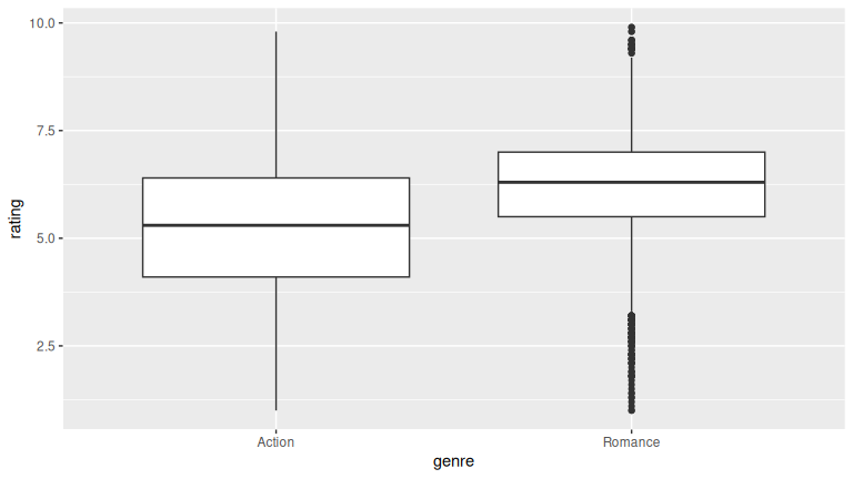
The results look similar to the previous plots. There are more outliers shown for Romance in the boxplot done here.
D.10 Chapter 10 Solutions
Needed packages
(LC10.1) Meaning of the error term \(\epsilon\) in \(Y = \beta_0 + \beta_1 X + \epsilon\).
Solution: C. It is the part of the response not explained by the line.
(LC10.2) A key property of the least squares estimates \(b_0, b_1\).
Solution: B. They are linear combinations of the observed responses \(y_1, y_2, \ldots, y_n\).
(LC10.3) How to encode a two-group difference in means with regression.
Solution: C. Include a dummy variable for the groups; its coefficient equals the mean difference.
(LC10.4) Meaning of the null hypothesis \(H_0: \beta_1 = 0\).
Solution: A. There is no linear association between the explanatory variable and the response.
(LC10.5) An assumption required by the linear regression model.
Solution: A. The error terms are normally distributed with mean zero and constant variance.
(LC10.6) Why the slope estimate \(b_1\) is a random variable.
Solution: C. It varies from sample to sample due to sampling variation.
(LC10.7) Residual analysis for UN data (\(y =\) fertility, \(x =\) life expectancy).
Solution:
Compute fitted values and residuals with get_regression_points().
simple_model <- lm(fertility_rate_2022 ~ hdi_2022,
                   data = na.omit(un_member_states_2024))
regression_points <- get_regression_points(simple_model, ID = "country")
regression_points
# A tibble: 107 × 5
country fertility_rate_2022 hdi_2022 fertility_rate_2022_hat residual
<chr> <dbl> <dbl> <dbl> <dbl>
1 Afghanistan 4.3 0.462 4.035 0.265
2 Algeria 2.7 0.745 2.394 0.306
3 Argentina 1.9 0.849 1.791 0.109
4 Armenia 1.6 0.786 2.157 -0.557
5 Australia 1.6 0.946 1.229 0.371
6 Austria 1.5 0.926 1.345 0.155
7 Azerbaijan 1.6 0.76 2.307 -0.707
8 Bahamas, The 1.4 0.82 1.959 -0.559
9 Bahrain 1.8 0.888 1.565 0.235
10 Barbados 1.6 0.809 2.023 -0.423
# ℹ 97 more rows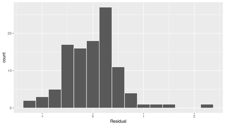
FIGURE D.1: Histogram of residuals.
The residuals appear to follow a Normal distribution pretty closely. There is one bin near 0.5 that is a bit high, but overall the histogram looks reasonably symmetric and mound-shaped.
ggplot(regression_points, aes(x = hdi_2022, y = residual)) +
  geom_point() +
  labs(x = "HDI", y = "Residual") +
  geom_hline(yintercept = 0, col = "blue", linewidth = 1)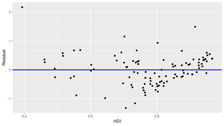
FIGURE D.2: Plot of residuals over HDI.
This plot seems to fit equality of variance. There doesn’t appear to be a strong “fan formation” in this graph.
(LC10.8) Interpretation of a near-zero \(p\)-value for the slope.
Solution: B. There is strong evidence against \(H_0: \beta_1 = 0\), indicating a linear relationship between the explanatory and response variables.
(LC10.9) Which assumptions a residual plot helps assess.
Solution: Residual plots help check linearity and equal variance. They do not directly check independence (need residuals vs time if sequential data). They are not sufficient for normality, which requires histograms or QQ-plots.
(LC10.10) Meaning of a U-shaped residual plot.
Solution: B. It suggests violation of the linearity assumption.
(LC10.11) Simulation-based inference for the correlation coefficient.
Solution:
Use the infer workflow with stat = "correlation" on waiting ~ duration.
- CI:
specify() |> generate(reps, type = "bootstrap") |> calculate(stat = "correlation") |> get_confidence_interval(type = "percentile", level = 0.95). - Test \(H_0:\rho=0\):
specify() |> hypothesize(null = "independence") |> generate(reps, type = "permute") |> calculate(stat = "correlation"), then compare the observed correlation withshade_p_value()/get_p_value(direction = "both").
(LC10.12) Why the bootstrap percentile method is appropriate for \(\beta_1\) here.
Solution: D. It does not require the bootstrap distribution to be normally shaped.
(LC10.13) Role of the permutation test for \(\beta_1\).
Solution: B. It assesses whether the observed slope could occur by chance under \(H_0\) of no relationship.
(LC10.14) \(p\)-value near 0 from the null distribution of slopes.
Solution: C. The observed slope is significantly different from 0, suggesting a meaningful relationship.
(LC10.15) Meaning of \(\beta_j\) in multiple regression.
Solution: D. The partial slope for \(X_j\), accounting for all other regressors.
(LC10.16) Why convert continent_of_origin to a factor.
Solution: B. To create dummy variables representing its categories.
(LC10.17) Purpose of a scatterplot matrix here.
Solution: C. Examine pairwise linear relationships and spot multicollinearity among regressors.
(LC10.18) Role of dummy variables for continent_of_origin.
Solution: B. They shift the intercept according to the category.
(LC10.19) Why it matters that estimators are unbiased.
Solution: B. On average, the estimates equal the true population parameters.
(LC10.20) Why coefficients change with different regressor sets.
Solution: C. Each coefficient depends on the specific combination of regressors in the model.
(LC10.21) Constructing a 95% CI for a coefficient in MLR.
Solution: A. Point estimate \(\pm\) (critical \(t\) value \(\times\) standard error).
(LC10.22) What the ANOVA model-comparison test evaluates.
Solution: B. Whether the reduced model is adequate or the full model is needed.
(LC10.23) Why use simulation-based methods in MLR.
Solution: D. They don’t rely on normality assumptions or large sample sizes.
(LC10.24) Purpose of the bootstrap distribution for partial slopes.
Solution: B. To approximate the sampling distribution by resampling with replacement.
(LC10.25) CI for a partial slope includes 0.
Solution: A. No statistically significant relationship with the response (at the chosen level).
(LC10.26) Observed test statistic far to the right of the null distribution.
Solution: C. Likely statistically significant; reject the null.
D.11 Chapter 11 Solutions
Needed packages
(LC11.1) Check that the LINE conditions are met for inference in the Seattle house prices example with
price_interaction <- lm(log10_price ~ log10_size * condition, data = house_prices).
Solution:
price_interaction <- lm(
  log10_price ~ log10_size * condition,
  data = house_prices
)

regression_points <- get_regression_points(price_interaction, ID = "id")
Plot log10 size and log10 price by condition:
ggplot(house_prices, aes(x = log10(sqft_living), y = log10(price), color = condition)) +
  geom_point(alpha = 0.3) +
  geom_smooth(method = "lm", se = FALSE) +
  labs(x = "Log10 Size (sqft)", y = "Log10 Price ($)", color = "Condition")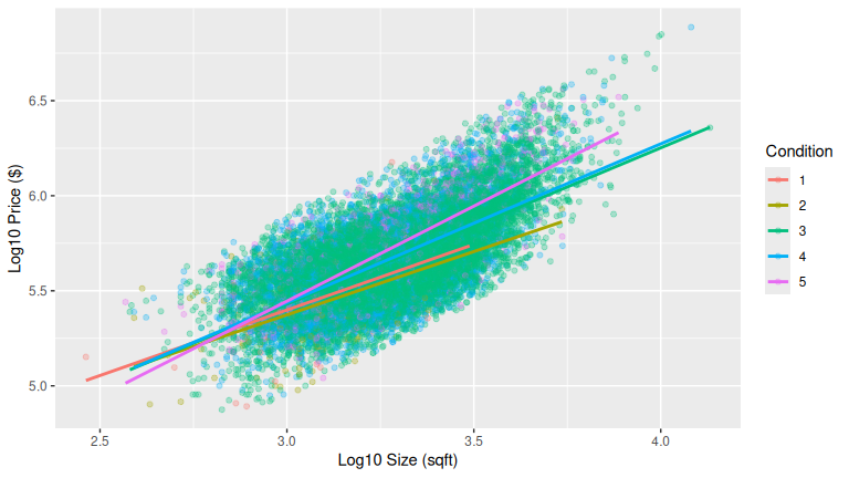
FIGURE D.3: Log10 size vs. log10 price by condition.
- Linearity: The relationship between log10 size and log10 price is approximately linear within each condition level. This is a little challenging to see due to overplotting.
- Independence: Each house sale is a separate observation, so independence is reasonable.
Plot Q-Q plot of residuals:
ggplot(regression_points, aes(sample = residual)) +
  geom_qq(alpha = 0.3) +
  geom_qq_line(color = "red") +
  labs(title = "Q-Q Plot of Residuals")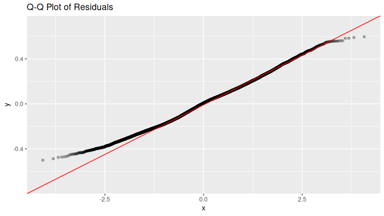
Histogram of residuals:
ggplot(regression_points, aes(x = residual)) +
  geom_histogram(binwidth = 0.05, color = "white") +
  labs(x = "Residual")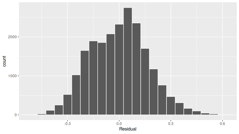
FIGURE D.4: Histogram of residuals.
- Normality: Residuals appear roughly bell-shaped after the log10 transformation.
Plot residuals vs. fitted (log10_price_hat) values:
ggplot(regression_points, aes(x = log10_price_hat, y = residual)) +
  geom_point(alpha = 0.3) +
  geom_hline(yintercept = 0, color = "red") +
  labs(x = "Fitted Values", y = "Residuals")
FIGURE D.5: Residuals vs. fitted values.
- Equal variance: The spread of residuals is fairly constant across fitted values. Overall, the LINE conditions are reasonably satisfied.
(LC11.2) Repeat the regression modeling and prediction for a house of condition 5 and size 1900 square feet, but using the parallel slopes model.
Solution:
house_prices <- house_prices |>
  mutate(
    log10_price = log10(price),
    log10_size = log10(sqft_living)
  )
# Fit regression model:
price_interaction <- lm(log10_price ~ log10_size + condition,
  data = house_prices
)

# Get regression table:
get_regression_table(price_interaction)
# A tibble: 6 × 7
term estimate std_error statistic p_value lower_ci upper_ci
<chr> <dbl> <dbl> <dbl> <dbl> <dbl> <dbl>
1 intercept 2.882 0.036 79.994 0 2.811 2.952
2 log10_size 0.837 0.006 134.169 0 0.825 0.85
3 condition: 2 -0.039 0.033 -1.16 0.246 -0.104 0.027
4 condition: 3 0.032 0.031 1.037 0.3 -0.028 0.092
5 condition: 4 0.044 0.031 1.422 0.155 -0.017 0.104
6 condition: 5 0.096 0.031 3.094 0.002 0.035 0.156
10^(2.88 + 0.096 + 0.837 * log10(1900))[1] 525190(LC11.3) Interpret the results of the other rows in get_regression_table(price_interaction) not already discussed.
Solution:
-
condition2–condition5: These give the intercept differences relative to condition 1 houses. For example, a positive value forcondition5means condition 5 houses start with higher baseline log10 price at size = 1 square foot. -
log10_size:condition2–log10_size:condition5: These give slope differences relative to condition 1. A positive coefficient means price increases faster with size for that condition compared to condition 1.
(LC11.4) Create, visualize, and interpret confidence intervals using both theory-based and simulation-based approaches.
Solution:
-
Theory-based: Use
get_regression_table(price_interaction)which reports CIs from the \(t\)-distribution. For example, the CI forlog10_sizeexcludes 0, so size is significant. -
Simulation-based: Bootstrap the regression with resampling (
inferpackage withfit()+get_confidence_interval()). Plot the bootstrap distribution of coefficients and shade the middle 95%. Both approaches agree: onlylog10_sizehas a confidence interval that does not include 0, confirming its significant relationship with log10 price.
(LC11.5) What date between 1994 and 2003 has the fewest number of births in the US? What story could you tell about why?
Solution:
US_births_1994_2003 |>
  arrange(births)
# A tibble: 3,652 × 6
year month date_of_month date day_of_week births
<int> <int> <int> <date> <ord> <int>
1 2001 12 25 2001-12-25 Tues 6443
2 2000 12 25 2000-12-25 Mon 6566
3 2003 12 25 2003-12-25 Thurs 6628
4 2002 12 25 2002-12-25 Wed 6629
5 1999 12 25 1999-12-25 Sat 6674
6 2000 12 24 2000-12-24 Sun 6801
7 1995 12 24 1995-12-24 Sun 6999
8 2002 4 7 2002-04-07 Sun 7008
9 2002 3 31 2002-03-31 Sun 7019
10 1998 12 25 1998-12-25 Fri 7020
# ℹ 3,642 more rowsThe dates with the fewest number of births in the US were 12/25 of the years of 2001, 2000, 2003, 2002, and 1999. Because it is Christmas Day and hospitals don’t generally induce labor on that day.
D.12 Appendix A1 Solutions
(LCA1.1) What proportion of the area under the normal curve is less than 3? Greater than 12? Between 0 and 12?
- Less than 3: 3 is one standard deviation less than the mean of 6, since \(\frac{3 - \mu}{\sigma} = \frac{3-6}{3} = -1\). Thus we compute the area to the left of \(z = -1\) in Figure A.2: 0.15% + 2.35% + 13.5% = 16%.
- Greater than 12: 12 is two standard deviations greater than the mean of 6, since \(\frac{12 - \mu}{\sigma} = \frac{12-6}{3} = +2\), we compute the area to the right of \(z = +2\) in Figure A.2: 2.35% + 0.15% = 2.5%.
- Between 0 and 12: 0 is two standard deviations less than the mean of 6, since \(\frac{0 - \mu}{\sigma} = \frac{0-6}{3} = -2\). Thus we compute the area between \(z = -2\) and \(z = +2\) in Figure A.2: 13.5% + 34% + 34% + 13.5% = 95%.
(LCA1.2) What is the 2.5th percentile of the area under the normal curve? The 97.5th percentile? The 100th percentile?
- 2.5th percentile: Starting from the left of Figure A.2, since 0.15% + 2.35% = 2.5%, the 2.5th percentile is \(z = -2\). However, this is in standard units. Thus we need the value in the normal distribution that is two standard deviations lower than the mean: \(\mu - 2 \cdot\sigma = 6 - 2 \cdot 3 = 0\).
- 97.5th percentile: Starting from the left of Figure A.2, since 0.15% + 2.35% + 13.5% + 34% + 34% + 13.5% = 97.5%, the 97.5th percentile is \(z = +2\). However, this is in standard units. Thus we need the value in the normal distribution that is two standard deviations higher than the mean: \(\mu + 2 \cdot\sigma = 6 + 2 \cdot 3 = 12\).
- 100th percentile: \(+\infty\). In other words, 100% of values will be less than positive infinity.