

Chapter 6 Multiple Regression
In Chapter 5 we introduced ideas related to modeling for explanation, in particular that the goal of modeling is to make explicit the relationship between some outcome variable \(y\) and some explanatory variable \(x\). While there are many approaches to modeling, we focused on one particular technique: linear regression, one of the most commonly used and easy-to-understand approaches to modeling. Furthermore to keep things simple, we only considered models with one explanatory \(x\) variable that was either numerical in Section 5.1 or categorical in Section 5.2.
In this chapter on multiple regression, we’ll start considering models that include more than one explanatory variable \(x\). You can imagine when trying to model a particular outcome variable, like teaching evaluation scores as in Section 5.1 or life expectancy as in Section 5.2, that it would be useful to include more than just one explanatory variable’s worth of information.
Since our regression models will now consider more than one explanatory variable, the interpretation of the associated effect of any one explanatory variable must be made in conjunction with the other explanatory variables included in your model. Let’s begin!
Needed packages
Let’s load all the packages needed for this chapter (this assumes you’ve already installed them). Recall from our discussion in Section 4.4 that loading the tidyverse package by running library(tidyverse) loads the following commonly used data science packages all at once:
ggplot2for data visualizationdplyrfor data wranglingtidyrfor converting data to “tidy” formatreadrfor importing spreadsheet data into R- As well as the more advanced
purrr,tibble,stringr, andforcatspackages
If needed, read Section 1.3 for information on how to install and load R packages.
6.1 One numerical and one categorical explanatory variable
Let’s revisit the instructor evaluation data from UT Austin we introduced in Section 5.1. We studied the relationship between teaching evaluation scores as given by students and “beauty” scores. The variable teaching score was the numerical outcome variable \(y\), and the variable “beauty” score (bty_avg) was the numerical explanatory \(x\) variable.
In this section, we are going to consider a different model. Our outcome variable will still be teaching score, but we’ll now include two different explanatory variables: age and (binary) gender. Could it be that instructors who are older receive better teaching evaluations from students? Or could it instead be that younger instructors receive better evaluations? Are there differences in evaluations given by students for instructors of different genders? We’ll answer these questions by modeling the relationship between these variables using multiple regression, where we have:
- A numerical outcome variable \(y\), the instructor’s teaching score, and
- Two explanatory variables:
- A numerical explanatory variable \(x_1\), the instructor’s age.
- A categorical explanatory variable \(x_2\), the instructor’s (binary) gender.
It is important to note that at the time of this study due to then commonly held beliefs about gender, this variable was often recorded as a binary variable. While the results of a model that oversimplifies gender this way may be imperfect, we still found the results to be pertinent and relevant today.
6.1.1 Exploratory data analysis
Recall that data on the 463 courses at UT Austin can be found in the evals data frame included in the moderndive package. However, to keep things simple, let’s select() only the subset of the variables we’ll consider in this chapter, and save this data in a new data frame called evals_ch6. Note that these are different than the variables chosen in Chapter 5.
Recall the three common steps in an exploratory data analysis we saw in Subsection 5.1.1:
- Looking at the raw data values.
- Computing summary statistics.
- Creating data visualizations.
Let’s first look at the raw data values by either looking at evals_ch6 using RStudio’s spreadsheet viewer or by using the glimpse() function from the dplyr package:
Rows: 463
Columns: 4
$ ID     <int> 1, 2, 3, 4, 5, 6, 7, 8, 9, 10, 11, 12, 13, 14, 15, 16, 17, 18, …
$ score  <dbl> 4.7, 4.1, 3.9, 4.8, 4.6, 4.3, 2.8, 4.1, 3.4, 4.5, 3.8, 4.5, 4.6…
$ age    <int> 36, 36, 36, 36, 59, 59, 59, 51, 51, 40, 40, 40, 40, 40, 40, 40,…
$ gender <fct> female, female, female, female, male, male, male, male, male, f…
Let’s also display a random sample of 5 rows of the 463 rows corresponding to different courses in Table 6.1. Remember due to the random nature of the sampling, you will likely end up with a different subset of 5 rows.
| ID | score | age | gender |
|---|---|---|---|
| 129 | 3.7 | 62 | male |
| 109 | 4.7 | 46 | female |
| 28 | 4.8 | 62 | male |
| 434 | 2.8 | 62 | male |
| 330 | 4.0 | 64 | male |
Now that we’ve looked at the raw values in our evals_ch6 data frame and got a sense of the data, let’s compute summary statistics. As we did in our exploratory data analyses in Sections 5.1.1 and 5.2.1 from the previous chapter, let’s use the skim() function from the skimr package, being sure to only select() the variables of interest in our model:
Skim summary statistics
 n obs: 463
 n variables: 3

── Variable type:factor
 variable missing complete   n n_unique                top_counts ordered
   gender       0      463 463        2 mal: 268, fem: 195, NA: 0   FALSE

── Variable type:integer
 variable missing complete   n  mean  sd p0 p25 p50 p75 p100
      age       0      463 463 48.37 9.8 29  42  48  57   73

── Variable type:numeric
 variable missing complete   n mean   sd  p0 p25 p50 p75 p100
    score       0      463 463 4.17 0.54 2.3 3.8 4.3 4.6    5
Observe that we have no missing data, that there are 268 courses taught by male instructors and 195 courses taught by female instructors, and that the average instructor age is 48.37. Recall that each row represents a particular course and that the same instructor often teaches more than one course. Therefore, the average age of the unique instructors may differ.
Furthermore, let’s compute the correlation coefficient between our two numerical variables: score and age. Recall from Subsection 5.1.1 that correlation coefficients only exist between numerical variables. We observe that they are “weakly negatively” correlated.
# A tibble: 1 × 1
     cor
   <dbl>
1 -0.107
Let’s now perform the last of the three common steps in an exploratory data analysis: creating data visualizations. Given that the outcome variable score and explanatory variable age are both numerical, we’ll use a scatterplot to display their relationship. How can we incorporate the categorical variable gender, however? By mapping the variable gender to the color aesthetic, thereby creating a colored scatterplot. The following code is similar to the code that created the scatterplot of teaching score over “beauty” score in Figure 5.2, but with color = gender added to the aes()thetic mapping.
ggplot(evals_ch6, aes(x = age, y = score, color = gender)) +
  geom_point() +
  labs(x = "Age", y = "Teaching Score", color = "Gender") +
  geom_smooth(method = "lm", se = FALSE)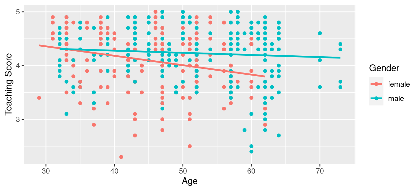
FIGURE 6.1: Colored scatterplot of relationship of teaching score and age.
In the resulting Figure 6.1, observe that ggplot() assigns a default in red/blue color scheme to the points and to the lines associated with the two levels of gender: female and male. Furthermore, the geom_smooth(method = "lm", se = FALSE) layer automatically fits a different regression line for each group.
We notice some interesting trends. First, there are almost no women faculty over the age of 60 as evidenced by lack of red dots above \(x\) = 60. Second, while both regression lines are negatively sloped with age (i.e., older instructors tend to have lower scores), the slope for age for the female instructors is more negative. In other words, female instructors are paying a harsher penalty for advanced age than the male instructors.
6.1.2 Interaction model
Let’s now quantify the relationship of our outcome variable \(y\) and the two explanatory variables using one type of multiple regression model known as an interaction model. We’ll explain where the term “interaction” comes from at the end of this section.
In particular, we’ll write out the equation of the two regression lines in Figure 6.1 using the values from a regression table. Before we do this, however, let’s go over a brief refresher of regression when you have a categorical explanatory variable \(x\).
Recall in Subsection 5.2.2 we fit a regression model for countries’ life expectancies as a function of which continent the country was in. In other words, we had a numerical outcome variable \(y\) = lifeExp and a categorical explanatory variable \(x\) = continent which had 5 levels: Africa, Americas, Asia, Europe, and Oceania. Let’s re-display the regression table you saw in Table 5.8:
| term | estimate | std_error | statistic | p_value | lower_ci | upper_ci |
|---|---|---|---|---|---|---|
| intercept | 54.8 | 1.02 | 53.45 | 0 | 52.8 | 56.8 |
| continent: Americas | 18.8 | 1.80 | 10.45 | 0 | 15.2 | 22.4 |
| continent: Asia | 15.9 | 1.65 | 9.68 | 0 | 12.7 | 19.2 |
| continent: Europe | 22.8 | 1.70 | 13.47 | 0 | 19.5 | 26.2 |
| continent: Oceania | 25.9 | 5.33 | 4.86 | 0 | 15.4 | 36.5 |
Recall our interpretation of the estimate column. Since Africa was the “baseline for comparison” group, the intercept term corresponds to the mean life expectancy for all countries in Africa of 54.8 years. The other four values of estimate correspond to “offsets” relative to the baseline group. So, for example, the “offset” corresponding to the Americas is +18.8 as compared to the baseline for comparison group Africa. In other words, the average life expectancy for countries in the Americas is 18.8 years higher. Thus the mean life expectancy for all countries in the Americas is 54.8 + 18.8 = 73.6. The same interpretation holds for Asia, Europe, and Oceania.
Going back to our multiple regression model for teaching score using age and gender in Figure 6.1, we generate the regression table using the same two-step approach from Chapter 5: we first “fit” the model using the lm() “linear model” function and then we apply the get_regression_table() function. This time, however, our model formula won’t be of the form y ~ x, but rather of the form y ~ x1 * x2. In other words, our two explanatory variables x1 and x2 are separated by a * sign:
# Fit regression model:
score_model_interaction <- lm(score ~ age * gender, data = evals_ch6)

# Get regression table:
get_regression_table(score_model_interaction)| term | estimate | std_error | statistic | p_value | lower_ci | upper_ci |
|---|---|---|---|---|---|---|
| intercept | 4.883 | 0.205 | 23.80 | 0.000 | 4.480 | 5.286 |
| age | -0.018 | 0.004 | -3.92 | 0.000 | -0.026 | -0.009 |
| gender: male | -0.446 | 0.265 | -1.68 | 0.094 | -0.968 | 0.076 |
| age:gendermale | 0.014 | 0.006 | 2.45 | 0.015 | 0.003 | 0.024 |
Looking at the regression table output in Table 6.3, there are four rows of values in the estimate column. While it is not immediately apparent, using these four values we can write out the equations of both lines in Figure 6.1. First, since the word female comes alphabetically before male, female instructors are the “baseline for comparison” group. Thus, intercept is the intercept for only the female instructors.
This holds similarly for age. It is the slope for age for only the female instructors. Thus, the red regression line in Figure 6.1 has an intercept of 4.883 and slope for age of -0.018. Remember that for this data, while the intercept has a mathematical interpretation, it has no practical interpretation since instructors can’t have zero age.
What about the intercept and slope for age of the male instructors in the blue line in Figure 6.1? This is where our notion of “offsets” comes into play once again.
The value for gender: male of -0.446 is not the intercept for the male instructors, but rather the offset in intercept for male instructors relative to female instructors. The intercept for the male instructors is intercept + gender: male = 4.883 + (-0.446) = 4.883 - 0.446 = 4.437.
Similarly, age:gendermale = 0.014 is not the slope for age for the male instructors, but rather the offset in slope for the male instructors. Therefore, the slope for age for the male instructors is age + age:gendermale \(= -0.018 + 0.014 = -0.004\). Thus, the blue regression line in Figure 6.1 has intercept 4.437 and slope for age of -0.004. Let’s summarize these values in Table 6.4 and focus on the two slopes for age:
| Gender | Intercept | Slope for age |
|---|---|---|
| Female instructors | 4.883 | -0.018 |
| Male instructors | 4.437 | -0.004 |
Since the slope for age for the female instructors was -0.018, it means that on average, a female instructor who is a year older would have a teaching score that is 0.018 units lower. For the male instructors, however, the corresponding associated decrease was on average only 0.004 units. While both slopes for age were negative, the slope for age for the female instructors is more negative. This is consistent with our observation from Figure 6.1, that this model is suggesting that age impacts teaching scores for female instructors more than for male instructors.
Let’s now write the equation for our regression lines, which we can use to compute our fitted values \(\widehat{y} = \widehat{\text{score}}\).
\[ \begin{aligned} \widehat{y} = \widehat{\text{score}} &= b_0 + b_{\text{age}} \cdot \text{age} + b_{\text{male}} \cdot \mathbb{1}_{\text{is male}}(x) + b_{\text{age,male}} \cdot \text{age} \cdot \mathbb{1}_{\text{is male}}(x)\\ &= 4.883 -0.018 \cdot \text{age} - 0.446 \cdot \mathbb{1}_{\text{is male}}(x) + 0.014 \cdot \text{age} \cdot \mathbb{1}_{\text{is male}}(x) \end{aligned} \]
Whoa! That’s even more daunting than the equation you saw for the life expectancy as a function of continent in Subsection 5.2.2! However, if you recall what an “indicator function” does, the equation simplifies greatly. In the previous equation, we have one indicator function of interest:
\[ \mathbb{1}_{\text{is male}}(x) = \left\{ \begin{array}{ll} 1 & \text{if } \text{instructor } x \text{ is male} \\ 0 & \text{otherwise}\end{array} \right. \]
Second, let’s match coefficients in the previous equation with values in the estimate column in our regression table in Table 6.3:
- \(b_0\) is the
intercept= 4.883 for the female instructors - \(b_{\text{age}}\) is the slope for
age= -0.018 for the female instructors - \(b_{\text{male}}\) is the offset in intercept = -0.446 for the male instructors
- \(b_{\text{age,male}}\) is the offset in slope for age = 0.014 for the male instructors
Let’s put this all together and compute the fitted value \(\widehat{y} = \widehat{\text{score}}\) for female instructors. Since for female instructors \(\mathbb{1}_{\text{is male}}(x)\) = 0, the previous equation becomes
\[ \begin{aligned} \widehat{y} = \widehat{\text{score}} &= 4.883 - 0.018 \cdot \text{age} - 0.446 \cdot 0 + 0.014 \cdot \text{age} \cdot 0\\ &= 4.883 - 0.018 \cdot \text{age} - 0 + 0\\ &= 4.883 - 0.018 \cdot \text{age}\\ \end{aligned} \]
which is the equation of the red regression line in Figure 6.1 corresponding to the female instructors in Table 6.4. Correspondingly, since for male instructors \(\mathbb{1}_{\text{is male}}(x)\) = 1, the previous equation becomes
\[ \begin{aligned} \widehat{y} = \widehat{\text{score}} &= 4.883 - 0.018 \cdot \text{age} - 0.446 + 0.014 \cdot \text{age}\\ &= (4.883 - 0.446) + (- 0.018 + 0.014) * \text{age}\\ &= 4.437 - 0.004 \cdot \text{age}\\ \end{aligned} \]
which is the equation of the blue regression line in Figure 6.1 corresponding to the male instructors in Table 6.4.
Phew! That was a lot of arithmetic! Don’t fret, however, this is as hard as modeling will get in this book. If you’re still a little unsure about using indicator functions and using categorical explanatory variables in a regression model, we highly suggest you re-read Subsection 5.2.2. This involves only a single categorical explanatory variable and thus is much simpler.
Before we end this section, we explain why we refer to this type of model as an “interaction model.” The \(b_{\text{age,male}}\) term in the equation for the fitted value \(\widehat{y}\) = \(\widehat{\text{score}}\) is what’s known in statistical modeling as an “interaction effect.” The interaction term corresponds to the age:gendermale = 0.014 in the final row of the regression table in Table 6.3.
We say there is an interaction effect if the associated effect of one variable depends on the value of another variable. That is to say, the two variables are “interacting” with each other. Here, the associated effect of the variable age depends on the value of the other variable gender. The difference in slopes for age of +0.014 of male instructors relative to female instructors shows this.
Another way of thinking about interaction effects on teaching scores is as follows. For a given instructor at UT Austin, there might be an associated effect of their age by itself, there might be an associated effect of their gender by itself, but when age and gender are considered together there might be an additional effect above and beyond the two individual effects.
6.1.3 Parallel slopes model
When creating regression models with one numerical and one categorical explanatory variable, we are not just limited to interaction models as we just saw. Another type of model we can use is known as a parallel slopes model. Unlike interaction models where the regression lines can have different intercepts and different slopes, parallel slopes models still allow for different intercepts but force all lines to have the same slope. The resulting regression lines are thus parallel. Let’s visualize the best-fitting parallel slopes model to evals_ch6.
Unfortunately, the geom_smooth() function in the ggplot2 package does not have a convenient way to plot parallel slopes models. Evgeni Chasnovski thus created a special purpose function called geom_parallel_slopes() that is included in the moderndive package. You won’t find geom_parallel_slopes() in the ggplot2 package, but rather the moderndive package. Thus, if you want to be able to use it, you will need to load both the ggplot2 and moderndive packages. Using this function, let’s now plot the parallel slopes model for teaching score. Notice how the code is identical to the code that produced the visualization of the interaction model in Figure 6.1, but now the geom_smooth(method = "lm", se = FALSE) layer is replaced with geom_parallel_slopes(se = FALSE).
ggplot(evals_ch6, aes(x = age, y = score, color = gender)) +
  geom_point() +
  labs(x = "Age", y = "Teaching Score", color = "Gender") +
  geom_parallel_slopes(se = FALSE)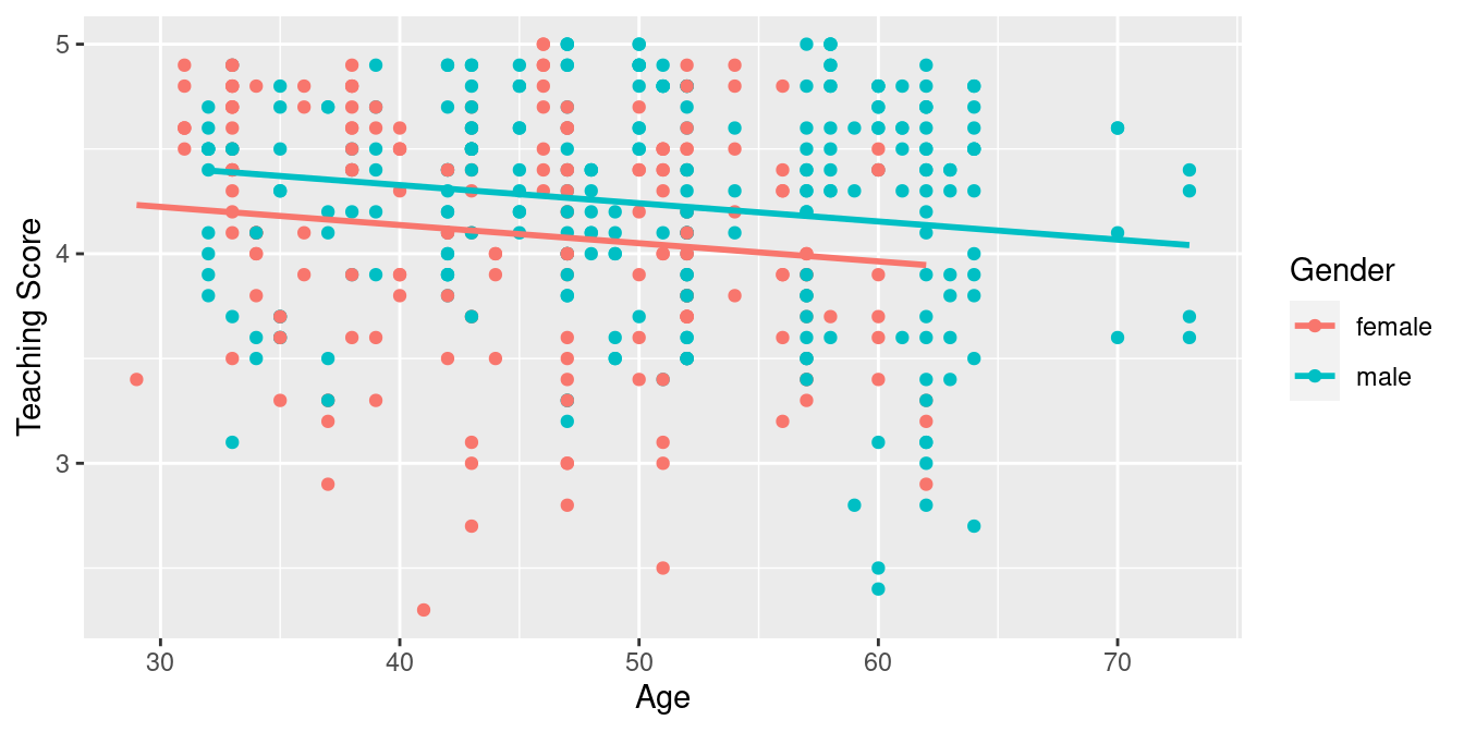
FIGURE 6.2: Parallel slopes model of score with age and gender.
Observe in Figure 6.2 that we now have parallel lines corresponding to the female and male instructors, respectively: here they have the same negative slope. This is telling us that instructors who are older will tend to receive lower teaching scores than instructors who are younger. Furthermore, since the lines are parallel, the associated penalty for being older is assumed to be the same for both female and male instructors.
However, observe also in Figure 6.2 that these two lines have different intercepts as evidenced by the fact that the blue line corresponding to the male instructors is higher than the red line corresponding to the female instructors. This is telling us that irrespective of age, female instructors tended to receive lower teaching scores than male instructors.
In order to obtain the precise numerical values of the two intercepts and the single common slope, we once again “fit” the model using the lm() “linear model” function and then apply the get_regression_table() function. However, unlike the interaction model which had a model formula of the form y ~ x1 * x2, our model formula is now of the form y ~ x1 + x2. In other words, our two explanatory variables x1 and x2 are separated by a + sign:
# Fit regression model:
score_model_parallel_slopes <- lm(score ~ age + gender, data = evals_ch6)
# Get regression table:
get_regression_table(score_model_parallel_slopes)| term | estimate | std_error | statistic | p_value | lower_ci | upper_ci |
|---|---|---|---|---|---|---|
| intercept | 4.484 | 0.125 | 35.79 | 0.000 | 4.238 | 4.730 |
| age | -0.009 | 0.003 | -3.28 | 0.001 | -0.014 | -0.003 |
| gender: male | 0.191 | 0.052 | 3.63 | 0.000 | 0.087 | 0.294 |
Similarly to the regression table for the interaction model from Table 6.3, we have an intercept term corresponding to the intercept for the “baseline for comparison” female instructor group and a gender: male term corresponding to the offset in intercept for the male instructors relative to female instructors. In other words, in Figure 6.2 the red regression line corresponding to the female instructors has an intercept of 4.484 while the blue regression line corresponding to the male instructors has an intercept of 4.484 + 0.191 = 4.675. Once again, since there aren’t any instructors of age 0, the intercepts only have a mathematical interpretation but no practical one.
Unlike in Table 6.3, however, we now only have a single slope for age of -0.009. This is because the model dictates that both the female and male instructors have a common slope for age. This is telling us that an instructor who is a year older than another instructor received a teaching score that is on average 0.009 units lower. This penalty for being of advanced age applies equally to both female and male instructors.
Let’s summarize these values in Table 6.6, noting the different intercepts but common slopes:
| Gender | Intercept | Slope for age |
|---|---|---|
| Female instructors | 4.484 | -0.009 |
| Male instructors | 4.675 | -0.009 |
Let’s now write the equation for our regression lines, which we can use to compute our fitted values \(\widehat{y} = \widehat{\text{score}}\).
\[ \begin{aligned} \widehat{y} = \widehat{\text{score}} &= b_0 + b_{\text{age}} \cdot \text{age} + b_{\text{male}} \cdot \mathbb{1}_{\text{is male}}(x)\\ &= 4.484 -0.009 \cdot \text{age} + 0.191 \cdot \mathbb{1}_{\text{is male}}(x) \end{aligned} \]
Let’s put this all together and compute the fitted value \(\widehat{y} = \widehat{\text{score}}\) for female instructors. Since for female instructors the indicator function \(\mathbb{1}_{\text{is male}}(x)\) = 0, the previous equation becomes
\[ \begin{aligned} \widehat{y} = \widehat{\text{score}} &= 4.484 -0.009 \cdot \text{age} + 0.191 \cdot 0\\ &= 4.484 -0.009 \cdot \text{age} \end{aligned} \]
which is the equation of the red regression line in Figure 6.2 corresponding to the female instructors. Correspondingly, since for male instructors the indicator function \(\mathbb{1}_{\text{is male}}(x)\) = 1, the previous equation becomes
\[ \begin{aligned} \widehat{y} = \widehat{\text{score}} &= 4.484 -0.009 \cdot \text{age} + 0.191 \cdot 1\\ &= (4.484 + 0.191) - 0.009 \cdot \text{age}\\ &= 4.675 -0.009 \cdot \text{age} \end{aligned} \]
which is the equation of the blue regression line in Figure 6.2 corresponding to the male instructors.
Great! We’ve considered both an interaction model and a parallel slopes model for our data. Let’s compare the visualizations for both models side-by-side in Figure 6.3.
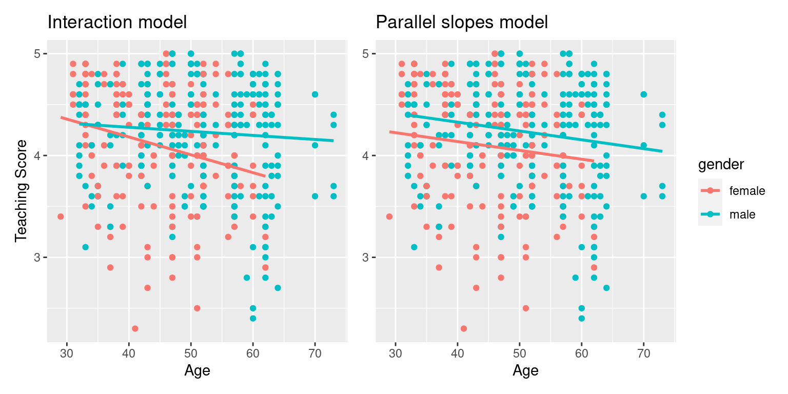
FIGURE 6.3: Comparison of interaction and parallel slopes models.
At this point, you might be asking yourself: “Why would we ever use a parallel slopes model?”. Looking at the left-hand plot in Figure 6.3, the two lines definitely do not appear to be parallel, so why would we force them to be parallel? For this data, we agree! It can easily be argued that the interaction model on the left is more appropriate. However, in the upcoming Subsection 6.3.1 on model selection, we’ll present an example where it can be argued that the case for a parallel slopes model might be stronger.
6.1.4 Observed/fitted values and residuals
For brevity’s sake, in this section we’ll only compute the observed values, fitted values, and residuals for the interaction model which we saved in score_model_interaction. You’ll have an opportunity to study the corresponding values for the parallel slopes model in the upcoming Learning check.
Say, you have an instructor who identifies as female and is 36 years old. What fitted value \(\widehat{y}\) = \(\widehat{\text{score}}\) would our model yield? Say, you have another instructor who identifies as male and is 59 years old. What would their fitted value \(\widehat{y}\) be?
We answer this question visually first for the female instructor by finding the intersection of the red regression line and the vertical line at \(x\) = age = 36. We mark this value with a large red dot in Figure 6.4. Similarly, we can identify the fitted value \(\widehat{y}\) = \(\widehat{\text{score}}\) for the male instructor by finding the intersection of the blue regression line and the vertical line at \(x\) = age = 59. We mark this value with a large blue dot in Figure 6.4.
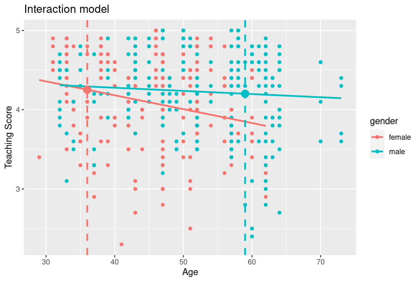
FIGURE 6.4: Fitted values for two new professors.
What are these two values of \(\widehat{y}\) = \(\widehat{\text{score}}\) precisely? We can use the equations of the two regression lines we computed in Subsection 6.1.2, which in turn were based on values from the regression table in Table 6.3:
- For all female instructors: \(\widehat{y} = \widehat{\text{score}} = 4.883 - 0.018 \cdot \text{age}\)
- For all male instructors: \(\widehat{y} = \widehat{\text{score}} = 4.437 - 0.004 \cdot \text{age}\)
So our fitted values would be: \(4.883 - 0.018 \cdot 36 = 4.24\) and \(4.437 - 0.004 \cdot 59 = 4.20\), respectively.
Now what if we want the fitted values not just for these two instructors, but for the instructors of all 463 courses included in the evals_ch6 data frame? Doing this by hand would be long and tedious! This is where the get_regression_points() function from the moderndive package can help: it will quickly automate the above calculations for all 463 courses. We present a preview of just the first 10 rows out of 463 in Table 6.7.
| ID | score | age | gender | score_hat | residual |
|---|---|---|---|---|---|
| 1 | 4.7 | 36 | female | 4.25 | 0.448 |
| 2 | 4.1 | 36 | female | 4.25 | -0.152 |
| 3 | 3.9 | 36 | female | 4.25 | -0.352 |
| 4 | 4.8 | 36 | female | 4.25 | 0.548 |
| 5 | 4.6 | 59 | male | 4.20 | 0.399 |
| 6 | 4.3 | 59 | male | 4.20 | 0.099 |
| 7 | 2.8 | 59 | male | 4.20 | -1.401 |
| 8 | 4.1 | 51 | male | 4.23 | -0.133 |
| 9 | 3.4 | 51 | male | 4.23 | -0.833 |
| 10 | 4.5 | 40 | female | 4.18 | 0.318 |
It turns out that the female instructor of age 36 taught the first four courses, while the male instructor taught the next 3. The resulting \(\widehat{y}\) = \(\widehat{\text{score}}\) fitted values are in the score_hat column. Furthermore, the get_regression_points() function also returns the residuals \(y-\widehat{y}\). Notice, for example, the first and fourth courses the female instructor of age 36 taught had positive residuals, indicating that the actual teaching scores they received from students were greater than their fitted score of 4.25. On the other hand, the second and third courses this instructor taught had negative residuals, indicating that the actual teaching scores they received from students were less than 4.25.
Learning check
(LC6.1) Compute the observed values, fitted values, and residuals not for the interaction model as we just did, but rather for the parallel slopes model we saved in score_model_parallel_slopes.
6.2 Two numerical explanatory variables
Let’s now switch gears and consider multiple regression models where instead of one numerical and one categorical explanatory variable, we now have two numerical explanatory variables. The dataset we’ll use is from An Introduction to Statistical Learning with Applications in R (ISLR), an intermediate-level textbook on statistical and machine learning (James et al. 2017). Its accompanying ISLR R package contains the datasets to which the authors apply various machine learning methods.
One frequently used dataset in this book is the Credit dataset, where the outcome variable of interest is the credit card debt of 400 individuals. Other variables like income, credit limit, credit rating, and age are included as well. Note that the Credit data is not based on real individuals’ financial information, but rather is a simulated dataset used for educational purposes.
In this section, we’ll fit a regression model where we have
- A numerical outcome variable \(y\), the cardholder’s credit card debt
- Two explanatory variables:
- One numerical explanatory variable \(x_1\), the cardholder’s credit limit
- Another numerical explanatory variable \(x_2\), the cardholder’s income (in thousands of dollars).
6.2.1 Exploratory data analysis
Let’s load the Credit dataset. To keep things simple let’s select() the subset of the variables we’ll consider in this chapter, and save this data in the new data frame credit_ch6. Notice our slightly different use of the select() verb here than we introduced in Subsection 3.8.1. For example, we’ll select the Balance variable from Credit but then save it with a new variable name debt. We do this because here the term “debt” is easier to interpret than “balance.”
library(ISLR)
credit_ch6 <- Credit %>% as_tibble() %>%
  select(ID, debt = Balance, credit_limit = Limit,
         income = Income, credit_rating = Rating, age = Age)
You can observe the effect of our use of select() in the first common step of an exploratory data analysis: looking at the raw values either in RStudio’s spreadsheet viewer or by using glimpse().
Rows: 400
Columns: 6
$ ID            <int> 1, 2, 3, 4, 5, 6, 7, 8, 9, 10, 11, 12, 13, 14, 15, 16, 1…
$ debt          <int> 333, 903, 580, 964, 331, 1151, 203, 872, 279, 1350, 1407…
$ credit_limit  <int> 3606, 6645, 7075, 9504, 4897, 8047, 3388, 7114, 3300, 68…
$ income        <dbl> 14.9, 106.0, 104.6, 148.9, 55.9, 80.2, 21.0, 71.4, 15.1,…
$ credit_rating <int> 283, 483, 514, 681, 357, 569, 259, 512, 266, 491, 589, 1…
$ age           <int> 34, 82, 71, 36, 68, 77, 37, 87, 66, 41, 30, 64, 57, 49, …
Furthermore, let’s look at a random sample of five out of the 400 credit card holders in Table 6.8. Once again, note that due to the random nature of the sampling, you will likely end up with a different subset of five rows.
| ID | debt | credit_limit | income | credit_rating | age |
|---|---|---|---|---|---|
| 272 | 436 | 4866 | 45.0 | 347 | 30 |
| 239 | 52 | 2910 | 26.5 | 236 | 58 |
| 87 | 815 | 6340 | 55.4 | 448 | 33 |
| 108 | 0 | 3189 | 39.1 | 263 | 72 |
| 149 | 0 | 2420 | 15.2 | 192 | 69 |
Now that we’ve looked at the raw values in our credit_ch6 data frame and got a sense of the data, let’s move on to the next common step in an exploratory data analysis: computing summary statistics. Let’s use the skim() function from the skimr package, being sure to only select() the columns of interest for our model:
Skim summary statistics
 n obs: 400
 n variables: 3

── Variable type:integer
  variable missing complete   n    mean      sd  p0     p25    p50     p75  p100
credit_limit     0      400 400 4735.6  2308.2  855 3088    4622.5 5872.75 13913
         debt    0      400 400  520.01  459.76   0   68.75  459.5  863     1999

── Variable type:numeric
 variable missing complete   n  mean    sd    p0   p25   p50   p75   p100
   income       0      400 400 45.22 35.24 10.35 21.01 33.12 57.47 186.63
Observe the summary statistics for the outcome variable debt: the mean and median credit card debt are $520.01 and $459.50, respectively, and that 25% of card holders had debts of $68.75 or less. Let’s now look at one of the explanatory variables credit_limit: the mean and median credit card limit are $4735.6 and $4622.50, respectively, while 75% of card holders had incomes of $57,470 or less.
Since our outcome variable debt and the explanatory variables credit_limit and income are numerical, we can compute the correlation coefficient between the different possible pairs of these variables. First, we can run the get_correlation() command as seen in Subsection 5.1.1 twice, once for each explanatory variable:
Or we can simultaneously compute them by returning a correlation matrix which we display in Table 6.9. We can see the correlation coefficient for any pair of variables by looking them up in the appropriate row/column combination.
| debt | credit_limit | income | |
|---|---|---|---|
| debt | 1.000 | 0.862 | 0.464 |
| credit_limit | 0.862 | 1.000 | 0.792 |
| income | 0.464 | 0.792 | 1.000 |
For example, the correlation coefficient of:
debtwith itself is 1 as we would expect based on the definition of the correlation coefficient.debtwithcredit_limitis 0.862. This indicates a strong positive linear relationship, which makes sense as only individuals with large credit limits can accrue large credit card debts.debtwithincomeis 0.464. This is suggestive of another positive linear relationship, although not as strong as the relationship betweendebtandcredit_limit.- As an added bonus, we can read off the correlation coefficient between the two explanatory variables of
credit_limitandincomeas 0.792.
We say there is a high degree of collinearity between the credit_limit and income explanatory variables. Collinearity (or multicollinearity) is a phenomenon where one explanatory variable in a multiple regression model is highly correlated with another.
So in our case since credit_limit and income are highly correlated, if we knew someone’s credit_limit, we could make pretty good guesses about their income as well. Thus, these two variables provide somewhat redundant information. However, we’ll leave discussion on how to work with collinear explanatory variables to a more intermediate-level book on regression modeling.
Let’s visualize the relationship of the outcome variable with each of the two explanatory variables in two separate plots in Figure 6.5.
ggplot(credit_ch6, aes(x = credit_limit, y = debt)) +
  geom_point() +
  labs(x = "Credit limit (in $)", y = "Credit card debt (in $)",
       title = "Debt and credit limit") +
  geom_smooth(method = "lm", se = FALSE)

ggplot(credit_ch6, aes(x = income, y = debt)) +
  geom_point() +
  labs(x = "Income (in $1000)", y = "Credit card debt (in $)",
       title = "Debt and income") +
  geom_smooth(method = "lm", se = FALSE)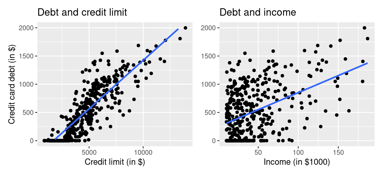
FIGURE 6.5: Relationship between credit card debt and credit limit/income.
Observe there is a positive relationship between credit limit and credit card debt: as credit limit increases so also does credit card debt. This is consistent with the strongly positive correlation coefficient of 0.862 we computed earlier. In the case of income, the positive relationship doesn’t appear as strong, given the weakly positive correlation coefficient of 0.464.
However, the two plots in Figure 6.5 only focus on the relationship of the outcome variable with each of the two explanatory variables separately. To visualize the joint relationship of all three variables simultaneously, we need a 3-dimensional (3D) scatterplot as seen in Figure 6.6. Each of the 400 observations in the credit_ch6 data frame are marked with a blue point where
- The numerical outcome variable \(y\)
debtis on the vertical axis. - The two numerical explanatory variables, \(x_1\)
incomeand \(x_2\)credit_limit, are on the two axes that form the bottom plane.
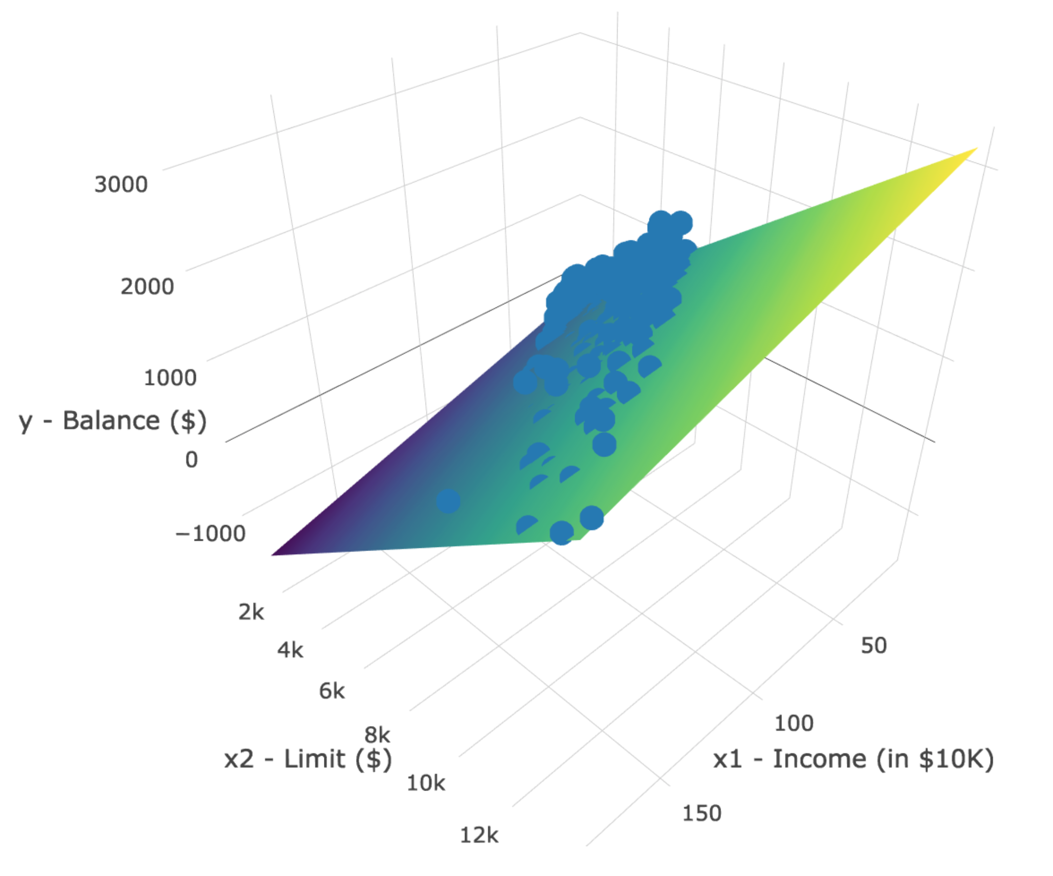
FIGURE 6.6: 3D scatterplot and regression plane.
Furthermore, we also include the regression plane. Recall from Subsection 5.3.2 that regression lines are “best-fitting” in that of all possible lines we can draw through a cloud of points, the regression line minimizes the sum of squared residuals. This concept also extends to models with two numerical explanatory variables. The difference is instead of a “best-fitting” line, we now have a “best-fitting” plane that similarly minimizes the sum of squared residuals. Head to this website to open an interactive version of this plot in your browser.
Learning check
(LC6.2) Conduct a new exploratory data analysis with the same outcome variable \(y\) debt but with credit_rating and age as the new explanatory variables \(x_1\) and \(x_2\). What can you say about the relationship between a credit card holder’s debt and their credit rating and age?
6.2.2 Regression plane
Let’s now fit a regression model and get the regression table corresponding to the regression plane in Figure 6.6. To keep things brief in this subsection, we won’t consider an interaction model for the two numerical explanatory variables income and credit_limit like we did in Subsection 6.1.2 using the model formula score ~ age * gender. Rather we’ll only consider a model fit with a formula of the form y ~ x1 + x2. Confusingly, however, since we now have a regression plane instead of multiple lines, the label “parallel slopes” doesn’t apply when you have two numerical explanatory variables. Just as we have done multiple times throughout Chapters 5 and this chapter, the regression table for this model using our two-step process is in Table 6.10.
# Fit regression model:
debt_model <- lm(debt ~ credit_limit + income, data = credit_ch6)
# Get regression table:
get_regression_table(debt_model)| term | estimate | std_error | statistic | p_value | lower_ci | upper_ci |
|---|---|---|---|---|---|---|
| intercept | -385.179 | 19.465 | -19.8 | 0 | -423.446 | -346.912 |
| credit_limit | 0.264 | 0.006 | 45.0 | 0 | 0.253 | 0.276 |
| income | -7.663 | 0.385 | -19.9 | 0 | -8.420 | -6.906 |
- We first “fit” the linear regression model using the
lm(y ~ x1 + x2, data)function and save it indebt_model. - We get the regression table by applying the
get_regression_table()function from themoderndivepackage todebt_model.
Let’s interpret the three values in the estimate column. First, the intercept value is -$385.179. This intercept represents the credit card debt for an individual who has credit_limit of $0 and income of $0. In our data, however, the intercept has no practical interpretation since no individuals had credit_limit or income values of $0. Rather, the intercept is used to situate the regression plane in 3D space.
Second, the credit_limit value is $0.264. Taking into account all the other explanatory variables in our model, for every increase of one dollar in credit_limit, there is an associated increase of on average $0.26 in credit card debt. Just as we did in Subsection 5.1.2, we are cautious not to imply causality as we saw in Subsection 5.3.1 that “correlation is not necessarily causation.” We do this merely stating there was an associated increase.
Furthermore, we preface our interpretation with the statement, “taking into account all the other explanatory variables in our model.” Here, by all other explanatory variables we mean income. We do this to emphasize that we are now jointly interpreting the associated effect of multiple explanatory variables in the same model at the same time.
Third, income = -$7.66. Taking into account all other explanatory variables in our model, for every increase of one unit of income ($1000 in actual income), there is an associated decrease of, on average, $7.66 in credit card debt.
Putting these results together, the equation of the regression plane that gives us fitted values \(\widehat{y}\) = \(\widehat{\text{debt}}\) is:
\[ \begin{aligned} \widehat{y} &= b_0 + b_1 \cdot x_1 + b_2 \cdot x_2\\ \widehat{\text{debt}} &= b_0 + b_{\text{limit}} \cdot \text{limit} + b_{\text{income}} \cdot \text{income}\\ &= -385.179 + 0.263 \cdot\text{limit} - 7.663 \cdot\text{income} \end{aligned} \]
Recall however in the right-hand plot of Figure 6.5 that when plotting the relationship between debt and income in isolation, there appeared to be a positive relationship. In the last discussed multiple regression, however, when jointly modeling the relationship between debt, credit_limit, and income, there appears to be a negative relationship of debt and income as evidenced by the negative slope for income of -$7.663. What explains these contradictory results? A phenomenon known as Simpson’s Paradox, whereby overall trends that exist in aggregate either disappear or reverse when the data are broken down into groups. In Subsection 6.3.4 we elaborate on this idea by looking at the relationship between credit_limit and credit card debt, but split along different income brackets.
Learning check
(LC6.3) Fit a new simple linear regression using lm(debt ~ credit_rating + age, data = credit_ch6) where credit_rating and age are the new numerical explanatory variables \(x_1\) and \(x_2\). Get information about the “best-fitting” regression plane from the regression table by applying the get_regression_table() function. How do the regression results match up with the results from your previous exploratory data analysis?
6.2.3 Observed/fitted values and residuals
Let’s also compute all fitted values and residuals for our regression model using the get_regression_points() function and present only the first 10 rows of output in Table 6.11. Remember that the coordinates of each of the blue points in our 3D scatterplot in Figure 6.6 can be found in the income, credit_limit, and debt columns. The fitted values on the regression plane are found in the debt_hat column and are computed using our equation for the regression plane in the previous section:
\[ \begin{aligned} \widehat{y} = \widehat{\text{debt}} &= -385.179 + 0.263 \cdot \text{limit} - 7.663 \cdot \text{income} \end{aligned} \]
| ID | debt | credit_limit | income | debt_hat | residual |
|---|---|---|---|---|---|
| 1 | 333 | 3606 | 14.9 | 454 | -120.8 |
| 2 | 903 | 6645 | 106.0 | 559 | 344.3 |
| 3 | 580 | 7075 | 104.6 | 683 | -103.4 |
| 4 | 964 | 9504 | 148.9 | 986 | -21.7 |
| 5 | 331 | 4897 | 55.9 | 481 | -150.0 |
| 6 | 1151 | 8047 | 80.2 | 1127 | 23.6 |
| 7 | 203 | 3388 | 21.0 | 349 | -146.4 |
| 8 | 872 | 7114 | 71.4 | 948 | -76.0 |
| 9 | 279 | 3300 | 15.1 | 371 | -92.2 |
| 10 | 1350 | 6819 | 71.1 | 873 | 477.3 |
6.3 Related topics
6.3.1 Model selection using visualizations
When should we use an interaction model versus a parallel slopes model? Recall in Sections 6.1.2 and 6.1.3 we fit both interaction and parallel slopes models for the outcome variable \(y\) (teaching score) using a numerical explanatory variable \(x_1\) (age) and a categorical explanatory variable \(x_2\) (gender recorded as a binary variable). We compared these models in Figure 6.3, which we display again now.
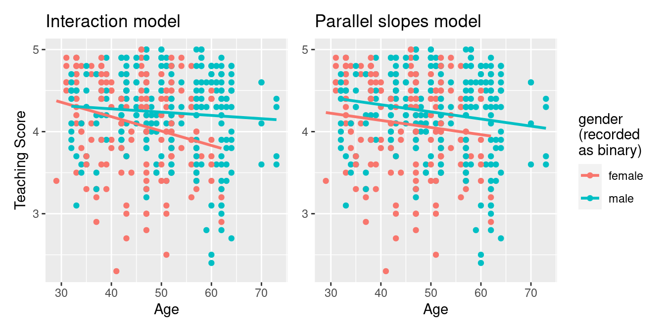
FIGURE 6.7: Previously seen comparison of interaction and parallel slopes models.
A lot of you might have asked yourselves: “Why would I force the lines to have parallel slopes (as seen in the right-hand plot) when they clearly have different slopes (as seen in the left-hand plot)?”.
The answer lies in a philosophical principle known as “Occam’s Razor.” It states that, “all other things being equal, simpler solutions are more likely to be correct than complex ones.” When viewed in a modeling framework, Occam’s Razor can be restated as, “all other things being equal, simpler models are to be preferred over complex ones.” In other words, we should only favor the more complex model if the additional complexity is warranted.
Let’s revisit the equations for the regression line for both the interaction and parallel slopes model:
\[ \begin{aligned} \text{Interaction} &: \widehat{y} = \widehat{\text{score}} = b_0 + b_{\text{age}} \cdot \text{age} + b_{\text{male}} \cdot \mathbb{1}_{\text{is male}}(x) + \\ & \qquad b_{\text{age,male}} \cdot \text{age} \cdot \mathbb{1}_{\text{is male}}\\ \text{Parallel slopes} &: \widehat{y} = \widehat{\text{score}} = b_0 + b_{\text{age}} \cdot \text{age} + b_{\text{male}} \cdot \mathbb{1}_{\text{is male}}(x) \end{aligned} \]
The interaction model is “more complex” in that there is an additional \(b_{\text{age,male}} \cdot \text{age} \cdot \mathbb{1}_{\text{is male}}\) interaction term in the equation not present for the parallel slopes model. Or viewed alternatively, the regression table for the interaction model in Table 6.3 has four rows, whereas the regression table for the parallel slopes model in Table 6.5 has three rows. The question becomes: “Is this additional complexity warranted?”. In this case, it can be argued that this additional complexity is warranted, as evidenced by the clear x-shaped pattern of the two regression lines in the left-hand plot of Figure 6.7.
However, let’s consider an example where the additional complexity might not be warranted. Let’s consider the MA_schools data included in the moderndive package which contains 2017 data on Massachusetts public high schools provided by the Massachusetts Department of Education. For more details, read the help file for this data by running ?MA_schools in the console.
Let’s model the numerical outcome variable \(y\), average SAT math score for a given high school, as a function of two explanatory variables:
- A numerical explanatory variable \(x_1\), the percentage of that high school’s student body that are economically disadvantaged and
- A categorical explanatory variable \(x_2\), the school size as measured by enrollment: small (13-341 students), medium (342-541 students), and large (542-4264 students).
Let’s create visualizations of both the interaction and parallel slopes model once again and display the output in Figure 6.8. Recall from Subsection 6.1.3 that the geom_parallel_slopes() function is a special purpose function included in the moderndive package, since the geom_smooth() method in the ggplot2 package does not have a convenient way to plot parallel slopes models.
# Interaction model
ggplot(MA_schools,
       aes(x = perc_disadvan, y = average_sat_math, color = size)) +
  geom_point(alpha = 0.25) +
  geom_smooth(method = "lm", se = FALSE) +
  labs(x = "Percent economically disadvantaged", y = "Math SAT Score",
       color = "School size", title = "Interaction model")
# Parallel slopes model
ggplot(MA_schools,
aes(x = perc_disadvan, y = average_sat_math, color = size)) +
geom_point(alpha = 0.25) +
geom_parallel_slopes(se = FALSE) +
labs(x = "Percent economically disadvantaged", y = "Math SAT Score",
color = "School size", title = "Parallel slopes model")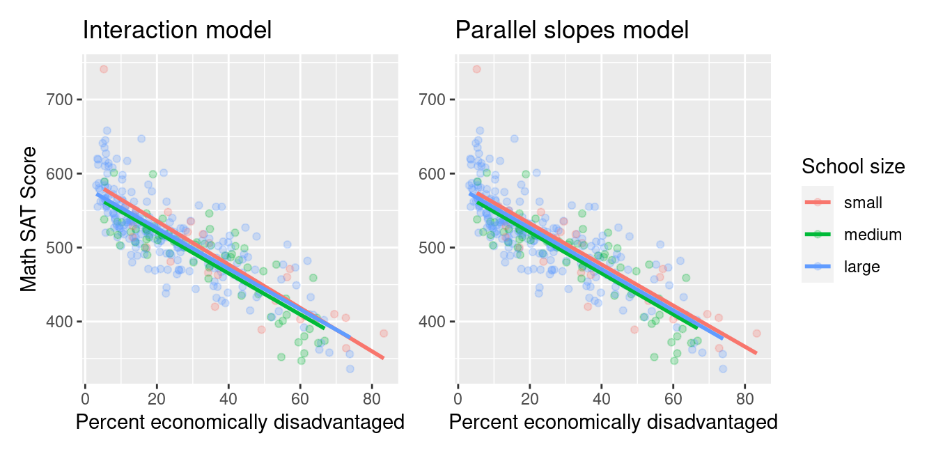
FIGURE 6.8: Comparison of interaction and parallel slopes models for Massachusetts schools.
Look closely at the left-hand plot of Figure 6.8 corresponding to an interaction model. While the slopes are indeed different, they do not differ by much and are nearly identical. Now compare the left-hand plot with the right-hand plot corresponding to a parallel slopes model. The two models don’t appear all that different. So in this case, it can be argued that the additional complexity of the interaction model is not warranted. Thus following Occam’s Razor, we should prefer the “simpler” parallel slopes model. Let’s explicitly define what “simpler” means in this case. Let’s compare the regression tables for the interaction and parallel slopes models in Tables 6.12 and 6.13.
model_2_interaction <- lm(average_sat_math ~ perc_disadvan * size,
                          data = MA_schools)
get_regression_table(model_2_interaction)| term | estimate | std_error | statistic | p_value | lower_ci | upper_ci |
|---|---|---|---|---|---|---|
| intercept | 594.327 | 13.288 | 44.726 | 0.000 | 568.186 | 620.469 |
| perc_disadvan | -2.932 | 0.294 | -9.961 | 0.000 | -3.511 | -2.353 |
| size: medium | -17.764 | 15.827 | -1.122 | 0.263 | -48.899 | 13.371 |
| size: large | -13.293 | 13.813 | -0.962 | 0.337 | -40.466 | 13.880 |
| perc_disadvan:sizemedium | 0.146 | 0.371 | 0.393 | 0.694 | -0.585 | 0.877 |
| perc_disadvan:sizelarge | 0.189 | 0.323 | 0.586 | 0.559 | -0.446 | 0.824 |
model_2_parallel_slopes <- lm(average_sat_math ~ perc_disadvan + size,
                              data = MA_schools)
get_regression_table(model_2_parallel_slopes)| term | estimate | std_error | statistic | p_value | lower_ci | upper_ci |
|---|---|---|---|---|---|---|
| intercept | 588.19 | 7.607 | 77.325 | 0.000 | 573.23 | 603.15 |
| perc_disadvan | -2.78 | 0.106 | -26.120 | 0.000 | -2.99 | -2.57 |
| size: medium | -11.91 | 7.535 | -1.581 | 0.115 | -26.74 | 2.91 |
| size: large | -6.36 | 6.923 | -0.919 | 0.359 | -19.98 | 7.26 |
Observe how the regression table for the interaction model has 2 more rows (6 versus 4). This reflects the additional “complexity” of the interaction model over the parallel slopes model.
Furthermore, note in Table 6.12 how the offsets for the slopes perc_disadvan:sizemedium being 0.146 and perc_disadvan:sizelarge being 0.189 are small relative to the slope for the baseline group of small schools of \(-2.932\). In other words, all three slopes are similarly negative: \(-2.932\) for small schools, \(-2.786\) \((=-2.932 + 0.146)\) for medium schools, and \(-2.743\) \((=-2.932 + 0.189)\) for large schools. These results are suggesting that irrespective of school size, the relationship between average math SAT scores and the percent of the student body that is economically disadvantaged is similar and, alas, quite negative.
What you have just performed is a rudimentary model selection: choosing which model fits data best among a set of candidate models. The model selection we performed used the “eyeball test”: qualitatively looking at visualizations to choose a model. In the next subsection, you’ll once again perform the same model selection, but this time using a numerical approach via the \(R^2\) (pronounced “R-squared”) value.
6.3.2 Model selection using R-squared
At the end of the previous section in Figure 6.8 you compared an interaction model with a parallel slopes model, where both models attempted to explain \(y\) = the average math SAT score for various high schools in Massachusetts. In Tables 6.12 and 6.13, we observed that the interaction model was “more complex” in that the regression table had 6 rows versus the 4 rows of the parallel slopes model.
Most importantly however, when comparing the left and right-hand plots of Figure 6.8, we observed that the three lines corresponding to small, medium, and large high schools were not that different. Given this similarity, we stated it could be argued that the “simpler” parallel slopes model should be favored.
In this section, we’ll mimic the model selection we just performed using the qualitative “eyeball test”, but this time using a numerical and quantitative approach. Specifically, we’ll use the \(R^2\) summary statistic (pronounced “R-squared”), also called the “coefficient of determination”. But first, we must introduce one new concept: the variance of a numerical variable.
We’ve previously studied two summary statistics of the spread (or variation) of a numerical variable: the standard deviation when studying the normal distribution in A.2 and the interquartile range (IQR) when studying boxplots in Section 2.7.1. We now introduce a third summary statistic of spread: the variance. The variance is merely the standard deviation squared and it can be computed in R using the var() summary function within summarize(). If you would like to see the formula, see A.1.3.
Recall that to get: 1) the observed values \(y\), 2) the fitted values \(\widehat{y}\) from a regression model, and 3) the resulting residuals \(y - \widehat{y}\), we can apply the get_regression_points() function our saved model, in this case model_2_interaction:
# A tibble: 332 × 6
      ID average_sat_math perc_disadvan size   average_sat_math_hat residual
   <int>            <dbl>         <dbl> <fct>                 <dbl>    <dbl>
 1     1              516          21.5 medium                 517.    -0.67
 2     2              514          22.7 large                  519.    -4.77
 3     3              534          14.6 large                  541.    -6.99
 4     4              581           6.3 large                  564.    17.2
 5     5              592          10.3 large                  553.    39.2
 6     6              576          10.3 large                  553.    23.2
 7     7              504          25.6 large                  511.    -6.82
 8     8              505          15.2 large                  539.   -34.3
 9     9              481          23.8 small                  525.   -43.5
10    10              513          25.5 large                  511.     1.91
# ℹ 322 more rows
Let’s now use the var() summary function within a summarize() to compute the variance of these three terms:
get_regression_points(model_2_interaction) %>%
  summarize(var_y = var(average_sat_math),
                      var_y_hat = var(average_sat_math_hat),
                      var_residual = var(residual))
# A tibble: 1 × 3
var_y var_y_hat var_residual
<dbl> <dbl> <dbl>
1 3691. 2580. 1111.Observe that the variance of \(y\) is equal to the variance of \(\widehat{y}\) plus the variance of the residuals. But what do these three terms tell us individually?
First, the variance of \(y\) (denoted as \(var(y)\)) tells us how much do Massachusetts high schools differ in average math SAT scores. The goal of regression modeling is to fit a model that hopefully explains this variation. In other words, we want to understand what factors explain why certain schools have high math SAT scores, while others have low scores. This is independent of the model; this is just data. In other words, whether we fit an interaction or parallel slopes model, \(var(y)\) remains the same.
Second, the variance of \(\widehat{y}\) (denoted as \(var(\widehat{y})\)) tells us how much the fitted values from our interaction model vary. That is to say, after accounting for (1) the percentage of the study body that is socioeconomically disadvantaged and (2) school size in an interaction model, how much do our model’s explanations of average math SAT scores vary?
Third, the variance of the residuals tells us how much do “the left-overs” from the model vary. Observe how the points in the left-hand plot of Figure 6.8 scatter around the three lines. Say instead all the points fell exactly on one of the three lines. Then all residuals would be zero and hence the variance of the residuals would be zero.
We’re now ready to introduce \(R^2\):
\[ R^2 = \frac{var(\widehat{y})}{var(y)} \]
It is the proportion of the spread/variation of the outcome variable \(y\) that is explained by our model, where our model’s explanatory power is embedded in the fitted values \(\widehat{y}\). Furthermore, since it can be mathematically proven that \(0 \leq var(\widehat{y}) \leq var(y)\) (a fact we leave for an advanced class on regression), we are guaranteed that:
\[ 0 \leq R^2 \leq 1 \]
\(R^2\) can be interpreted as follows:
- \(R^2\) values of 0 tell us that our model explains 0% of the variation in \(y\). Say we fit a model to the Massachusetts high school data and obtained \(R^2 = 0\). This would be telling us that the combination of explanatory variables \(x\) we used and model form we chose (interaction or parallel slopes) tell us nothing about average math SAT scores. The model is a poor fit.
- \(R^2\) values of 1 tell us that our model explains 100% of the variation in \(y\). Say we fit a model to the Massachusetts high school data and obtained \(R^2 = 1\). This would be telling us that the combination of explanatory variables \(x\) we used and model form we chose (interaction or parallel slopes) tell us everything we need to know about average math SAT scores.
In practice however, \(R^2\) values of 1 almost never occur. Think about it in the context of Massachusetts high schools. There are an infinite number of factors that influence why certain high schools perform well on SAT’s on average while others don’t perform well. The idea that a human-designed statistical model can capture all the heterogeneity of all high school students in Massachusetts is bordering on hubris. However, even if such models are not perfect, they may still prove useful in determining educational policy. A general principle of modeling we should keep in mind is a famous quote by eminent statistician George Box: “All models are wrong, but some are useful.”
Let’s repeat the above calculations for the parallel slopes model and compare them in Table 6.14.
| model | var_y | var_y_hat | var_residual | r_squared |
|---|---|---|---|---|
| Interaction | 3691 | 2580 | 1111 | 0.699 |
| Parallel slopes | 3691 | 2579 | 1112 | 0.699 |
Observe how the \(R^2\) values are near identical at around 0.699 = 69.9%. In other words, the additional complexity of the interaction model only improves our \(R^2\) value by a near zero amount. Thus, we are inclined to favor the “simpler” parallel slopes model.
Now let’s repeat this \(R^2\) comparison between interaction and parallel slopes model for our models of \(y\) = teaching score for UT Austin professors which you visually compared in Figure 6.7. We compare these values in Table 6.15
| model | var_y | var_y_hat | var_residual | r_squared |
|---|---|---|---|---|
| Interaction | 0.296 | 0.015 | 0.281 | 0.051 |
| Parallel slopes | 0.296 | 0.012 | 0.284 | 0.039 |
Observe how the \(R^2\) values are now very different! In other words, since the additional complexity of the interaction model over the parallel slopes model improves our \(R^2\) value by a relatively large amount (0.051 versus 0.039, which is an increase of about 31.5%), it could be argued that the additional complexity is warranted.
As a final note, we can also use the third of our get_regression() wrapper functions, get_regression_summaries(), to quickly automate calculating \(R^2\) for both the interaction and parallels slopes models for \(y\) = average math SAT score for Massachusetts high schools.
# A tibble: 1 × 9
  r_squared adj_r_squared   mse  rmse sigma statistic p_value    df  nobs
      <dbl>         <dbl> <dbl> <dbl> <dbl>     <dbl>   <dbl> <dbl> <dbl>
1     0.699         0.694 1107.  33.3  33.6      151.       0     5   332
# A tibble: 1 × 9
r_squared adj_r_squared mse rmse sigma statistic p_value df nobs
<dbl> <dbl> <dbl> <dbl> <dbl> <dbl> <dbl> <dbl> <dbl>
1 0.699 0.696 1109. 33.3 33.5 254. 0 3 3326.3.3 Correlation coefficient
Recall from Table 6.9 that the correlation coefficient between income in thousands of dollars and credit card debt was 0.464. What if instead we looked at the correlation coefficient between income and credit card debt, but where income was in dollars and not thousands of dollars? This can be done by multiplying income by 1000.
| debt | income | |
|---|---|---|
| debt | 1.000 | 0.464 |
| income | 0.464 | 1.000 |
We see it is the same! We say that the correlation coefficient is invariant to linear transformations. The correlation between \(x\) and \(y\) will be the same as the correlation between \(a\cdot x + b\) and \(y\) for any numerical values \(a\) and \(b\).
6.3.4 Simpson’s Paradox
Recall in Section 6.2, we saw the two seemingly contradictory results when studying the relationship between credit card debt and income. On the one hand, the right hand plot of Figure 6.5 suggested that the relationship between credit card debt and income was positive. We re-display this in Figure 6.9.
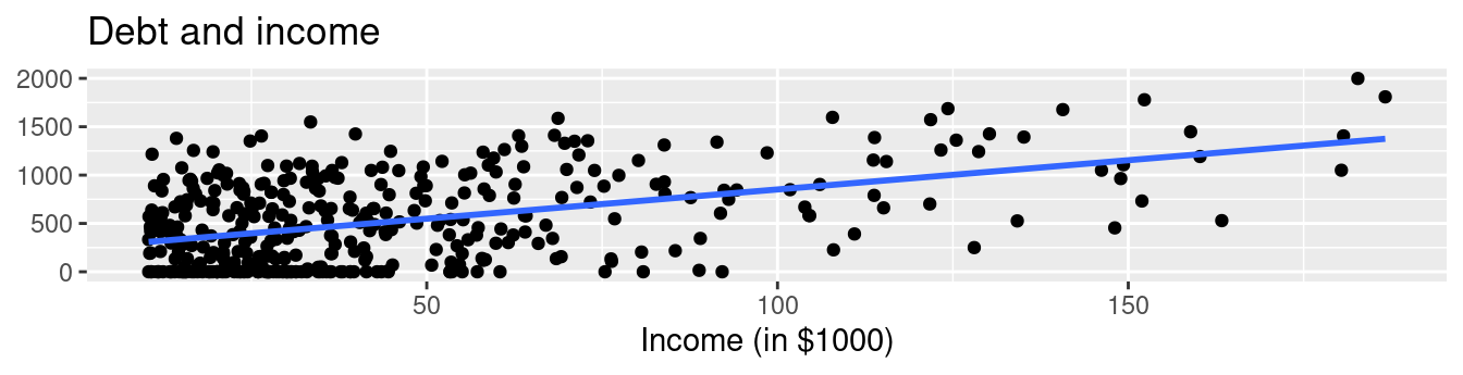
FIGURE 6.9: Relationship between credit card debt and income.
On the other hand, the multiple regression results in Table 6.10 suggested that the relationship between debt and income was negative. We re-display this information in Table 6.17.
| term | estimate | std_error | statistic | p_value | lower_ci | upper_ci |
|---|---|---|---|---|---|---|
| intercept | -385.179 | 19.465 | -19.8 | 0 | -423.446 | -346.912 |
| credit_limit | 0.264 | 0.006 | 45.0 | 0 | 0.253 | 0.276 |
| income | -7.663 | 0.385 | -19.9 | 0 | -8.420 | -6.906 |
Observe how the slope for income is \(-7.663\) and, most importantly for now, it is negative. This contradicts our observation in Figure 6.9 that the relationship is positive. How can this be? Recall the interpretation of the slope for income in the context of a multiple regression model: taking into account all the other explanatory variables in our model, for every increase of one unit in income (i.e., $1000), there is an associated decrease of on average $7.663 in debt.
In other words, while in isolation, the relationship between debt and income may be positive, when taking into account credit_limit as well, this relationship becomes negative. These seemingly paradoxical results are due to a phenomenon aptly named Simpson’s Paradox. Simpson’s Paradox occurs when trends that exist for the data in aggregate either disappear or reverse when the data are broken down into groups.
Let’s show how Simpson’s Paradox manifests itself in the credit_ch6 data. Let’s first visualize the distribution of the numerical explanatory variable credit_limit with a histogram in Figure 6.10.
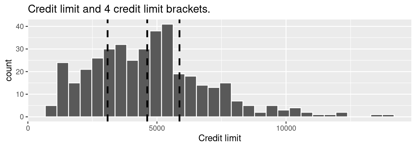
FIGURE 6.10: Histogram of credit limits and brackets.
The vertical dashed lines are the quartiles that cut up the variable credit_limit into four equally sized groups. Let’s think of these quartiles as converting our numerical variable credit_limit into a categorical variable “credit_limit bracket” with four levels. This means that
- 25% of credit limits were between $0 and $3088. Let’s assign these 100 people to the “low”
credit_limitbracket. - 25% of credit limits were between $3088 and $4622. Let’s assign these 100 people to the “medium-low”
credit_limitbracket. - 25% of credit limits were between $4622 and $5873. Let’s assign these 100 people to the “medium-high”
credit_limitbracket. - 25% of credit limits were over $5873. Let’s assign these 100 people to the “high”
credit_limitbracket.
Now in Figure 6.11 let’s re-display two versions of the scatterplot of debt and income from Figure 6.9, but with a slight twist:
- The left-hand plot shows the regular scatterplot and the single regression line, just as you saw in Figure 6.9.
- The right-hand plot shows the colored scatterplot, where the color aesthetic is mapped to “
credit_limitbracket.” Furthermore, there are now four separate regression lines.
In other words, the location of the 400 points are the same in both scatterplots, but the right-hand plot shows an additional variable of information: credit_limit bracket.
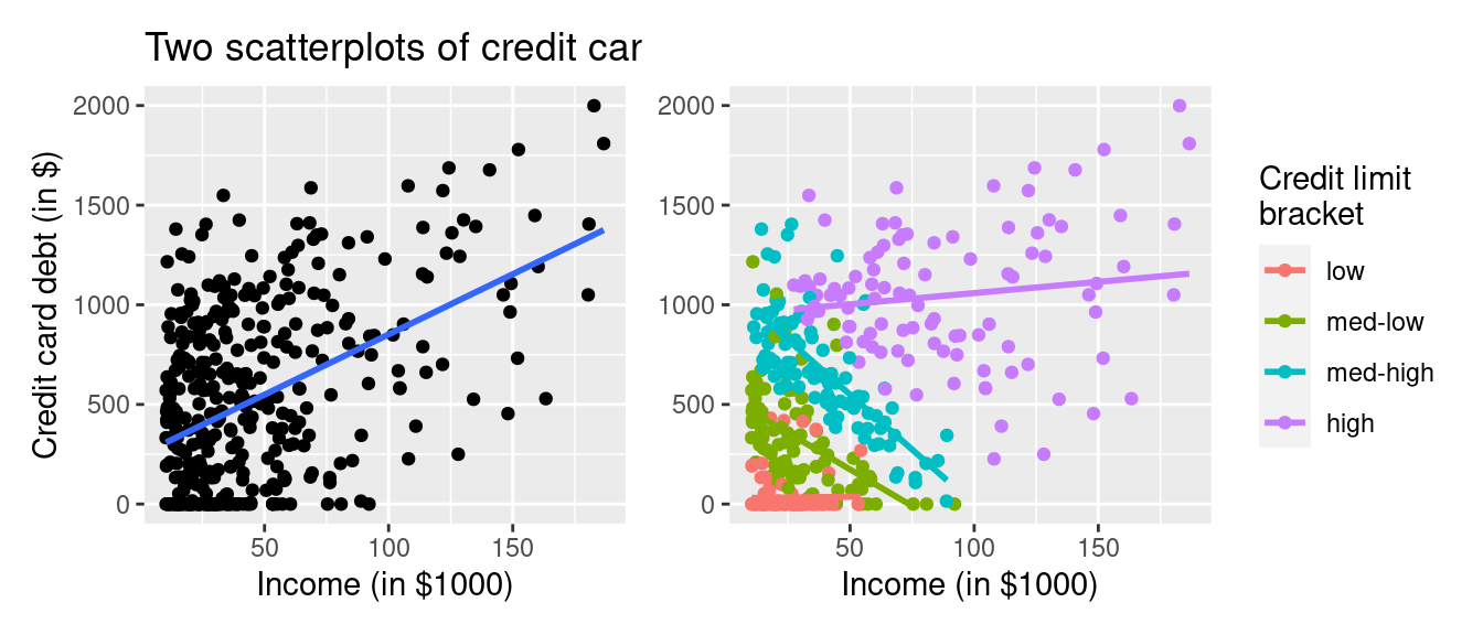
FIGURE 6.11: Relationship between credit card debt and income by credit limit bracket.
The left-hand plot of Figure 6.11 focuses on the relationship between debt and income in aggregate. It is suggesting that overall there exists a positive relationship between debt and income. However, the right-hand plot of Figure 6.11 focuses on the relationship between debt and income broken down by credit_limit bracket. In other words, we focus on four separate relationships between debt and income: one for the “low” credit_limit bracket, one for the “medium-low” credit_limit bracket, and so on.
Observe in the right-hand plot that the relationship between debt and income is clearly negative for the “medium-low” and “medium-high” credit_limit brackets, while the relationship is somewhat flat for the “low” credit_limit bracket. The only credit_limit bracket where the relationship remains positive is for the “high” credit_limit bracket. However, this relationship is less positive than in the relationship in aggregate, since the slope is shallower than the slope of the regression line in the left-hand plot.
In this example of Simpson’s Paradox, the credit_limit is a confounding variable of the relationship between credit card debt and income as we defined in Subsection 5.3.1. Thus, credit_limit needs to be accounted for in any appropriate model for the relationship between debt and income.
6.4 Conclusion
6.4.1 Additional resources
An R script file of all R code used in this chapter is available here.
6.4.2 What’s to come?
Congratulations! We’ve completed the “Data Modeling with moderndive” portion of this book. We’re ready to proceed to Part III of this book: “Statistical Inference with infer.” Statistical inference is the science of inferring about some unknown quantity using sampling.
The most well-known examples of sampling in practice involve polls. Because asking an entire population about their opinions would be a long and arduous task, pollsters often take a smaller sample that is hopefully representative of the population. Based on the results of this sample, pollsters hope to make claims about the entire population.
Once we’ve covered Chapters 7 on sampling, 8 on confidence intervals, and 9 on hypothesis testing, we’ll revisit the regression models we studied in Chapters 5 and 6 in Chapter 10 on inference for regression. So far, we’ve only studied the estimate column of all our regression tables. The next four chapters focus on what the remaining columns mean: the standard error (std_error), the test statistic, the p_value, and the lower and upper bounds of confidence intervals (lower_ci and upper_ci).
Furthermore in Chapter 10, we’ll revisit the concept of residuals \(y - \widehat{y}\) and discuss their importance when interpreting the results of a regression model. We’ll perform what is known as a residual analysis of the residual variable of all get_regression_points() outputs. Residual analyses allow you to verify what are known as the conditions for inference for regression. On to Chapter 7 on sampling in Part III as shown in Figure 6.12!

FIGURE 6.12: ModernDive flowchart - on to Part III!
References
James, Gareth, Daniela Witten, Trevor Hastie, and Robert Tibshirani. 2017. An Introduction to Statistical Learning: With Applications in r. First. New York, NY: Springer.