
Chapter 11 Tell Your Story with Data
Recall in the Preface and at the end of chapters throughout this book, we displayed the “ModernDive flowchart” mapping your journey through this book.
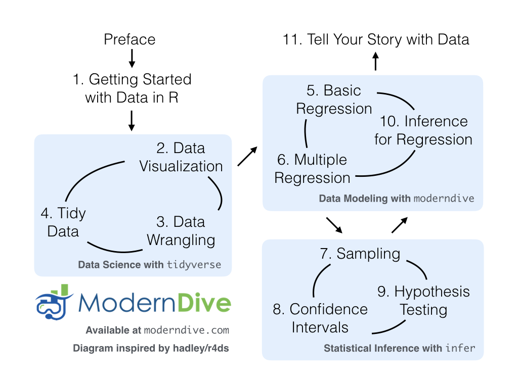
FIGURE 11.1: ModernDive flowchart.
11.1 Review
Let’s go over a refresher of what you’ve covered so far. You first got started with data in Chapter 1 where you learned about the difference between R and RStudio, started coding in R, installed and loaded your first R packages, and explored your first dataset: all domestic departure flights from a major New York City airport in 2013. Then you covered the following three parts of this book (Parts 2 and 4 are combined into a single portion):
- Data science with
tidyverse. You assembled your data science toolbox usingtidyversepackages. In particular, you- Ch.2: Visualized data using the
ggplot2package. - Ch.3: Wrangled data using the
dplyrpackage. - Ch.4: Learned about the concept of “tidy” data as a standardized data frame input and output format for all packages in the
tidyverse. Furthermore, you learned how to import spreadsheet files into R using thereadrpackage.
- Ch.2: Visualized data using the
- Data modeling with
moderndive. Using these data science tools and helper functions from themoderndivepackage, you fit your first data models. In particular, you - Statistical inference with
infer. Once again using your newly acquired data science tools, you unpacked statistical inference using theinferpackage. In particular, you - Data modeling with
moderndive(revisited): Armed with your understanding of statistical inference, you revisited and reviewed the models you constructed in Ch.5 and Ch.6. In particular, you- Ch.10: Interpreted confidence intervals and hypothesis tests in a regression setting.
We’ve guided you through your first experiences of “thinking with data,” an expression originally coined by Dr. Diane Lambert. The philosophy underlying this expression guided your path in the flowchart in Figure 11.1.
This philosophy is also well-summarized in “Practical Data Science for Stats”: a collection of pre-prints focusing on the practical side of data science workflows and statistical analysis curated by Dr. Jennifer Bryan and Dr. Hadley Wickham. They quote:
There are many aspects of day-to-day analytical work that are almost absent from the conventional statistics literature and curriculum. And yet these activities account for a considerable share of the time and effort of data analysts and applied statisticians. The goal of this collection is to increase the visibility and adoption of modern data analytical workflows. We aim to facilitate the transfer of tools and frameworks between industry and academia, between software engineering and statistics and computer science, and across different domains.
In other words, to be equipped to “think with data” in the 21st century, analysts need practice going through the “data/science pipeline” we saw in the Preface (re-displayed in Figure 11.2). It is our opinion that, for too long, statistics education has only focused on parts of this pipeline, instead of going through it in its entirety.
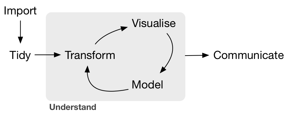
FIGURE 11.2: Data/science pipeline.
To conclude this book, we’ll present you with some additional case studies of working with data. In Section 11.2 we’ll take you through a full-pass of the “Data/Science Pipeline” in order to analyze the sale price of houses in Seattle, WA, USA. In Section 11.3, we’ll present you with some examples of effective data storytelling drawn from the data journalism website, FiveThirtyEight.com. We present these case studies to you because we believe that you should not only be able to “think with data,” but also be able to “tell your story with data.” Let’s explore how to do this!
Needed packages
Let’s load all the packages needed for this chapter (this assumes you’ve already installed them). Read Section 1.3 for information on how to install and load R packages.
11.2 Case study: Seattle house prices
Kaggle.com is a machine learning and predictive modeling competition website that hosts datasets uploaded by companies, governmental organizations, and other individuals. One of their datasets is the “House Sales in King County, USA”. It consists of sale prices of homes sold between May 2014 and May 2015 in King County, Washington, USA, which includes the greater Seattle metropolitan area. This dataset is in the house_prices data frame included in the moderndive package.
The dataset consists of 21,613 houses and 21 variables describing these houses (for a full list and description of these variables, see the help file by running ?house_prices in the console). In this case study, we’ll create a multiple regression model where:
- The outcome variable \(y\) is the sale
priceof houses. - Two explanatory variables:
- A numerical explanatory variable \(x_1\): house size
sqft_livingas measured in square feet of living space. Note that 1 square foot is about 0.09 square meters. - A categorical explanatory variable \(x_2\): house
condition, a categorical variable with five levels where1indicates “poor” and5indicates “excellent.”
- A numerical explanatory variable \(x_1\): house size
11.2.1 Exploratory data analysis: Part I
As we’ve said numerous times throughout this book, a crucial first step when presented with data is to perform an exploratory data analysis (EDA). Exploratory data analysis can give you a sense of your data, help identify issues with your data, bring to light any outliers, and help inform model construction.
Recall the three common steps in an exploratory data analysis we introduced in Subsection 5.1.1:
- Looking at the raw data values.
- Computing summary statistics.
- Creating data visualizations.
First, let’s look at the raw data using View() to bring up RStudio’s spreadsheet viewer and the glimpse() function from the dplyr package:
Rows: 21,613
Columns: 21
$ id            <chr> "7129300520", "6414100192", "5631500400", "2487200875", …
$ date          <date> 2014-10-13, 2014-12-09, 2015-02-25, 2014-12-09, 2015-02…
$ price         <dbl> 221900, 538000, 180000, 604000, 510000, 1225000, 257500,…
$ bedrooms      <int> 3, 3, 2, 4, 3, 4, 3, 3, 3, 3, 3, 2, 3, 3, 5, 4, 3, 4, 2,…
$ bathrooms     <dbl> 1.00, 2.25, 1.00, 3.00, 2.00, 4.50, 2.25, 1.50, 1.00, 2.…
$ sqft_living   <int> 1180, 2570, 770, 1960, 1680, 5420, 1715, 1060, 1780, 189…
$ sqft_lot      <int> 5650, 7242, 10000, 5000, 8080, 101930, 6819, 9711, 7470,…
$ floors        <dbl> 1.0, 2.0, 1.0, 1.0, 1.0, 1.0, 2.0, 1.0, 1.0, 2.0, 1.0, 1…
$ waterfront    <lgl> FALSE, FALSE, FALSE, FALSE, FALSE, FALSE, FALSE, FALSE, …
$ view          <int> 0, 0, 0, 0, 0, 0, 0, 0, 0, 0, 0, 0, 0, 0, 0, 3, 0, 0, 0,…
$ condition     <fct> 3, 3, 3, 5, 3, 3, 3, 3, 3, 3, 3, 4, 4, 4, 3, 3, 3, 4, 4,…
$ grade         <fct> 7, 7, 6, 7, 8, 11, 7, 7, 7, 7, 8, 7, 7, 7, 7, 9, 7, 7, 7…
$ sqft_above    <int> 1180, 2170, 770, 1050, 1680, 3890, 1715, 1060, 1050, 189…
$ sqft_basement <int> 0, 400, 0, 910, 0, 1530, 0, 0, 730, 0, 1700, 300, 0, 0, …
$ yr_built      <int> 1955, 1951, 1933, 1965, 1987, 2001, 1995, 1963, 1960, 20…
$ yr_renovated  <int> 0, 1991, 0, 0, 0, 0, 0, 0, 0, 0, 0, 0, 0, 0, 0, 0, 0, 0,…
$ zipcode       <fct> 98178, 98125, 98028, 98136, 98074, 98053, 98003, 98198, …
$ lat           <dbl> 47.5, 47.7, 47.7, 47.5, 47.6, 47.7, 47.3, 47.4, 47.5, 47…
$ long          <dbl> -122, -122, -122, -122, -122, -122, -122, -122, -122, -1…
$ sqft_living15 <int> 1340, 1690, 2720, 1360, 1800, 4760, 2238, 1650, 1780, 23…
$ sqft_lot15    <int> 5650, 7639, 8062, 5000, 7503, 101930, 6819, 9711, 8113, …
Here are some questions you can ask yourself at this stage of an EDA: Which variables are numerical? Which are categorical? For the categorical variables, what are their levels? Besides the variables we’ll be using in our regression model, what other variables do you think would be useful to use in a model for house price?
Observe, for example, that while the condition variable has values 1 through 5, these are saved in R as fct standing for “factors.” This is one of R’s ways of saving categorical variables. So you should think of these as the “labels” 1 through 5 and not the numerical values 1 through 5.
Let’s now perform the second step in an EDA: computing summary statistics. Recall from Section 3.3 that summary statistics are single numerical values that summarize a large number of values. Examples of summary statistics include the mean, the median, the standard deviation, and various percentiles.
We could do this using the summarize() function in the dplyr package along with R’s built-in summary functions, like mean() and median(). However, recall in Section 3.5, we saw the following code that computes a variety of summary statistics of the variable gain, which is the amount of time that a flight makes up mid-air:
gain_summary <- flights %>%
  summarize(
    min = min(gain, na.rm = TRUE),
    q1 = quantile(gain, 0.25, na.rm = TRUE),
    median = quantile(gain, 0.5, na.rm = TRUE),
    q3 = quantile(gain, 0.75, na.rm = TRUE),
    max = max(gain, na.rm = TRUE),
    mean = mean(gain, na.rm = TRUE),
    sd = sd(gain, na.rm = TRUE),
    missing = sum(is.na(gain))
  )
To repeat this for all three price, sqft_living, and condition variables would be tedious to code up. So instead, let’s use the convenient skim() function from the skimr package we first used in Subsection 6.1.1, being sure to only select() the variables of interest for our model:
Skim summary statistics
 n obs: 21613
 n variables: 3

── Variable type:factor
  variable missing complete     n n_unique                         top_counts ordered
 condition       0    21613 21613        5 3: 14031, 4: 5679, 5: 1701, 2: 172   FALSE

── Variable type:integer
    variable missing complete     n   mean     sd  p0  p25  p50  p75  p100
 sqft_living       0    21613 21613 2079.9 918.44 290 1427 1910 2550 13540

── Variable type:numeric
 variable missing complete     n      mean       sd    p0    p25    p50    p75    p100
    price       0    21613 21613 540088.14 367127.2 75000 321950 450000 645000 7700000
Observe that the mean price of $540,088 is larger than the median of $450,000. This is because a small number of very expensive houses are inflating the average. In other words, there are “outlier” house prices in our dataset. (This fact will become even more apparent when we create our visualizations next.)
However, the median is not as sensitive to such outlier house prices. This is why news about the real estate market generally report median house prices and not mean/average house prices. We say here that the median is more robust to outliers than the mean. Similarly, while both the standard deviation and interquartile-range (IQR) are both measures of spread and variability, the IQR is more robust to outliers.
Let’s now perform the last of the three common steps in an exploratory data analysis: creating data visualizations. Let’s first create univariate visualizations. These are plots focusing on a single variable at a time. Since price and sqft_living are numerical variables, we can visualize their distributions using a geom_histogram() as seen in Section 2.5 on histograms. On the other hand, since condition is categorical, we can visualize its distribution using a geom_bar(). Recall from Section 2.8 on barplots that since condition is not “pre-counted”, we use a geom_bar() and not a geom_col().
# Histogram of house price:
ggplot(house_prices, aes(x = price)) +
  geom_histogram(color = "white") +
  labs(x = "price (USD)", title = "House price")

# Histogram of sqft_living:
ggplot(house_prices, aes(x = sqft_living)) +
  geom_histogram(color = "white") +
  labs(x = "living space (square feet)", title = "House size")

# Barplot of condition:
ggplot(house_prices, aes(x = condition)) +
  geom_bar() +
  labs(x = "condition", title = "House condition")
In Figure 11.3, we display all three of these visualizations at once.
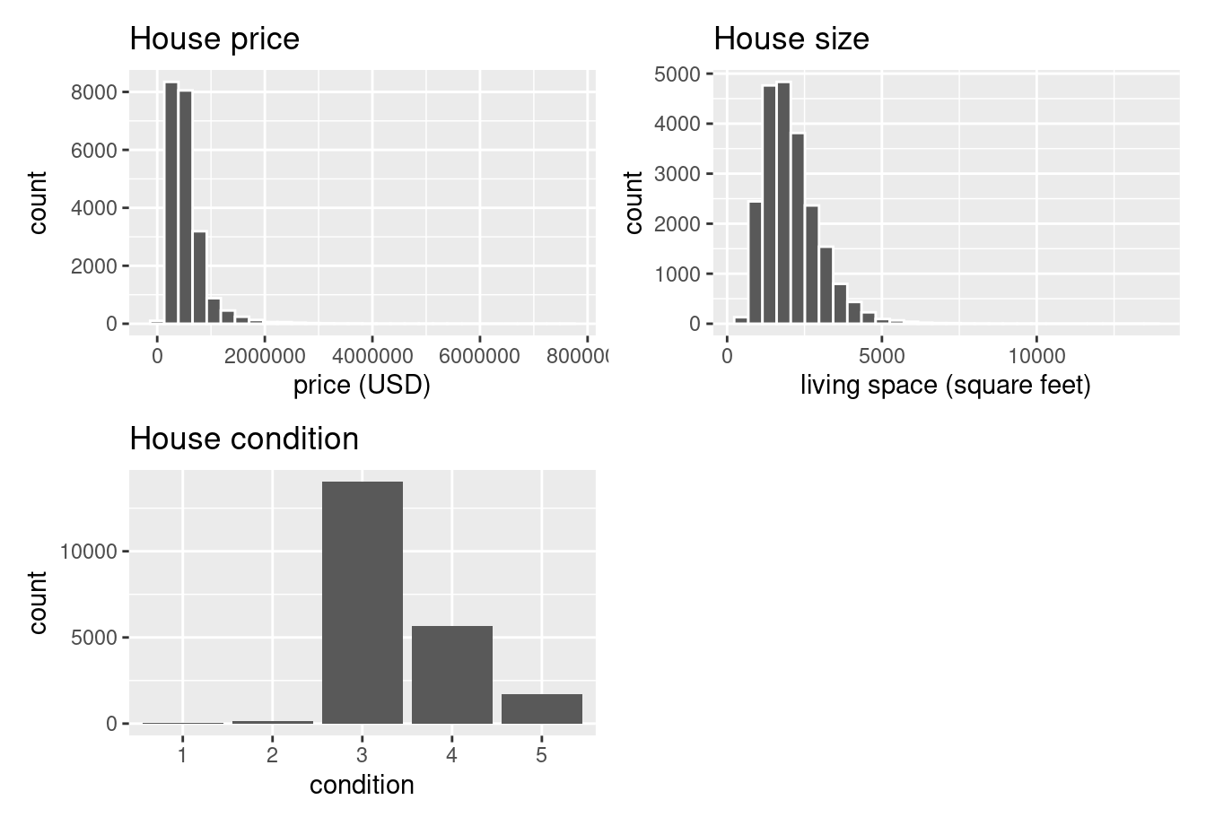
FIGURE 11.3: Exploratory visualizations of Seattle house prices data.
First, observe in the bottom plot that most houses are of condition “3”, with a few more of conditions “4” and “5”, and almost none that are “1” or “2”.
Next, observe in the histogram for price in the top-left plot that a majority of houses are less than two million dollars. Observe also that the x-axis stretches out to 8 million dollars, even though there does not appear to be any houses close to that price. This is because there are a very small number of houses with prices closer to 8 million. These are the outlier house prices we mentioned earlier. We say that the variable price is right-skewed as exhibited by the long right tail.
Further, observe in the histogram of sqft_living in the middle plot as well that most houses appear to have less than 5000 square feet of living space. For comparison, a football field in the US is about 57,600 square feet, whereas a standard soccer/association football field is about 64,000 square feet. Observe also that this variable is also right-skewed, although not as drastically as the price variable.
For both the price and sqft_living variables, the right-skew makes distinguishing houses at the lower end of the x-axis hard. This is because the scale of the x-axis is compressed by the small number of quite expensive and immensely-sized houses.
So what can we do about this skew? Let’s apply a log10 transformation to these variables. If you are unfamiliar with such transformations, we highly recommend you read Appendix A.3 on logarithmic (log) transformations. In summary, log transformations allow us to alter the scale of a variable to focus on multiplicative changes instead of additive changes. In other words, they shift the view to be on relative changes instead of absolute changes. Such multiplicative/relative changes are also called changes in orders of magnitude.
Let’s create new log10 transformed versions of the right-skewed variable price and sqft_living using the mutate() function from Section 3.5, but we’ll give the latter the name log10_size, which is shorter and easier to understand than the name log10_sqft_living.
house_prices <- house_prices %>%
  mutate(
    log10_price = log10(price),
    log10_size = log10(sqft_living)
    )
Let’s display the before and after effects of this transformation on these variables for only the first 10 rows of house_prices:
# A tibble: 21,613 × 4
     price log10_price sqft_living log10_size
     <dbl>       <dbl>       <int>      <dbl>
 1  221900     5.34616        1180    3.07188
 2  538000     5.73078        2570    3.40993
 3  180000     5.25527         770    2.88649
 4  604000     5.78104        1960    3.29226
 5  510000     5.70757        1680    3.22531
 6 1225000     6.08814        5420    3.73400
 7  257500     5.41078        1715    3.23426
 8  291850     5.46516        1060    3.02531
 9  229500     5.36078        1780    3.25042
10  323000     5.50920        1890    3.27646
# ℹ 21,603 more rows
Observe in particular the houses in the sixth and third rows. The house in the sixth row has price $1,225,000, which is just above one million dollars. Since \(10^6\) is one million, its log10_price is around 6.09.
Contrast this with all other houses with log10_price less than six, since they all have price less than $1,000,000. The house in the third row is the only house with sqft_living less than 1000. Since \(1000 = 10^3\), it’s the lone house with log10_size less than 3.
Let’s now visualize the before and after effects of this transformation for price in Figure 11.4.
# Before log10 transformation:
ggplot(house_prices, aes(x = price)) +
  geom_histogram(color = "white") +
  labs(x = "price (USD)", title = "House price: Before")

# After log10 transformation:
ggplot(house_prices, aes(x = log10_price)) +
  geom_histogram(color = "white") +
  labs(x = "log10 price (USD)", title = "House price: After")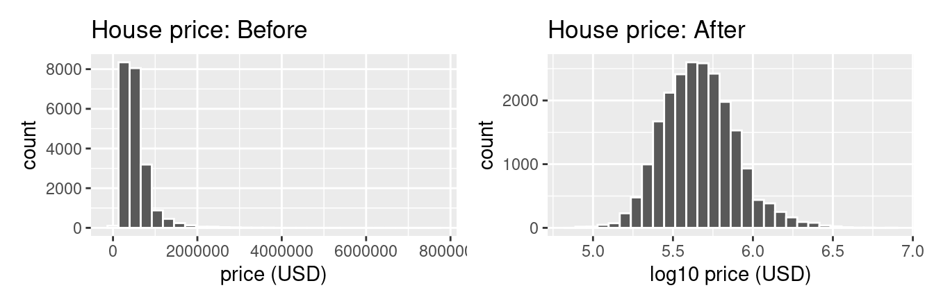
FIGURE 11.4: House price before and after log10 transformation.
Observe that after the transformation, the distribution is much less skewed, and in this case, more symmetric and more bell-shaped. Now you can more easily distinguish the lower priced houses.
Let’s do the same for house size, where the variable sqft_living was log10 transformed to log10_size.
# Before log10 transformation:
ggplot(house_prices, aes(x = sqft_living)) +
  geom_histogram(color = "white") +
  labs(x = "living space (square feet)", title = "House size: Before")

# After log10 transformation:
ggplot(house_prices, aes(x = log10_size)) +
  geom_histogram(color = "white") +
  labs(x = "log10 living space (square feet)", title = "House size: After")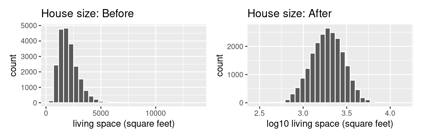
FIGURE 11.5: House size before and after log10 transformation.
Observe in Figure 11.5 that the log10 transformation has a similar effect of unskewing the variable. We emphasize that while in these two cases the resulting distributions are more symmetric and bell-shaped, this is not always necessarily the case.
Given the now symmetric nature of log10_price and log10_size, we are going to revise our multiple regression model to use our new variables:
- The outcome variable \(y\) is the sale
log10_priceof houses. - Two explanatory variables:
- A numerical explanatory variable \(x_1\): house size
log10_sizeas measured in log base 10 square feet of living space. - A categorical explanatory variable \(x_2\): house
condition, a categorical variable with five levels where1indicates “poor” and5indicates “excellent.”
- A numerical explanatory variable \(x_1\): house size
11.2.2 Exploratory data analysis: Part II
Let’s now continue our EDA by creating multivariate visualizations. Unlike the univariate histograms and barplot in the earlier Figures 11.3, 11.4, and 11.5, multivariate visualizations show relationships between more than one variable. This is an important step of an EDA to perform since the goal of modeling is to explore relationships between variables.
Since our model involves a numerical outcome variable, a numerical explanatory variable, and a categorical explanatory variable, we are in a similar regression modeling situation as in Section 6.1 where we studied the UT Austin teaching scores dataset. Recall in that case the numerical outcome variable was teaching score, the numerical explanatory variable was instructor age, and the categorical explanatory variable was (binary) gender.
We thus have two choices of models we can fit: either (1) an interaction model where the regression line for each condition level will have both a different slope and a different intercept or (2) a parallel slopes model where the regression line for each condition level will have the same slope but different intercepts.
Recall from Subsection 6.1.3 that the geom_parallel_slopes() function is a special purpose function that Evgeni Chasnovski created and included in the moderndive package, since the geom_smooth() method in the ggplot2 package does not have a convenient way to plot parallel slopes models. We plot both resulting models in Figure 11.6, with the interaction model on the left.
# Plot interaction model
ggplot(house_prices,
       aes(x = log10_size, y = log10_price, col = condition)) +
  geom_point(alpha = 0.05) +
  geom_smooth(method = "lm", se = FALSE) +
  labs(y = "log10 price",
       x = "log10 size",
       title = "House prices in Seattle")
# Plot parallel slopes model
ggplot(house_prices,
       aes(x = log10_size, y = log10_price, col = condition)) +
  geom_point(alpha = 0.05) +
  geom_parallel_slopes(se = FALSE) +
  labs(y = "log10 price",
       x = "log10 size",
       title = "House prices in Seattle")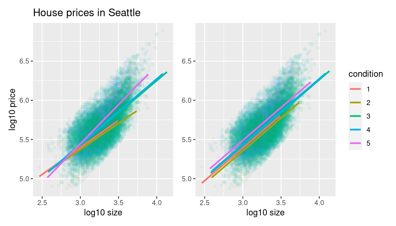
FIGURE 11.6: Interaction and parallel slopes models.
In both cases, we see there is a positive relationship between house price and size, meaning as houses are larger, they tend to be more expensive. Furthermore, in both plots it seems that houses of condition 5 tend to be the most expensive for most house sizes as evidenced by the fact that the line for condition 5 is highest, followed by conditions 4 and 3. As for conditions 1 and 2, this pattern isn’t as clear. Recall from the univariate barplot of condition in Figure 11.3, there are only a few houses of condition 1 or 2.
Let’s also show a faceted version of just the interaction model in Figure 11.7. It is now much more apparent just how few houses are of condition 1 or 2.
ggplot(house_prices,
       aes(x = log10_size, y = log10_price, col = condition)) +
  geom_point(alpha = 0.4) +
  geom_smooth(method = "lm", se = FALSE) +
  labs(y = "log10 price",
       x = "log10 size",
       title = "House prices in Seattle") +
  facet_wrap(~ condition)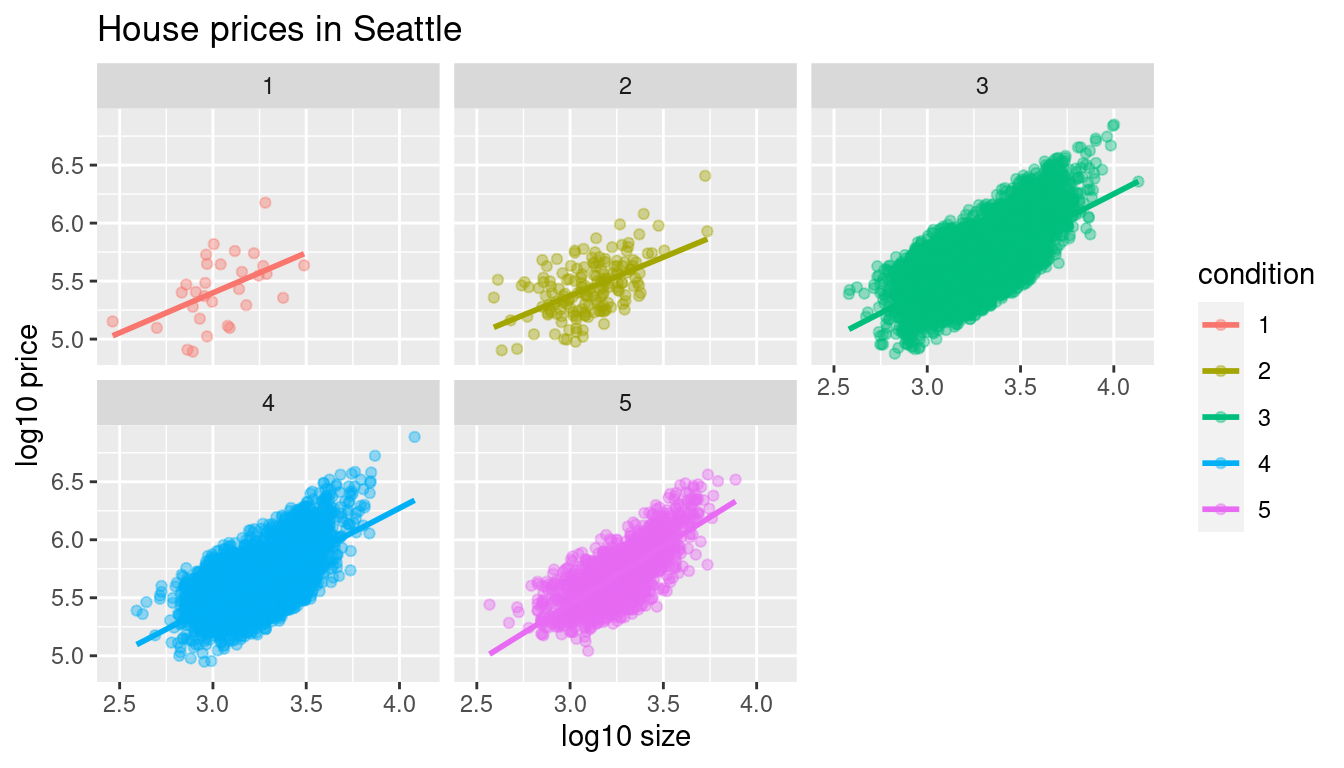
FIGURE 11.7: Faceted plot of interaction model.
Which exploratory visualization of the interaction model is better, the one in the left-hand plot of Figure 11.6 or the faceted version in Figure 11.7? There is no universal right answer. You need to make a choice depending on what you want to convey, and own that choice, with including and discussing both also as an option as needed.
11.2.3 Regression modeling
Which of the two models in Figure 11.6 is “better”? The interaction model in the left-hand plot or the parallel slopes model in the right-hand plot?
We had a similar discussion in Subsection 6.3.1 on model selection. Recall that we stated that we should only favor more complex models if the additional complexity is warranted. In this case, the more complex model is the interaction model since it considers five intercepts and five slopes total. This is in contrast to the parallel slopes model which considers five intercepts but only one common slope.
Is the additional complexity of the interaction model warranted? Looking at the left-hand plot in Figure 11.6, we’re of the opinion that it is, as evidenced by the slight x-like pattern to some of the lines. Therefore, we’ll focus the rest of this analysis only on the interaction model. This visual approach is somewhat subjective, however, so feel free to disagree! What are the five different slopes and five different intercepts for the interaction model? We can obtain these values from the regression table. Recall our two-step process for getting the regression table:
# Fit regression model:
price_interaction <- lm(log10_price ~ log10_size * condition,
                        data = house_prices)

# Get regression table:
get_regression_table(price_interaction)| term | estimate | std_error | statistic | p_value | lower_ci | upper_ci |
|---|---|---|---|---|---|---|
| intercept | 3.330 | 0.451 | 7.380 | 0.000 | 2.446 | 4.215 |
| log10_size | 0.690 | 0.148 | 4.652 | 0.000 | 0.399 | 0.980 |
| condition: 2 | 0.047 | 0.498 | 0.094 | 0.925 | -0.930 | 1.024 |
| condition: 3 | -0.367 | 0.452 | -0.812 | 0.417 | -1.253 | 0.519 |
| condition: 4 | -0.398 | 0.453 | -0.879 | 0.380 | -1.286 | 0.490 |
| condition: 5 | -0.883 | 0.457 | -1.931 | 0.053 | -1.779 | 0.013 |
| log10_size:condition2 | -0.024 | 0.163 | -0.148 | 0.882 | -0.344 | 0.295 |
| log10_size:condition3 | 0.133 | 0.148 | 0.893 | 0.372 | -0.158 | 0.424 |
| log10_size:condition4 | 0.146 | 0.149 | 0.979 | 0.328 | -0.146 | 0.437 |
| log10_size:condition5 | 0.310 | 0.150 | 2.067 | 0.039 | 0.016 | 0.604 |
Recall we saw in Subsection 6.1.2 how to interpret a regression table when there are both numerical and categorical explanatory variables. Let’s now do the same for all 10 values in the estimate column of Table 11.1.
In this case, the “baseline for comparison” group for the categorical variable condition are the condition 1 houses, since “1” comes first alphanumerically. Thus, the intercept and log10_size values are the intercept and slope for log10_size for this baseline group. Next, the condition2 through condition5 terms are the offsets in intercepts relative to the condition 1 intercept. Finally, the log10_size:condition2 through log10_size:condition5 are the offsets in slopes for log10_size relative to the condition 1 slope for log10_size.
Let’s simplify this by writing out the equation of each of the five regression lines using these 10 estimate values. We’ll write out each line in the following format:
\[ \widehat{\log10(\text{price})} = \hat{\beta}_0 + \hat{\beta}_{\text{size}} \cdot \log10(\text{size}) \]
- Condition 1:
\[\widehat{\log10(\text{price})} = 3.33 + 0.69 \cdot \log10(\text{size})\]
- Condition 2:
\[ \begin{aligned} \widehat{\log10(\text{price})} &= (3.33 + 0.047) + (0.69 - 0.024) \cdot \log10(\text{size}) \\ &= 3.377 + 0.666 \cdot \log10(\text{size}) \end{aligned} \]
- Condition 3:
\[ \begin{aligned} \widehat{\log10(\text{price})} &= (3.33 - 0.367) + (0.69 + 0.133) \cdot \log10(\text{size}) \\ &= 2.963 + 0.823 \cdot \log10(\text{size}) \end{aligned} \]
- Condition 4:
\[ \begin{aligned} \widehat{\log10(\text{price})} &= (3.33 - 0.398) + (0.69 + 0.146) \cdot \log10(\text{size}) \\ &= 2.932 + 0.836 \cdot \log10(\text{size}) \end{aligned} \]
- Condition 5:
\[ \begin{aligned} \widehat{\log10(\text{price})} &= (3.33 - 0.883) + (0.69 + 0.31) \cdot \log10(\text{size}) \\ &= 2.447 + 1 \cdot \log10(\text{size}) \end{aligned} \]
These correspond to the regression lines in the left-hand plot of Figure 11.6 and the faceted plot in Figure 11.7. For homes of all five condition types, as the size of the house increases, the price increases. This is what most would expect. However, the rate of increase of price with size is fastest for the homes with conditions 3, 4, and 5 of 0.823, 0.836, and 1, respectively. These are the three largest slopes out of the five.
11.2.4 Making predictions
Say you’re a realtor and someone calls you asking you how much their home will sell for. They tell you that it’s in condition = 5 and is sized 1900 square feet. What do you tell them? Let’s use the interaction model we fit to make predictions!
We first make this prediction visually in Figure 11.8. The predicted log10_price of this house is marked with a black dot. This is where the following two lines intersect:
- The regression line for the condition = 5 homes and
- The vertical dashed black line at
log10_sizeequals 3.28, since our predictor variable is the log10 transformed square feet of living space of \(\log10(1900) = 3.28\).
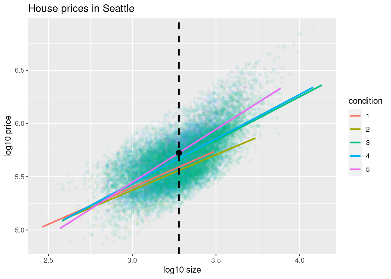
FIGURE 11.8: Interaction model with prediction.
Eyeballing it, it seems the predicted log10_price seems to be around 5.75. Let’s now obtain the exact numerical value for the prediction using the equation of the regression line for the condition = 5 houses, being sure to log10() the square footage first.
[1] 5.73This value is very close to our earlier visually made prediction of 5.75. But wait! Is our prediction for the price of this house $5.75? No! Remember that we are using log10_price as our outcome variable! So, if we want a prediction in dollar units of price, we need to unlog this by taking a power of 10 as described in Appendix A.3.
[1] 535493So our predicted price for this home of condition 5 and of size 1900 square feet is $535,493.
Learning check
(LC11.1) Repeat the regression modeling in Subsection 11.2.3 and the prediction making you just did on the house of condition 5 and size 1900 square feet in Subsection 11.2.4, but using the parallel slopes model you visualized in Figure 11.6. Show that it’s $524,807!
11.3 Case study: Effective data storytelling
As we’ve progressed throughout this book, you’ve seen how to work with data in a variety of ways. You’ve learned effective strategies for plotting data by understanding which types of plots work best for which combinations of variable types. You’ve summarized data in spreadsheet form and calculated summary statistics for a variety of different variables. Furthermore, you’ve seen the value of statistical inference as a process to come to conclusions about a population by using sampling. Lastly, you’ve explored how to fit linear regression models and the importance of checking the conditions required so that all confidence intervals and hypothesis tests have valid interpretation. All throughout, you’ve learned many computational techniques and focused on writing R code that’s reproducible.
We now present another set of case studies, but this time on the “effective data storytelling” done by data journalists around the world. Great data stories don’t mislead the reader, but rather engulf them in understanding the importance that data plays in our lives through storytelling.
11.3.1 Bechdel test for Hollywood gender representation
We recommend you read and analyze Walt Hickey’s FiveThirtyEight.com article, “The Dollar-And-Cents Case Against Hollywood’s Exclusion of Women.” In it, Walt completed a multidecade study of how many movies pass the Bechdel test, an informal test of gender representation in a movie that was created by Alison Bechdel.
As you read over the article, think carefully about how Walt Hickey is using data, graphics, and analyses to tell the reader a story. In the spirit of reproducibility, FiveThirtyEight have also shared the data and R code that they used for this article. You can also find the data used in many more of their articles on their GitHub page.
ModernDive co-authors Chester Ismay and Albert Y. Kim along with Jennifer Chunn went one step further by creating the fivethirtyeight package which provides access to these datasets more easily in R. For a complete list of all 129 datasets included in the fivethirtyeight package, check out the package webpage at https://fivethirtyeight-r.netlify.app/articles/fivethirtyeight.html.
Furthermore, example “vignettes” of fully reproducible start-to-finish analyses of some of these data using dplyr, ggplot2, and other packages in the tidyverse are available here. For example, a vignette showing how to reproduce one of the plots at the end of the article on the Bechdel test is available here.
11.3.2 US Births in 1999
The US_births_1994_2003 data frame included in the fivethirtyeight package provides information about the number of daily births in the United States between 1994 and 2003. For more information on this data frame including a link to the original article on FiveThirtyEight.com, check out the help file by running ?US_births_1994_2003 in the console.
It’s always a good idea to preview your data, either by using RStudio’s spreadsheet View() function or using glimpse() from the dplyr package:
Rows: 3,652
Columns: 6
$ year          <int> 1994, 1994, 1994, 1994, 1994, 1994, 1994, 1994, 1994, 19…
$ month         <int> 1, 1, 1, 1, 1, 1, 1, 1, 1, 1, 1, 1, 1, 1, 1, 1, 1, 1, 1,…
$ date_of_month <int> 1, 2, 3, 4, 5, 6, 7, 8, 9, 10, 11, 12, 13, 14, 15, 16, 1…
$ date          <date> 1994-01-01, 1994-01-02, 1994-01-03, 1994-01-04, 1994-01…
$ day_of_week   <ord> Sat, Sun, Mon, Tues, Wed, Thurs, Fri, Sat, Sun, Mon, Tue…
$ births        <int> 8096, 7772, 10142, 11248, 11053, 11406, 11251, 8653, 791…
We’ll focus on the number of births for each date, but only for births that occurred in 1999. Recall from Section 3.2 we can do this using the filter() function from the dplyr package:
As discussed in Section 2.4, since date is a notion of time and thus has sequential ordering to it, a linegraph would be a more appropriate visualization to use than a scatterplot. In other words, we should use a geom_line() instead of geom_point(). Recall that such plots are called time series plots.
ggplot(US_births_1999, aes(x = date, y = births)) +
  geom_line() +
  labs(x = "Date",
       y = "Number of births",
       title = "US Births in 1999")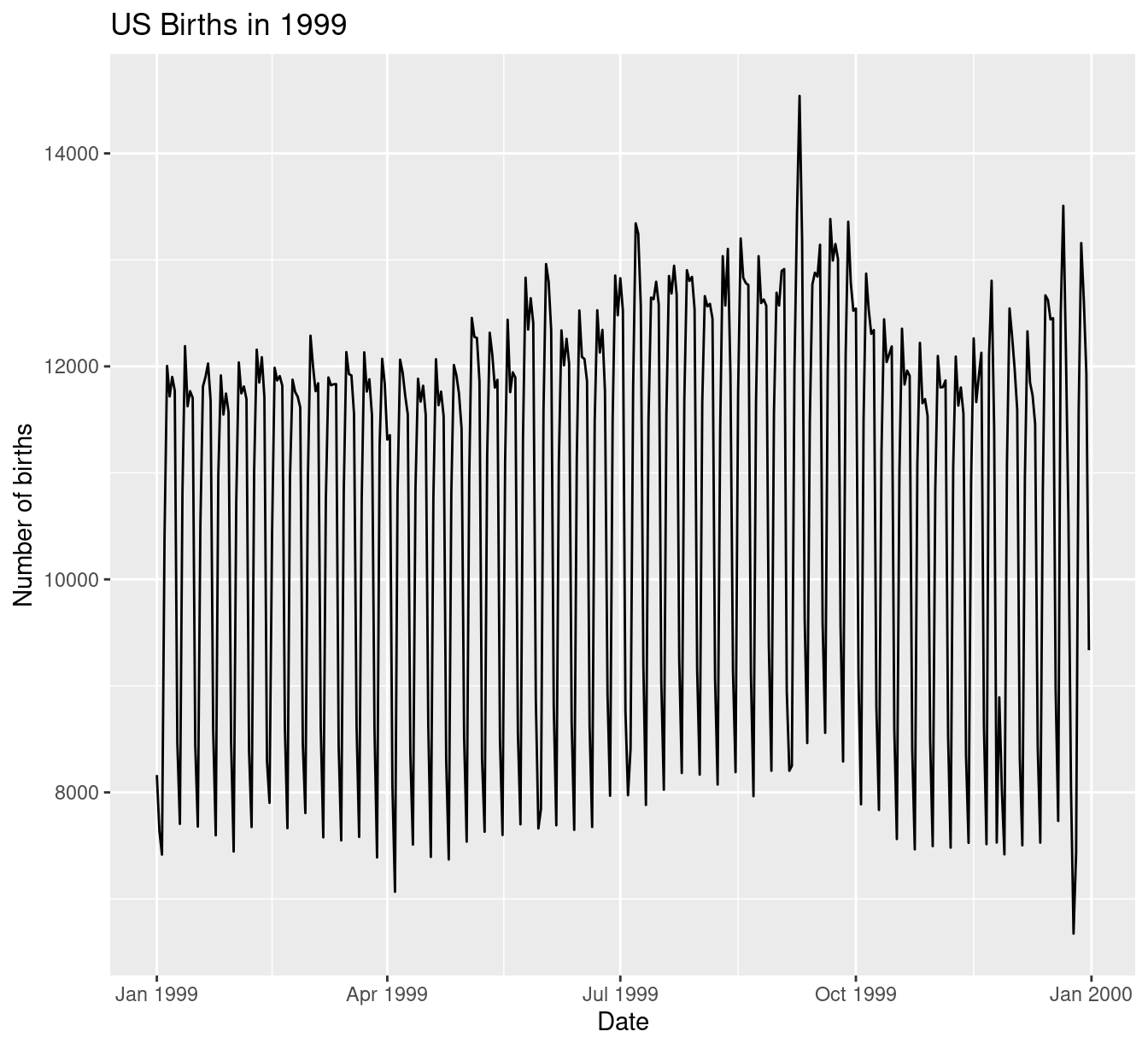
FIGURE 11.9: Number of births in the US in 1999.
We see a big dip occurring just before January 1st, 2000, most likely due to the holiday season. However, what about the large spike of over 14,000 births occurring just before October 1st, 1999? What could be the reason for this anomalously high spike?
Let’s sort the rows of US_births_1999 in descending order of the number of births. Recall from Section 3.6 that we can use the arrange() function from the dplyr function to do this, making sure to sort births in descending order:
# A tibble: 365 × 6
    year month date_of_month date       day_of_week births
   <int> <int>         <int> <date>     <ord>        <int>
 1  1999     9             9 1999-09-09 Thurs        14540
 2  1999    12            21 1999-12-21 Tues         13508
 3  1999     9             8 1999-09-08 Wed          13437
 4  1999     9            21 1999-09-21 Tues         13384
 5  1999     9            28 1999-09-28 Tues         13358
 6  1999     7             7 1999-07-07 Wed          13343
 7  1999     7             8 1999-07-08 Thurs        13245
 8  1999     8            17 1999-08-17 Tues         13201
 9  1999     9            10 1999-09-10 Fri          13181
10  1999    12            28 1999-12-28 Tues         13158
# ℹ 355 more rows
The date with the highest number of births (14,540) is in fact 1999-09-09. If we write down this date in month/day/year format (a standard format in the US), the date with the highest number of births is 9/9/99! All nines! Could it be that parents deliberately induced labor at a higher rate on this date? Maybe? Whatever the cause may be, this fact makes a fun story!
Learning check
(LC11.2) What date between 1994 and 2003 has the fewest number of births in the US? What story could you tell about why this is the case?
Time to think with data and further tell your story with data! How could statistical modeling help you here? What types of statistical inference would be helpful? What else can you find and where can you take this analysis? What assumptions did you make in this analysis? We leave these questions to you as the reader to explore and examine.
Remember to get in touch with us via our contact info in the Preface. We’d love to see what you come up with!
Please check out additional problem sets and labs at https://moderndive.com/labs as well.
11.3.3 Scripts of R code
An R script file of all R code used in this chapter is available here.
R code files saved as *.R files for all relevant chapters throughout the entire book are in the following table.
Concluding remarks
Now that you’ve made it to this point in the book, we suspect that you know a thing or two about how to work with data in R! You’ve also gained a lot of knowledge about how to use simulation-based techniques for statistical inference and how these techniques help build intuition about traditional theory-based inferential methods like the \(t\)-test.
The hope is that you’ve come to appreciate the power of data in all respects, such as data wrangling, tidying datasets, data visualization, data modeling, and statistical inference. In our opinion, while each of these is important, data visualization may be the most important tool for a citizen or professional data scientist to have in their toolbox. If you can create truly beautiful graphics that display information in ways that the reader can clearly understand, you have great power to tell your tale with data. Let’s hope that these skills help you tell great stories with data into the future. Thanks for coming along this journey as we dove into modern data analysis using R and the tidyverse!