
Chapter 10 Inference for Regression
In our penultimate chapter, we’ll revisit the regression models we first studied in Chapters 5 and 6. Armed with our knowledge of confidence intervals and hypothesis tests from Chapters 8 and 9, we’ll be able to apply statistical inference to further our understanding of relationships between outcome and explanatory variables.
Needed packages
Let’s load all the packages needed for this chapter (this assumes you’ve already installed them). Recall from our discussion in Section 4.4 that loading the tidyverse package by running library(tidyverse) loads the following commonly used data science packages all at once:
ggplot2for data visualizationdplyrfor data wranglingtidyrfor converting data to “tidy” formatreadrfor importing spreadsheet data into R- As well as the more advanced
purrr,tibble,stringr, andforcatspackages
If needed, read Section 1.3 for information on how to install and load R packages.
10.1 Regression refresher
Before jumping into inference for regression, let’s remind ourselves of the University of Texas Austin teaching evaluations analysis in Section 5.1.
10.1.1 Teaching evaluations analysis
Recall using simple linear regression we modeled the relationship between
- A numerical outcome variable \(y\) (the instructor’s teaching score) and
- A single numerical explanatory variable \(x\) (the instructor’s “beauty” score).
We first created an evals_ch5 data frame that selected a subset of variables from the evals data frame included in the moderndive package. This evals_ch5 data frame contains only the variables of interest for our analysis, in particular the instructor’s teaching score and the “beauty” rating bty_avg:
Rows: 463
Columns: 4
$ ID      <int> 1, 2, 3, 4, 5, 6, 7, 8, 9, 10, 11, 12, 13, 14, 15, 16, 17, 18,…
$ score   <dbl> 4.7, 4.1, 3.9, 4.8, 4.6, 4.3, 2.8, 4.1, 3.4, 4.5, 3.8, 4.5, 4.…
$ bty_avg <dbl> 5.00, 5.00, 5.00, 5.00, 3.00, 3.00, 3.00, 3.33, 3.33, 3.17, 3.…
$ age     <int> 36, 36, 36, 36, 59, 59, 59, 51, 51, 40, 40, 40, 40, 40, 40, 40…
In Subsection 5.1.1, we performed an exploratory data analysis of the relationship between these two variables of score and bty_avg. We saw there that a weakly positive correlation of 0.187 existed between the two variables.
This was evidenced in Figure 10.1 of the scatterplot along with the “best-fitting” regression line that summarizes the linear relationship between the two variables of score and bty_avg. Recall in Subsection 5.3.2 that we defined a “best-fitting” line as the line that minimizes the sum of squared residuals.
ggplot(evals_ch5,
       aes(x = bty_avg, y = score)) +
  geom_point() +
  labs(x = "Beauty Score",
       y = "Teaching Score",
       title = "Relationship between teaching and beauty scores") +
  geom_smooth(method = "lm", se = FALSE)
FIGURE 10.1: Relationship with regression line.
Looking at this plot again, you might be asking, “Does that line really have all that positive of a slope?”. It does increase from left to right as the bty_avg variable increases, but by how much? To get to this information, recall that we followed a two-step procedure:
- We first “fit” the linear regression model using the
lm()function with the formulascore ~ bty_avg. We saved this model inscore_model. - We get the regression table by applying the
get_regression_table()function from themoderndivepackage toscore_model.
# Fit regression model:
score_model <- lm(score ~ bty_avg, data = evals_ch5)
# Get regression table:
get_regression_table(score_model)| term | estimate | std_error | statistic | p_value | lower_ci | upper_ci |
|---|---|---|---|---|---|---|
| intercept | 3.880 | 0.076 | 50.96 | 0 | 3.731 | 4.030 |
| bty_avg | 0.067 | 0.016 | 4.09 | 0 | 0.035 | 0.099 |
Using the values in the estimate column of the resulting regression table in Table 10.1, we could then obtain the equation of the “best-fitting” regression line in Figure 10.1:
\[ \begin{aligned} \widehat{y} &= b_0 + b_1 \cdot x\\ \widehat{\text{score}} &= b_0 + b_{\text{bty}\_\text{avg}} \cdot\text{bty}\_\text{avg}\\ &= 3.880 + 0.067\cdot\text{bty}\_\text{avg} \end{aligned} \]
where \(b_0\) is the fitted intercept and \(b_1\) is the fitted slope for bty_avg. Recall the interpretation of the \(b_1\) = 0.067 value of the fitted slope:
For every increase of one unit in “beauty” rating, there is an associated increase, on average, of 0.067 units of evaluation score.
Thus, the slope value quantifies the relationship between the \(y\) variable score and the \(x\) variable bty_avg. We also discussed the intercept value of \(b_0\) = 3.88 and its lack of practical interpretation, since the range of possible “beauty” scores does not include 0.
10.1.2 Sampling scenario
Let’s now revisit this study in terms of the terminology and notation related to sampling we studied in Subsection 7.3.1.
First, let’s view the instructors for these 463 courses as a representative sample from a greater study population. In our case, let’s assume that the study population is all instructors at UT Austin and that the sample of instructors who taught these 463 courses is a representative sample. Unfortunately, we can only assume these two facts without more knowledge of the sampling methodology used by the researchers.
Since we are viewing these \(n\) = 463 courses as a sample, we can view our fitted slope \(b_1\) = 0.067 as a point estimate of the population slope \(\beta_1\). In other words, \(\beta_1\) quantifies the relationship between teaching score and “beauty” average bty_avg for all instructors at UT Austin. Similarly, we can view our fitted intercept \(b_0\) = 3.88 as a point estimate of the population intercept \(\beta_0\) for all instructors at UT Austin.
Putting these two ideas together, we can view the equation of the fitted line \(\widehat{y}\) = \(b_0 + b_1 \cdot x\) = \(3.880 + 0.067 \cdot \text{bty}\_\text{avg}\) as an estimate of some true and unknown population line \(y = \beta_0 + \beta_1 \cdot x\). Thus we can draw parallels between our teaching evaluations analysis and all the sampling scenarios we’ve seen previously. In this chapter, we’ll focus on the final scenario of regression slopes as shown in Table 10.2.
| Scenario | Population parameter | Notation | Point estimate | Symbol(s) |
|---|---|---|---|---|
| 1 | Population proportion | \(p\) | Sample proportion | \(\widehat{p}\) |
| 2 | Population mean | \(\mu\) | Sample mean | \(\overline{x}\) or \(\widehat{\mu}\) |
| 3 | Difference in population proportions | \(p_1 - p_2\) | Difference in sample proportions | \(\widehat{p}_1 - \widehat{p}_2\) |
| 4 | Difference in population means | \(\mu_1 - \mu_2\) | Difference in sample means | \(\overline{x}_1 - \overline{x}_2\) or \(\widehat{\mu}_1 - \widehat{\mu}_2\) |
| 5 | Population regression slope | \(\beta_1\) | Fitted regression slope | \(b_1\) or \(\widehat{\beta}_1\) |
Since we are now viewing our fitted slope \(b_1\) and fitted intercept \(b_0\) as point estimates based on a sample, these estimates will again be subject to sampling variability. In other words, if we collected a new sample of data on a different set of \(n\) = 463 courses and their instructors, the new fitted slope \(b_1\) will likely differ from 0.067. The same goes for the new fitted intercept \(b_0\). But by how much will these estimates vary? This information is in the remaining columns of the regression table in Table 10.1. Our knowledge of sampling from Chapter 7, confidence intervals from Chapter 8, and hypothesis tests from Chapter 9 will help us interpret these remaining columns.
10.2 Interpreting regression tables
We’ve so far focused only on the two leftmost columns of the regression table in Table 10.1: term and estimate. Let’s now shift our attention to the remaining columns: std_error, statistic, p_value, lower_ci and upper_ci in Table 10.3.
| term | estimate | std_error | statistic | p_value | lower_ci | upper_ci |
|---|---|---|---|---|---|---|
| intercept | 3.880 | 0.076 | 50.96 | 0 | 3.731 | 4.030 |
| bty_avg | 0.067 | 0.016 | 4.09 | 0 | 0.035 | 0.099 |
Given the lack of practical interpretation for the fitted intercept \(b_0\), in this section we’ll focus only on the second row of the table corresponding to the fitted slope \(b_1\). We’ll first interpret the std_error, statistic, p_value, lower_ci and upper_ci columns. Afterwards in the upcoming Subsection 10.2.5, we’ll discuss how R computes these values.
10.2.1 Standard error
The third column of the regression table in Table 10.1 std_error corresponds to the standard error of our estimates. Recall the definition of standard error we saw in Subsection 7.3.2:
The standard error is the standard deviation of any point estimate computed from a sample.
So what does this mean in terms of the fitted slope \(b_1\) = 0.067? This value is just one possible value of the fitted slope resulting from this particular sample of \(n\) = 463 pairs of teaching and “beauty” scores. However, if we collected a different sample of \(n\) = 463 pairs of teaching and “beauty” scores, we will almost certainly obtain a different fitted slope \(b_1\). This is due to sampling variability.
Say we hypothetically collected 1000 such samples of pairs of teaching and “beauty” scores, computed the 1000 resulting values of the fitted slope \(b_1\), and visualized them in a histogram. This would be a visualization of the sampling distribution of \(b_1\), which we defined in Subsection 7.3.2. Further recall that the standard deviation of the sampling distribution of \(b_1\) has a special name: the standard error.
Recall that we constructed three sampling distributions for the sample proportion \(\widehat{p}\) using shovels of size 25, 50, and 100 in Figure 7.12. We observed that as the sample size increased, the standard error decreased as evidenced by the narrowing sampling distribution.
The standard error of \(b_1\) similarly quantifies how much variation in the fitted slope \(b_1\) one would expect between different samples. So in our case, we can expect about 0.016 units of variation in the bty_avg slope variable. Recall that the estimate and std_error values play a key role in inferring the value of the unknown population slope \(\beta_1\) relating to all instructors.
In Section 10.4, we’ll perform a simulation using the infer package to construct the bootstrap distribution for \(b_1\) in this case. Recall from Subsection 8.7.1 that the bootstrap distribution is an approximation to the sampling distribution in that they have a similar shape. Since they have a similar shape, they have similar standard errors. However, unlike the sampling distribution, the bootstrap distribution is constructed from a single sample, which is a practice more aligned with what’s done in real life.
10.2.2 Test statistic
The fourth column of the regression table in Table 10.1 statistic corresponds to a test statistic relating to the following hypothesis test:
\[ \begin{aligned} H_0 &: \beta_1 = 0\\ \text{vs } H_A&: \beta_1 \neq 0. \end{aligned} \]
Recall our terminology, notation, and definitions related to hypothesis tests we introduced in Section 9.2.
A hypothesis test consists of a test between two competing hypotheses: (1) a null hypothesis \(H_0\) versus (2) an alternative hypothesis \(H_A\).
A test statistic is a point estimate/sample statistic formula used for hypothesis testing.
Here, our null hypothesis \(H_0\) assumes that the population slope \(\beta_1\) is 0. If the population slope \(\beta_1\) is truly 0, then this is saying that there is no true relationship between teaching and “beauty” scores for all the instructors in our population. In other words, \(x\) = “beauty” score would have no associated effect on \(y\) = teaching score. The alternative hypothesis \(H_A\), on the other hand, assumes that the population slope \(\beta_1\) is not 0, meaning it could be either positive or negative. This suggests either a positive or negative relationship between teaching and “beauty” scores. Recall we called such alternative hypotheses two-sided. By convention, all hypothesis testing for regression assumes two-sided alternatives.
Recall our “hypothesized universe” of no gender discrimination we assumed in our promotions activity in Section 9.1. Similarly here when conducting this hypothesis test, we’ll assume a “hypothesized universe” where there is no relationship between teaching and “beauty” scores. In other words, we’ll assume the null hypothesis \(H_0: \beta_1 = 0\) is true.
The statistic column in the regression table is a tricky one, however. It corresponds to a standardized t-test statistic, much like the two-sample \(t\) statistic we saw in Subsection 9.6.1 where we used a theory-based method for conducting hypothesis tests. In both these cases, the null distribution can be mathematically proven to be a \(t\)-distribution. Since such test statistics are tricky for individuals new to statistical inference to study, we’ll skip this and jump into interpreting the \(p\)-value. If you’re curious, we have included a discussion of this standardized t-test statistic in Subsection 10.5.1.
10.2.3 p-value
The fifth column of the regression table in Table 10.1 p_value corresponds to the p-value of the hypothesis test \(H_0: \beta_1 = 0\) versus \(H_A: \beta_1 \neq 0\).
Again recalling our terminology, notation, and definitions related to hypothesis tests we introduced in Section 9.2, let’s focus on the definition of the \(p\)-value:
A p-value is the probability of obtaining a test statistic just as extreme or more extreme than the observed test statistic assuming the null hypothesis \(H_0\) is true.
Recall that you can intuitively think of the \(p\)-value as quantifying how “extreme” the observed fitted slope of \(b_1\) = 0.067 is in a “hypothesized universe” where there is no relationship between teaching and “beauty” scores.
Following the hypothesis testing procedure we outlined in Section 9.4, since the \(p\)-value in this case is 0, for any choice of significance level \(\alpha\) we would reject \(H_0\) in favor of \(H_A\). Using non-statistical language, this is saying: we reject the hypothesis that there is no relationship between teaching and “beauty” scores in favor of the hypothesis that there is. That is to say, the evidence suggests there is a significant relationship, one that is positive.
More precisely, however, the \(p\)-value corresponds to how extreme the observed test statistic of 4.09 is when compared to the appropriate null distribution. In Section 10.4, we’ll perform a simulation using the infer package to construct the null distribution in this case.
An extra caveat here is that the results of this hypothesis test are only valid if certain “conditions for inference for regression” are met, which we’ll introduce shortly in Section 10.3.
10.2.4 Confidence interval
The two rightmost columns of the regression table in Table 10.1 (lower_ci and upper_ci) correspond to the endpoints of the 95% confidence interval for the population slope \(\beta_1\). Recall our analogy of “nets are to fish” what “confidence intervals are to population parameters” from Section 8.3. The resulting 95% confidence interval for \(\beta_1\) of (0.035, 0.099) can be thought of as a range of plausible values for the population slope \(\beta_1\) of the linear relationship between teaching and “beauty” scores.
As we introduced in Subsection 8.5.2 on the precise and shorthand interpretation of confidence intervals, the statistically precise interpretation of this confidence interval is: “if we repeated this sampling procedure a large number of times, we expect about 95% of the resulting confidence intervals to capture the value of the population slope \(\beta_1\).” However, we’ll summarize this using our shorthand interpretation that “we’re 95% ‘confident’ that the true population slope \(\beta_1\) lies between 0.035 and 0.099.”
Notice in this case that the resulting 95% confidence interval for \(\beta_1\) of \((0.035, \, 0.099)\) does not contain a very particular value: \(\beta_1\) equals 0. Recall we mentioned that if the population regression slope \(\beta_1\) is 0, this is equivalent to saying there is no relationship between teaching and “beauty” scores. Since \(\beta_1\) = 0 is not in our plausible range of values for \(\beta_1\), we are inclined to believe that there, in fact, is a relationship between teaching and “beauty” scores and a positive one at that. So in this case, the conclusion about the population slope \(\beta_1\) from the 95% confidence interval matches the conclusion from the hypothesis test: evidence suggests that there is a meaningful relationship between teaching and “beauty” scores.
Recall from Subsection 8.5.3, however, that the confidence level is one of many factors that determine confidence interval widths. So for example, say we used a higher confidence level of 99% instead of 95%. The resulting confidence interval for \(\beta_1\) would be wider and thus might now include 0. The lesson to remember here is that any confidence-interval-based conclusion depends highly on the confidence level used.
What are the calculations that went into computing the two endpoints of the 95% confidence interval for \(\beta_1\)?
Recall our sampling bowl example from Subsection 8.7.2 discussing lower_ci and upper_ci. Since the sampling and bootstrap distributions of the sample proportion \(\widehat{p}\) were roughly normal, we could use the rule of thumb for bell-shaped distributions from Appendix A.2 to create a 95% confidence interval for \(p\) with the following equation:
\[\widehat{p} \pm \text{MoE}_{\widehat{p}} = \widehat{p} \pm 1.96 \cdot \text{SE}_{\widehat{p}} = \widehat{p} \pm 1.96 \cdot \sqrt{\frac{\widehat{p}(1-\widehat{p})}{n}}\]
We can generalize this to other point estimates that have roughly normally shaped sampling and/or bootstrap distributions:
\[\text{point estimate} \pm \text{MoE} = \text{point estimate} \pm 1.96 \cdot \text{SE}.\]
We’ll show in Section 10.4 that the sampling/bootstrap distribution for the fitted slope \(b_1\) is in fact bell-shaped as well. Thus we can construct a 95% confidence interval for \(\beta_1\) with the following equation:
\[b_1 \pm \text{MoE}_{b_1} = b_1 \pm 1.96 \cdot \text{SE}_{b_1}.\]
What is the value of the standard error \(\text{SE}_{b_1}\)? It is in fact in the third column of the regression table in Table 10.1: 0.016. Thus
\[ \begin{aligned} b_1 \pm 1.96 \cdot \text{SE}_{b_1} &= 0.067 \pm 1.96 \cdot 0.016 = 0.067 \pm 0.031\\ &= (0.036, 0.098) \end{aligned} \]
This closely matches the \((0.035, 0.099)\) confidence interval in the last two columns of Table 10.1.
Much like hypothesis tests, however, the results of this confidence interval also are only valid if the “conditions for inference for regression” to be discussed in Section 10.3 are met.
10.2.5 How does R compute the table?
Since we didn’t perform the simulation to get the values of the standard error, test statistic, \(p\)-value, and endpoints of the 95% confidence interval in Table 10.1, you might be wondering how were these values computed. What did R do behind the scenes? Does R run simulations like we did using the infer package in Chapters 8 and 9 on confidence intervals and hypothesis testing?
The answer is no! Much like the theory-based method for constructing confidence intervals you saw in Subsection 8.7.2 and the theory-based hypothesis test you saw in Subsection 9.6.1, there exist mathematical formulas that allow you to construct confidence intervals and conduct hypothesis tests for inference for regression. These formulas were derived in a time when computers didn’t exist, so it would’ve been impossible to run the extensive computer simulations we have in this book. We present these formulas in Subsection 10.5.1 on “theory-based inference for regression.”
In Section 10.4, we’ll go over a simulation-based approach to constructing confidence intervals and conducting hypothesis tests using the infer package. In particular, we’ll convince you that the bootstrap distribution of the fitted slope \(b_1\) is indeed bell-shaped.
10.3 Conditions for inference for regression
Recall in Subsection 8.3.2 we stated that we could only use the standard-error-based method for constructing confidence intervals if the bootstrap distribution was bell shaped. Similarly, there are certain conditions that need to be met in order for the results of our hypothesis tests and confidence intervals we described in Section 10.2 to have valid meaning. These conditions must be met for the assumed underlying mathematical and probability theory to hold true.
For inference for regression, there are four conditions that need to be met. Note the first four letters of these conditions are highlighted in bold in what follows: LINE. This can serve as a nice reminder of what to check for whenever you perform linear regression.
- Linearity of relationship between variables
- Independence of the residuals
- Normality of the residuals
- Equality of variance of the residuals
Conditions L, N, and E can be verified through what is known as a residual analysis. Condition I can only be verified through an understanding of how the data was collected.
In this section, we’ll go over a refresher on residuals, verify whether each of the four LINE conditions hold true, and then discuss the implications.
10.3.1 Residuals refresher
Recall our definition of a residual from Subsection 5.1.3: it is the observed value minus the fitted value denoted by \(y - \widehat{y}\). Recall that residuals can be thought of as the error or the “lack-of-fit” between the observed value \(y\) and the fitted value \(\widehat{y}\) on the regression line in Figure 10.1. In Figure 10.2, we illustrate one particular residual out of 463 using an arrow, as well as its corresponding observed and fitted values using a circle and a square, respectively.
FIGURE 10.2: Example of observed value, fitted value, and residual.
Furthermore, we can automate the calculation of all \(n\) = 463 residuals by applying the get_regression_points() function to our saved regression model in score_model. Observe how the resulting values of residual are roughly equal to score - score_hat (there is potentially a slight difference due to rounding error).
# Fit regression model:
score_model <- lm(score ~ bty_avg, data = evals_ch5)
# Get regression points:
regression_points <- get_regression_points(score_model)
regression_points
# A tibble: 463 × 5
ID score bty_avg score_hat residual
<int> <dbl> <dbl> <dbl> <dbl>
1 1 4.7 5 4.214 0.486
2 2 4.1 5 4.214 -0.114
3 3 3.9 5 4.214 -0.314
4 4 4.8 5 4.214 0.586
5 5 4.6 3 4.08 0.52
6 6 4.3 3 4.08 0.22
7 7 2.8 3 4.08 -1.28
8 8 4.1 3.333 4.102 -0.002
9 9 3.4 3.333 4.102 -0.702
10 10 4.5 3.167 4.091 0.409
# ℹ 453 more rowsA residual analysis is used to verify conditions L, N, and E and can be performed using appropriate data visualizations. While there are more sophisticated statistical approaches that can also be done, we’ll focus on the much simpler approach of looking at plots.
10.3.2 Linearity of relationship
The first condition is that the relationship between the outcome variable \(y\) and the explanatory variable \(x\) must be Linear. Recall the scatterplot in Figure 10.1 where we had the explanatory variable \(x\) as “beauty” score and the outcome variable \(y\) as teaching score. Would you say that the relationship between \(x\) and \(y\) is linear? It’s hard to say because of the scatter of the points about the line. In the authors’ opinions, we feel this relationship is “linear enough.”
Let’s present an example where the relationship between \(x\) and \(y\) is clearly not linear in Figure 10.3. In this case, the points clearly do not form a line, but rather a U-shaped polynomial curve. In this case, any results from an inference for regression would not be valid.
FIGURE 10.3: Example of a clearly non-linear relationship.
10.3.3 Independence of residuals
The second condition is that the residuals must be Independent. In other words, the different observations in our data must be independent of one another.
For our UT Austin data, while there is data on 463 courses, these 463 courses were actually taught by 94 unique instructors. In other words, the same professor is often included more than once in our data. The original evals data frame that we used to construct the evals_ch5 data frame has a variable prof_ID, which is an anonymized identification variable for the professor:
# A tibble: 463 × 4
      ID prof_ID score bty_avg
   <int>   <int> <dbl>   <dbl>
 1     1       1   4.7   5
 2     2       1   4.1   5
 3     3       1   3.9   5
 4     4       1   4.8   5
 5     5       2   4.6   3
 6     6       2   4.3   3
 7     7       2   2.8   3
 8     8       3   4.1   3.333
 9     9       3   3.4   3.333
10    10       4   4.5   3.167
# ℹ 453 more rows
For example, the professor with prof_ID equal to 1 taught the first 4 courses in the data, the professor with prof_ID equal to 2 taught the next 3, and so on. Given that the same professor taught these first four courses, it is reasonable to expect that these four teaching scores are related to each other. If a professor gets a high score in one class, chances are fairly good they’ll get a high score in another. This dataset thus provides different information than if we had 463 unique instructors teaching the 463 courses.
In this case, we say there exists dependence between observations. The first four courses taught by professor 1 are dependent, the next 3 courses taught by professor 2 are related, and so on. Any proper analysis of this data needs to take into account that we have repeated measures for the same profs.
So in this case, the independence condition is not met. What does this mean for our analysis? We’ll address this in Subsection 10.3.6 coming up, after we check the remaining two conditions.
10.3.4 Normality of residuals
The third condition is that the residuals should follow a Normal distribution. Furthermore, the center of this distribution should be 0. In other words, sometimes the regression model will make positive errors: \(y - \widehat{y} > 0\). Other times, the regression model will make equally negative errors: \(y - \widehat{y} < 0\). However, on average the errors should equal 0 and their shape should be similar to that of a bell.
The simplest way to check the normality of the residuals is to look at a histogram, which we visualize in Figure 10.4.
ggplot(regression_points, aes(x = residual)) +
  geom_histogram(binwidth = 0.25, color = "white") +
  labs(x = "Residual")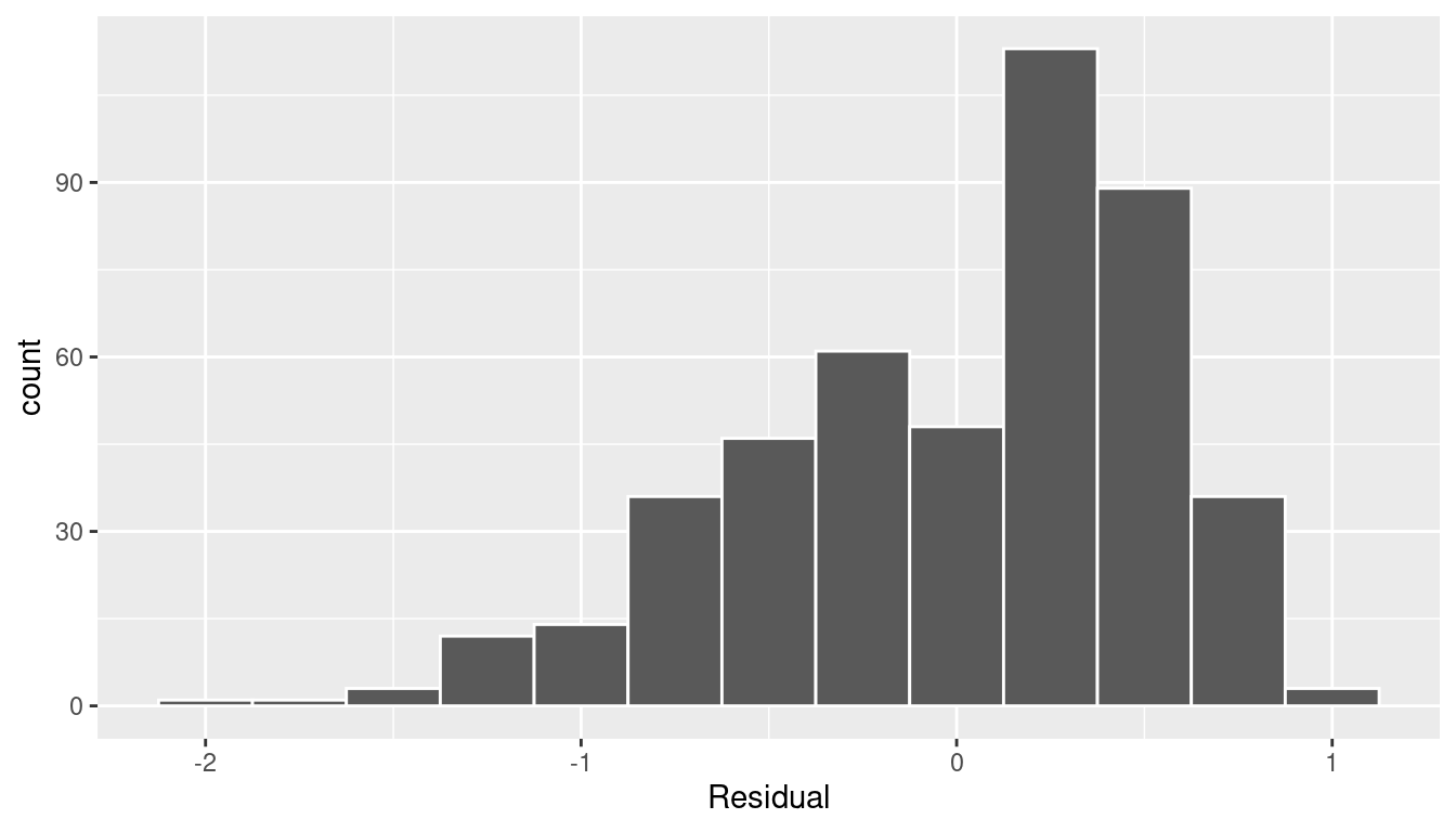
FIGURE 10.4: Histogram of residuals.
This histogram shows that we have more positive residuals than negative. Since the residual \(y-\widehat{y}\) is positive when \(y > \widehat{y}\), it seems our regression model’s fitted teaching scores \(\widehat{y}\) tend to underestimate the true teaching scores \(y\). Furthermore, this histogram has a slight left-skew in that there is a tail on the left. This is another way to say the residuals exhibit a negative skew.
Is this a problem? Again, there is a certain amount of subjectivity in the response. In the authors’ opinion, while there is a slight skew to the residuals, we feel it isn’t drastic. On the other hand, others might disagree with our assessment.
Let’s present examples where the residuals clearly do and don’t follow a normal distribution in Figure 10.5. In this case of the model yielding the clearly non-normal residuals on the right, any results from an inference for regression would not be valid.
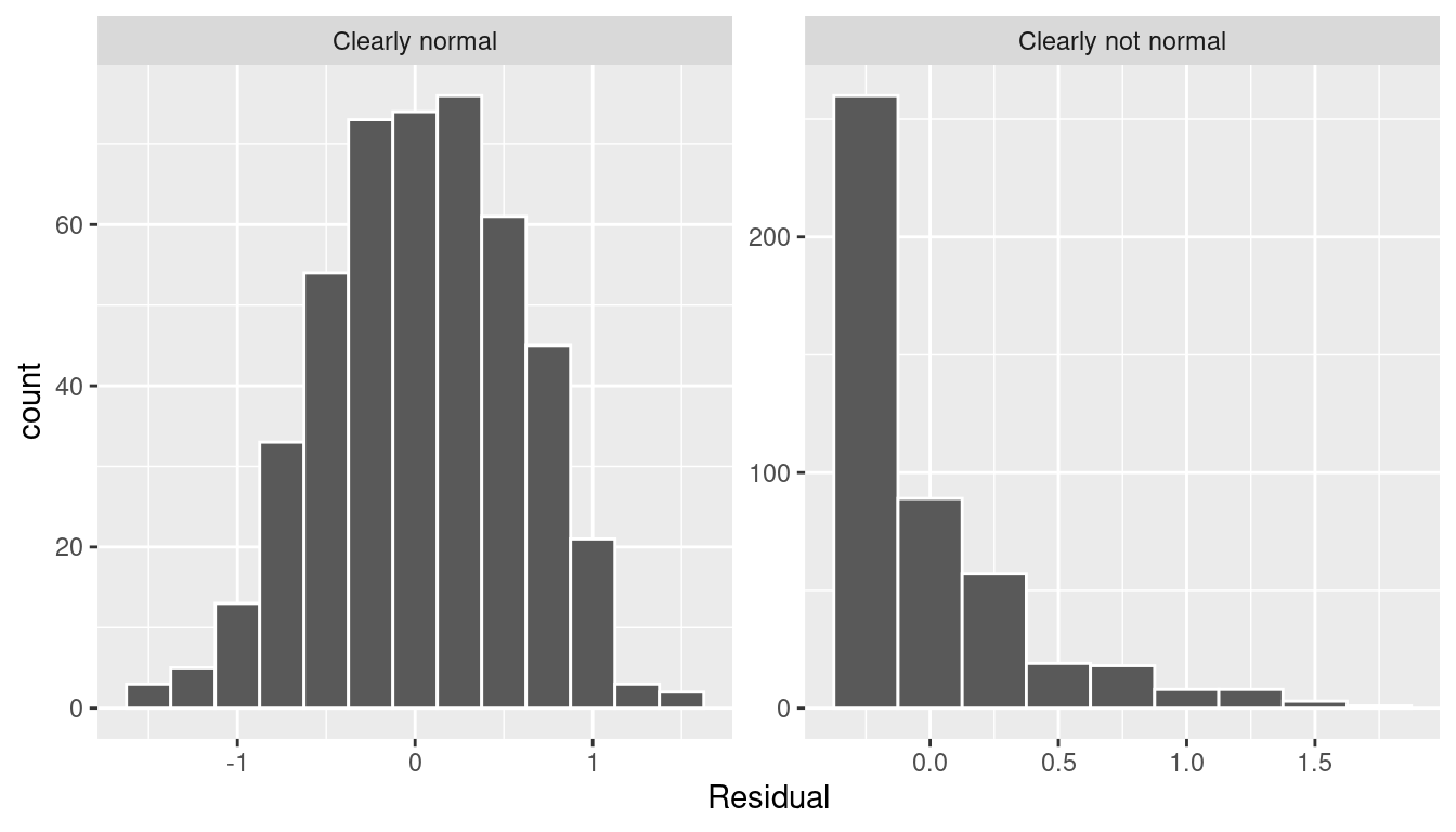
FIGURE 10.5: Example of clearly normal and clearly not normal residuals.
10.3.5 Equality of variance
The fourth and final condition is that the residuals should exhibit Equal variance across all values of the explanatory variable \(x\). In other words, the value and spread of the residuals should not depend on the value of the explanatory variable \(x\).
Recall the scatterplot in Figure 10.1: we had the explanatory variable \(x\) of “beauty” score on the x-axis and the outcome variable \(y\) of teaching score on the y-axis. Instead, let’s create a scatterplot that has the same values on the x-axis, but now with the residual \(y-\widehat{y}\) on the y-axis as seen in Figure 10.6.
ggplot(regression_points, aes(x = bty_avg, y = residual)) +
  geom_point() +
  labs(x = "Beauty Score", y = "Residual") +
  geom_hline(yintercept = 0, col = "blue", size = 1)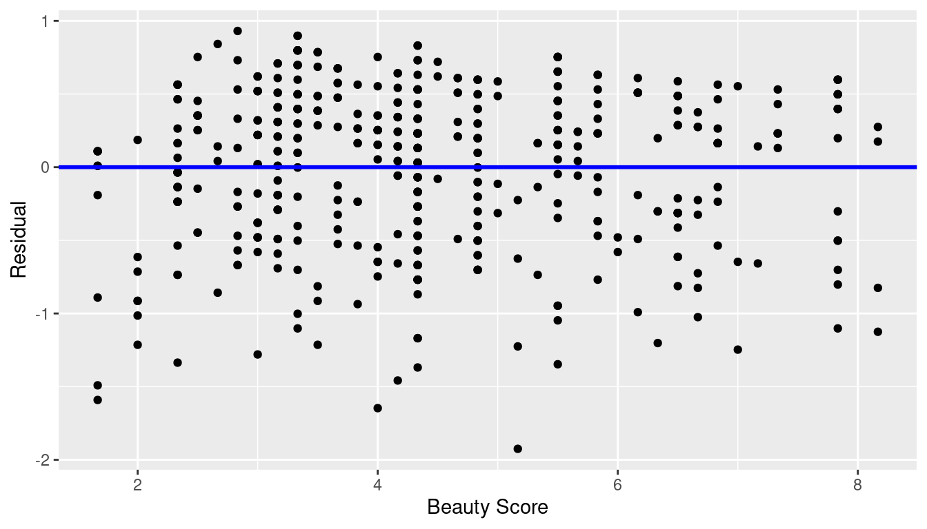
FIGURE 10.6: Plot of residuals over beauty score.
You can think of Figure 10.6 as a modified version of the plot with the regression line in Figure 10.1, but with the regression line flattened out to \(y=0\). Looking at this plot, would you say that the spread of the residuals around the line at \(y=0\) is constant across all values of the explanatory variable \(x\) of “beauty” score? This question is rather qualitative and subjective in nature, thus different people may respond with different answers. For example, some people might say that there is slightly more variation in the residuals for smaller values of \(x\) than for higher ones. However, it can be argued that there isn’t a drastic non-constancy.
In Figure 10.7 let’s present an example where the residuals clearly do not have equal variance across all values of the explanatory variable \(x\).
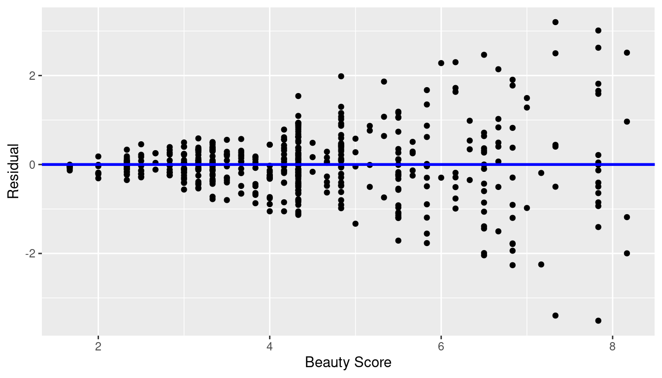
FIGURE 10.7: Example of clearly non-equal variance.
Observe how the spread of the residuals increases as the value of \(x\) increases. This is a situation known as heteroskedasticity. Any inference for regression based on a model yielding such a pattern in the residuals would not be valid.
10.3.6 What’s the conclusion?
Let’s list our four conditions for inference for regression again and indicate whether or not they were satisfied in our analysis:
- Linearity of relationship between variables: Yes
- Independence of residuals: No
- Normality of residuals: Somewhat
- Equality of variance: Yes
So what does this mean for the results of our confidence intervals and hypothesis tests in Section 10.2?
First, the Independence condition. The fact that there exist dependencies between different rows in evals_ch5 must be addressed. In more advanced statistics courses, you’ll learn how to incorporate such dependencies into your regression models. One such technique is called hierarchical/multilevel modeling.
Second, when conditions L, N, E are not met, it often means there is a shortcoming in our model. For example, it may be the case that using only a single explanatory variable is insufficient, as we did with “beauty” score. We may need to incorporate more explanatory variables in a multiple regression model as we did in Chapter 6, or perhaps use a transformation of one or more of your variables, or use an entirely different modeling technique. To learn more about addressing such shortcomings, you’ll have to take a class on or read up on more advanced regression modeling methods.
In our case, the best we can do is view the results suggested by our confidence intervals and hypothesis tests as preliminary. While a preliminary analysis suggests that there is a significant relationship between teaching and “beauty” scores, further investigation is warranted; in particular, by improving the preliminary score ~ bty_avg model so that the four conditions are met. When the four conditions are roughly met, then we can put more faith into our confidence intervals and \(p\)-values.
The conditions for inference in regression problems are a key part of regression analysis that are of vital importance to the processes of constructing confidence intervals and conducting hypothesis tests. However, it is often the case with regression analysis in the real world that not all the conditions are completely met. Furthermore, as you saw, there is a level of subjectivity in the residual analyses to verify the L, N, and E conditions. So what can you do? We as authors advocate for transparency in communicating all results. This lets the stakeholders of any analysis know about a model’s shortcomings or whether the model is “good enough.” So while this checking of assumptions has lead to some fuzzy “it depends” results, we decided as authors to show you these scenarios to help prepare you for difficult statistical decisions you may need to make down the road.
Learning check
(LC10.1) Continuing with our regression using age as the explanatory variable and teaching score as the outcome variable.
- Use the
get_regression_points()function to get the observed values, fitted values, and residuals for all 463 instructors. - Perform a residual analysis and look for any systematic patterns in the residuals. Ideally, there should be little to no pattern but comment on what you find here.
10.4 Simulation-based inference for regression
Recall in Subsection 10.2.5 when we interpreted the third through seventh columns of a regression table, we stated that R doesn’t do simulations to compute these values. Rather R uses theory-based methods that involve mathematical formulas.
In this section, we’ll use the simulation-based methods you previously learned in Chapters 8 and 9 to recreate the values in the regression table in Table 10.1. In particular, we’ll use the infer package workflow to
- Construct a 95% confidence interval for the population slope \(\beta_1\) using bootstrap resampling with replacement. We did this previously in Sections 8.4 with the
penniesdata and 8.6 with themythbusters_yawndata. - Conduct a hypothesis test of \(H_0: \beta_1 = 0\) versus \(H_A: \beta_1 \neq 0\) using a permutation test. We did this previously in Sections 9.3 with the
promotionsdata and 9.5 with themovies_sampleIMDb data.
10.4.1 Confidence interval for slope
We’ll construct a 95% confidence interval for \(\beta_1\) using the infer workflow outlined in Subsection 8.4.2. Specifically, we’ll first construct the bootstrap distribution for the fitted slope \(b_1\) using our single sample of 463 courses:
specify()the variables of interest inevals_ch5with the formula:score ~ bty_avg.generate()replicates by usingbootstrapresampling with replacement from the original sample of 463 courses. We generatereps = 1000replicates usingtype = "bootstrap".calculate()the summary statistic of interest: the fittedslope\(b_1\).
Using this bootstrap distribution, we’ll construct the 95% confidence interval using the percentile method and (if appropriate) the standard error method as well. It is important to note in this case that the bootstrapping with replacement is done row-by-row. Thus, the original pairs of score and bty_avg values are always kept together, but different pairs of score and bty_avg values may be resampled multiple times. The resulting confidence interval will denote a range of plausible values for the unknown population slope \(\beta_1\) quantifying the relationship between teaching and “beauty” scores for all professors at UT Austin.
Let’s first construct the bootstrap distribution for the fitted slope \(b_1\):
bootstrap_distn_slope <- evals_ch5 %>%
  specify(formula = score ~ bty_avg) %>%
  generate(reps = 1000, type = "bootstrap") %>%
  calculate(stat = "slope")
bootstrap_distn_slope
# A tibble: 1,000 × 2
replicate stat
<int> <dbl>
1 1 0.0651055
2 2 0.0382313
3 3 0.108056
4 4 0.0666601
5 5 0.0715932
6 6 0.0854565
7 7 0.0624868
8 8 0.0412859
9 9 0.0796269
10 10 0.0761299
# ℹ 990 more rowsObserve how we have 1000 values of the bootstrapped slope \(b_1\) in the stat column. Let’s visualize the 1000 bootstrapped values in Figure 10.8.
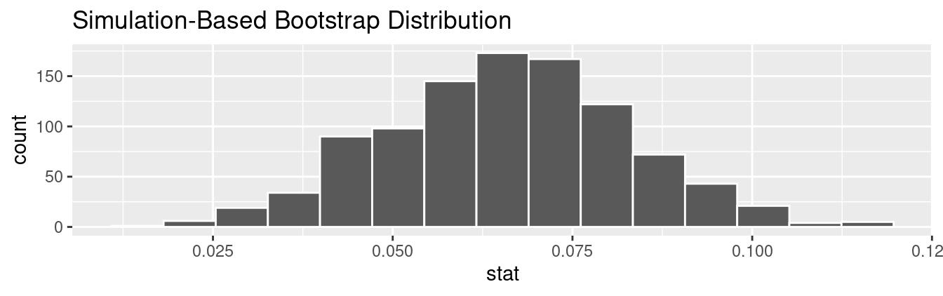
FIGURE 10.8: Bootstrap distribution of slope.
Observe how the bootstrap distribution is roughly bell-shaped. Recall from Subsection 8.7.1 that the shape of the bootstrap distribution of \(b_1\) closely approximates the shape of the sampling distribution of \(b_1\).
Percentile-method
First, let’s compute the 95% confidence interval for \(\beta_1\) using the percentile method. We’ll do so by identifying the 2.5th and 97.5th percentiles which include the middle 95% of values. Recall that this method does not require the bootstrap distribution to be normally shaped.
percentile_ci <- bootstrap_distn_slope %>%
  get_confidence_interval(type = "percentile", level = 0.95)
percentile_ci
# A tibble: 1 × 2
lower_ci upper_ci
<dbl> <dbl>
1 0.0323411 0.0990027The resulting percentile-based 95% confidence interval for \(\beta_1\) of (0.032, 0.099) is similar to the confidence interval in the regression Table 10.1 of (0.035, 0.099).
Standard error method
Since the bootstrap distribution in Figure 10.8 appears to be roughly bell-shaped, we can also construct a 95% confidence interval for \(\beta_1\) using the standard error method.
In order to do this, we need to first compute the fitted slope \(b_1\), which will act as the center of our standard error-based confidence interval. While we saw in the regression table in Table 10.1 that this was \(b_1\) = 0.067, we can also use the infer pipeline with the generate() step removed to calculate it:
Response: score (numeric)
Explanatory: bty_avg (numeric)
# A tibble: 1 × 1
       stat
      <dbl>
1 0.0666370
We then use the get_ci() function with level = 0.95 to compute the 95% confidence interval for \(\beta_1\). Note that setting the point_estimate argument to the observed_slope of 0.067 sets the center of the confidence interval.
se_ci <- bootstrap_distn_slope %>%
  get_ci(level = 0.95, type = "se", point_estimate = observed_slope)
se_ci
# A tibble: 1 × 2
lower_ci upper_ci
<dbl> <dbl>
1 0.0333767 0.0998974The resulting standard error-based 95% confidence interval for \(\beta_1\) of \((0.033, 0.1)\) is slightly different than the confidence interval in the regression Table 10.1 of \((0.035, 0.099)\).
Comparing all three
Let’s compare all three confidence intervals in Figure 10.9, where the percentile-based confidence interval is marked with solid lines, the standard error based confidence interval is marked with dashed lines, and the theory-based confidence interval (0.035, 0.099) from the regression table in Table 10.1 is marked with dotted lines.
visualize(bootstrap_distn_slope) +
  shade_confidence_interval(endpoints = percentile_ci, fill = NULL,
                            linetype = "solid", color = "grey90") +
  shade_confidence_interval(endpoints = se_ci, fill = NULL,
                            linetype = "dashed", color = "grey60") +
  shade_confidence_interval(endpoints = c(0.035, 0.099), fill = NULL,
                            linetype = "dotted", color = "black")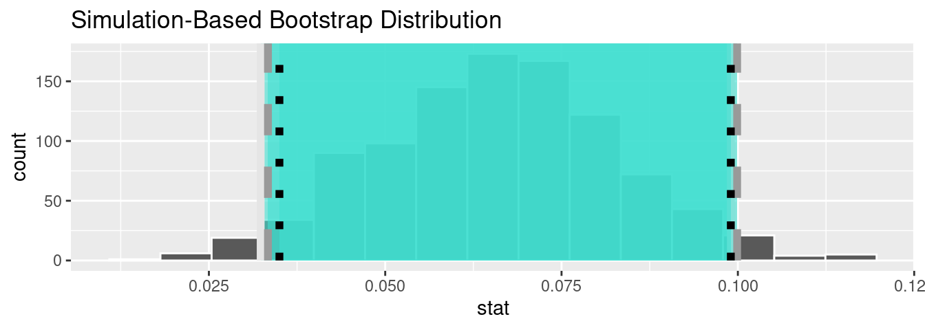
FIGURE 10.9: Comparing three confidence intervals for the slope.
Observe that all three are quite similar! Furthermore, none of the three confidence intervals for \(\beta_1\) contain 0 and are entirely located above 0. This is suggesting that there is in fact a meaningful positive relationship between teaching and “beauty” scores.
10.4.2 Hypothesis test for slope
Let’s now conduct a hypothesis test of \(H_0: \beta_1 = 0\) vs. \(H_A: \beta_1 \neq 0\). We will use the infer package, which follows the hypothesis testing paradigm in the “There is only one test” diagram in Figure 9.14.
Let’s first think about what it means for \(\beta_1\) to be zero as assumed in the null hypothesis \(H_0\). Recall we said if \(\beta_1 = 0\), then this is saying there is no relationship between the teaching and “beauty” scores. Thus assuming this particular null hypothesis \(H_0\) means that in our “hypothesized universe” there is no relationship between score and bty_avg. We can therefore shuffle/permute the bty_avg variable to no consequence.
We construct the null distribution of the fitted slope \(b_1\) by performing the steps that follow. Recall from Section 9.2 on terminology, notation, and definitions related to hypothesis testing where we defined the null distribution: the sampling distribution of our test statistic \(b_1\) assuming the null hypothesis \(H_0\) is true.
specify()the variables of interest inevals_ch5with the formula:score ~ bty_avg.hypothesize()the null hypothesis ofindependence. Recall from Section 9.3 that this is an additional step that needs to be added for hypothesis testing.generate()replicates by permuting/shuffling values from the original sample of 463 courses. We generatereps = 1000replicates usingtype = "permute"here.calculate()the test statistic of interest: the fittedslope\(b_1\).
In this case, we permute the values of bty_avg across the values of score 1000 times. We can do this shuffling/permuting since we assumed a “hypothesized universe” of no relationship between these two variables. Then we calculate the "slope" coefficient for each of these 1000 generated samples.
null_distn_slope <- evals %>%
  specify(score ~ bty_avg) %>%
  hypothesize(null = "independence") %>%
  generate(reps = 1000, type = "permute") %>%
  calculate(stat = "slope")
Observe the resulting null distribution for the fitted slope \(b_1\) in Figure 10.10.
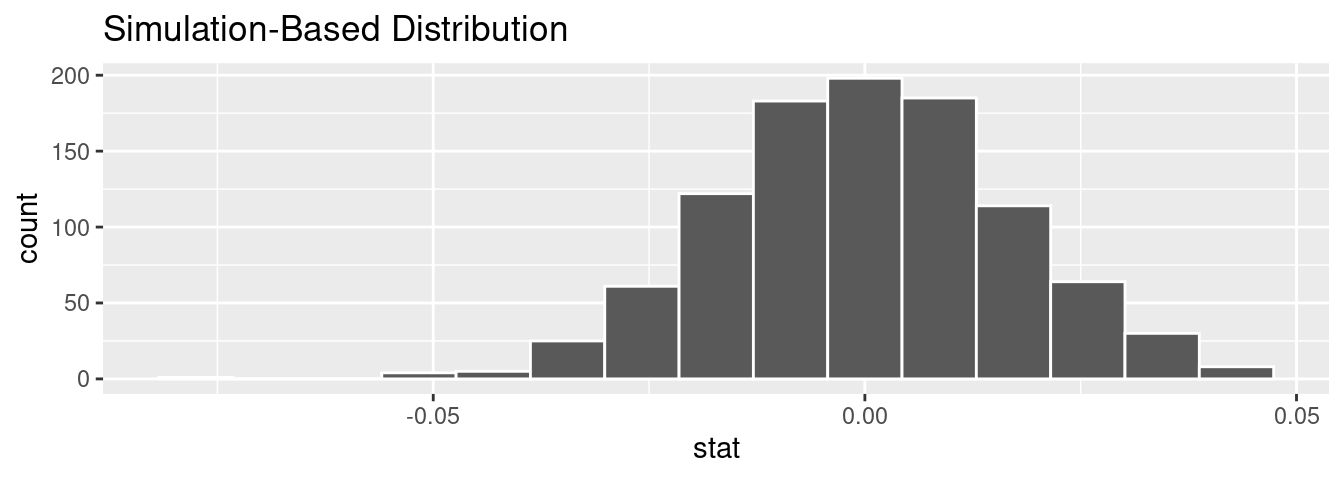
FIGURE 10.10: Null distribution of slopes.
Notice how it is centered at \(b_1\) = 0. This is because in our hypothesized universe, there is no relationship between score and bty_avg and so \(\beta_1 = 0\). Thus, the most typical fitted slope \(b_1\) we observe across our simulations is 0. Observe, furthermore, how there is variation around this central value of 0.
Let’s visualize the \(p\)-value in the null distribution by comparing it to the observed test statistic of \(b_1\) = 0.067 in Figure 10.11. We’ll do this by adding a shade_p_value() layer to the previous visualize() code.
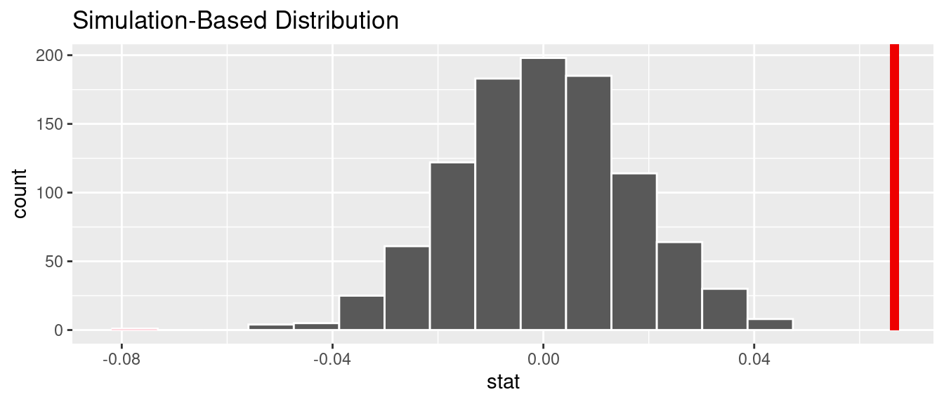
FIGURE 10.11: Null distribution and \(p\)-value.
Since the observed fitted slope 0.067 falls far to the right of this null distribution and thus the shaded region doesn’t overlap it, we’ll have a \(p\)-value of 0. For completeness, however, let’s compute the numerical value of the \(p\)-value anyways using the get_p_value() function. Recall that it takes the same inputs as the shade_p_value() function:
# A tibble: 1 × 1
  p_value
    <dbl>
1       0
This matches the \(p\)-value of 0 in the regression table in Table 10.1. We therefore reject the null hypothesis \(H_0: \beta_1 = 0\) in favor of the alternative hypothesis \(H_A: \beta_1 \neq 0\). We thus have evidence that suggests there is a significant relationship between teaching and “beauty” scores for all instructors at UT Austin.
When the conditions for inference for regression are met and the null distribution has a bell shape, we are likely to see similar results between the simulation-based results we just demonstrated and the theory-based results shown in the regression table in Table 10.1.
Learning check
(LC10.2) Repeat the inference but this time for the correlation coefficient instead of the slope. Note the implementation of stat = "correlation" in the calculate() function of the infer package.
10.5 Conclusion
10.5.1 Theory-based inference for regression
Recall in Subsection 10.2.5 when we interpreted the regression table in Table 10.1, we mentioned that R does not compute its values using simulation-based methods for constructing confidence intervals and conducting hypothesis tests as we did in Chapters 8 and 9 using the infer package. Rather, R uses a theory-based approach using mathematical formulas, much like the theory-based confidence intervals you saw in Subsection 8.7.2 and the theory-based hypothesis tests you saw in Subsection 9.6.1. These formulas were derived in a time when computers didn’t exist, so it would’ve been incredibly labor intensive to run extensive simulations.
In particular, much like the formula for the standard error for the sample proportion \(\widehat{p}\) we saw in Subsection 7.6.2 and the formula for the standard error for the difference in sample means \(\overline{x}_1 - \overline{x}_2\) we saw in Subsection 9.6.1, there is a formula for the standard error of the fitted slope \(b_1\):
\[\text{SE}_{b_1} = \dfrac{\dfrac{s_y}{s_x} \cdot \sqrt{1-r^2}}{\sqrt{n-2}}\]
As with many formulas in statistics, there’s a lot going on here, so let’s first break down what each symbol represents. First \(s_x\) and \(s_y\) are the sample standard deviations of the explanatory variable bty_avg and the response variable score, respectively. Second, \(r\) is the sample correlation coefficient between score and bty_avg. This was computed as 0.187 in Chapter 5. Lastly, \(n\) is the number of pairs of points in the evals_ch5 data frame, here 463.
To put this formula into words, the standard error of \(b_1\) depends on the relationship between the variability of the response variable and the variability of the explanatory variable as measured in the \(s_y / s_x\) term. Next, it looks into how the two variables relate to each other in the \(\sqrt{1-r^2}\) term.
However, the most important observation to make in the previous formula is that there is an \(n - 2\) in the denominator. In other words, as the sample size \(n\) increases, the standard error \(\text{SE}_{b_1}\) decreases. Just as we demonstrated in Subsection 7.3.3 when we used shovels with \(n\) = 25, 50, and 100 slots, the amount of sampling variation of the fitted slope \(b_1\) will depend on the sample size \(n\). In particular, as the sample size increases, both the sampling and bootstrap distributions narrow and the standard error \(\text{SE}_{b_1}\) decreases. Hence, our estimates of \(b_1\) for the true population slope \(\beta_1\) get more and more precise.
R then uses this formula for the standard error of \(b_1\) in the third column of the regression table and subsequently to construct 95% confidence intervals. But what about the hypothesis test? Much like with our theory-based hypothesis test in Subsection 9.6.1, R uses the following \(t\)-statistic as the test statistic for hypothesis testing:
\[ t = \dfrac{ b_1 - \beta_1}{ \text{SE}_{b_1}} \]
And since the null hypothesis \(H_0: \beta_1 = 0\) is assumed during the hypothesis test, the \(t\)-statistic becomes
\[ t = \dfrac{ b_1 - 0}{ \text{SE}_{b_1}} = \dfrac{ b_1 }{ \text{SE}_{b_1}} \]
What are the values of \(b_1\) and \(\text{SE}_{b_1}\)? They are in the estimate and std_error column of the regression table in Table 10.1. Thus the value of 4.09 in the table is computed as 0.067/0.016 = 4.188. Note there is a difference due to some rounding error here.
Lastly, to compute the \(p\)-value, we need to compare the observed test statistic of 4.09 to the appropriate null distribution. Recall from Section 9.2, that a null distribution is the sampling distribution of the test statistic assuming the null hypothesis \(H_0\) is true. Much like in our theory-based hypothesis test in Subsection 9.6.1, it can be mathematically proven that this distribution is a \(t\)-distribution with degrees of freedom equal to \(df = n - 2 = 463 - 2 = 461\).
Don’t worry if you’re feeling a little overwhelmed at this point. There is a lot of background theory to understand before you can fully make sense of the equations for theory-based methods. That being said, theory-based methods and simulation-based methods for constructing confidence intervals and conducting hypothesis tests often yield consistent results. As mentioned before, in our opinion, two large benefits of simulation-based methods over theory-based are that (1) they are easier for people new to statistical inference to understand, and (2) they also work in situations where theory-based methods and mathematical formulas don’t exist.
10.5.2 Summary of statistical inference
We’ve finished the last two scenarios from the “Scenarios of sampling for inference” table in Subsection 7.6.1, which we re-display in Table 10.4.
| Scenario | Population parameter | Notation | Point estimate | Symbol(s) |
|---|---|---|---|---|
| 1 | Population proportion | \(p\) | Sample proportion | \(\widehat{p}\) |
| 2 | Population mean | \(\mu\) | Sample mean | \(\overline{x}\) or \(\widehat{\mu}\) |
| 3 | Difference in population proportions | \(p_1 - p_2\) | Difference in sample proportions | \(\widehat{p}_1 - \widehat{p}_2\) |
| 4 | Difference in population means | \(\mu_1 - \mu_2\) | Difference in sample means | \(\overline{x}_1 - \overline{x}_2\) or \(\widehat{\mu}_1 - \widehat{\mu}_2\) |
| 5 | Population regression slope | \(\beta_1\) | Fitted regression slope | \(b_1\) or \(\widehat{\beta}_1\) |
Armed with the regression modeling techniques you learned in Chapters 5 and 6, your understanding of sampling for inference in Chapter 7, and the tools for statistical inference like confidence intervals and hypothesis tests in Chapters 8 and 9, you’re now equipped to study the significance of relationships between variables in a wide array of data! Many of the ideas presented here can be extended into multiple regression and other more advanced modeling techniques.
10.5.3 Additional resources
An R script file of all R code used in this chapter is available here.
10.5.4 What’s to come
You’ve now concluded the last major part of the book on “Statistical Inference with infer.” The closing Chapter 11 concludes this book with various short case studies involving real data, such as house prices in the city of Seattle, Washington in the US. You’ll see how the principles in this book can help you become a great storyteller with data!